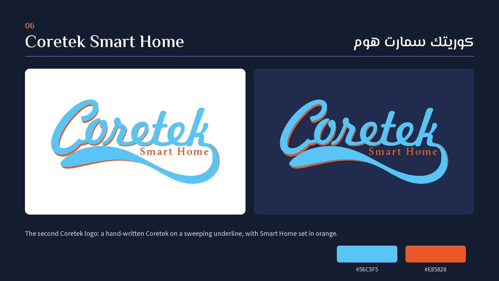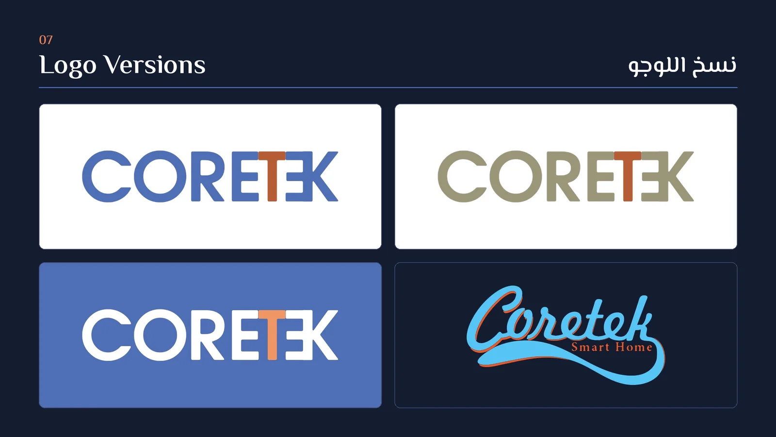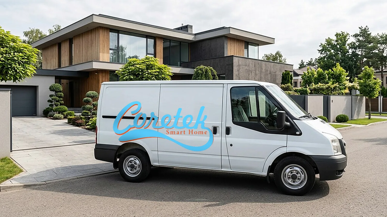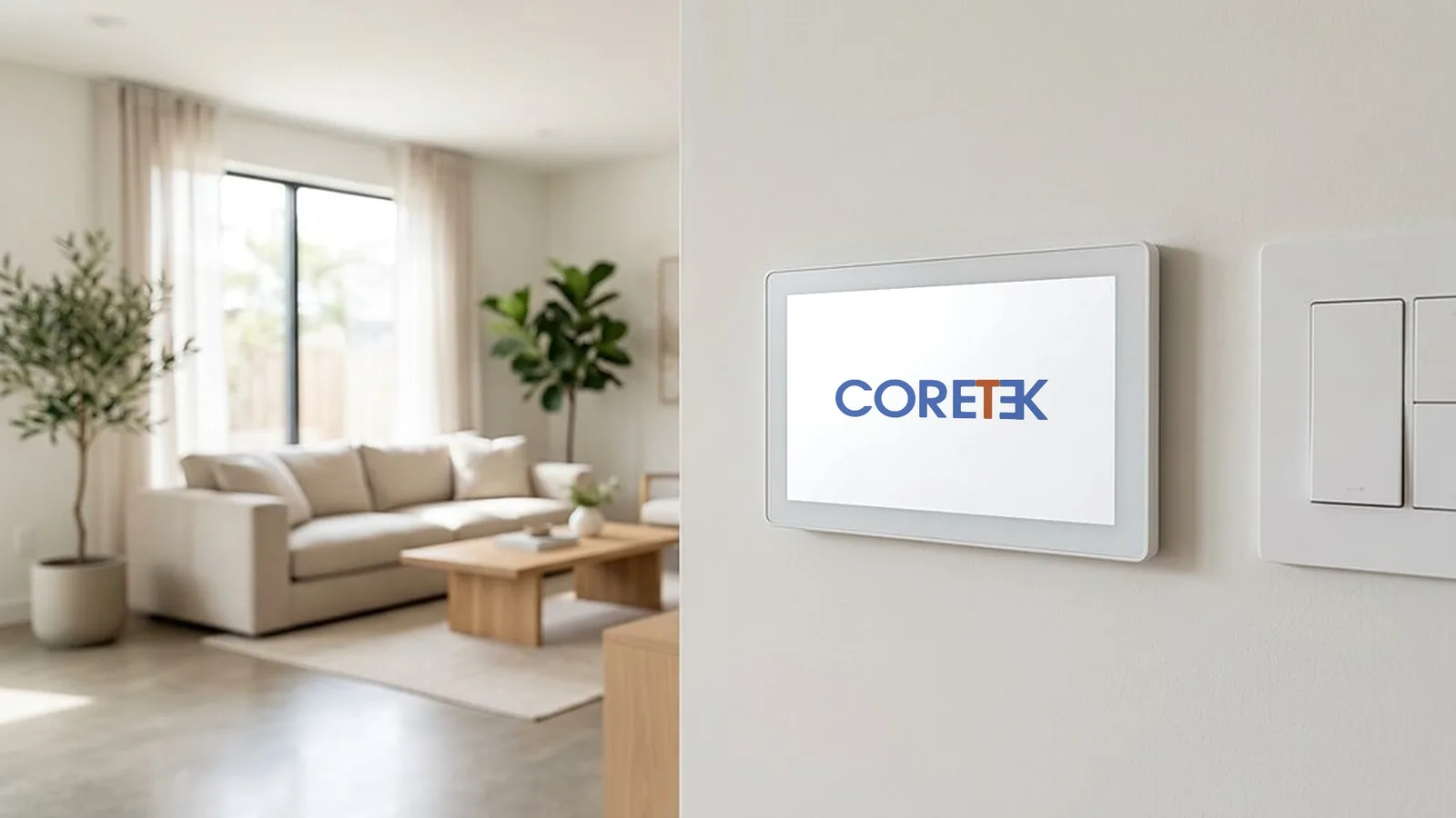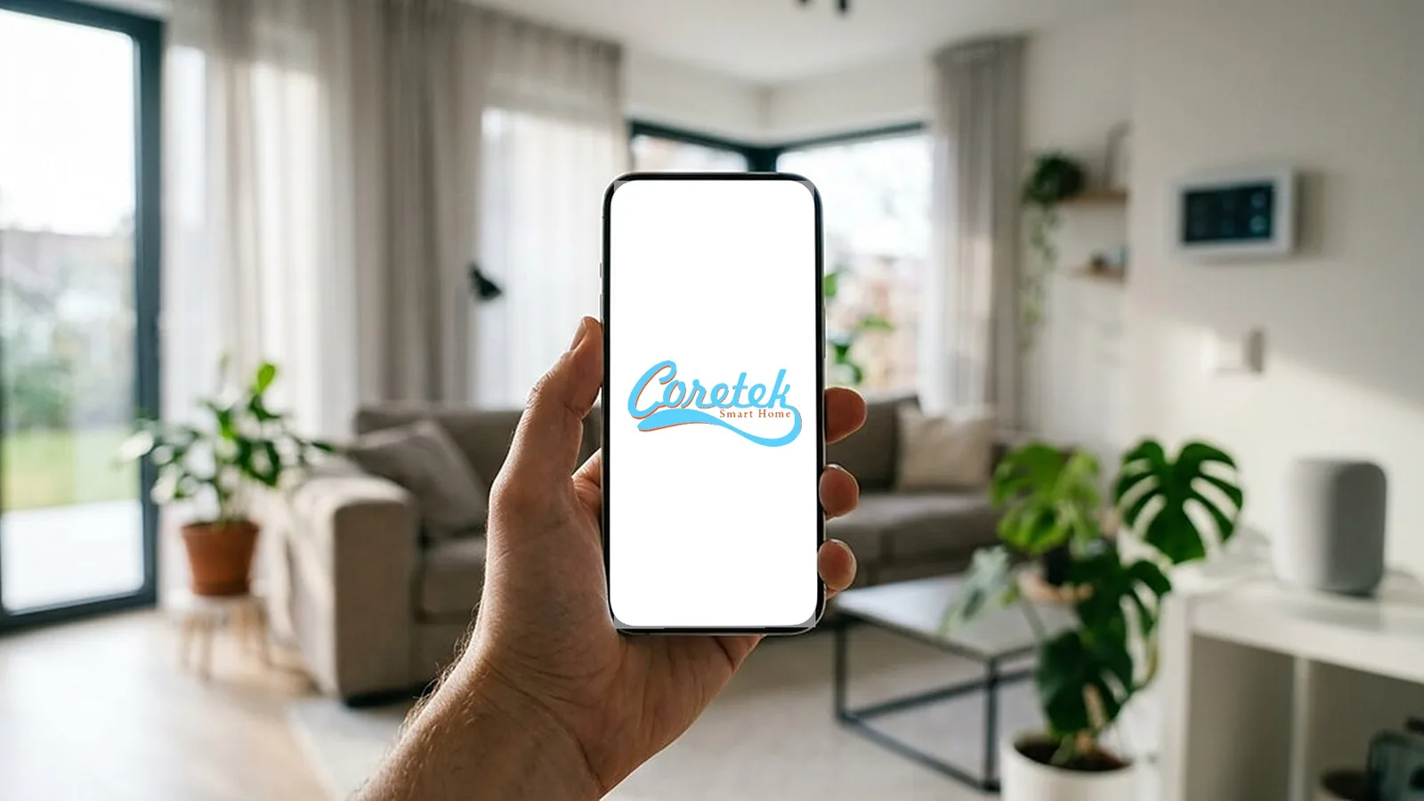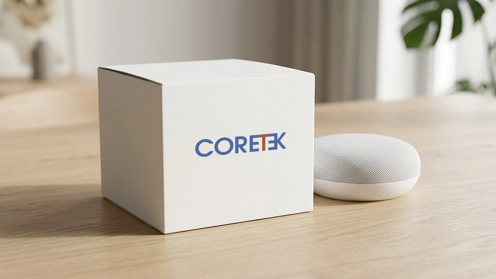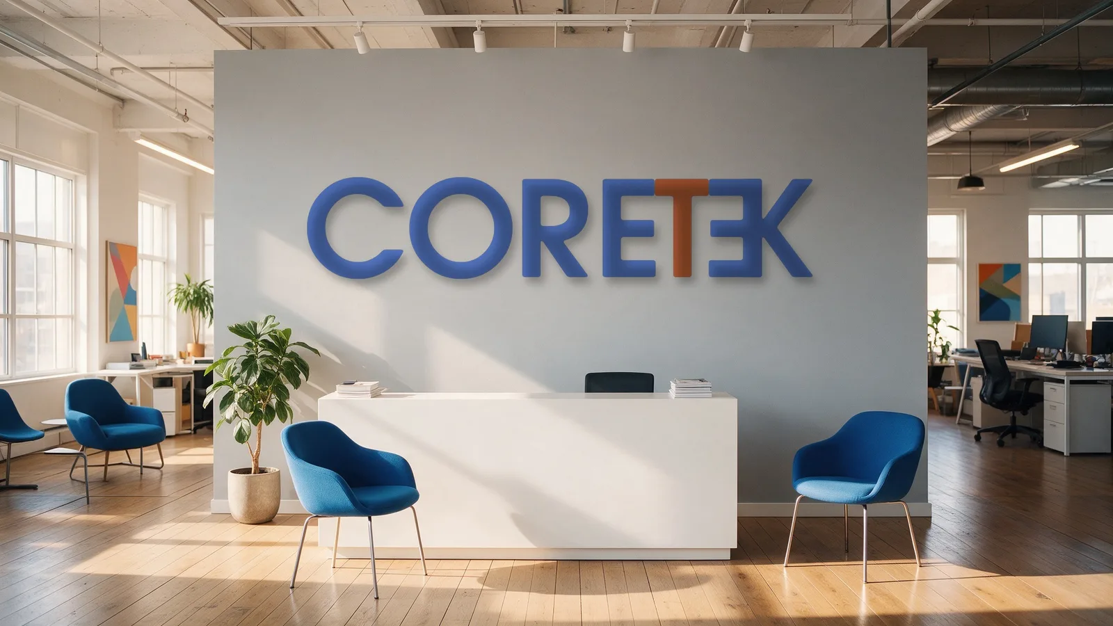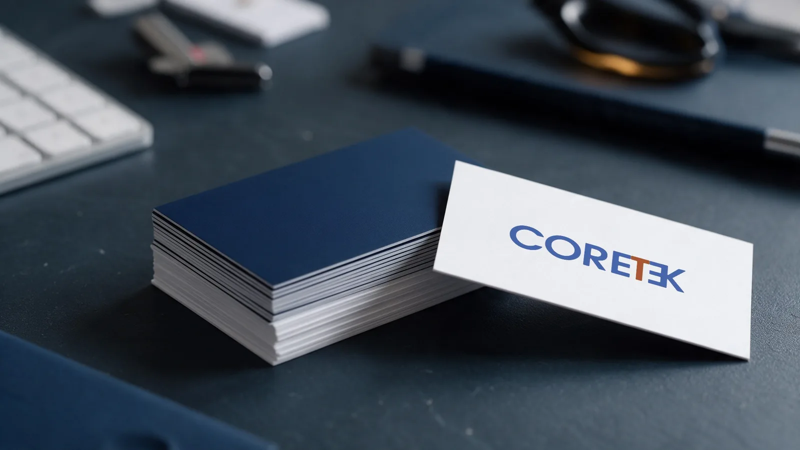
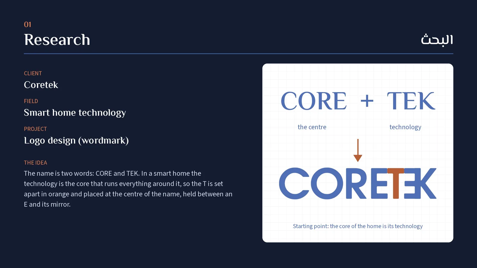
Two logos for Coretek, a smart home technology company. The CORETEK wordmark splits the name into CORE and TEK: the orange T stands at the centre, framed by an E and its mirror, so the technology is the core of the home. A second logo, Coretek Smart Home, is hand-written on a sweeping underline. Applied to a wall control panel, a service van, an app screen, packaging and stationery.

كوريتك سمارت هوم: تصميم اللوجو
لوجوين لشركة كوريتك للبيوت الذكية. كلمة CORETEK بتتقسم لـ CORE و TEK: حرف الـ T البرتقاني واقف في النص بين حرف E ومرايته، يعني التكنولوجيا هي قلب البيت. واللوجو التاني Coretek Smart Home مكتوب بخط إيد فوق خط منحني. ومطبّقين على شاشة التحكم، وعربية التركيبات، وشاشة الموبايل، والعلبة، والمطبوعات.
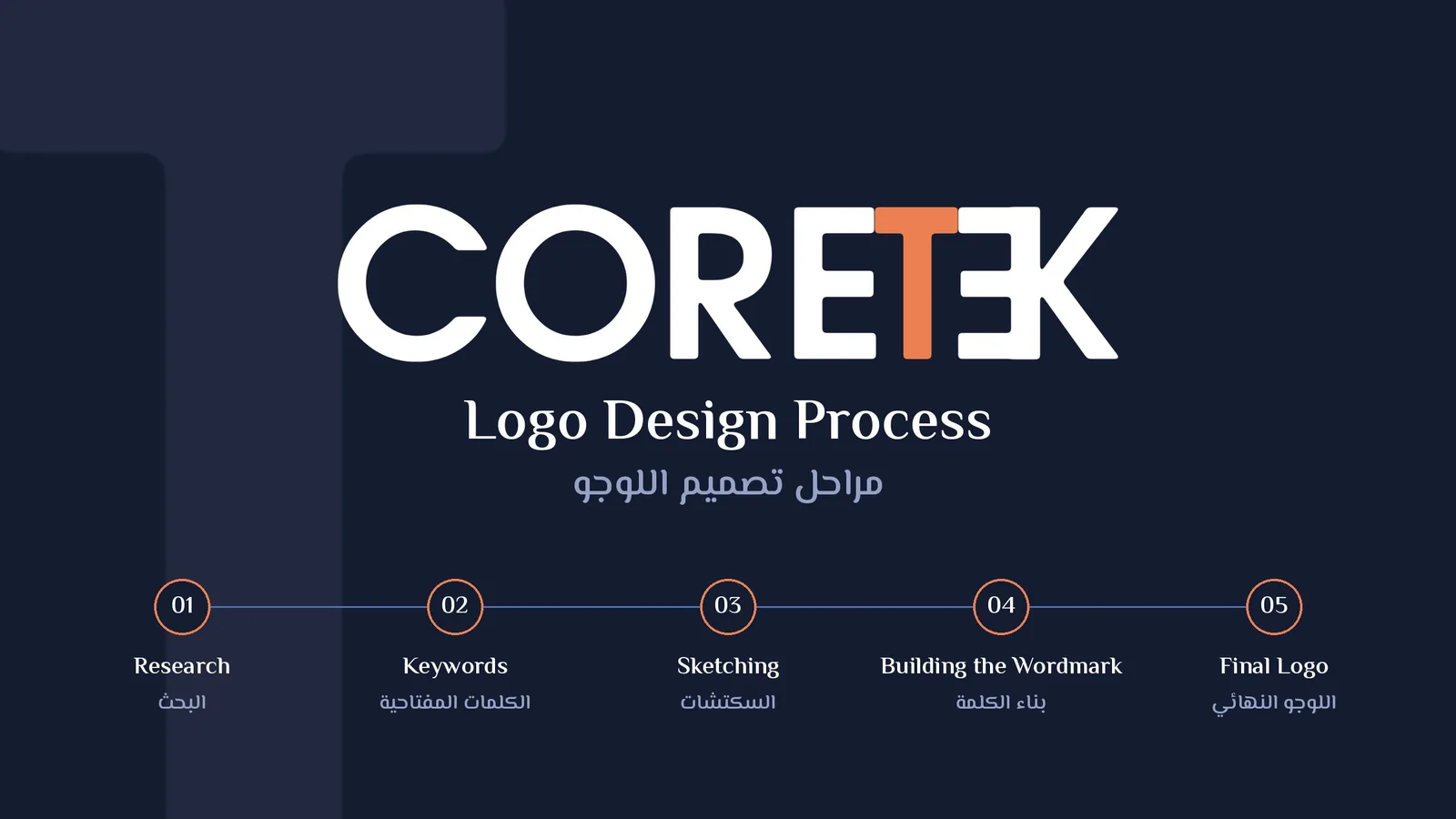
Coretek Smart Home logo design: Process overview
Coretek Smart Home logo design: Research: client, field and the idea
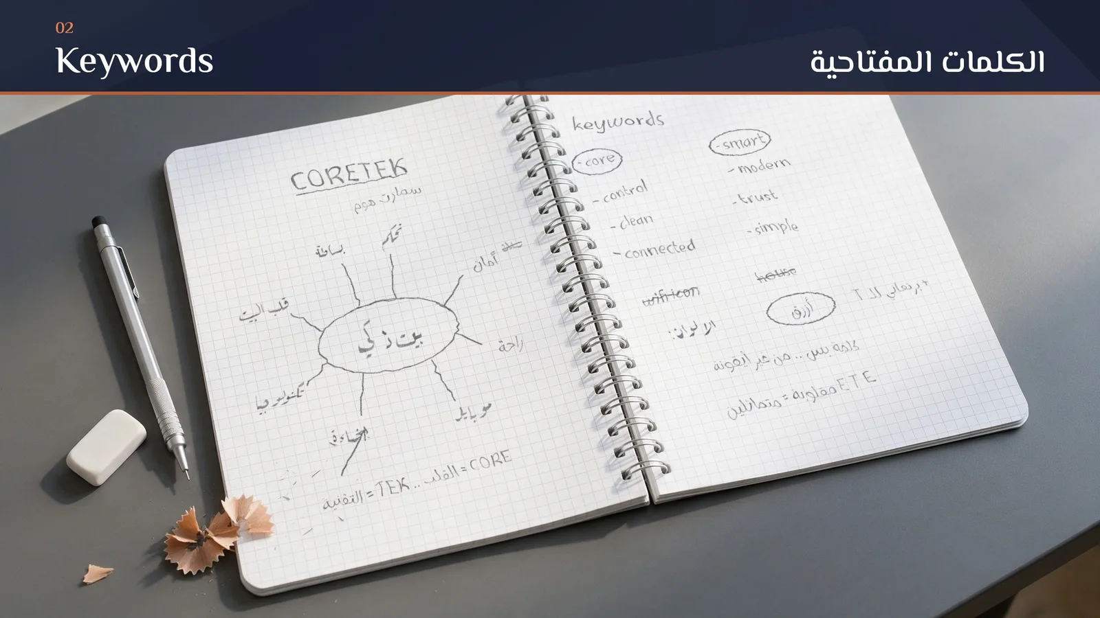
Coretek Smart Home logo design: Keywords (grid notebook)
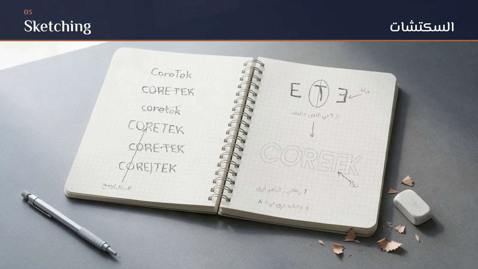
Coretek Smart Home logo design: Sketching (grid notebook)
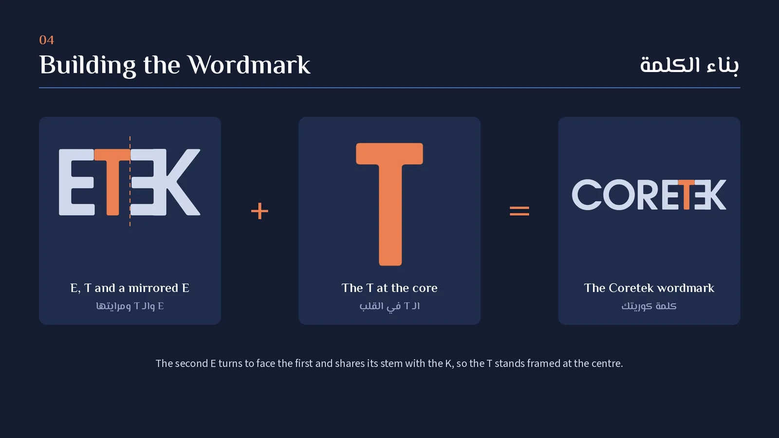
Coretek Smart Home logo design: Building the wordmark: E, T and a mirrored E
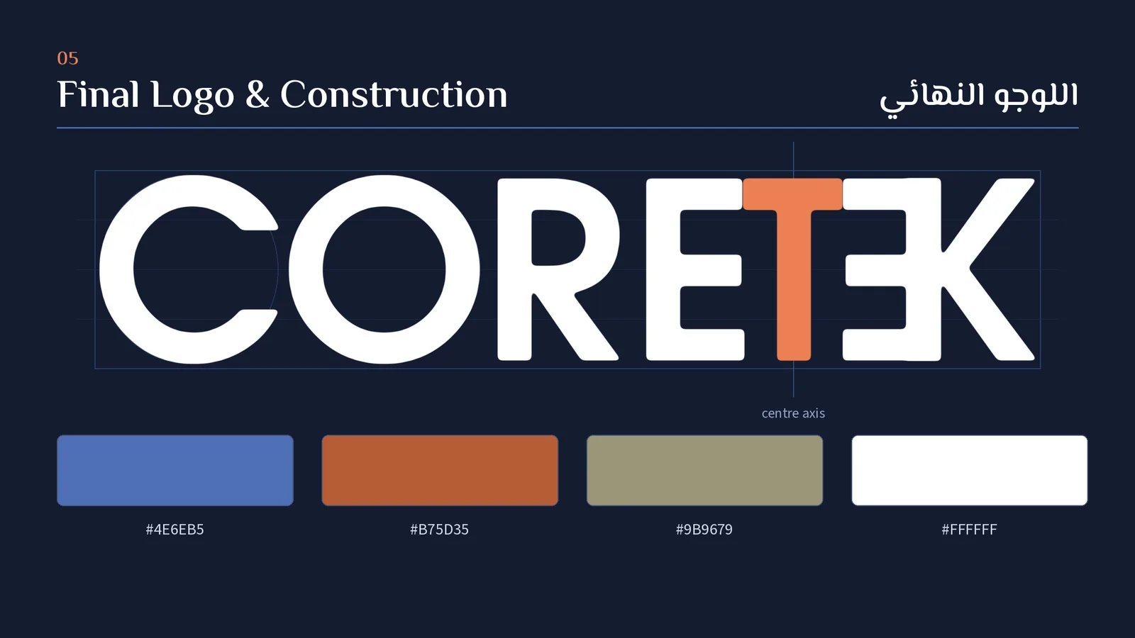
Coretek Smart Home logo design: Final logo, construction and colours
Coretek Smart Home logo design: The second logo, Coretek Smart Home
Coretek Smart Home logo design: Logo versions
Coretek Smart Home logo design: Mockup, service van
Coretek Smart Home logo design: Mockup, smart home wall control panel
Coretek Smart Home logo design: Mockup, phone app screen
Coretek Smart Home logo design: Mockup, product box
Coretek Smart Home logo design: Mockup, reception wall
Coretek Smart Home logo design: Mockup, business cards
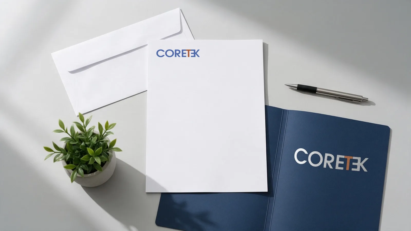
Coretek Smart Home logo design: Mockup, letterhead and folder
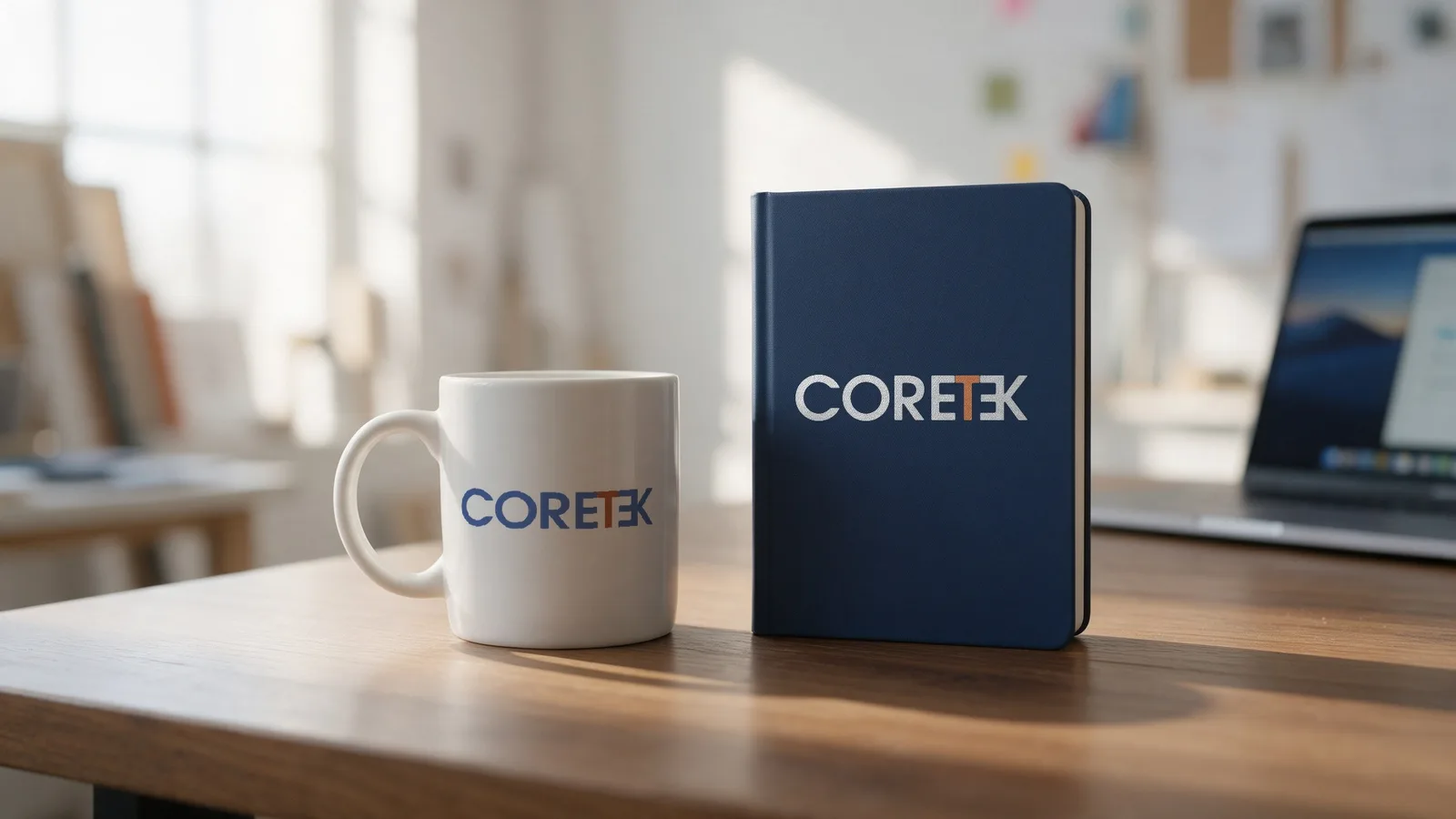
Coretek Smart Home logo design: Mockup, mug and notebook