

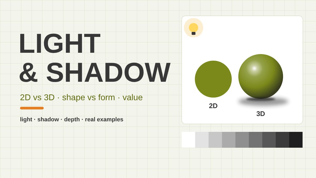
What Is the Difference Between 2D and 3D in Design?
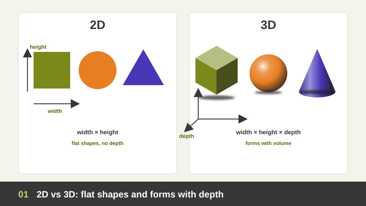
2D means two-dimensional: a thing that has width and height but no depth. A circle drawn on paper, a flat icon, a silhouette, a cut-paper collage, a logo in one colour: all 2D. 3D means three-dimensional: a thing that also has depth, so it has volume, a front and a back, and it can be lit from one side and cast a shadow. A ball, a bottle, a building, a sculpture and a product render are 3D.
Here is the important part for designers and painters: a sheet of paper, a canvas and a screen are all flat. Whatever we put on them is physically 2D. So in graphic design and painting, 3D is always an illusion. We make the viewer believe in depth by copying how the real world looks, and the strongest tool for that is light and shadow. Perspective, overlap and size help, but without light and shade even a perfect perspective drawing looks like a wire frame.
That gives every designer a choice in every project: keep things flat (clear, graphic, symbolic, fast to read) or build volume (real, tactile, dramatic, desirable), or mix the two. This article is about that choice. It continues my series on the elements of design: line, shape, texture and white space, all part of The Principles of Design. Light and value are the elements that turn shapes into forms.
Key takeaways
- 2D design has two dimensions, width and height: flat shapes. 3D design adds a third, depth: forms that have volume. On a flat page or screen, 3D is always an illusion, and light and shadow are the main tools that create it.
- A circle becomes a sphere, a square becomes a cube, the moment you add light, shadow and value (how light or dark an area is). Every lit form has the same anatomy: highlight, light, halftone, core shadow, reflected light and cast shadow.
- Value distribution, how you spread the lights, middles and darks across a design, decides where the eye goes, how deep the picture feels and what mood it has. Strong designs usually rest on a simple plan of three or four values.
- Light direction, hardness and colour change the feeling completely: side light is dramatic, soft front light is gentle, light from below is frightening, warm light with cool shadows feels natural.
- Ancient Egyptian painting and Hokusai are deliberately flat; Caravaggio, Vermeer and Joseph Wright of Derby build drama with light. Below I analyse each one, then show how designers use flat design, shadows in UI, logos, typography, isometric illustration, 3D renders and social media.
Flat Shape vs Form: How a Circle Becomes a Sphere
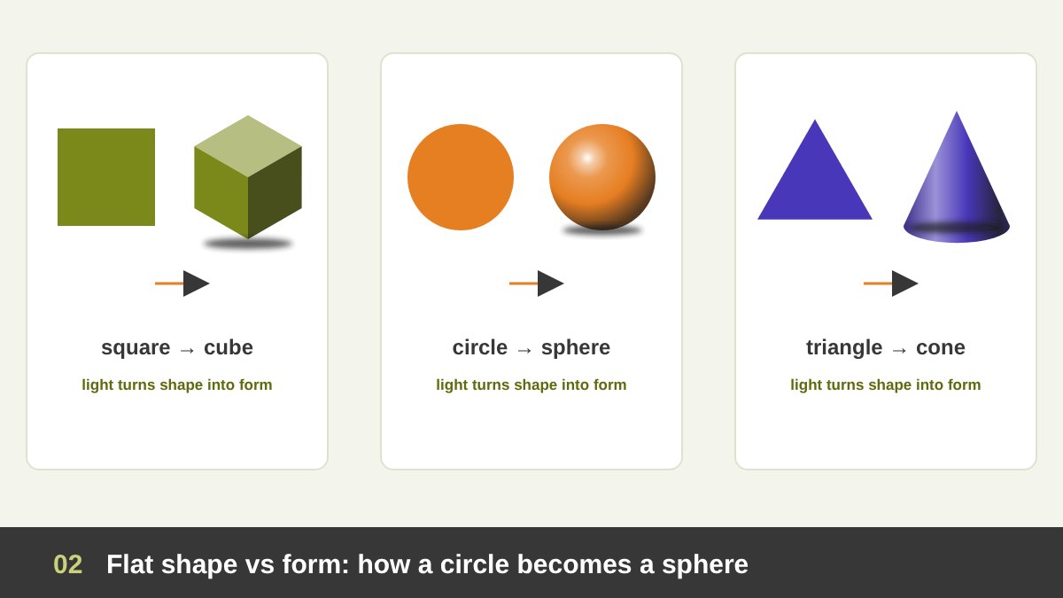
In design language, a shape is a flat, enclosed area: it has an outline and a fill, nothing more. A form is the 3D version of a shape: it has volume. The square’s form is the cube, the circle’s form is the sphere (or the cylinder), the triangle’s form is the cone or the pyramid. Every complex object can be simplified into these basic forms, which is why art schools still start with drawing cubes, spheres and cylinders under one lamp.
What turns one into the other? Not the outline. The outline of a sphere is just a circle. The difference is what happens inside the outline: a gradual change from light to dark that follows the curve of the surface. On a cube the change is sudden, one value per plane, because each flat face turns to the light at a different angle. On a cylinder the light runs in vertical bands; on a cone the bands meet at the tip.
So when you look at any object you want to draw or design, ask two questions: what is its basic form, and how would light fall on that form? Once you know that a head is roughly a sphere and a box, or that a perfume bottle is a cylinder with a cube on top, you know where its lights and shadows must go. I covered the flat side of this in Shape in Design; this article is about the moment the shape gets volume.
How Light Creates the Illusion of 3D
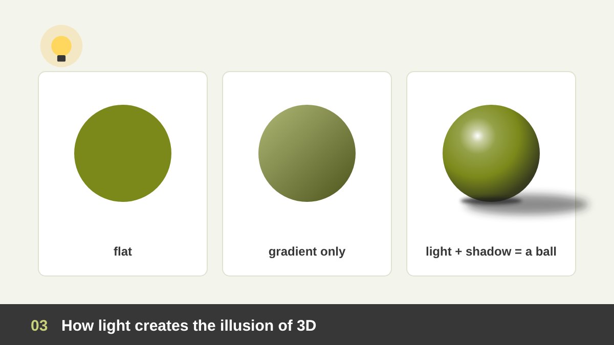
Our brain reads depth from shading almost instantly. It assumes that light comes from one source, usually from above, because that is how the sun and most lamps light our world. The neuroscientist V. S. Ramachandran showed in 1988 that a grey disc that is light at the top and dark at the bottom is seen as a bump, while the same disc turned upside down is seen as a dent. Nothing changed but the direction of the shading.
That is why light and shadow are so powerful in design: they speak directly to perception. A flat circle is a symbol. Add a soft gradient and it starts to curve. Add a bright highlight, a dark core shadow, a little reflected light at the edge and a cast shadow on the ground, and it becomes a ball sitting on a table. You drew nothing new; you only changed the values.
Two more things make the illusion convincing. First, the shadows must agree with one light source: the highlight, the core shadow and the cast shadow all point to the same lamp. Second, the object must touch the ground: a thin, very dark contact shadow where it meets the surface. Without it, even a perfectly shaded sphere looks pasted on, like a sticker floating above the page.
The Anatomy of Light and Shadow on a Form
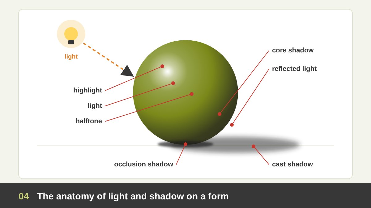
Every lit form, whether it is an apple, a face or a 3D logo, shows the same zones of light. Learn them once and you will see them everywhere. On the side facing the light: the highlight (the brightest spot, a reflection of the light source itself), the light (the lit surface, showing the object’s true colour) and the halftone or midtone (where the surface starts turning away from the light).
Then the shadow side. The core shadow is the darkest band on the object, just where the surface turns away from the light; its edge is called the terminator. Beyond it there is usually a slightly lighter area, the reflected light, because light bounces back from the table or nearby walls. Finally, on the ground, the cast shadow: the shadow the object throws onto another surface. It is darkest and sharpest right under the object, the occlusion or contact shadow, and it gets lighter and softer as it moves away.
A common mistake is to make the reflected light too bright. It belongs to the shadow family, so it must stay darker than any value on the lit side; otherwise the form breaks into two halves. The second common mistake is to forget the core shadow and go straight from light to a grey edge, which makes things look flat and plastic. The terminator is where volume really lives.
What Is Value in Design? The Light-to-Dark Scale
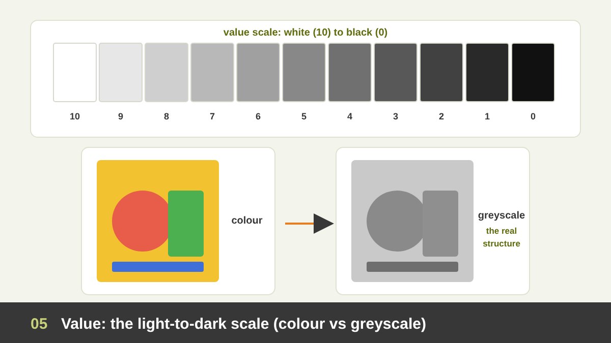
Value is how light or dark a colour is, from white to black, regardless of its hue. Yellow has a light value, navy has a dark value, and red and green can have exactly the same value. Artists organise values on a value scale, usually 9 or 10 steps. The painter and teacher Albert Munsell built his colour system (published in 1905) on three dimensions, hue, value and chroma, with value running from 0 (black) to 10 (white).
Value is the hidden structure of every image. There is an old studio saying: value does all the work, colour gets all the credit. Turn a photo, a painting or a poster into greyscale and you see its real skeleton: what is lit, what is in shadow, what stands out and what sinks. If a design falls apart in greyscale, no colour palette will save it. If it reads well in greyscale, almost any palette will work.
For designers this is also a question of accessibility. Text contrast is a value relationship: the WCAG guidelines ask for a contrast ratio of at least 4.5:1 for normal body text. Light grey text on a white background is a value problem, and so is a red button on a green background for a colour-blind user. Check values, not only colours.
Value Distribution: Spreading Light and Dark Across a Design
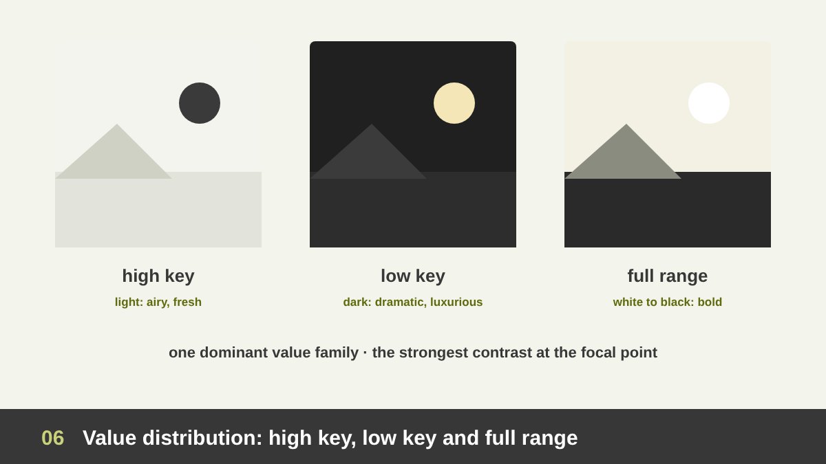
Value distribution means how you spread lights, middle tones and darks across the whole design. It is one of the most important decisions you make, and most beginners never make it consciously. A design that is mostly light values is called high key: airy, fresh, optimistic, often used for wellness, baby products, weddings and minimal brands. A design that is mostly dark values is low key: dramatic, mysterious, luxurious, cinematic. A full range design uses everything from white to black and feels bold and energetic.
A useful rule: choose one dominant value family that covers most of the area (roughly 60 to 70 percent), a secondary family for most of the rest, and keep the small accent, the extreme contrast, for the focal point. When lights, middles and darks are spread in equal amounts everywhere, the design becomes noisy and the eye does not know where to rest.
The eye goes first to the place with the strongest value contrast: the lightest light next to the darkest dark. Painters use this deliberately: they put the brightest face against the darkest background exactly where they want you to look. Designers do the same with a white headline on a dark photo, or a dark button on a light page. Contrast is a budget; spend it where it matters.
Notan: Designing with Light and Dark Masses
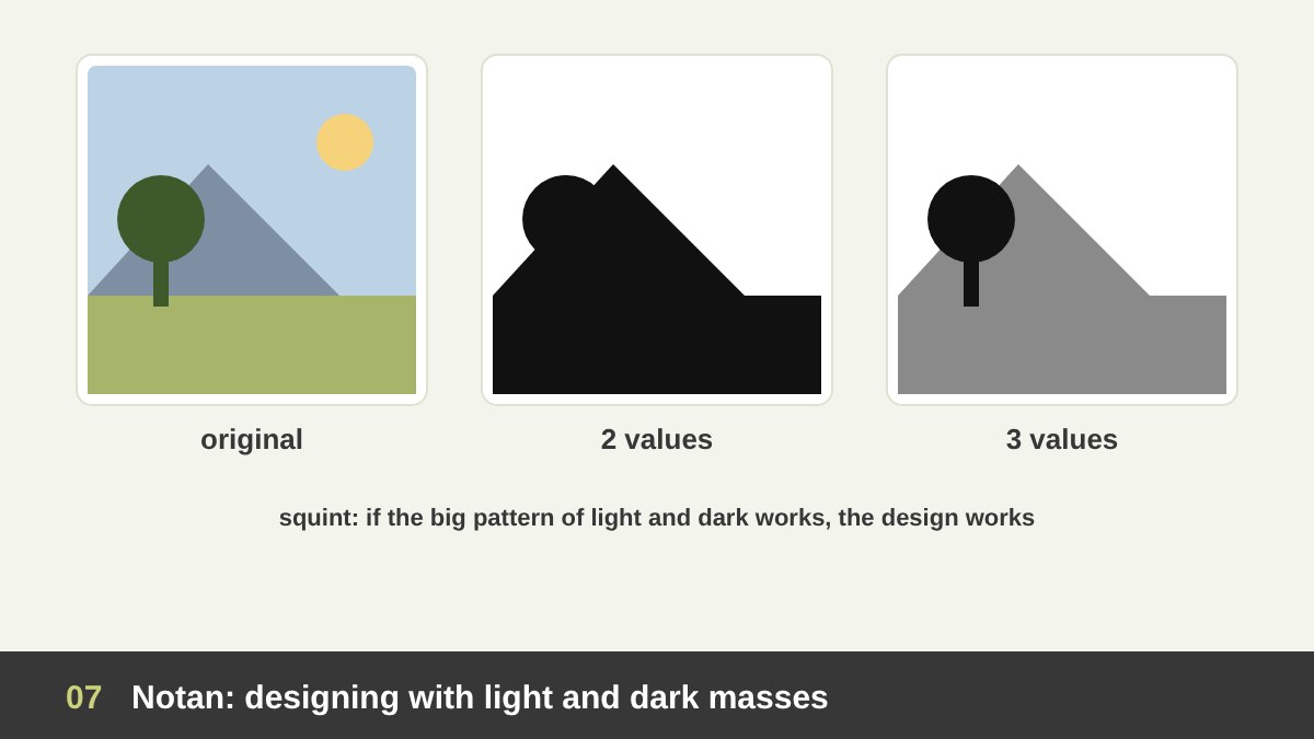
Notan (濃淡) is a Japanese word for the harmony of light and dark. The American teacher Arthur Wesley Dow introduced it to Western art education in his book Composition (1899), and it is still one of the best exercises I know. You reduce a picture to two values, pure black and pure white, and judge only the pattern they make. Then you try three values: light, middle and dark.
The exercise reveals whether a composition has a strong big pattern. Good images read clearly at notan level: a light figure on a dark ground, a dark tree against a light sky, an interlocking pattern of light and dark shapes that is interesting on its own. Weak images turn into grey mush, because every area has the same middle value and nothing separates.
Before I start a painting, a poster or even a website hero section, I make small thumbnails, a few centimetres wide, in three values. It takes five minutes and saves hours. It is also the bridge between this article and White Space in Design: notan is figure and ground expressed through value, and the light and dark shapes must both be designed.
Light Direction and Mood
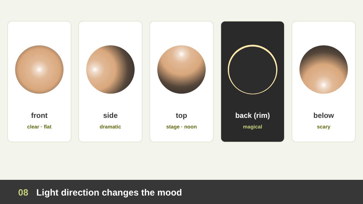
Where the light comes from changes the meaning of an image. Front light (from the viewer’s direction) flattens forms and hides texture: it is honest and clear but not very dramatic, which is why ID photos and many product catalogues use it. Side light (from 90 degrees) splits the form into light and dark halves and shows every bump and wrinkle: it is dramatic, sculptural and serious.
Three-quarter light, from above and to one side at about 45 degrees, is the classic choice of portrait painters and photographers because it shows volume while keeping the face readable. A famous version is Rembrandt lighting, which leaves a small triangle of light on the shadow-side cheek. Top light feels like noon sun or a spotlight on a stage. Back light or rim light outlines the subject with a glowing edge and separates it from the background; it feels magical, romantic or heroic.
Light from below is the one we almost never see in nature, so the brain reads it as wrong: it is the torch-under-the-chin look of horror films. Designers use all of these on purpose. A cosmetics campaign uses soft front and rim light for flawless skin; a sports poster uses hard side light to show muscles; a thriller poster lights a face from below. Before you shade anything, decide the direction and what it should make people feel.
Hard Light, Soft Light and the Edges of Shadows
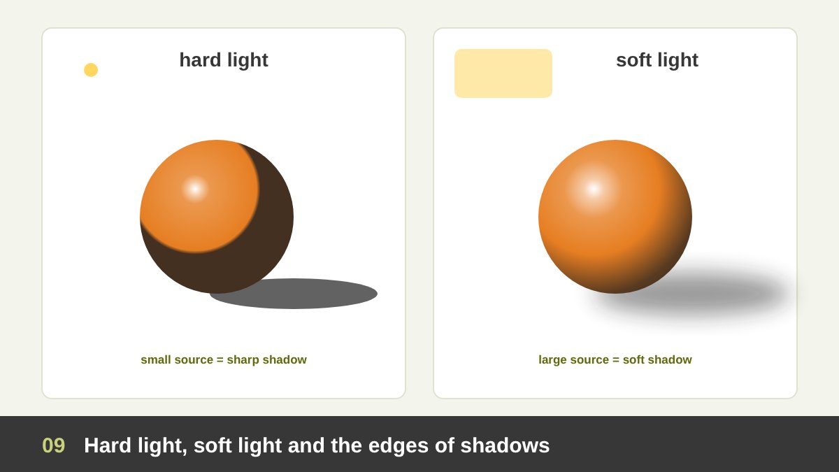
Light is not only about direction; it is also about quality. A hard light comes from a small or distant source, like the midday sun, a bare bulb or a spotlight. It makes crisp shadows with sharp edges, strong contrast and bright, small highlights. A soft light comes from a large source close to the object, like a cloudy sky, a big window or a photographer’s softbox. It wraps around the form, the shadow edges become gradual and the contrast is gentle.
The rule is simple and useful: the bigger the light source relative to the object, the softer the shadow. That is why photographers bounce flash off walls and why UI designers use large blur values for elevated cards. Hard light feels energetic, bold and graphic; soft light feels calm, flattering and premium.
Painters talk about edges: hard edges (sharp borders that attract the eye), soft edges (gradual transitions) and lost edges (where the object and the background have the same value and the border disappears). Controlling edges is a quiet way to control attention. Keep the hardest edges at the focal point and let the edges soften and disappear as you move away from it.
Cast Shadows: Grounding Objects and Telling a Story
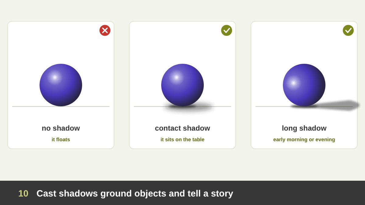
A cast shadow is the shadow an object throws onto another surface. It does three jobs. First, it grounds the object: a product photo cut out on white with no shadow looks like it is floating, while a soft shadow underneath makes it sit on a surface. Second, it shows where the light is and how far the object is from the surface: the further the object lifts, the larger, softer and lighter its shadow becomes, which is exactly how UI elevation works.
Third, a cast shadow can tell time and mood. A short shadow straight under an object says noon. A long, stretched shadow says early morning or evening, and it adds melancholy, mystery or nostalgia. The Surrealist painter Giorgio de Chirico built a whole world of empty squares and impossibly long shadows that make the viewer feel uneasy.
Remember that cast shadows follow the surface they fall on. A shadow bends up a wall, wraps over steps and distorts on a curved surface. It also has a shape that can be designed, sometimes even more interesting than the object itself; I come back to that idea in the section on shadow art. And keep the shadow darkest and sharpest where the object touches the ground.
The Colour of Light and Shadow
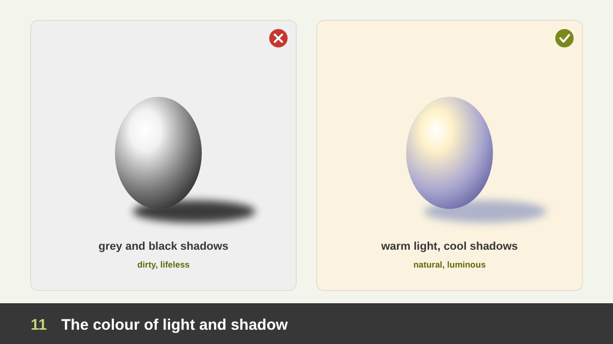
Shadows are almost never black or neutral grey. In nature, the light from the sun is warm, while the shadows are filled by the blue light of the sky, so warm light gives cool shadows. Indoors under a warm lamp the same rule applies. Reverse the light, cool moonlight or a blue screen, and the shadows become warmer by comparison. The Impressionists were famous for painting violet and blue shadows on snow instead of grey.
Shadows also pick up colour from their surroundings. The reflected light on the underside of a white cup on a red table is pinkish. A face next to a green wall has a hint of green in its shadows. This is what makes a render or a painting feel like a real place instead of a collection of objects.
In graphic design, the practical lesson is: do not make shadows with pure black. A default 75 percent black drop shadow looks dirty on a coloured background. Instead, use a darker, slightly more saturated version of the background colour, or a dark blue-grey, with low opacity. The shadow then belongs to the scene. The same goes for darkening a photo for text: a deep brand colour overlay usually looks better than black.
Depth Cues: Overlap, Size, Perspective and Atmospheric Perspective
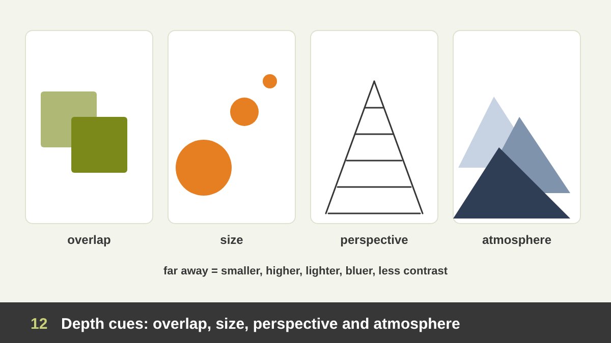
Light and shadow are the strongest depth cues, but they work together with others. Overlap: the shape in front hides part of the shape behind. Size: things further away look smaller. Position: things higher on the page often read as further away. Linear perspective: parallel lines converge to a vanishing point, a system formalised by Brunelleschi and Alberti in Renaissance Florence.
Then there is atmospheric perspective, also called aerial perspective. Leonardo da Vinci described it in his notebooks: because of the air between us and distant objects, mountains far away become lighter, bluer, less contrasted and less detailed. So value contrast itself is a depth cue: strong darks and lights come forward, soft greyish values fall back.
Designers use these cues even in completely flat work. A layered flat illustration of hills, where each layer is lighter than the one in front, reads as a deep landscape without a single gradient. A website hero that blurs and lightens the background photo pushes it back behind the headline. Depth is not only for 3D software; it is a way of arranging values.
Flat 2D on Purpose: Ancient Egyptian Painting
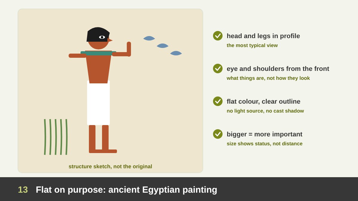
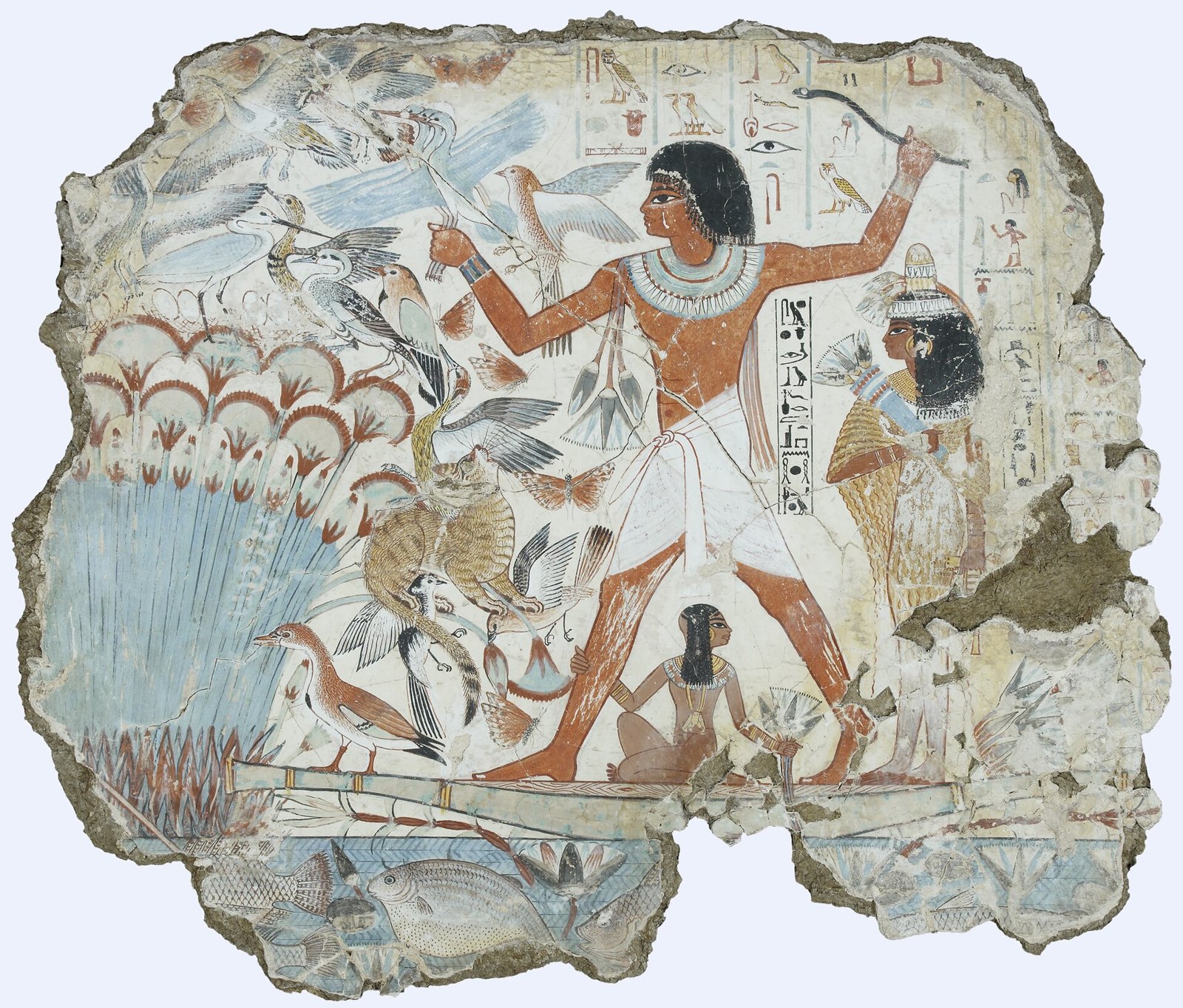
Flatness is not a lack of skill. Ancient Egyptian painters could observe the world perfectly, yet they chose to paint it flat: clear outlines, flat areas of colour, no cast shadows, no single light source. The scene from the tomb-chapel of Nebamun, painted in Thebes around 1350 BC and now in the British Museum, shows him hunting birds in the marshes with his family, and every element is shown in its most recognisable view.
Look at the figure: the head and legs are in profile, but the eye and the shoulders are shown from the front. Fish under the water are shown whole, as if the water were transparent. Important people are bigger than less important ones. This is a conceptual image, not an optical one: it shows what things are, not how they look from one point at one moment. Light and shadow, which belong to a single moment, would only get in the way.
This is exactly the logic of a good icon, pictogram or flat logo today. A toilet sign, a road sign or an app icon shows the clearest, most typical view of a thing, with flat colour and no lighting, because it must be read instantly by everyone. As an Egyptian designer I find it moving that one of the oldest visual systems in the world is also one of the most modern.
Hokusai’s Great Wave: Flat Colour That Still Feels Deep
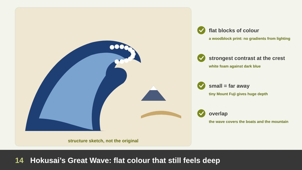
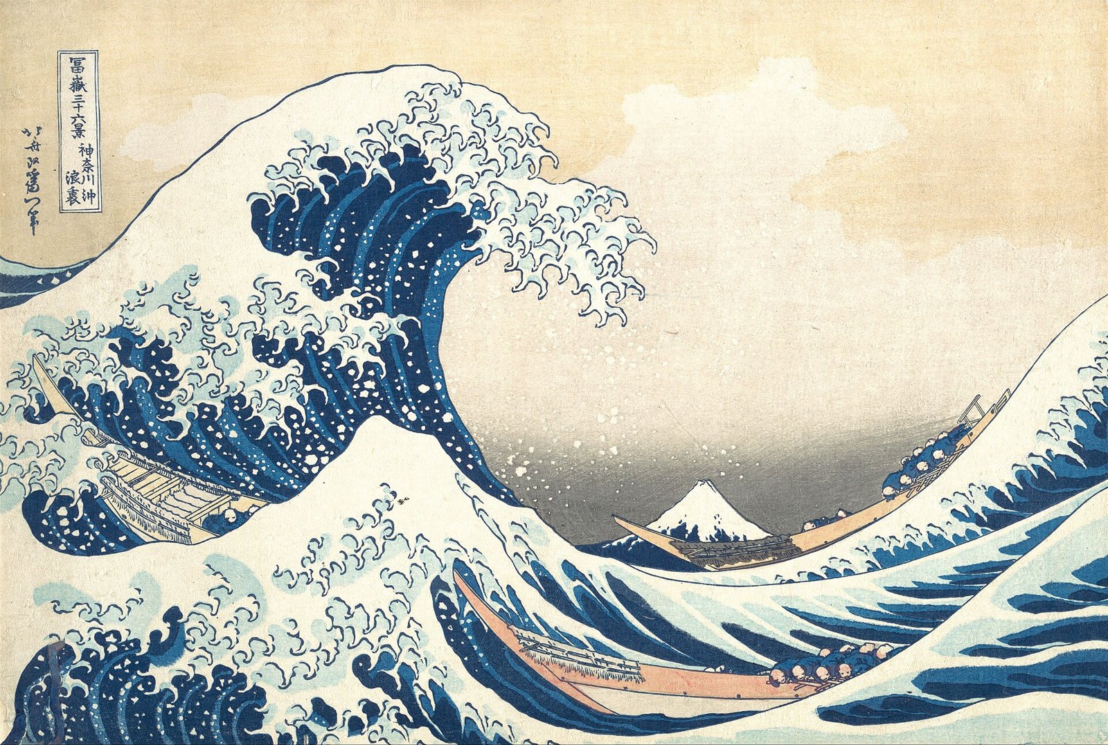
Under the Wave off Kanagawa, known as The Great Wave, by Katsushika Hokusai, was printed around 1830 to 1832 as part of the series Thirty-six Views of Mount Fuji. It is a woodblock print: every colour is a separate flat block, so there are no soft gradients from lighting. There is no cast shadow and no single light source. And yet the picture feels enormous and deep.
How? Through the other depth cues and through value. The huge wave overlaps the boats and Mount Fuji, the mountain is tiny because it is far away, and the strongest value contrast, the white claw-like foam against the dark Prussian blue, is right at the crest of the wave where the drama is. The sky behind has a gentle graded band, made by wiping the block, that pushes it back. It is a perfect lesson in creating depth with flat shapes and planned values.
Japanese prints like this one deeply influenced European artists and poster designers in the late 19th century, a movement called Japonisme. Toulouse-Lautrec, Mucha and later many graphic designers learned from them that a picture could be flat, bold, outlined and decorative and still be powerful. Much of what we call flat illustration today has its roots here.
Chiaroscuro and Tenebrism: Caravaggio’s Calling of Saint Matthew
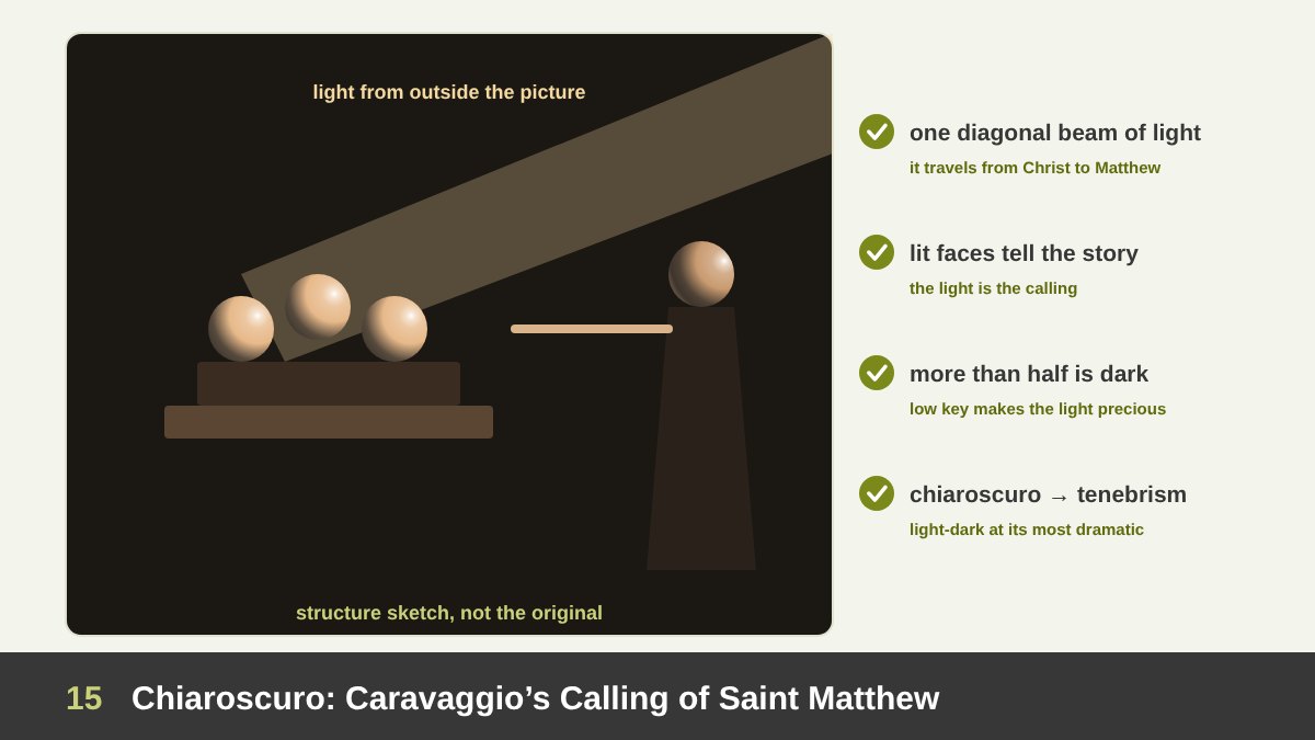
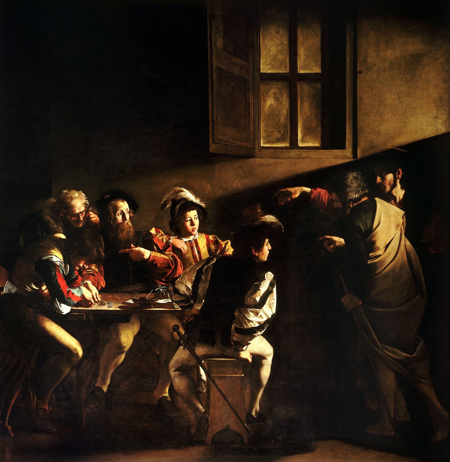
Chiaroscuro is Italian for light-dark: the use of strong contrasts between light and shadow to model forms and create drama. Tenebrism is its extreme form, where most of the picture sinks into deep darkness and a few areas are lit as if by a spotlight. Its great master was Caravaggio, and The Calling of Saint Matthew (1599–1600), in the Contarelli Chapel of San Luigi dei Francesi in Rome, is the perfect example.
Analyse the light. It enters from the upper right, above Christ, as a hard diagonal beam that cuts across the dark wall. Christ himself is half in shadow; it is the light that travels from him to the group at the table and picks out the faces of the men, especially the one who points at himself as if to ask “me?”. The beam does the storytelling: it is the calling. The window painted on the wall does not light the scene at all; the real light comes from outside the picture, and it is symbolic.
Notice the value distribution: probably more than half of the canvas is near-black. Against it, a few lit faces and hands become impossible to ignore. Designers use exactly this structure in film posters, luxury ads and dramatic product shots: a dark field, one directional light, and the brightest values only on what matters. Low key with a single spotlight is the most powerful attention tool there is.
Light That Models Form: Vermeer’s Girl with a Pearl Earring
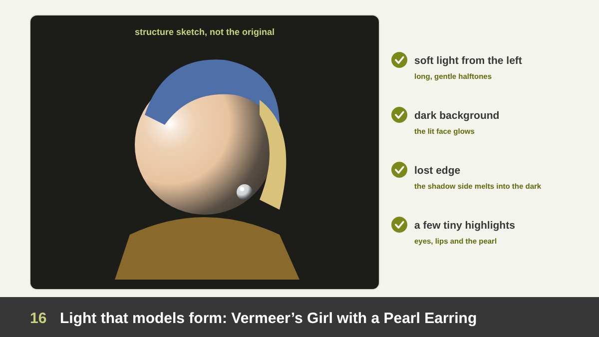
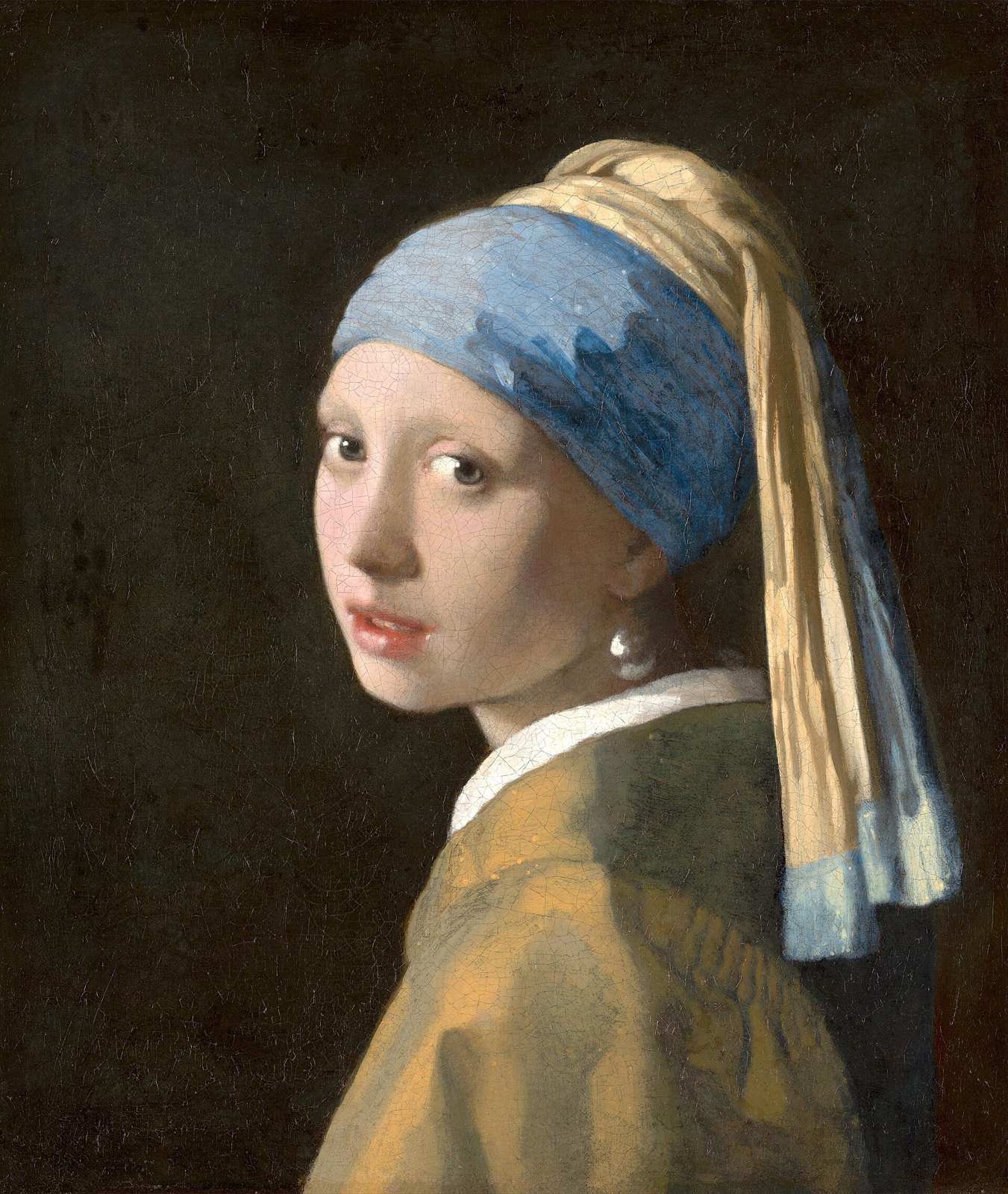
Johannes Vermeer’s Girl with a Pearl Earring (about 1665), in the Mauritshuis in The Hague, uses light very differently from Caravaggio. The light is soft, coming from a window on the upper left, and it wraps gently around the face. There are no hard edges on the cheek; the form turns from light into shadow through a long, subtle halftone.
Look at how few values do the work. The background is almost black, which makes the lit side of the face glow. The shadow side of the face is soft and warm and almost merges with the background: a lost edge that makes the head feel round and real. The brightest, sharpest marks in the whole painting are tiny highlights: on the lips, in the eyes and on the pearl, which is painted with just a few strokes, a bright reflection on top and the reflected glow of the white collar below.
The lesson for designers is the economy of highlights. A highlight is the brightest value in an image, so it is also the strongest attractor. Vermeer places a handful of them exactly on the eyes, the mouth and the pearl. In product photography and 3D renders the same rule decides whether a bottle looks precious: one or two clean, well-shaped highlights, not reflections everywhere.
One Light Source and a Story: Wright of Derby’s Air Pump
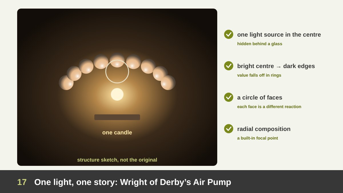
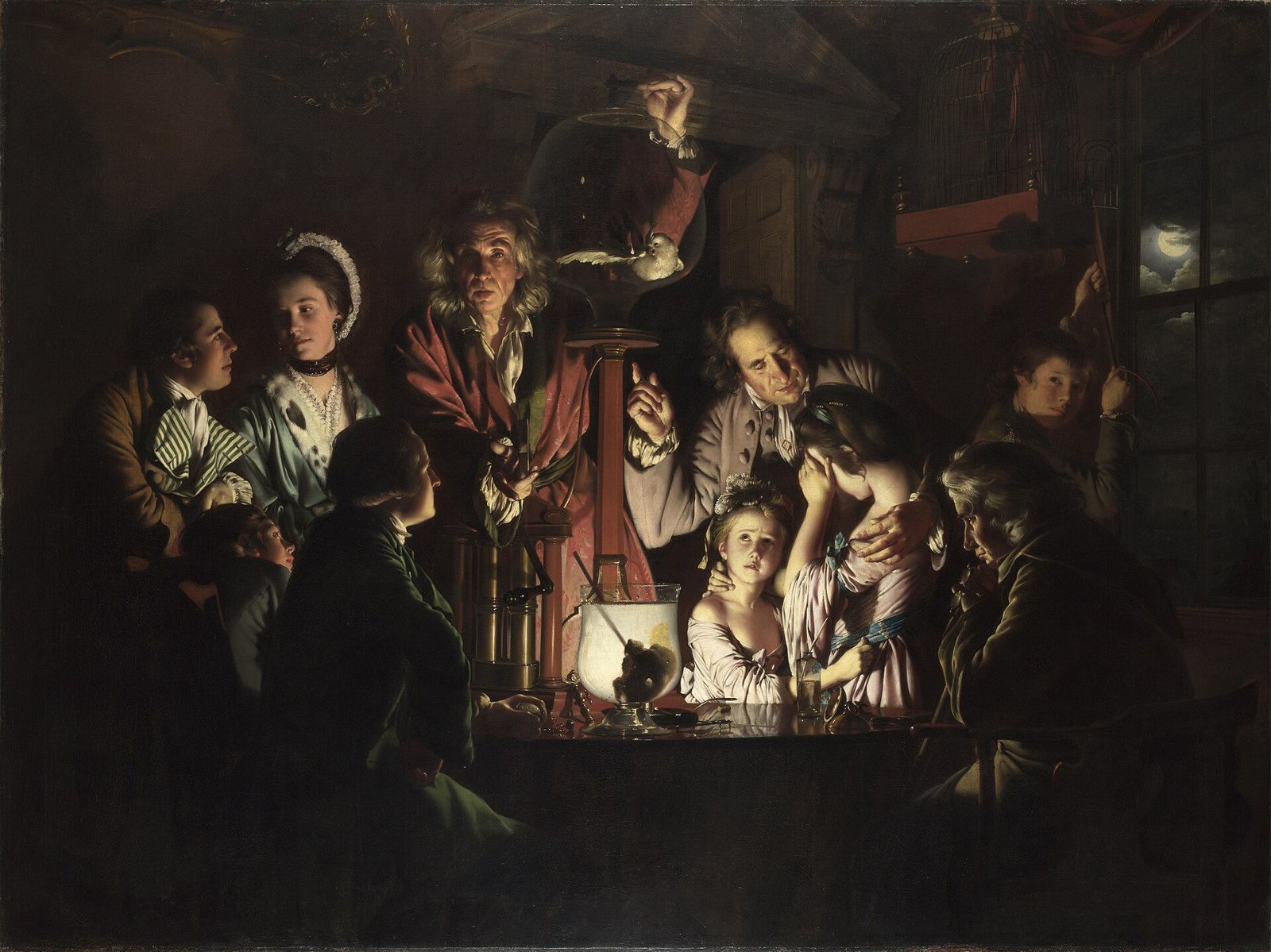
Joseph Wright of Derby painted An Experiment on a Bird in the Air Pump in 1768; it hangs in the National Gallery, London. A travelling scientist demonstrates a vacuum pump by removing the air from a glass bowl with a bird inside. The whole scene is lit by one candle, hidden behind a glass on the table, so the light radiates from the centre of the composition.
This central light source creates a very clear value distribution: the brightest values are in the middle, on the glass and the faces closest to the candle, and the values get darker in rings as you move to the edges, until the room disappears into black. The faces become a circle of reactions, each lit from below and in front: curiosity, fear, indifference, a father explaining, two girls who cannot look. The light literally gathers the people around the idea.
For designers, this is the blueprint of the radial light composition: one bright centre, darkening towards the edges, the same structure as a vignette in photography or a spotlight in a stage design. It guarantees a focal point. Product launches, event posters and game key art use it constantly: the hero object in the light, everything else falling away into shadow.
Flat Design in Graphics: When Less Light Means Clearer Communication
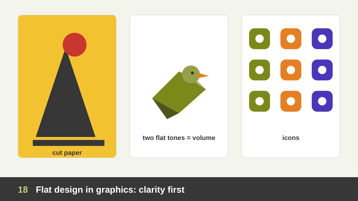
In graphic design, choosing flat is often the smart choice. Flat shapes reproduce perfectly at any size, from a favicon to a billboard; they print cleanly in one or two colours; they load fast on screens; and above all, they are read instantly. The designer Saul Bass built film posters and title sequences from a few flat, cut-paper shapes, and the illustrator Charley Harper drew birds and animals as flat geometric planes, a style he called “minimal realism”.
Flat does not mean without volume. Look closely at good flat illustration and you will find light and shadow translated into flat planes: one tone for the lit side, a darker tone for the shadow side, a hard edge between them. That is the cube logic from the start of this article, simplified. Two or three flat values per object are enough to suggest roundness while keeping the graphic clarity.
The danger of flat design is ambiguity: when everything is equally flat, nothing looks clickable, nothing comes forward and the hierarchy depends only on size and colour. That is why most flat systems quietly reintroduce a little depth: a long shadow, a tonal plane, an overlapping card. The art is to add just enough light to guide the eye without losing the clarity that made flat attractive in the first place.
From Skeuomorphism to Flat to Depth Again: Light in UI History
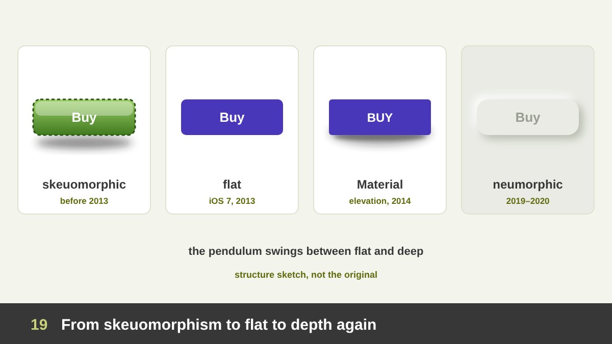
User interface design is a living history of light and shadow. Early smartphone interfaces were skeuomorphic: they imitated real materials with lighting, glossy highlights, stitched leather, wood and paper, so that people would understand what to touch. Apple’s iOS 6 was the peak of this style. In 2013, iOS 7 swept it away for flat design: thin type, flat colour, no textures and almost no shadows.
Flat UI was clean, but users sometimes could not tell a button from a label. In 2014 Google introduced Material Design, based on the metaphor of paper and ink: interface elements are flat sheets, but they sit at different elevations and cast realistic shadows from a key light and an ambient light. The higher a sheet, the larger and softer its shadow. Depth came back, but as a system with rules.
Around 2019 to 2020 designers on Dribbble popularised neumorphism, soft buttons that seem to be pushed out of the background with one light and one dark shadow; it looked beautiful but had poor contrast and accessibility. Glassmorphism added frosted, translucent layers, and in 2025 Apple introduced Liquid Glass, a material that bends and reflects light. The pendulum keeps swinging between flat and deep, but the lesson stays the same: light in UI is there to explain what is on top, what is touchable and what belongs together. I discuss where it is going in Graphic Design Trends 2026.
Shadows in UI: Elevation, Hierarchy and Focus
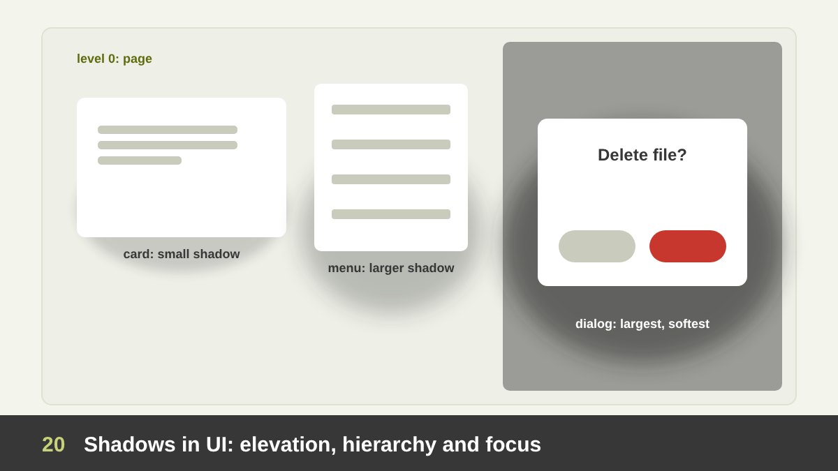
In interface design, a shadow is information. It tells the user how far an element is from the surface below it, and therefore how important or temporary it is. A common elevation stack: the page at level 0, cards slightly raised with a small, tight shadow, menus and dropdowns higher with a larger shadow, and modal dialogs at the top with the largest, softest shadow, often with a dark overlay that dims everything behind them.
Good UI shadows follow the physics we saw earlier. There is one consistent light source, usually from above, so shadows fall slightly downwards. Realistic shadows are made of two layers: a small, darker one close to the element (the contact shadow) and a large, very soft and light one (the ambient shadow). The higher the element, the more the shadow spreads and the lighter it becomes. Shadows are tinted with the background colour, not pure black.
And use them sparingly. If every card, button, image and input has a shadow, nothing is elevated any more, and the page looks heavy and dated. Many modern interfaces use borders or a change of background value for most elements and keep real shadows for things that float: menus, toasts, dialogs and the element being dragged. In dark mode, shadows hardly show, so elevation is expressed by making higher surfaces slightly lighter.
Light and Shadow in Logos: From Glossy 3D to Flat and Back
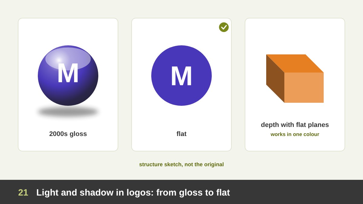
In the 2000s, the “Web 2.0” years, logos were full of light: bevels, glossy reflections, gradients, drop shadows and chrome effects, partly because screens and software had just made those effects easy. Then the big brands flattened. Microsoft introduced its flat four-square logo in 2012, Google moved to a flat, simplified wordmark in 2015, Instagram replaced its realistic camera icon with a flat glyph on a gradient in 2016, and Mastercard simplified its interlocking circles the same year.
Why? A logo must work everywhere: tiny on a phone, embroidered on a shirt, printed in one colour on a receipt, animated on a screen. Lighting effects break at small sizes, cannot be embroidered or engraved, and age quickly because they show the fashion of the moment. That is why I always design a logo in flat black and white first, as I explained in What Makes a Good Logo. If it works flat, depth can be added later as a version for special uses.
Depth in a logo is not forbidden; it must be structural, not decorative. A ribbon that folds, shown with a darker tone on the back side, a cube drawn with three flat values, or overlapping transparent shapes all suggest volume with flat means, so they survive in one colour. The rule from flat illustration applies: if you need light, translate it into flat planes.
Shadow in Typography: Drop Shadows, Long Shadows and 3D Type
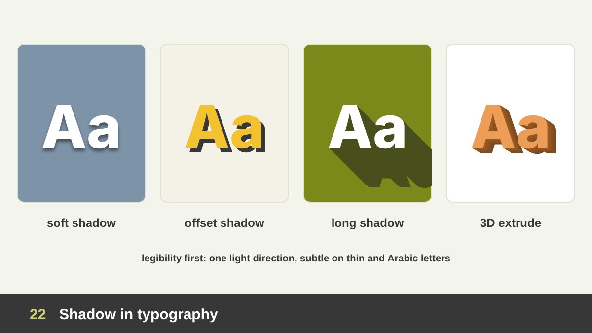
Type can be lit too. The most practical use is the soft drop shadow or glow that keeps white text readable on a busy photo; done well it is almost invisible, just a slight darkening of the photo behind the letters. A hard offset shadow, a flat copy of the text shifted a few pixels, is a retro, poster-like effect from sign painting and comics.
The long shadow was a popular trend around 2013, in the first years of flat design: a flat shadow that trails from the letters or icons at 45 degrees, as if lit by a low sun. Extruded 3D type gives letters real depth, with a lit front face, a darker side face and sometimes a cast shadow; it is the language of film titles, sports graphics, sign painting and many 2020s posters made in 3D software. Embossed and debossed letters use one light edge and one dark edge to look raised or pressed in.
The rule for all of them: legibility first. Keep the light direction consistent with the rest of the design, keep the shadow darker than the background and lighter than nothing, avoid heavy black blur behind thin letters, and never use effects to rescue a weak typeface or a bad layout. For Arabic type, with its dots and fine joins, make shadows even more subtle so they do not fill the counters and blur the dots.
Shadow as the Idea: Shadow Art and Clever Ads
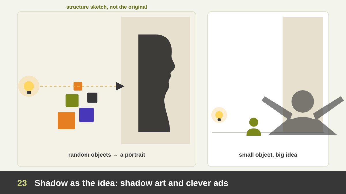
Sometimes the shadow is not a side effect but the whole concept. Shadow artists build sculptures that look like random piles until a single lamp is switched on. The British duo Tim Noble and Sue Webster made Dirty White Trash (with Gulls) in 1998 from six months of their own rubbish, which casts a perfect shadow of the two artists sitting back to back. The Japanese artist Kumi Yamashita creates portraits and figures that exist only as light and shadow on a wall.
Advertising and poster design use the same trick. An object casts a shadow of what it could become: a small child’s shadow is a superhero, a pet’s shadow is a lion, a bottle’s shadow is a city skyline, a cigarette’s shadow is a gravestone. The viewer’s brain completes the second meaning, exactly like the hidden images in negative space that I analysed in White Space in Design. It is one of the oldest and most effective concept structures in visual communication.
If you want to try it, start with the story, not the effect: what is the object, and what is its hidden truth, wish or danger? Then design the shadow as a clear, readable silhouette, because a shadow is a pure 2D shape. Keep one light source, a believable direction, and enough empty space for the shadow to be seen. The idea should be understood in under two seconds.
Isometric and 2.5D Illustration: Fake 3D with Flat Tones
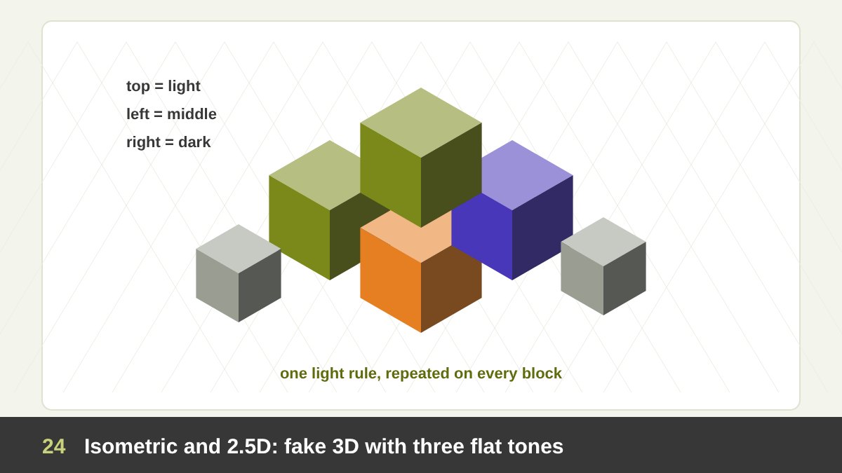
Isometric drawing is a way to show 3D objects without perspective: the three axes are drawn at equal angles, with the horizontal edges at 30 degrees, and parallel lines stay parallel instead of meeting at a vanishing point. Engineers used it for technical drawings; designers use it for infographics, explainer illustrations, game worlds and tech websites. It is often called 2.5D, because it looks three-dimensional but is drawn with flat, graphic means.
The secret of good isometric work is a strict light rule: choose the light direction once and give every object the same three flat tones, for example a light top face, a middle left face and a dark right face. Repeat it across every block, building and character, and the whole scene feels solid and consistent. Mix the rule even once and the illusion breaks. The mobile game Monument Valley (2014) became famous for this kind of calm, flat-shaded isometric world full of Escher-like impossible architecture.
Isometric illustration is a good example of what this whole article is about: depth is built from value planning, not from effects. Three tones, one direction, clean shapes. It is also a great exercise for students: draw a simple isometric cube, then a room, then a city, keeping the same three values everywhere.
3D Design Today: Renders, Mock-ups and Three-Point Lighting
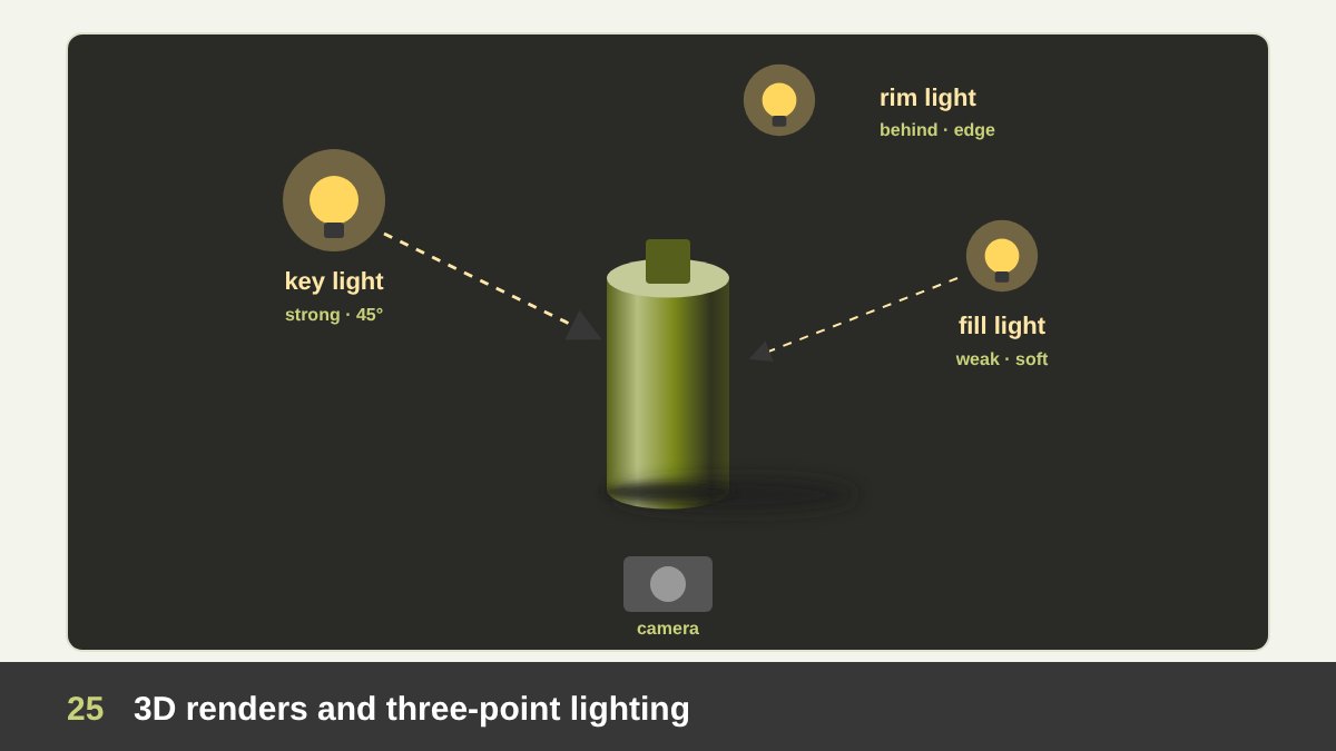
Today designers can build real 3D scenes in software such as Blender, Cinema 4D or Adobe’s Substance tools, and generative AI tools can produce 3D-looking images in seconds. Packaging is shown in 3D mock-ups before it is printed, brands use 3D characters and type, and product launches rely on renders that are often more perfect than photos. But software does not light the scene for you: it gives you virtual lamps, and the same rules apply.
The classic starting point, borrowed from photography and film, is three-point lighting. The key light is the main light, usually at about 45 degrees to the side and above; it decides the direction and the main shadows. The fill light, on the other side, is weaker and softer; it lifts the shadows so they are not black, and the ratio between key and fill decides how dramatic the image is. The rim light or back light sits behind the object and draws a bright edge that separates it from the background.
Add an environment for reflections, a ground plane for the contact shadow, and keep the highlights clean and few, and a simple bottle starts to look like an advertisement. With AI tools the same knowledge helps you write better prompts and judge the results: if the light directions disagree, the shadow is missing or the highlights are everywhere, you will see it immediately. A designer who understands light directs the machine instead of accepting whatever it produces.
Light and Shadow in Social Media Designs and Carousels
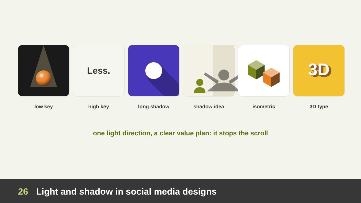
On a social feed, light is one of the fastest ways to stop the thumb. A low-key post, a dark background with one product or one face in a spotlight, stands out among bright, busy posts and feels premium. A high-key post, light values with a single dark word, feels fresh and calm. A shadow concept, an object with an unexpected shadow, makes people look twice. Flat isometric infographics explain processes clearly, and 3D extruded headlines feel bold and contemporary.
Plan the value structure for the small size: a post is first seen at thumbnail scale, where only the big light and dark masses survive. Make the notan test, squint at it, or view it in greyscale. If the main subject is not the strongest contrast at that size, it will not be seen. Keep one light direction across a series so that a campaign looks like one family.
For carousels, light can become the thread that connects the slides. One idea I like: the light source moves across the slides, from dawn on the first slide to noon in the middle and dusk at the end, and the shadows of the objects rotate with it, inviting the next swipe. Or a spotlight that wanders from detail to detail of a product. Whatever you do, keep the same light logic and the same value plan from the first slide to the last.
Common Light and Shadow Mistakes
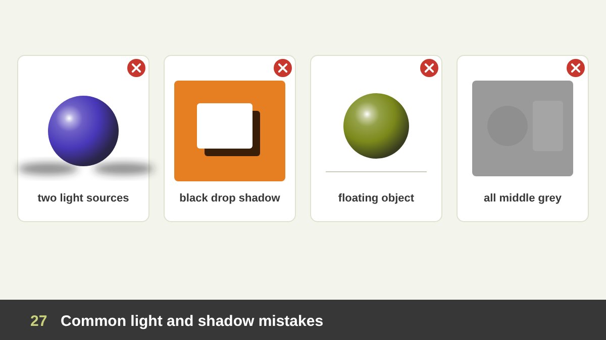
Inconsistent light sources. The highlight says the light is on the left, the shadow falls to the left too, and the product photo pasted next to it is lit from the right. The viewer may not be able to explain it, but they feel that something is fake. Decide one light direction for the whole design, including photos you place in it.
Black and dirty shadows. Default black drop shadows at high opacity make everything look heavy and cheap. Tint shadows with the background colour and keep them soft. No contact shadow. Objects without a dark line where they touch the ground float. Reflected light too bright. It splits the form and looks like plastic. Shadows everywhere. If everything is elevated, nothing is.
No value plan. The most common and the most serious mistake: every area has the same middle value, so the design is grey and nothing leads the eye. Or the opposite: strong lights and darks scattered everywhere, so the design is noisy. Plan three or four values, give one of them most of the area, and keep the strongest contrast for the focal point.
How to Use Light and Shadow in Your Design: A Practical Checklist
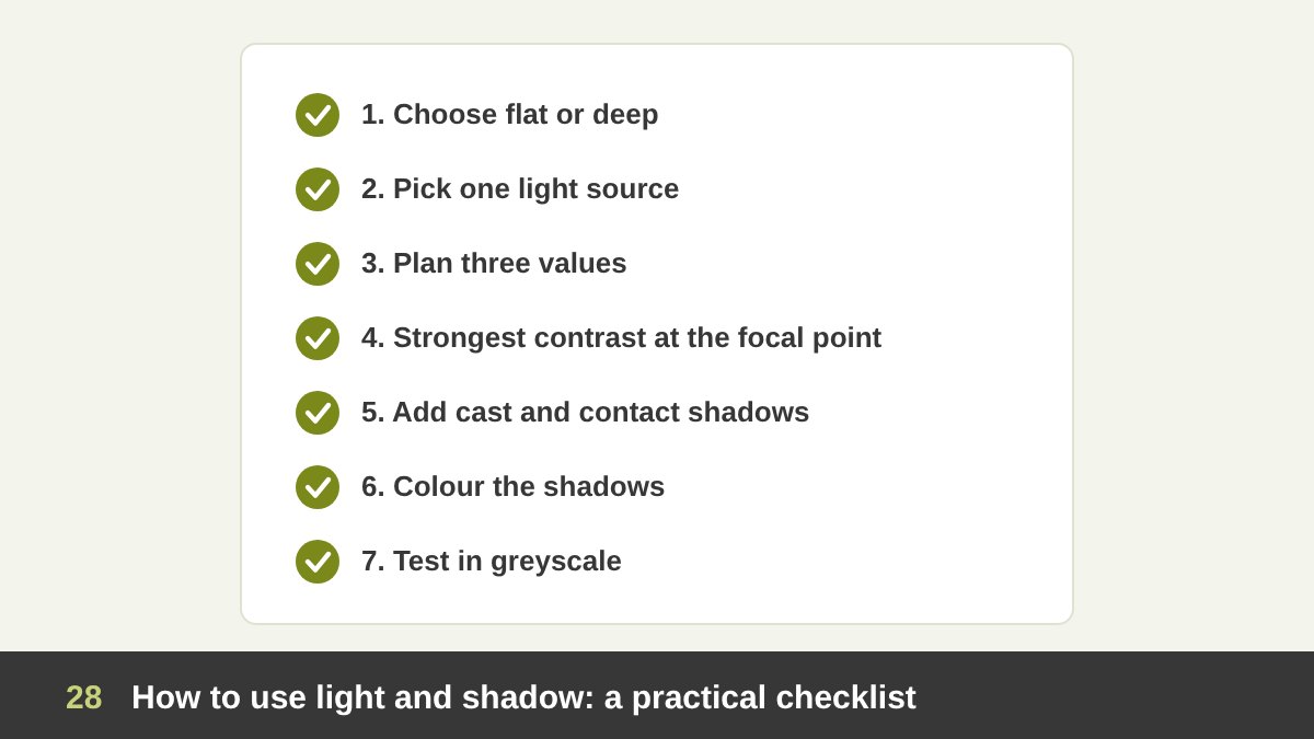
Here is the process I follow and teach. 1. Choose flat or deep. Does this project need clarity and scalability (flat), the feeling of something real and desirable (3D), or a mix? 2. Pick one light source: its direction, its hardness and its colour, according to the mood you want. 3. Plan the values with tiny thumbnails in three values before you design the details.
4. Put the strongest contrast at the focal point, and let contrast and edges soften as you move away from it. 5. Add cast and contact shadows so that objects sit on their surfaces, and check that every shadow agrees with the light. 6. Colour the shadows with the background or a cool tone instead of black. 7. Test in greyscale, by squinting, and at small size; if the message does not read, fix the values, not the colours.
Light and value connect all the other elements of design: they give shapes volume, reveal texture, shape white space and organise the hierarchy described in The Principles of Design. If you would like help with a brand, a campaign, a website or a painting that needs this kind of light, see my portfolio or get in touch.
| Term | What it does | Where you see it |
|---|---|---|
| 2D shape | Flat area with width and height; reads instantly and scales anywhere | Icons, flat logos, pictograms, Egyptian painting, flat illustration |
| 3D form | Volume with depth, created on a flat surface by light and shadow | Product renders, painting, packaging mock-ups, 3D type |
| Highlight | Brightest spot, a reflection of the light source; strongest attractor | Eyes, glass, metal, a pearl, a bottle in an ad |
| Core shadow | Darkest band on the object where it turns away from the light | Every round form; the key to volume |
| Reflected light | Light bounced back into the shadow side; stays darker than the lit side | The underside of a ball or a chin |
| Cast shadow | Grounds the object and shows the light direction and time | Product photos, UI elevation, shadow-concept ads |
| Value | Lightness or darkness regardless of hue; the hidden structure | Greyscale test, text contrast, notan thumbnails |
| High key / low key | Mostly light values (airy) or mostly dark values (dramatic) | Wellness brands / luxury ads and film posters |
| Chiaroscuro / tenebrism | Strong light-dark contrast; a spotlight in darkness | Caravaggio, film noir, dramatic product shots |
| Hard / soft light | Small source, crisp shadows / large source, gradual shadows | Sports posters / beauty and premium brands |
| Atmospheric perspective | Distant things lighter, bluer and less contrasted | Layered flat landscapes, blurred hero backgrounds |
| Elevation | Shadow size and softness show how high a UI element floats | Cards, menus, dialogs in Material Design |
Light and Shadow in Design: Frequently Asked Questions
What is the difference between 2D and 3D in design?
2D design has two dimensions, width and height, so it is made of flat shapes such as icons, flat logos and flat illustrations. 3D design adds depth, so it shows forms with volume, such as products, spheres and buildings. On paper or on a screen, 3D is an illusion created mainly with light, shadow and value, together with perspective and overlap.
What is the difference between shape and form?
A shape is a flat, two-dimensional area with an outline, such as a circle, square or triangle. A form is its three-dimensional version with volume: a sphere, cube or cone. In drawing and design, a shape becomes a form when you add light and shadow that follow its surface.
Why are light and shadow important in design?
Light and shadow create the illusion of depth and volume, show the direction of light and the time of day, set the mood, separate elements and lead the eye. The strongest value contrast in a design is where people look first, so light and shadow are also tools of hierarchy and focus.
What is value in art and design?
Value is how light or dark a colour or area is, from white to black, independent of its hue. Value creates form, depth and contrast. A good test is to view a design in greyscale: if it still reads clearly, its value structure is strong.
What are the parts of light and shadow on an object?
On the lit side there are the highlight, the light and the halftone. On the shadow side there are the core shadow, whose edge is the terminator, and the reflected light. On the surface below there is the cast shadow, darkest where the object touches the ground (the occlusion or contact shadow).
How do I make a realistic drop shadow in graphic design?
Use one consistent light direction, make the shadow fall slightly away from the light, use a soft blur, tint it with a darker version of the background colour instead of pure black, and keep the opacity low. For extra realism combine a small, darker contact shadow with a larger, very soft ambient shadow.
Leave a Reply