

What Is Texture in Design?
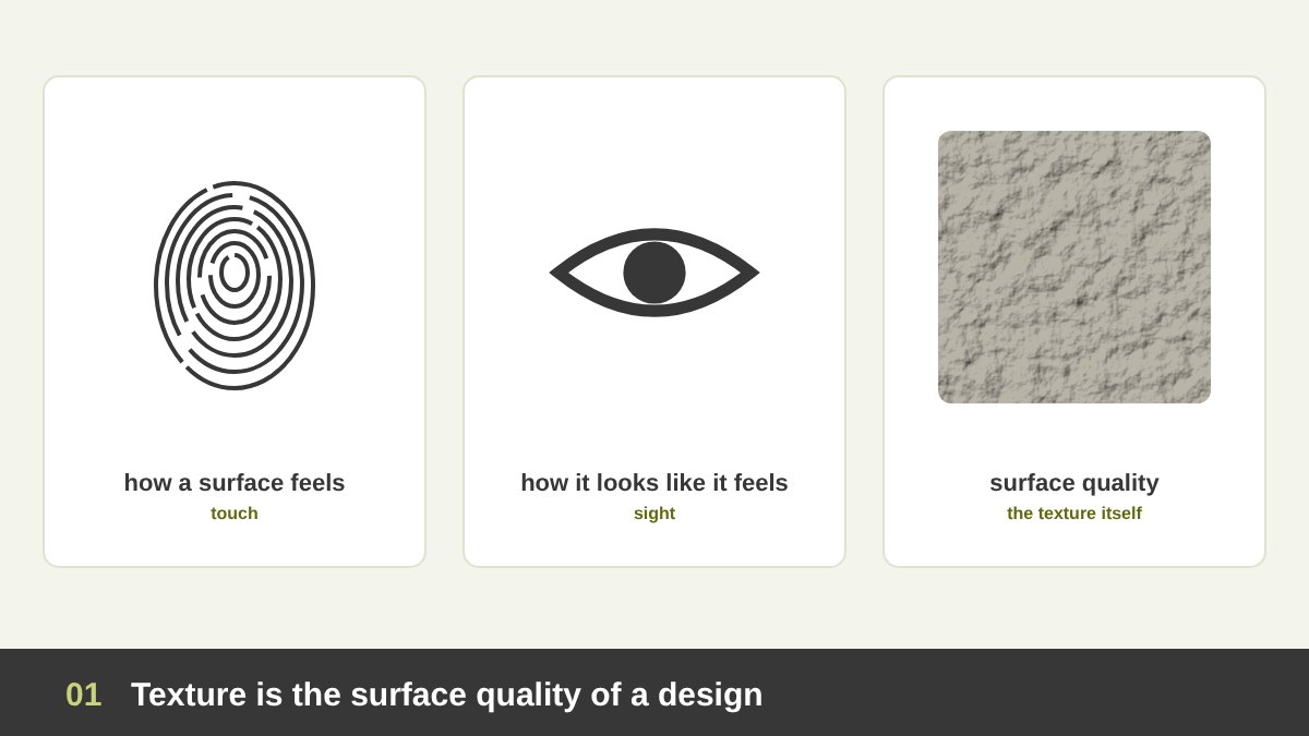
In design and art, texture is the surface quality of something: how it feels, or how it looks like it would feel. Run your hand over a stone wall, a wool blanket, a sheet of handmade paper or a glass screen, and each one gives a different sensation. Designers use exactly those sensations, real or suggested, to give their work character.
We experience texture through two senses. Touch tells us directly whether a surface is rough, smooth, soft, hard, sticky or slippery. Sight remembers those experiences, so when we only see a surface, our brain predicts how it would feel. That is why a photo of tree bark looks rough even on a perfectly smooth phone screen, and why a texture can make us want to touch a design, or pull our hand away from it.
Texture is one of the core elements of design, together with point, line, shape, form, value, colour, space and type. I explained how they fit together in The Principles of Design, and I wrote full articles on line in design and shape in design. Texture is the element that comes closest to our bodies. Line and shape organise a design; texture makes it feel real. A flat design is like a voice without an accent: correct, but anonymous.
Key takeaways
- Texture is the surface quality of a design: how something feels when we touch it, or how it looks like it would feel. It is one of the basic elements of design, next to point, line, shape, form, value, colour and space.
- There are two big families: tactile (actual) texture that you can really feel, like thick paint, embossed paper or fabric, and visual (implied) texture that only looks rough or smooth, like a photo of stone printed on smooth paper.
- Textures can be natural (stone, wood, sand, water, leaves) or man-made (concrete, brick, fabric, metal, paper, glass), and they can be simulated, abstract or completely invented. Texture is irregular; a regular repeat is a pattern.
- Texture works on our feelings: rough feels raw and honest, smooth feels modern and clean, soft feels comforting, grainy feels handmade and nostalgic, glossy feels new and luxurious. It also creates focal points, depth and contrast.
- Van Gogh, Meret Oppenheim, Picasso, Max Ernst, Roy Lichtenstein, Jamie Reid, David Carson and the designers of the Coca-Cola contour bottle built famous works on texture. Below I analyse each one, then show how to use texture in typography, logos, print, UI and social media.
Tactile Texture and Visual Texture
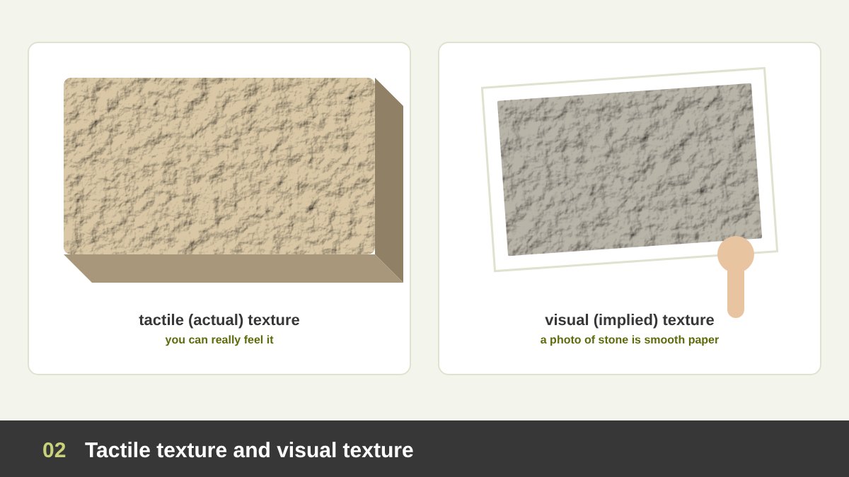
The most important distinction in texture is between tactile texture and visual texture. Tactile texture, also called actual or physical texture, is real: you can feel it with your fingers. Thick oil paint, collage, carved wood, woven fabric, embossed business cards, letterpress printing, uncoated paper, ceramic glazes and the ribs on a bottle are all tactile textures.
Visual texture, also called implied or simulated texture, exists only for the eye. A photograph of marble, a hatched pencil drawing, a grainy gradient on Instagram or a wood-effect background in a presentation all look textured, but the surface is flat and smooth. Most graphic design today, especially on screens, works with visual texture, because a screen cannot be touched in any meaningful way.
Great work often mixes the two. A painter builds real relief with thick paint and also paints the illusion of fabric; a packaging designer prints a photo of kraft paper and then adds a real embossed logo; a poster uses a scanned paper texture and is printed on rough paper. Ask in every project: will people touch this? If yes, design the real surface too, not only the picture of it.
The Properties of a Texture
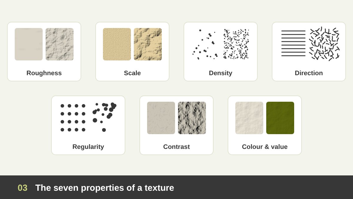
Just like a line or a shape, every texture has properties you can control. Roughness: from glass-smooth to rock-rough, the most basic property and the one that carries most of the feeling. Scale: the size of the texture’s grain. Fine grain, like sand or paper, reads as a quiet surface; coarse grain, like crumpled paper or bark, becomes a strong visual element.
Density: how many marks, grains or fibres are packed into an area. Sparse texture feels light and airy; dense texture feels heavy and dark. Direction: wood grain, brushed metal and brushstrokes have a direction that moves the eye, while sand and stone are non-directional and calm. Regularity: a texture can be even and controlled or random and wild.
Contrast: the difference between the highs and lows of the surface, which in a picture becomes the difference between light and shadow. Low-contrast textures stay in the background; high-contrast textures shout. Colour and value: the same paper texture feels warm and natural in cream and serious in dark olive. When a texture feels wrong, check these seven properties before you replace it.
Natural Textures: Stone, Wood, Sand, Water, Bark and Leaves
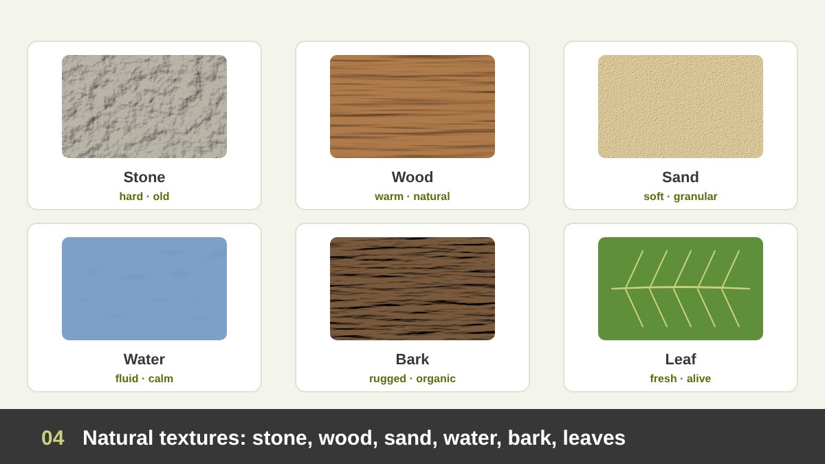
Natural textures come from the world around us: stone, wood, sand, soil, water, bark, leaves, skin, fur, feathers, shells. Because we have touched them all our lives, they carry strong and almost universal associations. Stone suggests age, permanence and strength; wood suggests warmth, craft and home; sand suggests softness, summer and time.
Water textures, ripples and waves, feel fluid and calm; bark feels rugged and organic; leaves feel fresh and alive. Brands use natural textures to borrow these feelings: an organic food brand uses kraft paper and leaf textures, a spa uses stone and water, a furniture brand photographs its products close up to show the wood grain.
Egyptian and Arab art has a long tradition of working with natural materials as texture. A beautiful example is the Ramses Wissa Wassef Art Centre in Harrania near Giza, founded in 1952, where villagers weave tapestries with wool dyed from local plants. The slight irregularities of the hand-spun wool and natural dyes give each tapestry a living surface that a printed copy can never reproduce. When you use a natural texture, keep a little of that irregularity; perfect, repeated natural textures quickly look fake.
Man-Made Textures: Concrete, Brick, Fabric, Metal, Paper and Glass
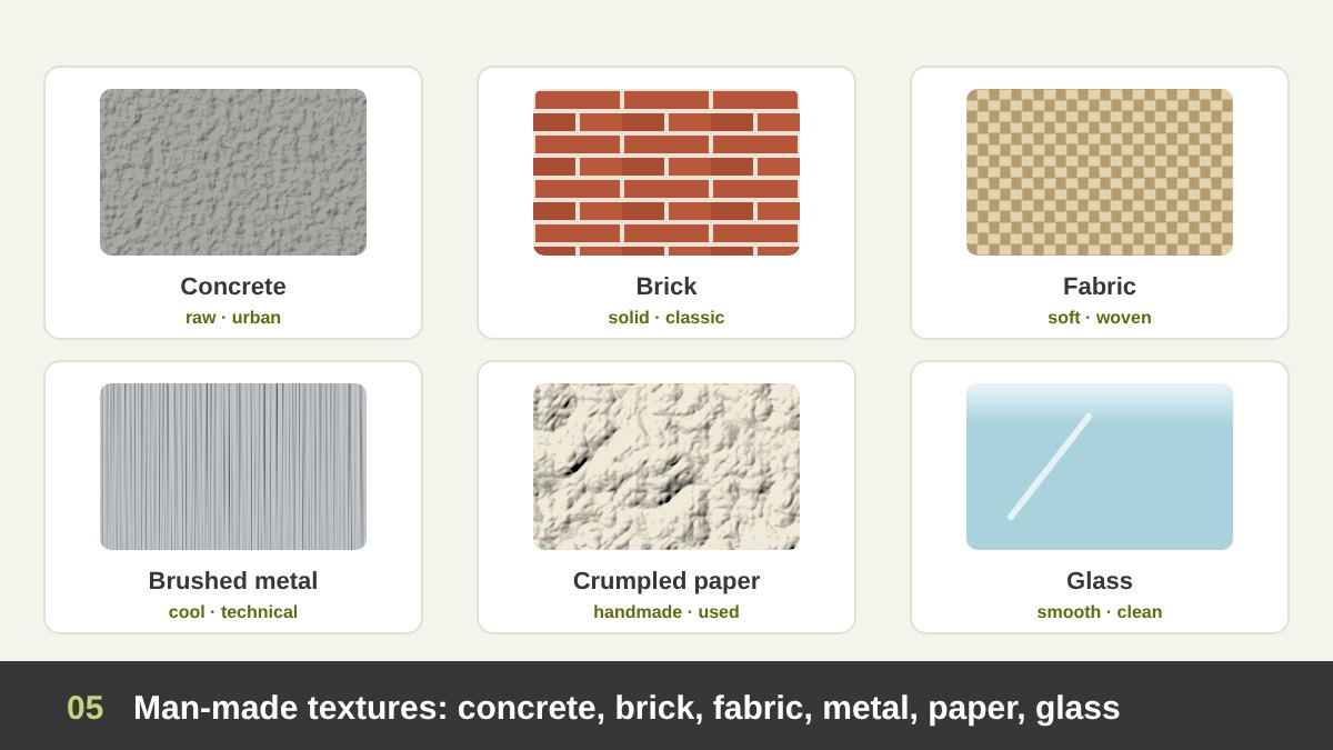
Man-made textures come from materials we produce: concrete, brick, asphalt, fabric, metal, plastic, glass, paper, cardboard, rubber. They tell stories about cities, industry, fashion and technology. Concrete feels raw, urban and honest, which is why it appears so often in architecture studios’ and streetwear brands’ visuals. Brick feels solid, classic and local.
Fabric, woven, knitted or felted, feels soft and human and suggests fashion, comfort and craft. Brushed metal feels cool, precise and technical; for years it was the default texture of hi-fi equipment and early software interfaces. Paper and cardboard feel handmade, honest and eco-friendly, especially when they are crumpled, torn or recycled.
Glass is the most interesting man-made texture today: smooth, transparent and reflective, it suggests cleanliness, technology and luxury. Interface designers simulate it with blur and transparency, as I explain in the UI section below. In Egypt, the appliqué textiles of the khayamiya tentmakers in Cairo are another wonderful man-made texture: layers of hand-stitched cotton that create a rich surface you can see and feel.
Simulated, Abstract and Invented Texture
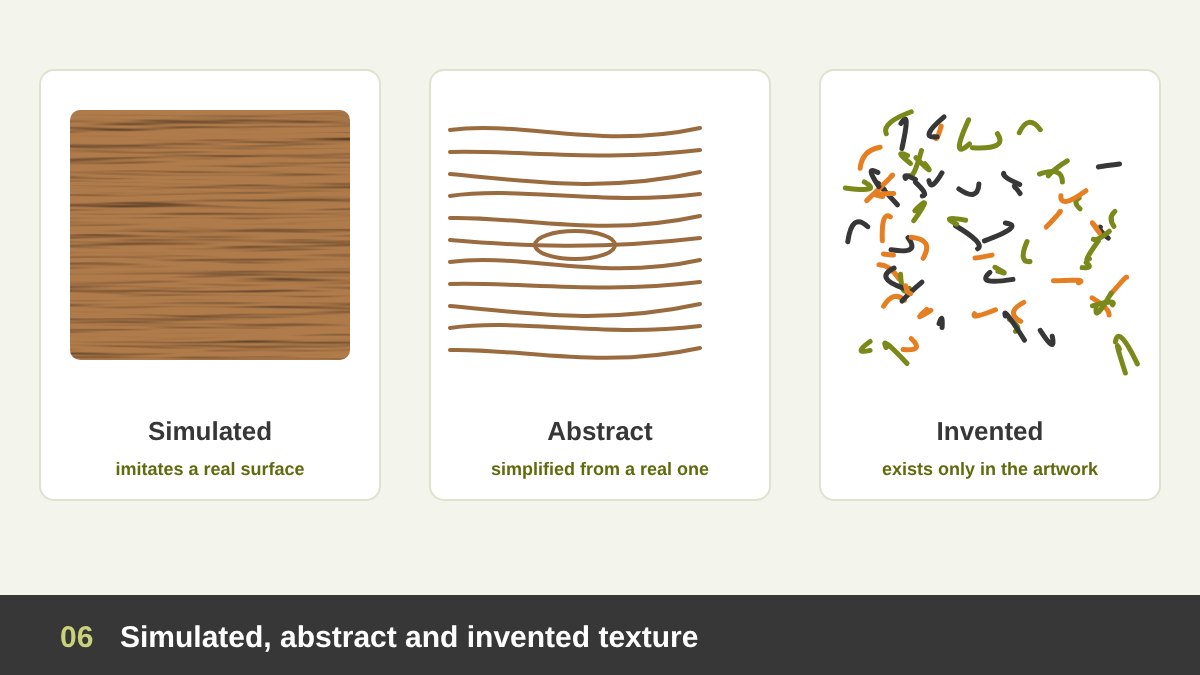
Visual texture comes in three degrees of realism. Simulated texture imitates a real surface as convincingly as possible: a painted velvet dress in a Renaissance portrait, a wood-effect laminate, a photorealistic marble background. Its power is illusion. The famous trompe-l’œil (“deceive the eye”) tradition in painting is built entirely on simulated texture.
Abstract texture starts from a real surface but simplifies it into a few marks: a handful of wavy lines that say “wood”, short strokes that say “grass”, dots that say “sand”. Illustrators, icon designers and comic artists use abstract texture all the time, because it gives the idea of a surface without the noise of a photo, and it matches a flat or graphic style.
Invented texture does not exist anywhere outside the artwork. It is created by the artist’s marks, a technique or a process: scribbles, spatter, digital noise, generative patterns, rubbings and transfers. Invented textures are where a designer’s personal style shows most clearly. Max Ernst’s frottages, which I analyse below, are a perfect example of a real surface turned into an invented world.
Texture Versus Pattern
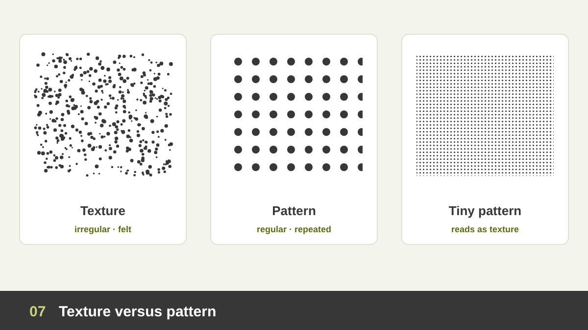
Students often confuse texture and pattern. A pattern is a regular, planned repetition of a motif: polka dots, stripes, checks, Islamic geometric tiles. A texture is usually irregular: no two grains of sand, fibres of paper or knots of wood are identical, and that randomness is exactly what makes it feel natural and tactile.
The two meet when scale changes. A pattern seen from far away, or printed very small, stops being read as a pattern and becomes a texture: the tiny dots of a halftone print, the weave of a fabric, the bricks of a wall seen from across the street. In the other direction, a texture enlarged a lot becomes a set of shapes and lines.
In practice: use pattern when you want order, rhythm and a recognisable brand motif, and use texture when you want warmth, depth, age or a physical feeling. Many strong brand identities combine them: a clear pattern built from the logo, printed on a textured paper. I wrote more about rhythm and repetition in The Principles of Design.
Light Reveals Texture
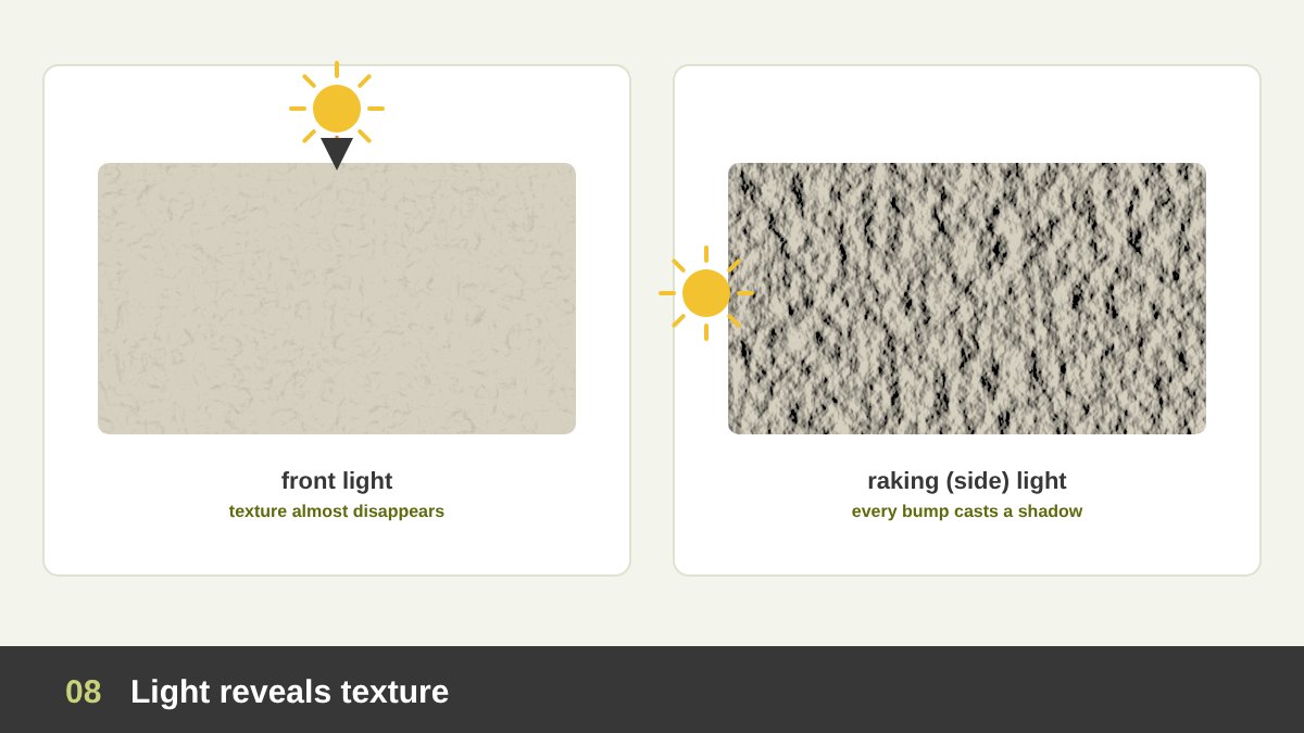
Texture is not only in the surface; it is in the light that hits it. A rough wall lit straight from the front looks almost flat, because every bump is lit equally and casts no shadow. The same wall lit from the side, with raking light, suddenly shows every crack and grain, because each bump has a bright side and a shadow.
Museums and conservators use raking light to study the brushwork and surface of paintings, and photographers use it to make textures dramatic. Painters and illustrators fake it: to make a surface look rough, they paint small highlights on one side of each bump and small shadows on the other, all following one imaginary light source.
For designers this has two practical lessons. First, when you photograph products with texture, such as fabric, leather, wood or embossed print, light them from the side. Second, when you create digital textures, keep the light direction consistent: a texture lit from the top-left on one card and from the bottom-right on another feels wrong, even if viewers cannot say why.
The Psychology of Texture
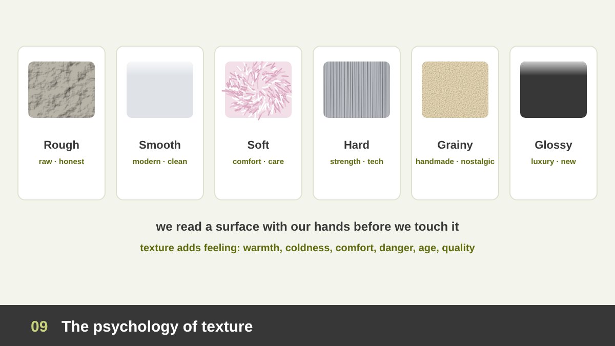
We have touched surfaces all our lives, so our brain links each texture with a feeling, and it does so before we think. Rough textures feel raw, honest, strong, natural or aggressive. Smooth textures feel modern, clean, calm and precise. Soft textures, like fur, wool or velvet, feel comforting, warm and caring.
Hard textures, like metal and stone, feel strong, durable and technical. Grainy textures, such as film grain, paper fibre and risograph prints, feel handmade, human and nostalgic, which explains their popularity on social media today. Glossy textures feel new, expensive and luxurious, but also cold. And worn or distressed textures feel old, authentic, rebellious or simply dirty, depending on the context.
Research in what psychologists call haptic perception supports what designers know by instinct: the weight and surface of a product or a printed piece change how people judge its quality. A heavy, textured business card feels more serious than a thin glossy one with the same design. But meaning always depends on context and culture: the grunge texture that feels cool on a music poster feels dirty on a hospital website.
Texture Creates Focal Points, Depth and Contrast
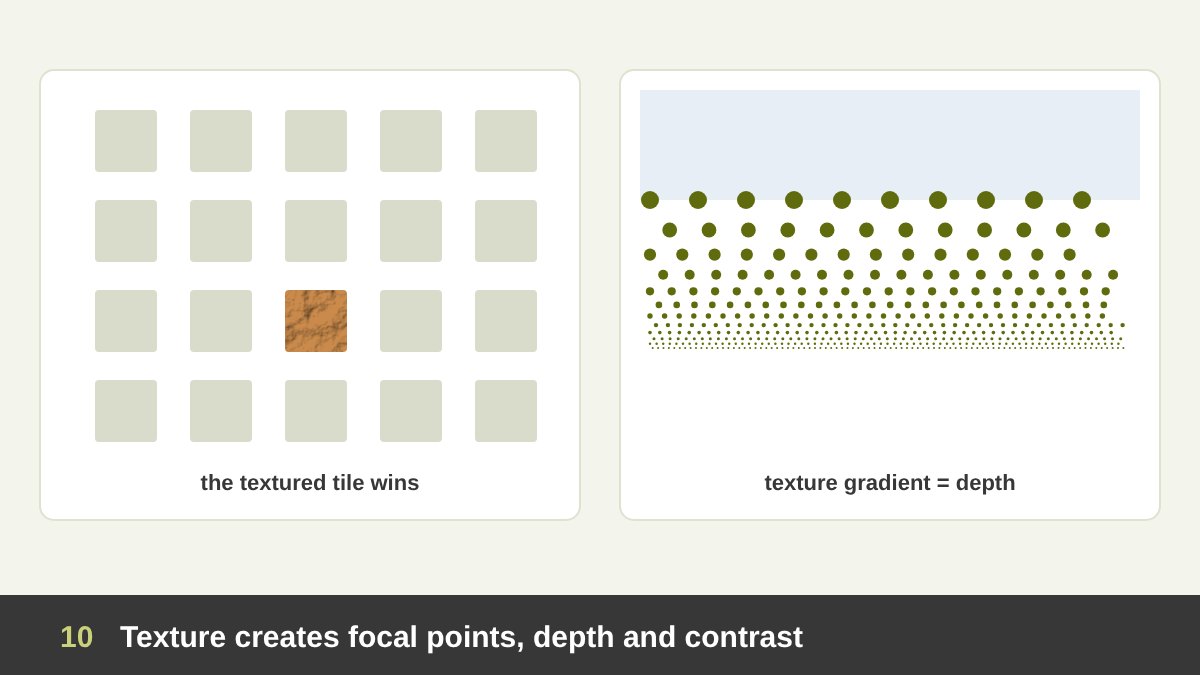
Like any element, texture can create a focal point. In a layout full of flat, smooth areas, the one textured area wins the eye, whether it is a brushstroke behind a headline, a paper-texture card or a close-up photo of fabric. In a very busy, textured design, the opposite is true: one smooth, clean area becomes the focal point.
Texture also creates depth. The psychologist James J. Gibson described the texture gradient in 1950: when a textured surface, such as a field, a floor or a crowd, goes into the distance, its grains look smaller, denser and less sharp. Our brain reads that change as depth. Painters, illustrators and 3D designers use texture gradients to create space on a flat surface.
Finally, texture creates contrast and balance. Rough next to smooth makes both feel stronger: a glossy logo on a matte card, a clean sans serif on a rough concrete photo, a smooth product on a linen background. A small, strongly textured area can also balance a larger smooth area, because texture adds visual weight.
Texture in Typography
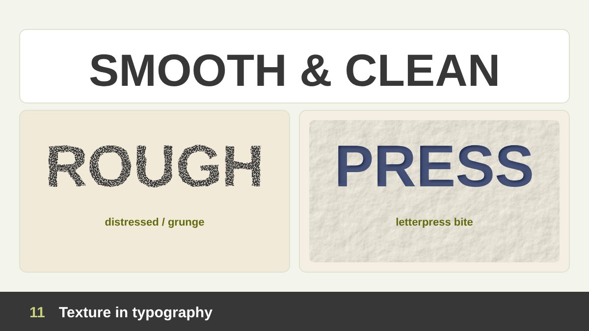
Letters can carry texture in three ways. The first is texture inside the letters: distressed, grunge, stamped, chalk, brush or spray-paint typefaces, or clean letters filled with a photo texture. They add personality instantly but reduce readability, so they work best for short, big headlines.
The second is texture of the printing process. Letterpress presses metal or wood type into thick paper, so each letter has a slight bite you can feel and a little uneven ink. Risograph, screen printing and old photocopies also add their own grain. Many digital fonts and effects try to imitate these imperfections because they feel human and crafted.
The third is typographic colour, sometimes called the texture of text: when you look at a paragraph from a distance with half-closed eyes, it becomes a grey texture. Typeface, size, weight, line spacing and letter spacing all change that texture. Good typographers aim for an even, calm texture in body text, without dark clusters or white rivers, and use texture effects only where they add meaning.
Texture in Logos, Branding and Packaging
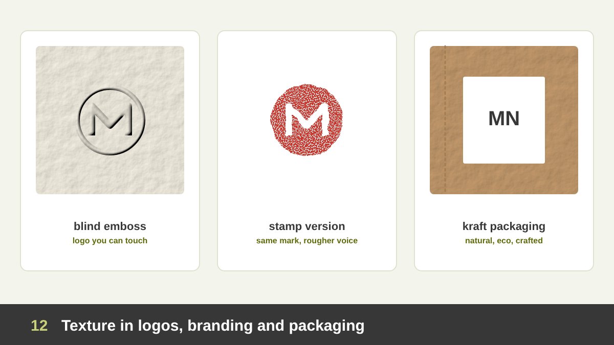
A logo itself should work as a flat, simple mark, because it has to be printed small, embroidered, engraved and displayed on screens. I explain why in what makes a good logo design. Texture enters branding through the applications: the paper, the finish, the packaging material, the photography and the supporting graphics.
The same mark can speak in different voices: blind embossed (raised with no ink) on thick cotton paper it feels discreet and luxurious; printed as a rough stamp it feels handmade and authentic; printed on kraft paper it feels natural and eco-friendly. Many coffee, bakery, craft and organic brands build their whole identity on textured materials.
The most powerful form is tactile branding: a texture or a shape that people recognise with their hands. The classic example is the Coca-Cola contour bottle, which I analyse below, but you can see the same idea in textured packaging, ribbed perfume bottles, debossed leather tags and the particular feel of a luxury brand’s shopping bag. If you want to understand the difference between a logo and everything around it, read branding vs logo design.
Texture in Print: Paper and Finishes
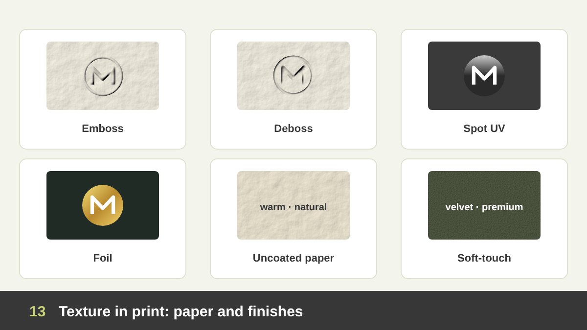
Print is where designers can create real, tactile texture. The first decision is the paper: coated (smooth, glossy or silk, sharp colours) or uncoated (natural, slightly rough, warmer colours), thin or thick, white or tinted, recycled, cotton, linen-embossed or felt-marked. The same design printed on two papers can feel like two different brands.
Then come the finishes. Emboss raises part of the design, and deboss presses it in. Spot UV adds a glossy, slightly raised varnish to selected areas, creating a texture contrast with a matte background. Foil stamping adds metallic shine. Soft-touch lamination gives a velvety, almost skin-like surface. Letterpress, die-cutting and edge painting add depth and detail.
Use finishes with a reason, not everywhere. One special finish on the logo, or on one key word, makes it precious; four finishes on one card make it cheap. And always ask the printer for physical samples: texture is one of the few things in design that you cannot judge from a PDF on a screen.
Texture in Web and UI/UX Design
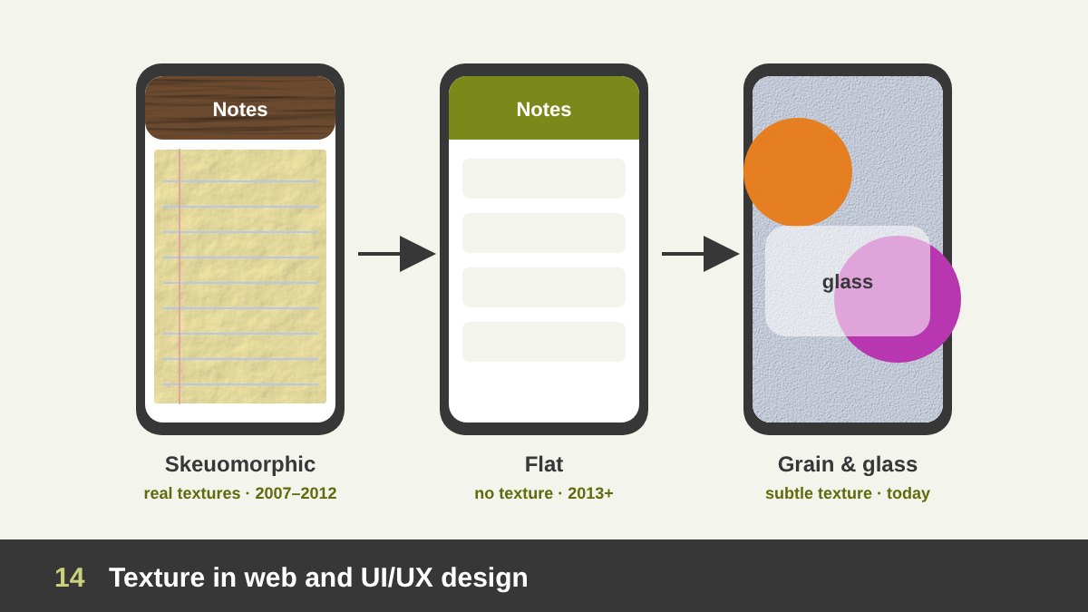
Digital interfaces have gone through a full cycle with texture. In the early smartphone years, around 2007 to 2012, interfaces were skeuomorphic: they imitated real materials, such as leather calendars, yellow legal-pad notes, wooden bookshelves and brushed-metal controls. The textures helped people understand new digital objects by linking them to familiar physical ones.
In 2013 Apple’s iOS 7, following Microsoft’s Metro style, made flat design mainstream: no textures, no shadows, just colour, shape and type. Flat design was cleaner, faster and easier to scale, but it could also feel cold and identical from one app to another. Since then, texture has returned in subtle forms: soft shadows, grain and noise on gradients, paper backgrounds on editorial websites, and frosted and liquid glass effects, which Apple made the basis of its interface design in 2025.
My advice for UI: use texture sparingly and functionally. A light grain can stop large gradients from looking plastic and banded; a glass effect can show that a panel floats above content; a paper texture can give an editorial site warmth. But keep text on clean, high-contrast areas, keep files light so the site stays fast, and never let texture reduce accessibility.
Texture Techniques in Painting and Drawing
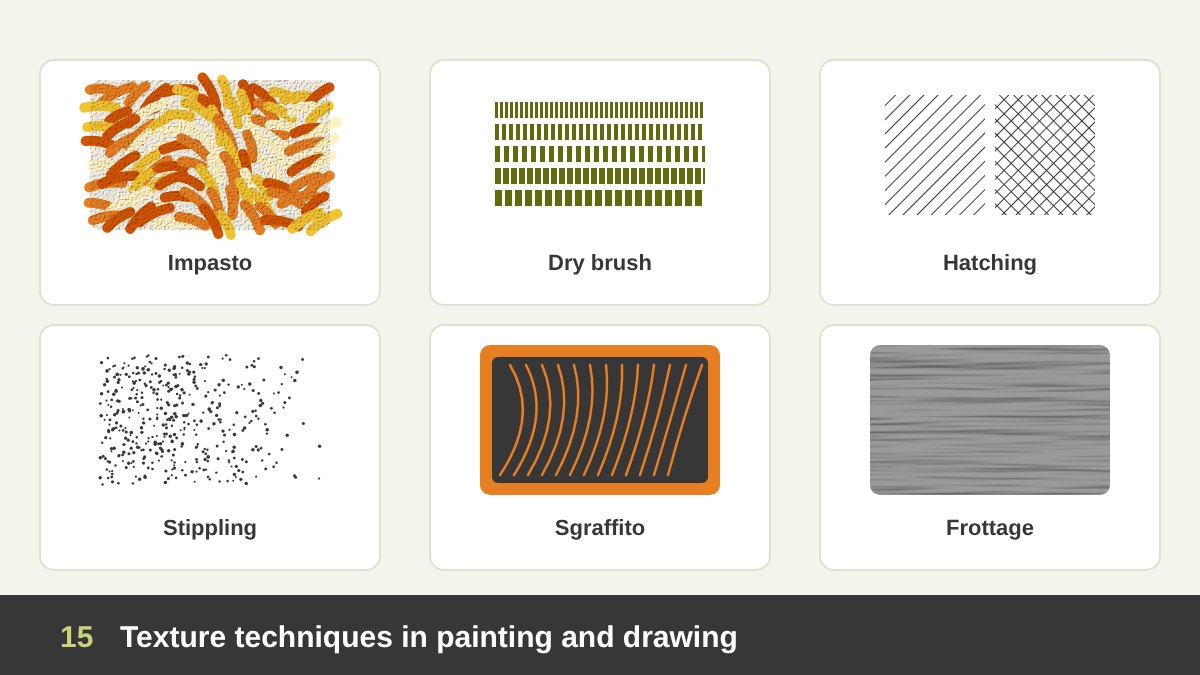
As a painter and drawing teacher, this is my favourite part of texture. Every medium has techniques that create texture, and learning them gives designers a library of hand-made surfaces. Impasto is paint applied so thickly that brush or knife marks stand up from the canvas. Dry brush uses very little paint on a dry brush, so the stroke breaks up and the paper or canvas grain shows through.
In drawing, hatching (parallel lines) and cross-hatching (crossed layers of lines) build value and texture at the same time; the direction of the lines can follow the form or the material. Stippling builds tone from thousands of dots. Scumbling rubs a thin, broken layer of paint over another colour, and glazing builds smooth, glowing layers.
Sgraffito scratches through a top layer to reveal the colour beneath. Frottage rubs a pencil or crayon over paper placed on a textured surface, and collage glues real materials onto the work. Designers can scan these hand-made textures and use them in digital work; they will always feel more alive than a generic texture downloaded from the internet. I talk more about where art and design meet in art vs design.
Texture in Photography
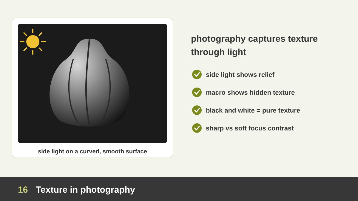
Photography cannot capture touch, so it captures texture through light, detail and focus. Side light reveals relief, as we saw above. Macro photography reveals textures we never notice: the pores of a leaf, the fibres of paper, the crystals of salt. Black and white removes colour and leaves only light and texture, which is why many texture studies are monochrome.
A classic example is Pepper No. 30 (1930) by the American photographer Edward Weston. Weston photographed a single green pepper inside a tin funnel, with soft light falling from the side. In black and white, the smooth, shiny skin and deep folds of an ordinary vegetable look like a sculpture or a human body. The texture is the whole subject.
For design work, photography is the main source of texture: product close-ups, material backgrounds, fabric and paper scans. Contrast is the key: a sharp, textured subject against a soft, blurred background, or a smooth product on a rough surface. When you choose stock photos, notice whether the textures in them support the feeling you want.
Real Example: Van Gogh’s The Starry Night (1889)
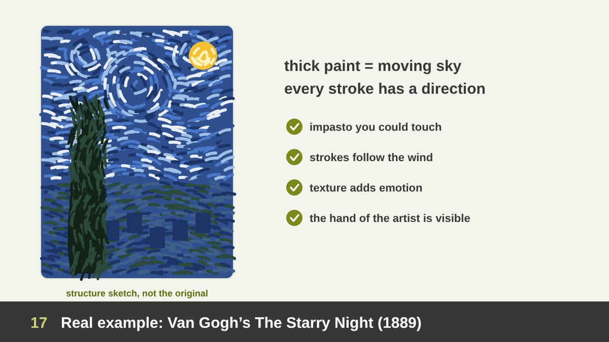
Vincent van Gogh painted The Starry Night in June 1889, in the asylum at Saint-Rémy-de-Provence in the south of France. It is now in the Museum of Modern Art in New York. My sketch above shows only the structure; please look at the original in high resolution, because its power is in the surface.
The painting is built on impasto: thick paint laid on in short, directional strokes that you could feel with your fingers. The key is that every stroke has a direction. In the sky, the strokes curve around the stars and the great spirals, so the whole sky seems to move like wind or water. In the cypress, the strokes rise like flames. In the village, the strokes are shorter and calmer, so the houses feel still under the moving sky.
Here texture is emotion and movement. A smooth, blended sky would show a quiet night; Van Gogh’s textured sky shows what the night felt like to him. The visible strokes also keep the hand of the artist in the work, which is one reason his paintings feel so personal. Designers use the same idea when they choose brush textures and hand-drawn marks: texture shows that a human made this, with feeling.
Real Example: Meret Oppenheim’s Object (1936)
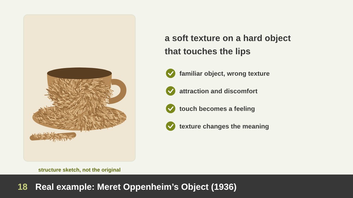
In 1936 the Swiss Surrealist artist Meret Oppenheim covered a teacup, a saucer and a spoon with animal fur. The work is called Object, also known as Le Déjeuner en fourrure (Breakfast in Fur), and it is in the collection of the Museum of Modern Art in New York; you can read about it on the artist’s page. According to a well-known story, the idea came from a conversation in a Paris café with Picasso and Dora Maar about a fur-covered bracelet she had designed.
The whole artwork is a texture contradiction. A cup is hard, smooth, cold and clean; it touches our lips and holds hot liquid. Fur is soft, warm, alive and impossible to drink from. When we imagine putting this cup to our mouth, we feel attraction and discomfort at the same time. The object has not changed its shape at all: only its texture changed, and its meaning changed completely.
The lesson for designers is that texture can change meaning without changing form. The same product shape in matte black, in glossy chrome, in wood or in felt tells four different stories. Surprising textures, used with intention, make people stop, look and remember, which is exactly what advertising and packaging need.
Real Example: Picasso’s Still Life with Chair Caning (1912)
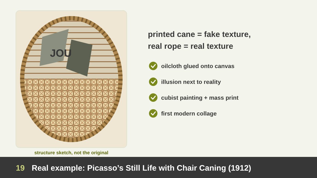
In 1912 Pablo Picasso made Still Life with Chair Caning, a small oval work now in the Musée Picasso in Paris. It is considered the first cubist collage. Into an oil painting of a café table, Picasso glued a piece of oilcloth printed with the pattern of woven chair caning, and instead of a frame he wrapped the oval in a real rope.
The work plays a clever game with texture. The chair caning looks real, but it is a printed, simulated texture that is perfectly flat; the café objects above are painted in broken cubist planes; and the rope around the edge is a real, tactile texture that you could hold. Illusion, painting and reality sit side by side, and the viewer has to ask what is real.
For designers, this is the birth of an approach we still use every day: mixing found materials, printed textures and drawn elements in one composition. Every collage poster, every mood board and every social media post that combines a paper scan, a photo and a hand-drawn line follows the path that Picasso and Georges Braque opened in 1912.
Real Example: Max Ernst’s Frottages (1925–26)
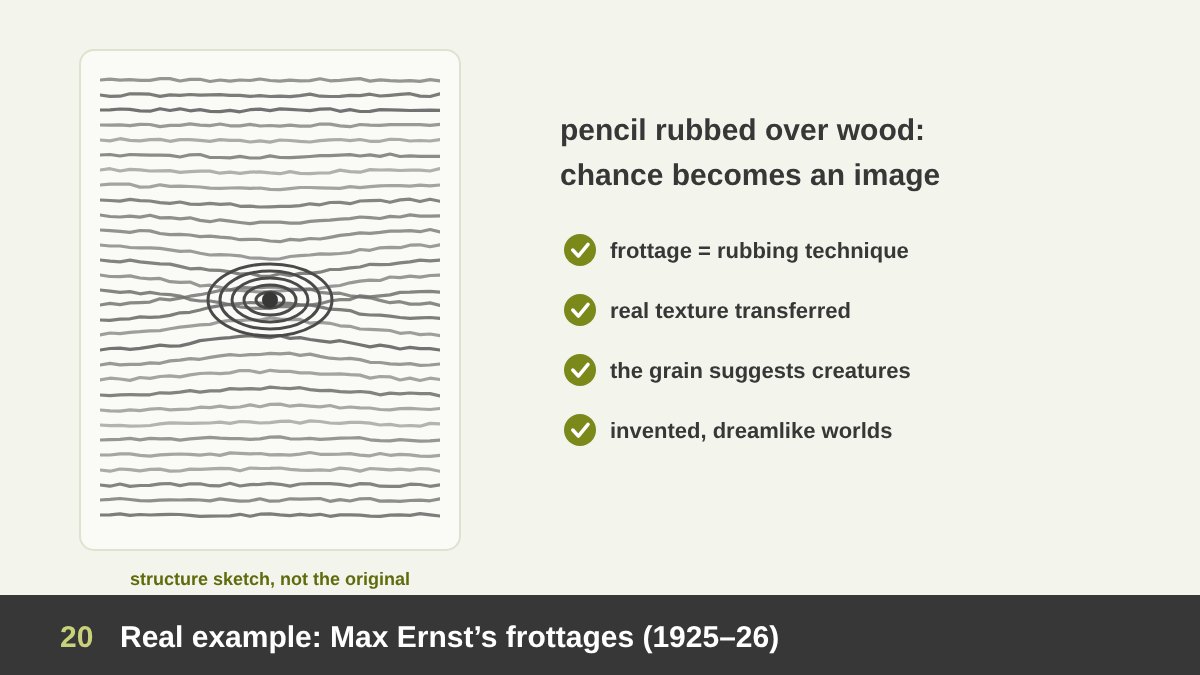
In 1925 the German-French Surrealist Max Ernst was staring at the worn wooden floorboards of a hotel room. He placed sheets of paper on the floor and rubbed them with a pencil, and the grain of the wood appeared on the paper. He called the technique frottage, from the French frotter, “to rub”, and in 1926 he published a portfolio of these drawings called Histoire Naturelle (Natural History). You can read more about the rubbing technique.
Ernst did not just copy the floor. He looked into the rubbed textures, the way we look at clouds, and found eyes, leaves, forests, birds and strange creatures in them, then developed those images. A real texture became the starting point for an invented world. The grain is still visible, which gives the images a natural, almost scientific feel, and that is exactly what makes them dreamlike.
This is one of the best exercises I give my students: collect rubbings and prints from different surfaces, such as leaves, coins, fabric, wood and walls, then look at them until they suggest an idea. Designers can scan such textures and build original illustrations, backgrounds and brand patterns from them. Chance, used well, is a creative partner.
Real Example: Roy Lichtenstein’s Whaam! (1963)
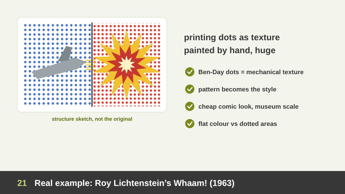
Roy Lichtenstein, one of the leaders of American Pop Art, painted Whaam! in 1963. It is a huge two-panel painting, about four metres wide, now at Tate Modern in London. Lichtenstein adapted it from a panel drawn by Irv Novick in a 1962 DC war comic: on the left a fighter plane fires a missile; on the right another plane explodes.
The texture here is mechanical. Cheap comic books were printed with Ben-Day dots, small dots of colour that create tones and shades with very little ink. Lichtenstein painted those dots by hand, enlarged to the size of coins, using stencils. Up close the surface is a field of dots; from a distance it reads as smooth colour. The dotted texture becomes the signature of the style.
What makes it brilliant is the contrast between the texture’s origin and its new context: the cheapest printing texture, painted slowly by an artist and hung in a museum. Today, halftone and dot textures are everywhere in graphic design, from risograph posters to social media, and they still carry that Pop Art feeling: bold, graphic, a little nostalgic and full of energy.
Real Example: Jamie Reid and the Punk Ransom-Note Look (1977)
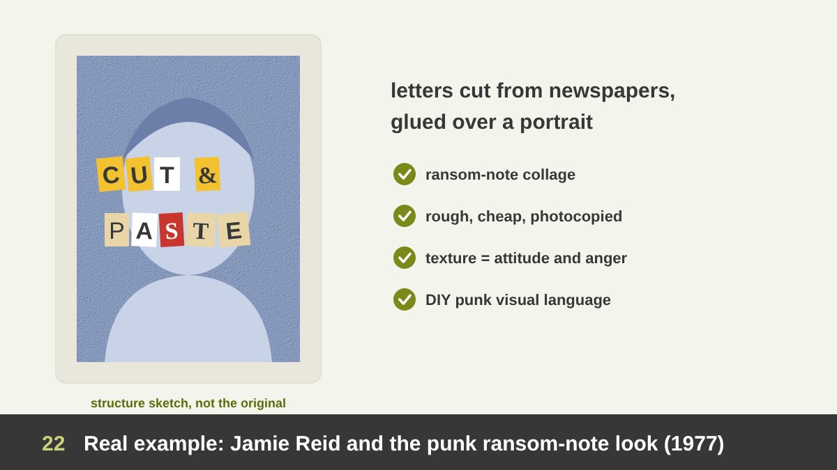
The British artist Jamie Reid designed the visual identity of the Sex Pistols, including the sleeve of the single God Save the Queen in 1977. He took a formal portrait of the Queen and glued strips of letters over the eyes and mouth, letters cut out of newspapers and magazines in different sizes, typefaces and colours, like an anonymous ransom note.
The design is built on rough collage texture: torn and cut edges, mismatched type, cheap paper, photocopied grain and flat, crude colour. Nothing is polished. That roughness is the message: it feels improvised, angry, cheap and impossible to control, exactly the attitude of punk. A clean, perfectly typeset version would have said nothing.
Reid’s cut-and-paste look became the visual language of punk and DIY culture, and it still returns regularly in fashion, music and social media design. The lesson: texture carries attitude. Torn paper, photocopy grain and collage say “raw, independent, real”. Use them when your message needs that energy, and avoid them when it needs trust and calm.
Real Example: David Carson and Ray Gun Magazine (1992–95)
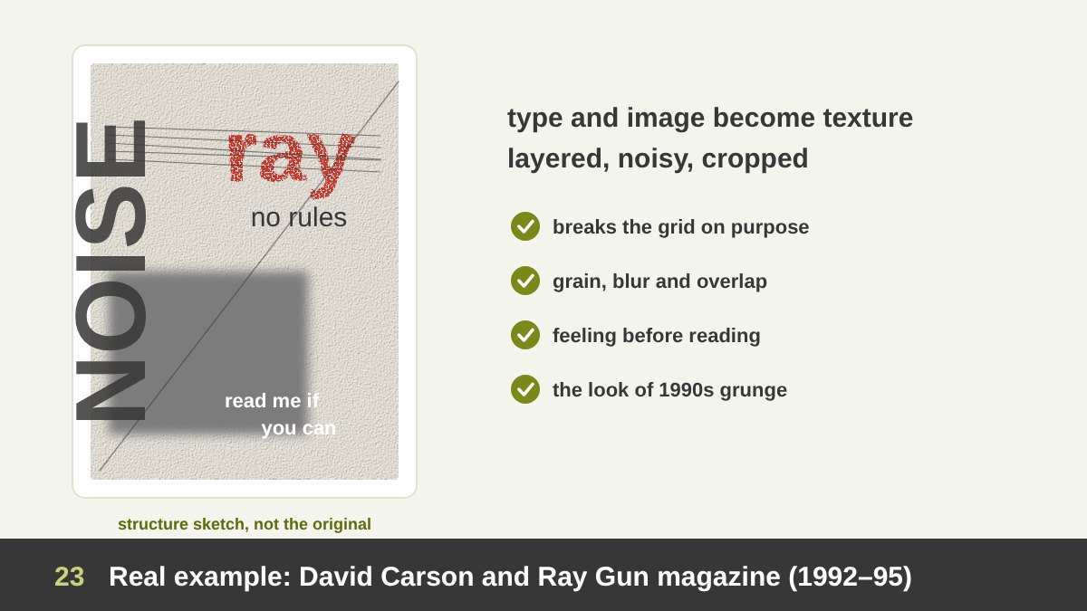
The American designer David Carson was the art director of Ray Gun, an alternative music and lifestyle magazine, from 1992 to 1995. His pages became the symbol of grunge typography: rotated and overlapping text, letters cut off at the edges, distressed fonts, blurred and scratched photos, and layers of noise.
In Carson’s work, type and image become texture. Columns of text are treated as grey surfaces that can be stacked, stretched and cut; headlines are broken and dirty; photos are blurred or partly covered. He famously set one interview with Bryan Ferry, which he found boring, entirely in the symbol font Zapf Dingbats, so it could not be read at all. The page communicates a feeling before it communicates information.
Carson’s work is still debated: many designers find it inspiring, others find it unreadable. Both are right, and that is the lesson. Texture competes with readability. In a music magazine for young readers who want an experience, that trade can be worth it. In a medical leaflet, a bank app or a government form, it is not. Know what your audience needs before you add noise.
Real Example: The Contour Bottle (1915) and Tactile Branding
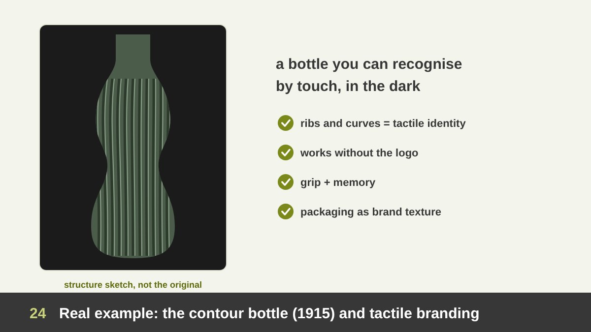
In 1915 the Coca-Cola Company asked bottle suppliers to design a bottle so distinctive that, in the words of the brief, a person could recognise it even if they felt it in the dark, and could tell what it was even if it was broken on the ground. The winning design came from the Root Glass Company in Terre Haute, Indiana, where Earl R. Dean drew a bottle inspired by the ribbed shape of a cocoa pod. It was patented in November 1915.
The brief is one of the clearest examples of tactile branding in history. The bottle’s curves and vertical ribs are a texture you hold every time you drink: they help the grip, and they make the bottle recognisable without reading a single letter. The shape and its texture work like a second logo, made of glass instead of ink.
For designers, the lesson goes beyond bottles. Ask what your brand feels like in the hand: the paper of the business card, the weight of the box, the surface of the product, the bag, even the texture of the website’s background. Brands that think about texture create memories that a flat logo alone cannot create.
Social Media Designs Built on Texture: Six Techniques
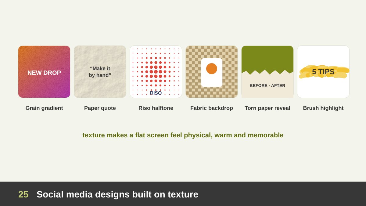
Social media is a flat, glowing screen, and that is exactly why texture works so well there: it makes a post feel physical, warm and different from the smooth content around it. These six sample posts, which I designed for this article, show the techniques I use most and why each one works.
1. The grain gradient: a colourful gradient with a fine grain on top looks richer and more analogue than a smooth gradient, and avoids colour banding. 2. The paper quote: a quote on a scanned paper texture feels personal, like a page from a notebook. 3. The risograph halftone: dot textures and slightly misaligned colours give a playful, printed, Pop Art feeling.
4. The fabric backdrop: photographing a product on linen, felt or wool adds softness and lifestyle without distracting from the product. 5. The torn-paper reveal: a torn edge between two images is perfect for before-and-after content and adds a handmade touch. 6. The brush highlight: one rough brushstroke behind a key word guides the eye like a highlighter. In each case, notice that the texture supports the message and never covers it.
Analysing a Texture-Based Instagram and LinkedIn Carousel
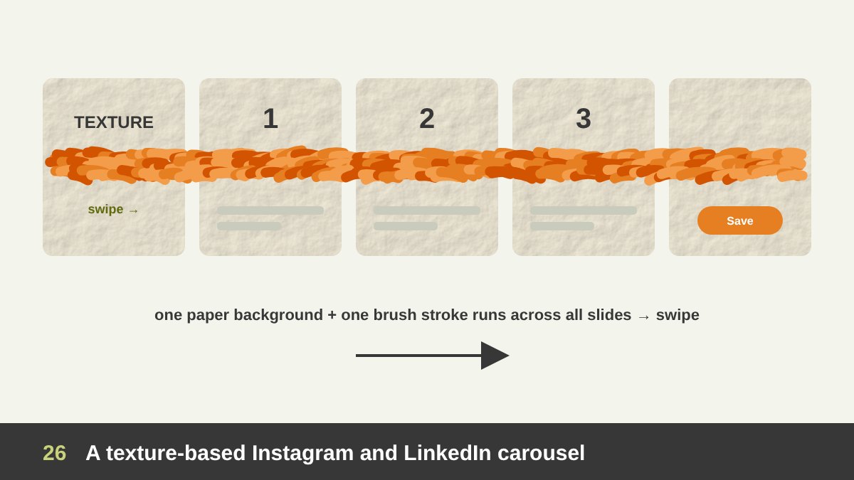
A simple and very effective carousel technique is the continuous texture carousel. All the slides share one paper or fabric background, and one textured element, here an orange brushstroke, runs across the edges from slide to slide. When the stroke is cut by the right edge of the cover, the viewer wants to follow it, so they swipe.
In the sample above, texture has three jobs. The paper background unifies the slides and gives the whole carousel a warm, crafted feeling. The brushstroke is the visual thread that connects the points into one story. And on the last slide, the stroke ends at the call to action (save, follow, visit the website), so the eye arrives exactly where you want it.
Tips if you design one: design the carousel as one long canvas and then cut it into slides; use one main texture and one accent texture only; keep text on calm, high-contrast areas; and export at a quality that keeps the grain sharp but the file light. I use the same idea of one connecting visual thread when I present design work to clients.
Common Mistakes When Using Texture
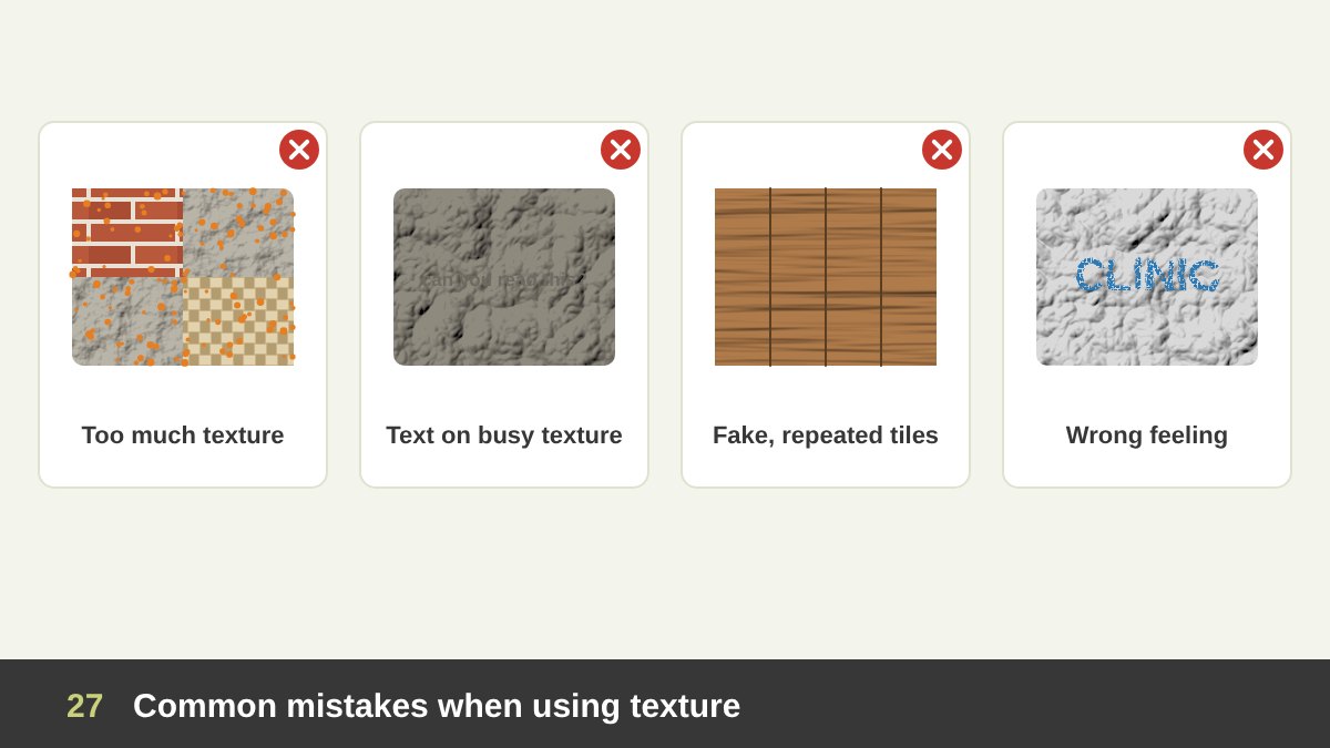
After years of teaching and reviewing junior designers’ work, these are the texture mistakes I see most often. Too many textures: wood, brick, fabric, grunge and paper in one design. Each texture is a strong voice, and together they become noise. Choose one main texture and, at most, one accent.
Text on busy texture: headlines and body text placed on a rough photo or a high-contrast texture become hard to read. Calm the texture behind the text, add a solid area, or move the text. Fake, repeated tiles: a small texture repeated across a big area shows its seams and repeated features, and the eye immediately recognises it as fake. Use large, high-quality textures or vary them.
The wrong feeling: a grunge or distressed texture on a clinic, a bank or a children’s brand sends a message of dirt and danger, not character. Always connect texture to the brand’s personality. And finally, texture with no purpose: noise added only because the layout looks empty. Like every other element, texture needs a job: to add warmth, depth, focus, contrast, age, luxury or attitude.
How to Use Texture in Your Next Design: A Practical Checklist
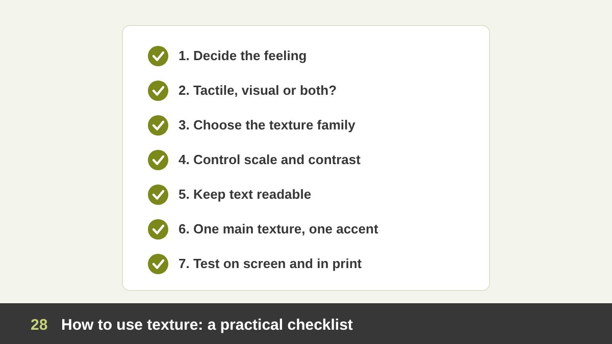
Here is the process I follow, and teach, whenever texture plays a role in a design. 1. Decide the feeling first. Warm, raw, luxurious, natural, technical, nostalgic, rebellious? 2. Tactile, visual or both? Will people touch this piece? If yes, choose the paper, material and finish, not only the picture. 3. Choose the texture family. Natural, man-made, hand-made or digital, simulated, abstract or invented.
4. Control scale and contrast. Fine, low-contrast textures for backgrounds; bold textures only for focal areas. Keep the light direction consistent. 5. Keep text readable. Put important text on calm areas and check the contrast. 6. Use one main texture and one accent, and repeat them consistently across the whole project so they become part of the identity.
7. Test it. View the design small on a phone, print a proof on the real paper, and touch it. Ask whether the texture adds feeling or only adds noise. Texture is the element that brings a design closest to the senses, and mastering it will make your work warmer and more memorable. If you would like help with a brand identity, packaging, a poster or a website with real character, take a look at my portfolio or get in touch.
| Texture | What it communicates | Where to use it |
|---|---|---|
| Rough (stone, concrete) | Strength, honesty, rawness, permanence | Architecture, outdoor and streetwear brands, bold posters |
| Smooth (glass, gloss) | Modernity, cleanliness, technology, luxury | Tech products, UI, beauty, premium packaging |
| Soft (fur, wool, velvet) | Comfort, warmth, care, intimacy | Home, fashion, baby and wellness brands |
| Wood | Warmth, craft, nature, home | Furniture, cafés, organic and handmade brands |
| Paper and kraft | Handmade, honesty, eco-friendliness | Packaging, stationery, editorial design, quotes |
| Grain and noise | Nostalgia, analogue warmth, depth | Gradients, social media, posters, photography |
| Halftone and dots | Pop Art energy, print, playfulness | Posters, comics, social media, merchandise |
| Distressed and grunge | Rebellion, age, attitude | Music, streetwear, events (avoid for trust-based brands) |
| Brushstrokes and impasto | Emotion, the artist’s hand, energy | Art, cultural events, highlights, illustration |
| Collage and torn paper | DIY, rawness, storytelling | Campaigns, music, before-and-after content |
| Tactile finishes | Quality, luxury, memorability | Business cards, packaging, invitations, books |
Texture in Design: Frequently Asked Questions
What is texture in design?
Texture is one of the basic elements of design. It is the surface quality of a design: how something feels when we touch it, or how it looks like it would feel. Designers use texture to add feeling, depth, focus, contrast and personality to their work.
What are the types of texture in art and design?
The two main types are tactile (actual) texture, which you can physically feel, and visual (implied) texture, which only looks textured. Visual texture can be simulated (imitating a real surface), abstract (simplified from a real surface) or invented (created by the artist). Textures can also be grouped as natural or man-made.
What is the difference between texture and pattern?
A pattern is a regular, planned repetition of a motif, such as stripes or polka dots. A texture is usually irregular, like sand, wood or paper. When a pattern is seen very small or from far away, it can start to read as a texture.
Why is texture important in graphic design?
Texture makes designs feel real and human, creates emotional associations (warm, raw, luxurious, nostalgic), adds depth, draws attention to focal points and creates contrast. In print and packaging, real textures such as paper, embossing and finishes also change how people judge quality.
How do you create texture in digital design?
Use scanned real textures (paper, fabric, paint, rubbings), photo textures, brushes, grain and noise effects, halftone patterns and blur or glass effects. Keep the light direction consistent, control the scale and contrast, and keep text on calm areas so it stays readable.
Which famous artworks use texture?
Famous examples include Van Gogh’s The Starry Night (thick, directional impasto), Meret Oppenheim’s fur-covered cup Object, Picasso’s Still Life with Chair Caning (the first cubist collage), Max Ernst’s frottages, Roy Lichtenstein’s Ben-Day dots in Whaam!, Jamie Reid’s punk collages and David Carson’s grunge pages for Ray Gun.
Leave a Reply