
What Is a Shape in Design?
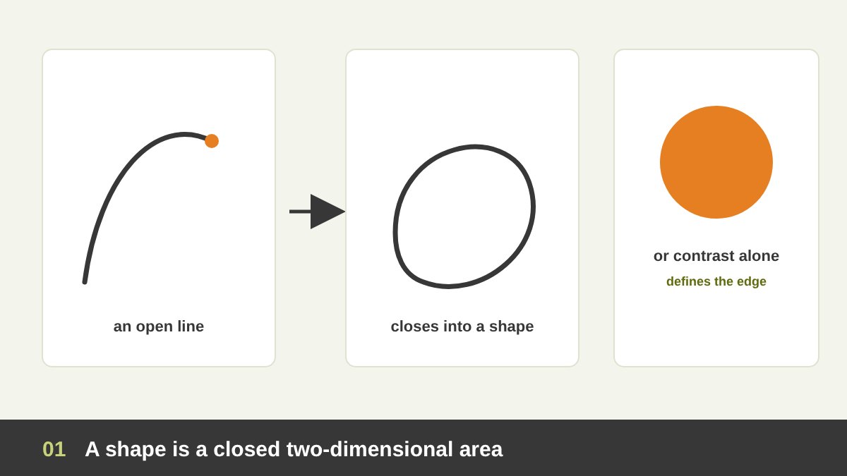
In design, a shape is a closed, two-dimensional area that is separated from the space around it by a boundary. Draw a line and bring it back to where it started, and you have made a shape. But a shape does not need an outline: a red circle on a white page, a dark silhouette against a bright sky or a patch of texture on a smooth surface are all shapes, because their edges are defined by contrast of colour, value or texture.
A shape has width and height but no depth. When a shape gains a third dimension, real or illusionary, through light, shadow and perspective, it becomes a form: a circle becomes a sphere, a square becomes a cube, a triangle becomes a cone or a pyramid. Designers move between the two all the time: a flat icon is a shape; the same icon with gradients and shadows starts to read as a form.
Shape is one of the core elements of design, together with point, line, form, texture, value, colour, space and type. I explained how they fit together in The Principles of Design, and I wrote a full article on line in design, the element that comes just before shape. In this article I focus on shape, because it is the element people recognise first. Before we read a word or notice a colour, our brain has already identified the shapes in front of us. That is why logos, icons, signs and posters live or die by their shapes.
Key takeaways
- A shape is a closed, two-dimensional area with a boundary. It is created when a line closes on itself, or when an area of colour, value or texture stands out from what is around it.
- Every shape has properties you control: type, size, proportion, edge, orientation, colour and position. Change one of them and the message changes.
- The main types of shape are geometric (circle, square, triangle, polygons), organic (natural, free-flowing), abstract and symbolic (icons, pictograms, simplified figures), positive and negative shapes, and implied shapes that the brain completes by itself.
- Shapes have a psychology: circles feel friendly, complete and inclusive; squares feel stable and trustworthy; triangles feel dynamic, directional and sometimes dangerous; organic shapes feel natural and human.
- In real work, shape builds logos, icons, letters, layouts, characters and patterns, and creates focal points and hierarchy. Saul Bass, Shigeo Fukuda, Matisse, Malevich and the designers of FedEx, Mastercard and WWF built some of the most famous images in history on shape alone.
The Properties of a Shape
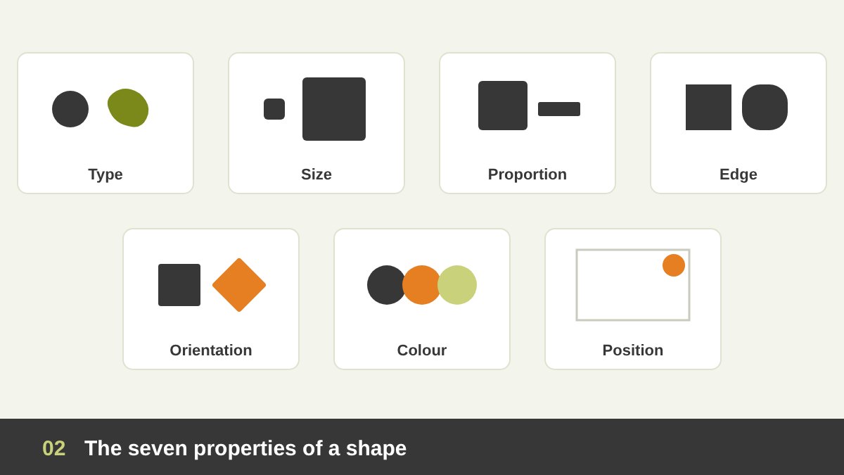
Every shape you use has a set of properties, and each one is a design decision. Good designers choose them on purpose instead of accepting the first rectangle the software draws.
Type: geometric, organic or abstract, which sets the basic personality. Size: big shapes come forward and dominate; small shapes recede or become details. Proportion: a square and a long thin rectangle are both four-sided, but one feels balanced and the other feels like a band or a direction. Edge: sharp corners feel precise and serious; rounded corners feel soft and friendly; rough edges feel handmade.
Orientation: a square standing on its side feels stable; the same square rotated 45 degrees becomes a diamond and suddenly feels active and alert, like a warning sign. Colour, value and texture: they decide whether the shape is loud or quiet, heavy or light. Position: a shape in the centre feels calm and important; near an edge it creates tension; overlapping another shape it creates depth and relationship. Next time you place a shape, ask which of these seven properties is actually saying something.
The Three Basic Geometric Shapes: Circle, Square and Triangle
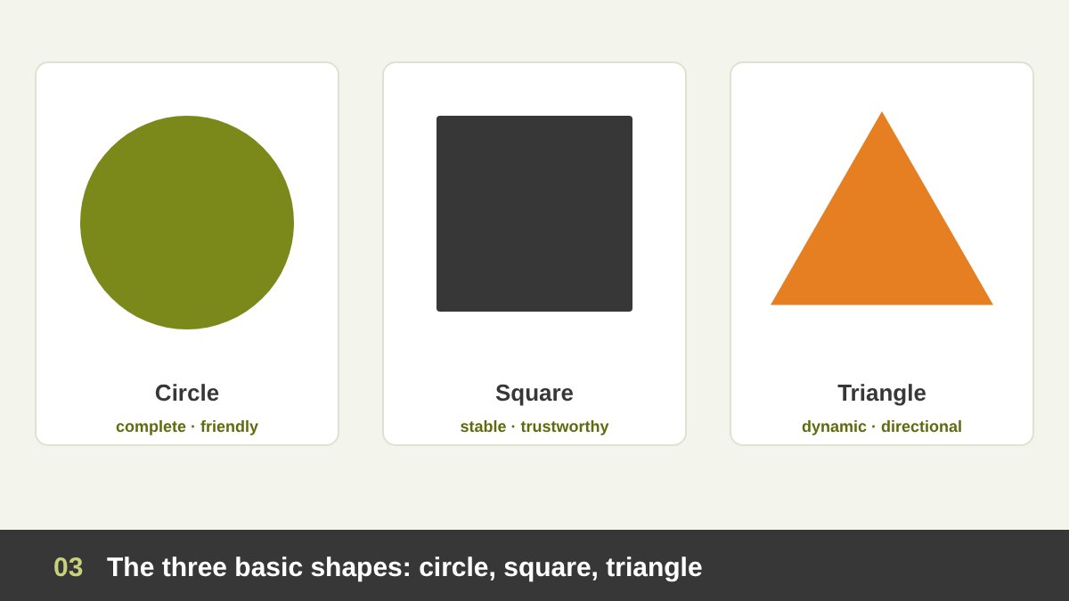
Geometric shapes are regular, precise shapes that can be described with mathematics: circles, squares, rectangles, triangles, polygons. They feel man-made, organised and rational, because nature rarely produces perfect geometry. Three of them are the foundation of almost everything we design.
The circle has no beginning and no end. It feels complete, protective, inclusive and friendly, which is why it appears in so many logos about community, connection and global reach. It also has no direction, so it holds the eye in one place. The square and rectangle are the shapes of buildings, screens, pages and boxes. They feel stable, honest, reliable and orderly, and they are the natural shape of most layouts. That makes them almost invisible, so use them for structure and use other shapes for emphasis.
The triangle is the most dynamic of the three. Standing on its base it feels stable and strong, like a pyramid; standing on its point it feels unstable and tense; pointing sideways it becomes an arrow or a play button. Triangles suggest direction, progress, energy, and sometimes danger, which is why warning signs use them. Bauhaus teachers treated these three as the alphabet of form, and every design student still starts with them.
More Geometric Shapes: Polygons, Stars, Ellipses and Rounded Rectangles
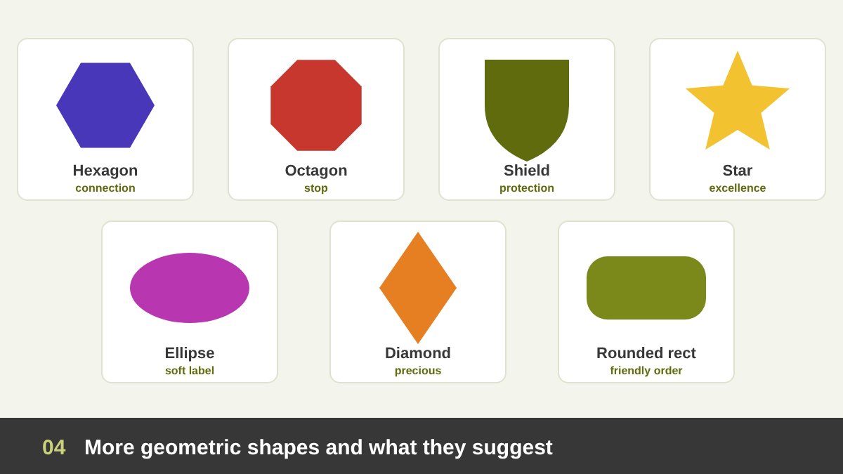
Beyond the basic three, designers use a whole family of geometric shapes, each with its own associations. The hexagon appears in honeycombs and molecules, so it suggests efficiency, connection, science and technology. The octagon is strongly linked to the stop sign in many countries. Pentagons and shields suggest protection, security and tradition, which is why sports clubs, security companies and universities love them.
Stars mean excellence, ratings, fame and celebration; a five-pointed star on a product says “premium” or “top rated” in less than a second. The ellipse is a stretched circle; it feels softer and more dynamic than a circle and is often used for badges and labels. The rhombus or diamond feels sharp, precious and attention-seeking.
The most used shape in digital design today is probably the rounded rectangle: buttons, cards, app icons, input fields and message bubbles. It combines the order of the rectangle with the friendliness of the circle. The size of the corner radius changes the personality: tiny corners feel serious and corporate; large, pill-shaped corners feel playful and approachable. Choose a radius and use it consistently across a brand or an interface.
Organic Shapes: The Shapes of Nature
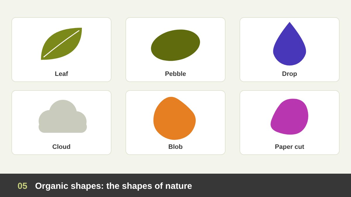
Organic shapes are irregular, free-flowing shapes like the ones we find in nature: leaves, stones, clouds, waves, puddles, animals and the human body. They are rarely symmetrical and cannot easily be described with a formula. Because of that, they feel natural, human, spontaneous, relaxed and alive.
Designers use organic shapes when a brand or message should feel warm, approachable, healthy or creative: food, beauty, wellness, children’s products, eco brands and lifestyle content. The soft background “blobs” that became popular in websites and social media posts are organic shapes; so are hand-drawn frames, paper cut-outs and brush strokes.
The opposite of geometric is not “bad” or “messy”. The best designs often combine both: a strict geometric grid holding organic photos, a geometric logo with one organic leaf, a rounded organic button on a precise layout. As a painter, I find organic shapes the most expressive part of drawing; as a designer, I use them carefully, because too many free shapes without structure quickly become chaos.
Abstract and Symbolic Shapes: Icons, Pictograms and Silhouettes
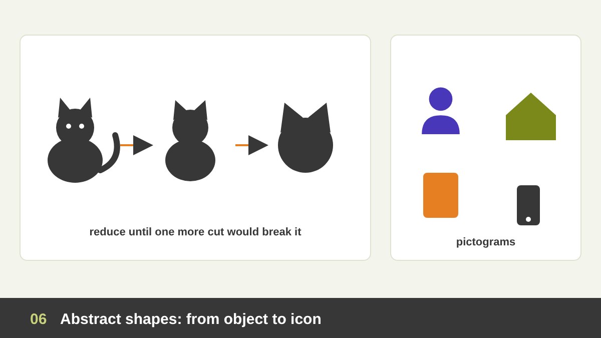
Abstract shapes are simplified versions of real things. They keep only the essential features so that we still recognise the object: a few curves become a person, a triangle on a square becomes a house, a circle with rays becomes the sun. Icons, pictograms, emoji, road signs and most logos are abstract shapes.
Designing a good abstract shape is a process of reduction. You start from the real object, draw it, then remove detail after detail until removing one more would make it unrecognisable. That is exactly the exercise I give students: take a cat, a cup or a car and simplify it in five steps. The result at step five is often a better logo or icon than the realistic drawing at step one.
Silhouettes are a special type of abstract shape: a figure filled with one flat colour, without any inner details. A good silhouette is recognisable from its outline alone. Character designers test their characters this way, and poster designers use silhouettes because they read instantly from a distance. Pictogram systems, like the sport pictograms designed for the Olympic Games, are abstract shapes working together as one family.
Positive and Negative Shapes: Figure and Ground
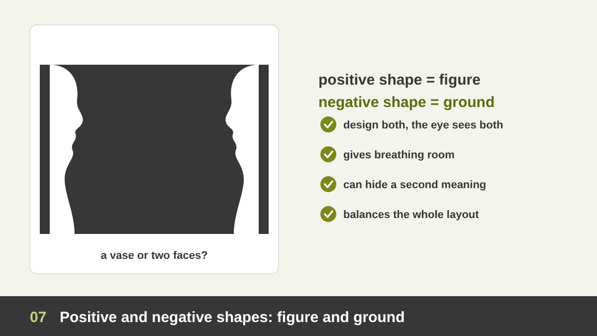
Every shape you place on a page creates two shapes at the same time. The positive shape (the figure) is the object itself; the negative shape (the ground, or negative space) is the area around and between objects. Beginners only design the positive shapes; professionals design both, because the eye sees both.
The classic demonstration is the Rubin vase, described by the Danish psychologist Edgar Rubin around 1915 (more about the Rubin vase). You see either a vase in the middle or two faces looking at each other, but never both at exactly the same time. The image works because the negative shape was designed as carefully as the positive one.
In practice, negative shapes do three things. They give a design breathing room, so the positive shapes look clear and confident. They can hide a second meaning, like the arrow in the FedEx logo that I analyse below. And they create balance: if the empty areas of a layout have awkward, random shapes, the whole design feels uncomfortable even when the viewer cannot explain why. Squint at your design and look at the empty spaces as if they were the content.
Implied Shapes and Gestalt: How the Brain Completes Shapes
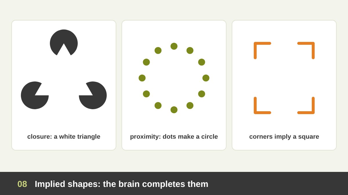
Some of the strongest shapes in design are not drawn at all. The brain completes them by itself, following the principles described by the Gestalt psychologists in the early twentieth century. The most important one for shapes is closure: when a shape is incomplete, we fill in the missing parts and see the whole.
A famous example is the Kanizsa triangle, published by the Italian psychologist Gaetano Kanizsa in 1955 (about illusory contours): three black circles with a wedge cut out of each make us see a bright white triangle that does not exist. Other Gestalt principles create shapes too: proximity (dots placed close together read as one group shape), similarity (similar elements form a shape inside a crowd), and continuity, which I explained in the line article.
Implied shapes make a design more engaging, because the viewer participates in completing the image, and more memorable, because that small effort creates a moment of discovery. The WWF panda, which I analyse below, is one of the best examples: the panda’s head and back are never drawn, yet everybody sees them.
Static and Dynamic Shapes, Hard and Soft Edges
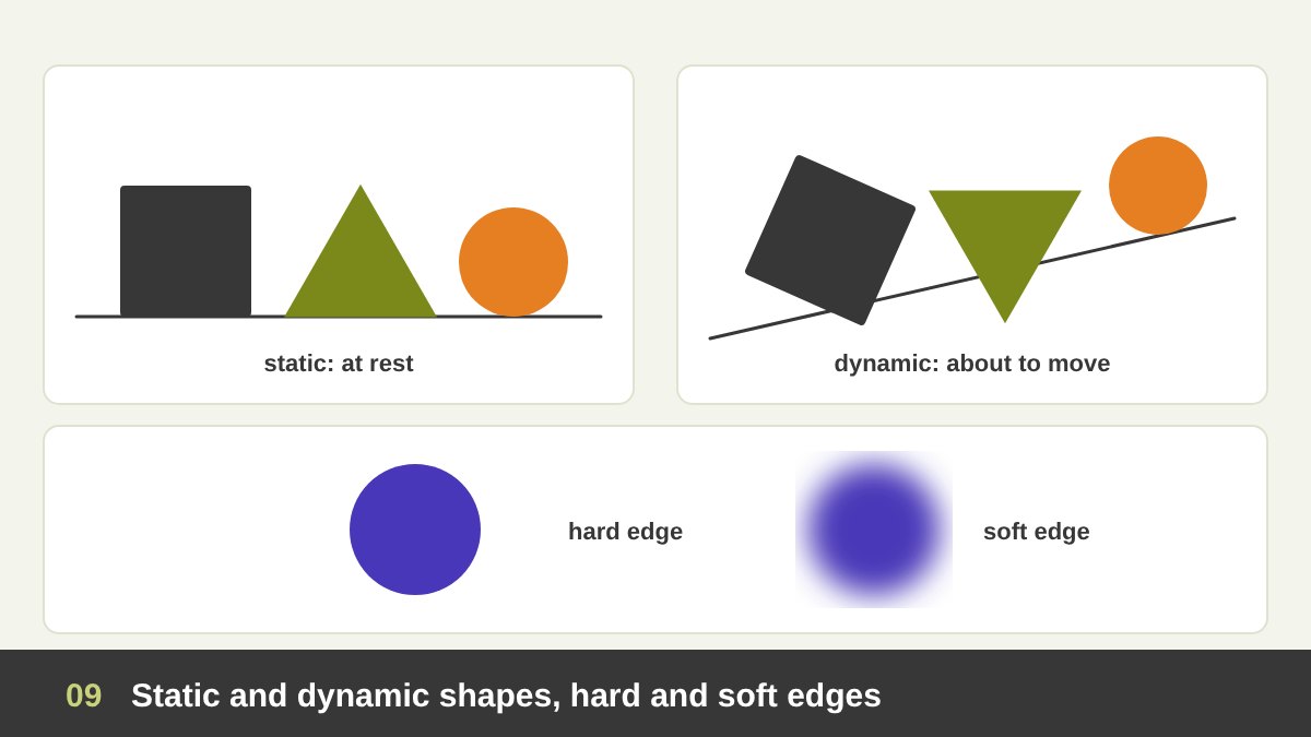
Shapes can feel static (at rest) or dynamic (in motion), and this has more to do with how you place them than with the shape itself. A square sitting flat on its base, a triangle on its wide side, a circle resting on a line: all static, calm and stable. Rotate the square, tip the triangle onto its point, place the circle at the top of a slope: suddenly they seem about to move, fall or roll.
This is the same psychology I described for horizontal, vertical and diagonal lines in the line article: anything tilted feels like movement. Use static shapes for brands and layouts that should feel safe and established, and dynamic shapes for sport, sales, launches and anything about change.
Edges carry personality too. Hard edges (crisp, sharp boundaries) feel precise, modern and graphic. Soft edges (blurred, feathered or gradient boundaries) feel atmospheric, gentle and dreamy, and they make a shape seem further away or out of focus. Painters use the difference between hard and soft edges to control where the eye goes: the sharpest edge in a painting is usually where the artist wants you to look.
The Psychology of Shape: What Shapes Make Us Feel
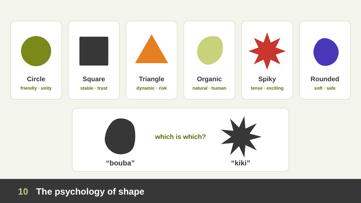
Shapes speak to us emotionally, often before we know what they represent. A practical cheat sheet I give my students: circle = unity, friendship, community, protection, the whole world. Square and rectangle = stability, trust, order, honesty, solidity. Triangle = direction, energy, ambition, progress, and danger when it points down or sideways. Organic shapes = nature, comfort, creativity, humanity. Sharp, spiky shapes = tension, aggression, excitement. Rounded shapes = softness, safety, playfulness.
There is real research behind this. In 1929 the psychologist Wolfgang Köhler showed people a rounded blob and a spiky star and asked which one was called “takete” and which “baluma” (later “maluma”). Most people matched the soft word to the rounded shape. In 2001 V. S. Ramachandran and Edward Hubbard repeated the test with “bouba” and “kiki”, and around 95% of people chose the same way (the bouba/kiki effect). The effect has been found across many languages and cultures. At the Bauhaus in 1923, Wassily Kandinsky even sent a questionnaire asking people to match the triangle, square and circle to yellow, red and blue, a famous early attempt to connect shape, colour and feeling.
These meanings are tendencies, not laws. Culture and context matter, and a circle can feel aggressive if it is huge, red and pulsing. The real skill is to choose shape on purpose: decide the feeling you want first, then choose the type, proportion, edge and orientation of the shapes that carry it.
Using Shape to Create Focal Points, Hierarchy and Contrast
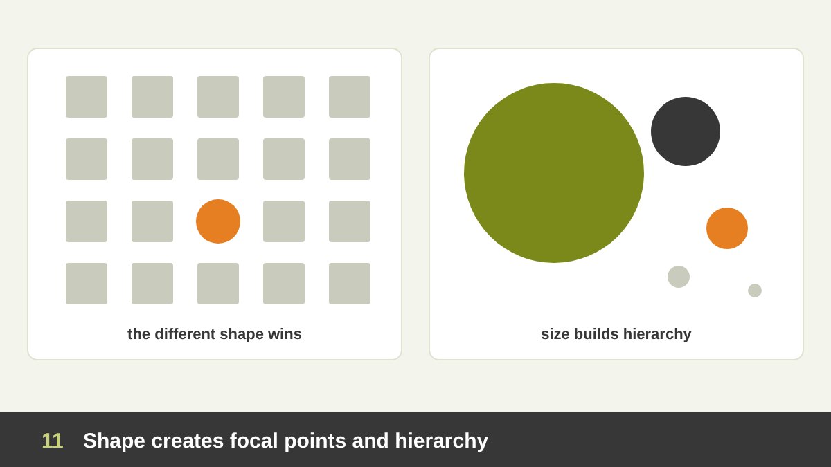
One of the most useful jobs of shape is directing attention. The eye is drawn to whatever is different. Put one circle among twenty squares, one organic shape in a geometric layout, or one tilted shape among level ones, and that shape becomes the focal point instantly. This is the principle of contrast and emphasis that I described in The Principles of Design.
Shape also builds hierarchy through size. The largest shape on a page is read first, the medium shapes next and the small shapes last. A strong poster usually has one dominant shape, a few supporting shapes and some small details, never ten shapes of the same size fighting each other.
A practical tip for social media and ads: if a product or message must stand out in a busy feed, put it inside a contrasting shape, like a bright circle behind a product, a rounded badge for a price, or a burst shape for a discount. These shapes work like a spotlight. But use only one spotlight per design: if everything is in a badge, nothing stands out.
Using Shape as a Container: Frames, Cards and Masks
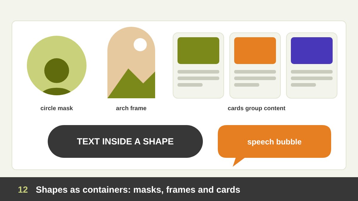
Shapes are also containers that group and hold content. A card on a website is a rounded rectangle that tells the user “everything inside belongs together”. A coloured block behind a headline separates it from the background. A speech bubble says “someone is talking”. Containers make complex layouts easy to scan.
Masking photos into shapes is one of the simplest ways to give a design personality. The same portrait feels formal in a rectangle, friendly in a circle, elegant in an arch and playful in an organic blob. Arch-shaped frames, for example, have become a popular way to give interior, wedding and lifestyle designs a soft, architectural feeling.
The rule is consistency. Decide a small set of container shapes for a project, for example rectangles with 12 px corners for cards, circles for profile photos and one arch for hero images, and repeat them. Repetition of shape is what makes a brand feel like a system instead of a collection of unrelated posts.
Shape in Typography
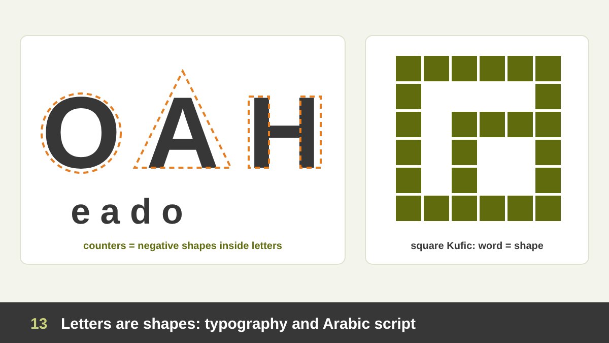
Every letter is a shape, and every typeface has a shape language. Geometric sans-serif typefaces such as Futura are built from almost perfect circles, triangles and squares: the “O” is a circle, the “A” is a triangle, the “H” is two rectangles and a bar. That is why they feel modern, clean and rational. Humanist typefaces have more organic, handwritten shapes and feel warmer.
Letters also contain negative shapes: the enclosed spaces inside letters like “o”, “e”, “a” and “d” are called counters. Type designers spend a great deal of time balancing these inner shapes, because they decide how readable and even a typeface looks. Even the overall shape of a word (its silhouette of ascenders and descenders) helps us read quickly.
Arabic script is especially rich in shape. Letters like ن، ق and ي have deep round bowls, alif is a pure vertical line, and the dots are small geometric shapes in their own right. Square Kufic turns words into perfect geometric blocks, so a word becomes a shape and a shape becomes a word. When I design Arabic and bilingual logos, I often start by finding a shape that both scripts share, like a circle or a square, and build the mark around it.
Shape in Logo Design
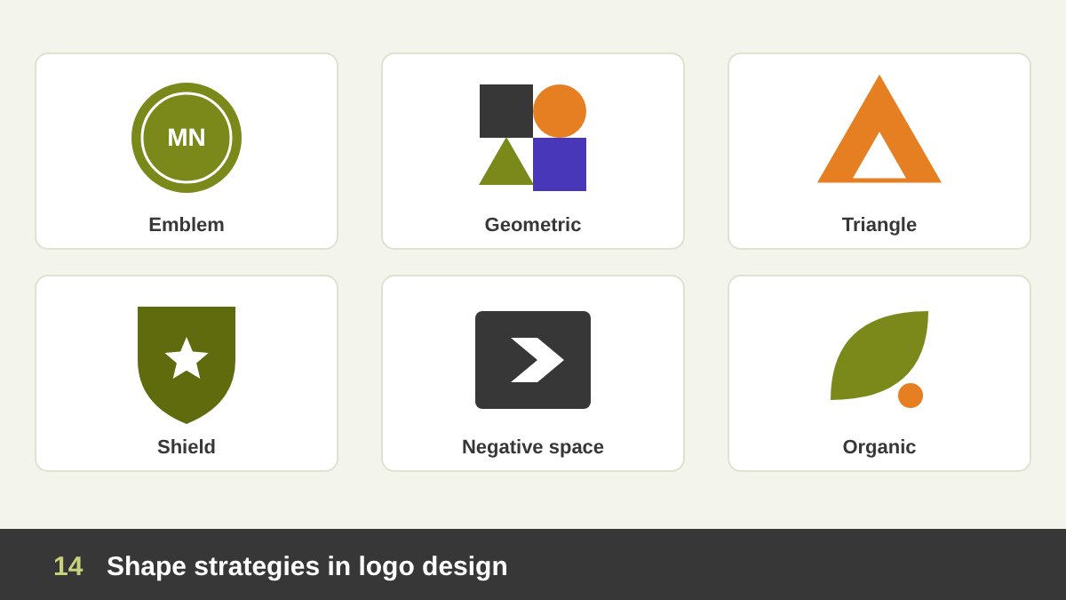
Most memorable logos are built on one strong shape. A circle, a square, a triangle, a shield or an organic form gives the logo its silhouette, and that silhouette is what people remember. It is also what makes a logo work very small, as an app icon, a favicon or an embroidered badge. Simplicity of shape is one of the qualities I explain in What Makes a Good Logo Design.
Common shape strategies in logos are: emblems and badges (a symbol or name inside a circle, shield or crest, classic and trustworthy); geometric symbols (a mark built from simple shapes, modern and scalable); negative-space logos (a second shape hidden between the main shapes, clever and memorable); organic marks (leaves, drops, hand-drawn forms, warm and natural); and overlapping shapes (two or more shapes intersecting to express connection or partnership).
A tip I always share: design the logo in solid black first, with no colour, gradient or effect. If the shape is not strong in black on white, colour will not save it. Then test it tiny. A logo is only one part of a brand, as I explain in Branding vs Logo Design, but its core shape often becomes the base of the whole identity: patterns, frames, icons and even the shape of photos can all grow from it.
Shape in Web and UI/UX Design
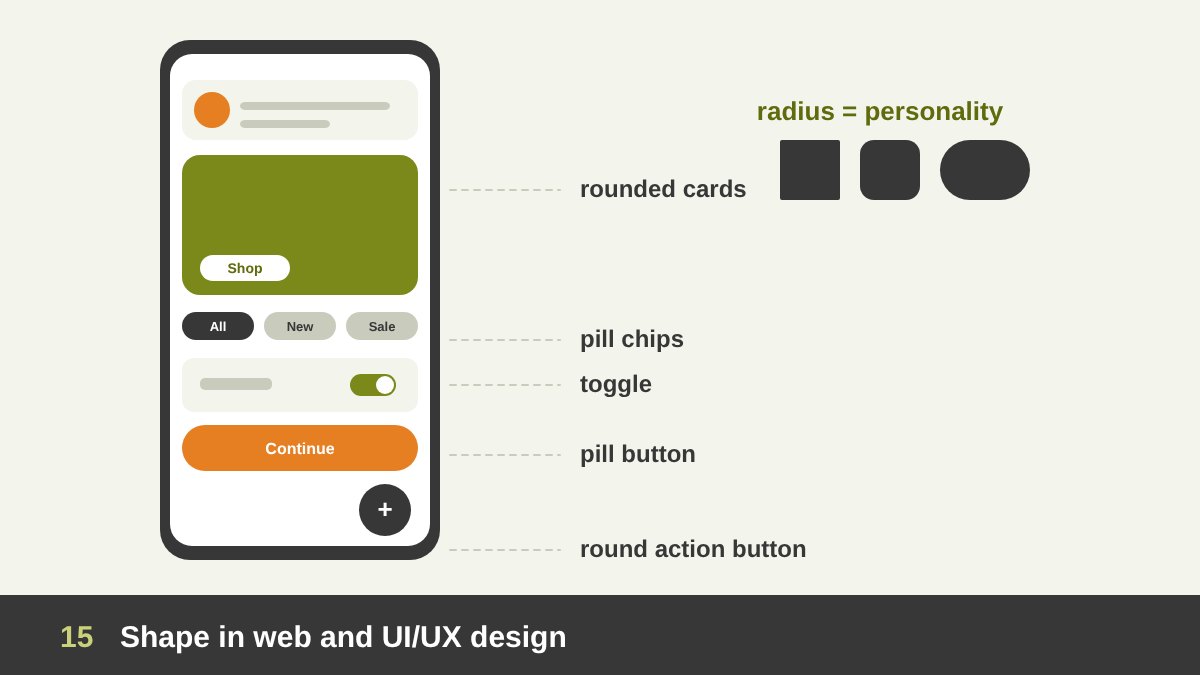
Interfaces are built from shapes, and in UI, shape is also communication. Users have learned that a rounded rectangle with a label is a button, a small pill is a tag or chip, a circle with a photo is a person, a toggle is a pill with a circle inside, and a floating round button is the main action on the screen. These conventions are called affordances: the shape tells you what you can do with it.
The corner radius is one of the strongest brand decisions in a digital product. Sharp corners feel professional and technical; medium corners feel neutral and friendly; full pill shapes feel playful and soft. Many design systems define the radius as a token (for example 4, 8 and 16 px) and use it everywhere so that the product feels consistent.
Shape also guides users through a flow: the main call to action can be the only filled shape on the screen while secondary actions are outlined; progress steps can be circles connected by lines; and selected states can change the shape, for example from an outline to a filled pill. My advice: never break shape conventions just to look different. A link that looks like a button, or a button that does not look clickable, costs you users.
Shape Language in Illustration and Character Design
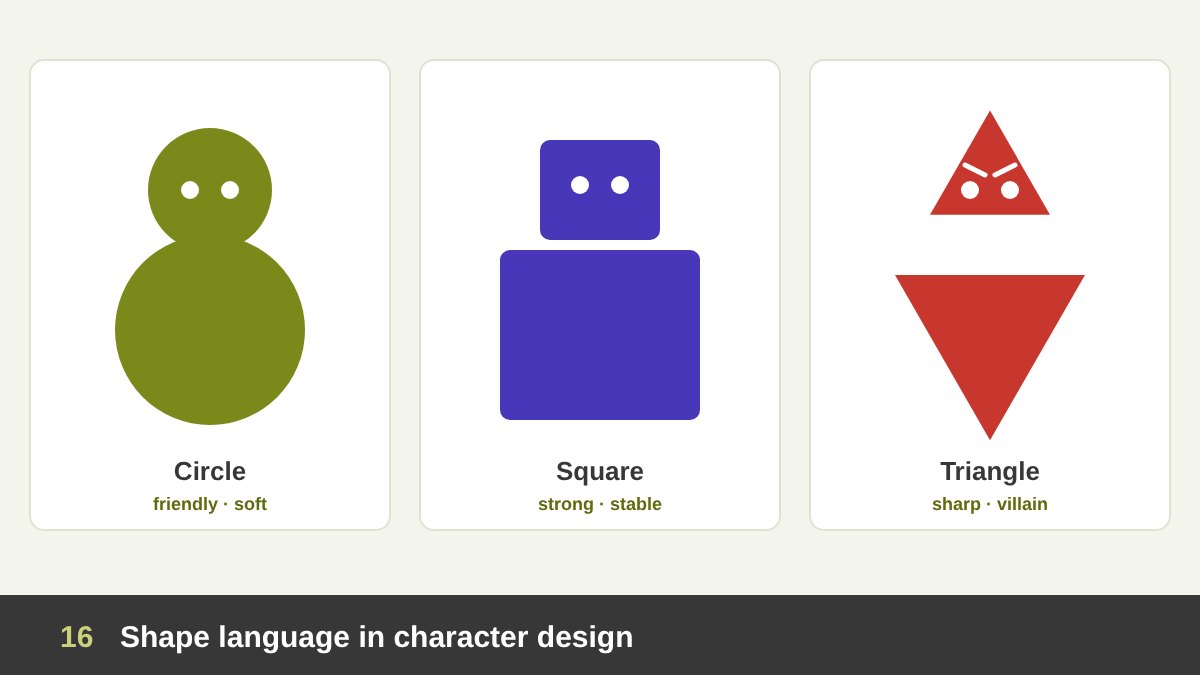
Illustrators, animators and game designers use a concept called shape language: building characters and objects from basic shapes so that their personality is clear before any detail is added. Circle-based characters feel friendly, cute, soft and harmless. Square-based characters feel strong, stable, dependable and stubborn: heroes, protectors, the strong friend. Triangle-based characters feel sharp, energetic, cunning or dangerous, which is why so many villains have pointed chins, sharp shoulders and angular hats.
Good character designers mix shapes on purpose: a big square body with a small round face can feel like a gentle giant; a round character with sharp eyebrows can feel cute but mischievous. The silhouette test I mentioned earlier is essential here: fill your character with black, and if you can still recognise it and feel its personality, the shape language works.
This is not only for cartoons. Brand mascots, illustrations for websites, infographics characters and even product shapes follow the same rules. As a drawing teacher, I always ask students to start a figure or an object with simple shapes before any line or detail. Shape first, detail last.
Shape in Patterns: Islamic Geometry, Memphis and Brand Patterns
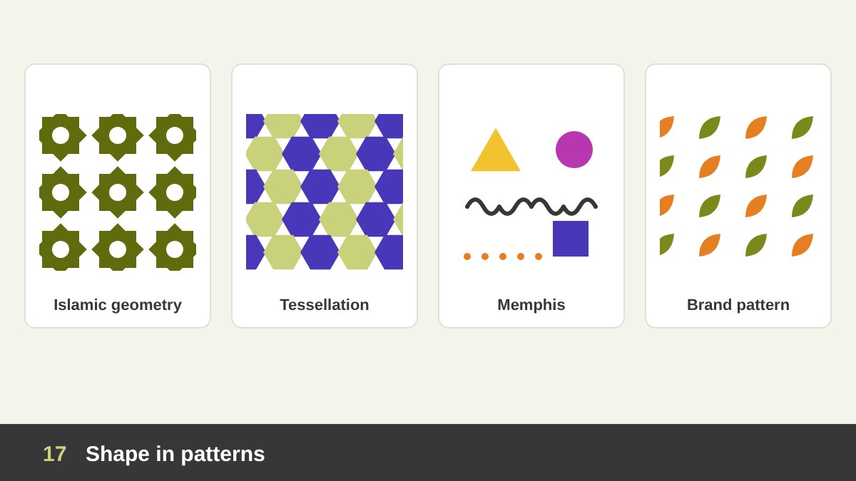
When shapes repeat, they become patterns, and patterns create texture, rhythm and identity. The most sophisticated shape patterns in history are probably the geometric patterns of Islamic art, which we see in mosques, palaces, mashrabiya screens and old Cairo houses. They are built from circles divided into equal parts, which produce stars, polygons and interlacing bands that can repeat forever.
Tessellations are shapes that fit together without gaps, like hexagons in a honeycomb or squares in a floor; the Dutch artist M. C. Escher took them to another level by tessellating birds, fish and lizards. At the opposite extreme, the Memphis style of the 1980s mixed squiggles, triangles, dots and bright colours in a deliberately playful, chaotic way, and it keeps returning in social media and packaging.
For brands, a pattern built from a logo shape is one of the most useful assets: it can fill a background, wrap packaging, decorate a booth or animate a social media post while staying recognisable. When I design an identity, I usually extract one or two shapes from the logo and turn them into a pattern system, because it gives the brand a voice even when the logo itself is not shown.
Real Example: Saul Bass’s Anatomy of a Murder (1959)
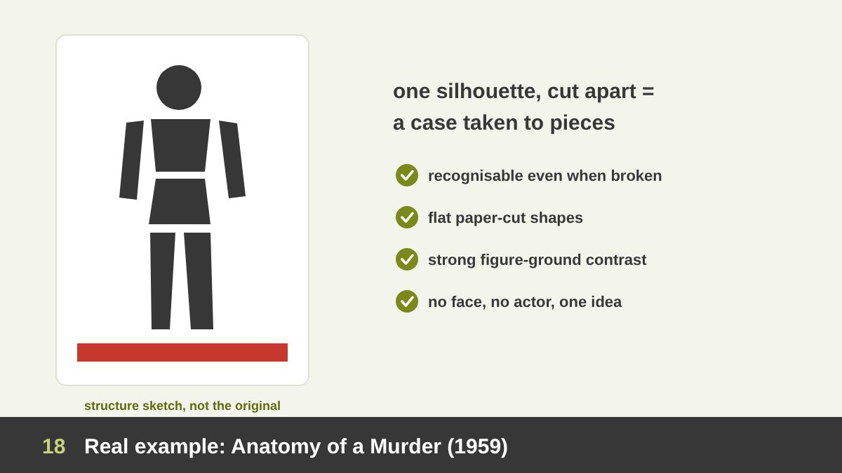
Now let’s look at real designs built on shape and analyse why they work. The first is the identity for Otto Preminger’s courtroom drama Anatomy of a Murder (1959), designed by Saul Bass, the designer whose line-based Vertigo poster I analysed in the line article. You can read about the film and see its poster on Wikipedia; the image here is my own structure sketch of how its shapes work.
The whole design is one idea: a black silhouette of a body, cut into separate, flat pieces, like a puzzle or like evidence laid out on a table. There is no face, no actor, no scene. The flat paper-cut shapes, the strong figure-ground contrast and the slightly uneven hand-cut letters make it feel raw and modern. The same shapes moved and assembled in the animated title sequence Bass created for the film.
Why it works: the silhouette is instantly recognisable even when it is broken; the cut between the pieces tells the story of a case being taken apart, piece by piece; and the extreme reduction makes the shape impossible to forget. Lesson for us: a single shape, changed in one meaningful way, can carry the whole concept.
Real Example: Shigeo Fukuda’s Victory 1945 (1975)
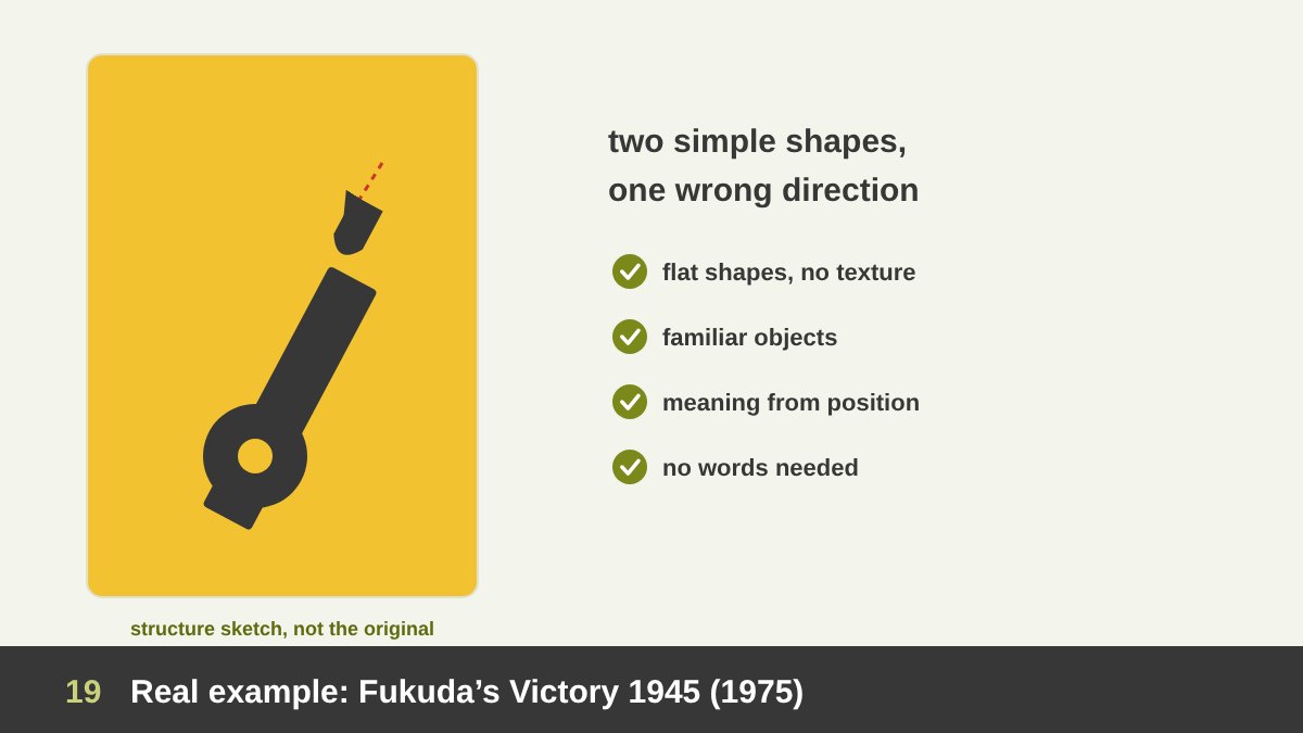
The Japanese designer Shigeo Fukuda was a master of visual wit with simple shapes. His poster Victory 1945, made in 1975, thirty years after the end of the Second World War, shows a projectile heading straight back into the opening of a cannon’s barrel. According to the New York Art Directors Club, it won him the grand prize at the 1975 Warsaw poster competition, whose proceeds went to a peace fund (more about Fukuda).
Everything in the poster is a flat, simple shape: the barrel, the wheel, the shell. There are no textures, no shadows and almost no text. The meaning comes from one small change in the relationship between two shapes: the shell flies in the wrong direction. War turns against itself. The viewer understands the message in a second and keeps thinking about it much longer.
Why it works: simplified shapes remove everything that distracts from the idea; the shapes are so familiar that we immediately notice when something is wrong; and the poster uses shape plus position to tell a story, without a single word of explanation. Lesson: when you have a strong idea, the simplest shapes deliver it best.
Real Example: Matisse’s The Snail (1953)
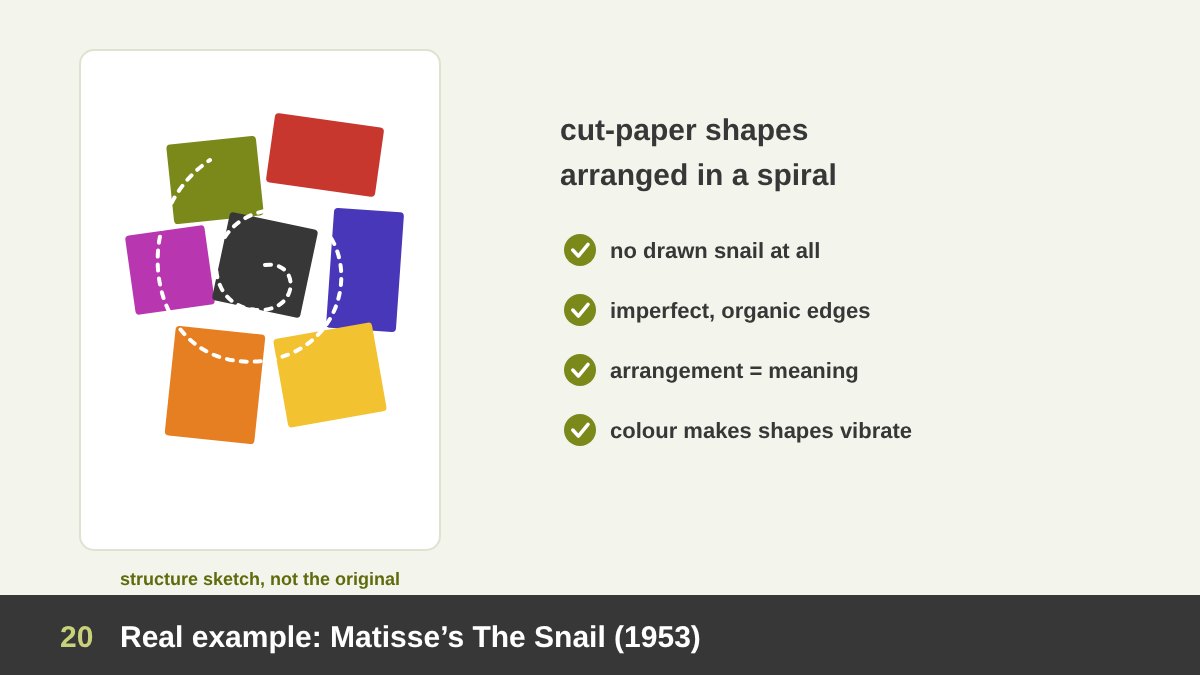
Shape is a painter’s tool too. In the last years of his life, when illness made painting difficult, Henri Matisse started “drawing with scissors”: he cut shapes out of paper painted with gouache and arranged them on large sheets. One of the most famous results is The Snail (1953), now at Tate in London.
There is no drawn snail in the picture. Instead, large coloured shapes, some almost rectangular and some irregular with torn and cut edges, are arranged so that they turn in a spiral around the centre, like a snail’s shell. The idea of the snail comes from the arrangement of shapes, not from their outline.
Why it works: it proves that organic, imperfect shapes can be monumental; the arrangement of shapes creates movement and meaning by itself; and colour contrast between neighbouring shapes makes each one vibrate. Matisse’s cut-outs influenced posters, textiles, album covers and today’s trend for paper-cut and blob-shaped illustrations. Lesson: you can tell a story with how shapes are placed together, not only with what each shape is.
Real Example: Malevich’s Black Square (1915)
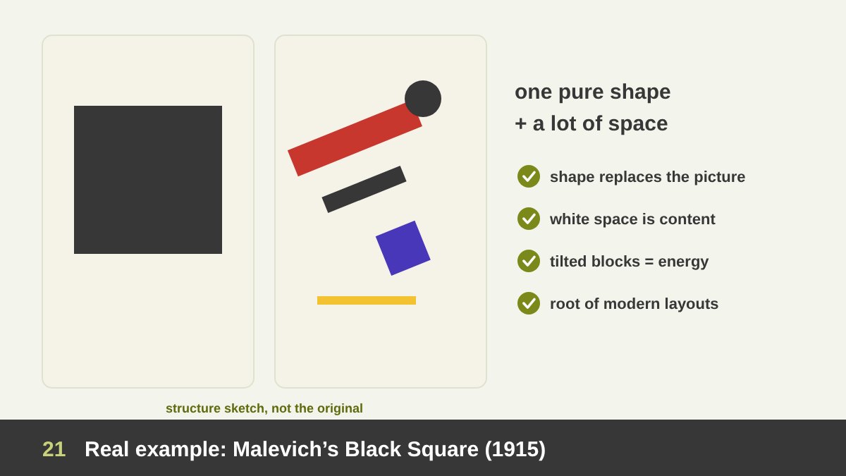
In 1915, the Russian artist Kazimir Malevich exhibited a painting of a black square on a white background in Petrograd and called the movement it started Suprematism (about the painting). It was hung high in the corner of the room, the place where a religious icon would traditionally hang in a Russian home. It was a statement: a pure shape could replace the picture of something.
After Black Square, Malevich and his followers painted compositions of floating geometric shapes, rectangles, circles, crosses and lines, set at diagonals in white space. These works, together with Russian Constructivism, had a direct influence on modern graphic design: on posters, on asymmetric layouts, on the use of bold geometric blocks and diagonals, and later on the Bauhaus and the Swiss style.
Why it matters for designers: it shows that a single shape can hold attention if it is placed with intention; that white space is part of the composition; and that tilted geometric shapes create energy without any illustration. Many modern minimalist logos, posters and websites are, in a way, descendants of this square. Lesson: never underestimate the power of one simple shape and a lot of space.
Real Example: The FedEx Logo and Its Hidden Arrow (1994)
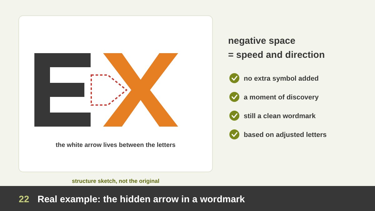
The FedEx wordmark, designed in 1994 by Lindon Leader at Landor Associates, is probably the most famous example of negative space in a logo (more about FedEx). Look at the space between the “E” and the “x”: it forms a right-pointing white arrow.
The arrow was not an accident. The letterforms were adjusted, based on the typefaces Univers and Futura, so that the white space between the letters would form a clean arrow. Leader said the logo promoted FedEx as getting from point A to point B reliably, with speed and precision. Many people use the logo for years without noticing the arrow; once someone shows it to them, they can never stop seeing it.
Why it works: the negative shape carries the brand idea (speed, direction, delivery) without adding a single extra element; it rewards attention with a moment of discovery; and the logo stays a simple, readable wordmark for people who never notice. Lesson: before adding a symbol to a logo, look at the shapes that already exist between your letters and elements.
Real Example: Mastercard and the Olympic Rings
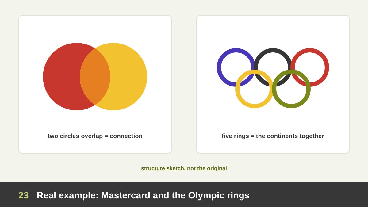
Two of the most recognised symbols in the world are built from nothing but circles. According to Pentagram, which redesigned the Mastercard identity in 2016, the brand mark has relied since 1968 on two interlocking circles in red and yellow. The overlap expresses connection, and the circles suggest inclusiveness and accessibility. In the redesign, the overlap colour sits between the red and the yellow, so the circles feel transparent. The symbol is now strong enough to be used without the name.
The Olympic rings were designed by Pierre de Coubertin, founder of the modern Olympics; five interlocking rings stand for the union of the continents. A detail Egyptian readers will love: according to the history of the Olympic symbols, the Olympic flag was first raised in Alexandria, at the 1914 Pan-Egyptian Games, before it flew at the Antwerp Games in 1920.
Why they work: the circle already means unity, completeness and the world; overlapping or interlocking circles add the idea of connection and partnership; and the shapes are so simple that a child can draw them from memory. Lesson: when your message is about people or things coming together, overlapping shapes may say it better than any illustration.
Real Example: The WWF Panda and the Power of Closure
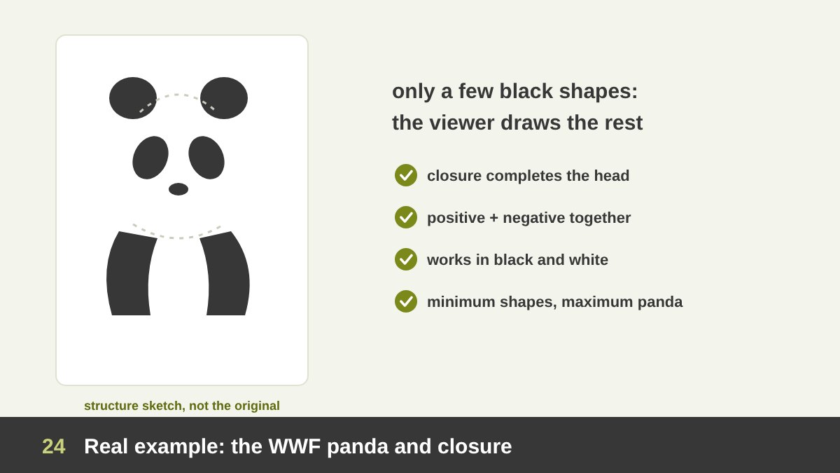
The WWF panda is a perfect lesson in implied shape. The original panda was drawn in 1961 by the naturalist Sir Peter Scott, one of WWF’s founders, inspired by Chi Chi, a giant panda living at London Zoo at the time. Over the years it was simplified into today’s version, made of a few solid black shapes (about WWF).
Look closely and you notice that large parts of the panda are not drawn. The outline of the white head and back is missing; the black ears, eye patches, arms and legs are separate shapes. Our brain uses the Gestalt principle of closure to connect them and “see” the whole animal. The panda also works well in black and white, which keeps reproduction simple and affordable.
Why it works: it uses positive and negative shapes together; it invites the viewer to complete the image, which makes it memorable; and it is reduced to the minimum number of shapes that still say “panda”. Lesson: you can often remove more than you think. Let the viewer finish the shape.
Social Media Designs Built on Shape: Six Techniques
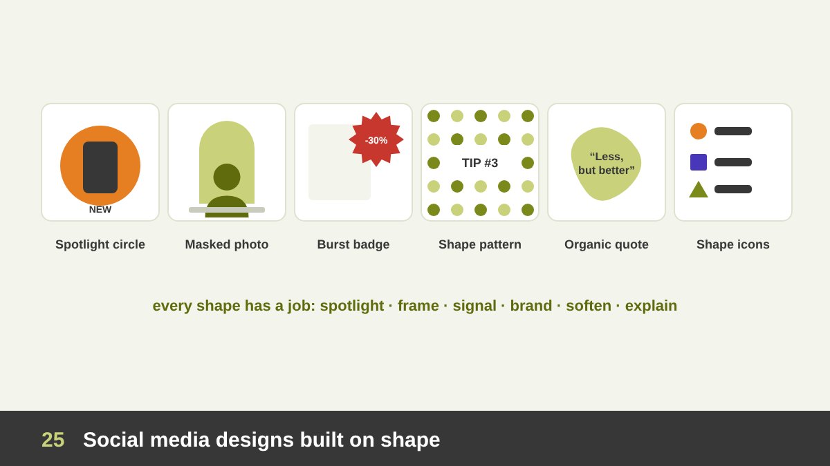
Shapes are perfect for social media because they read instantly on a small screen and give a feed a consistent look. These six sample posts, which I designed for this article, show the techniques I use most and why each one works.
1. The spotlight circle: a large bright circle behind a product or a face separates it from the background and becomes the focal point of the post. 2. The masked photo: a photo inside an arch, a circle or a blob instantly gives the feed a recognisable personality. 3. The burst badge: a star or burst shape with a price or a discount attracts the eye like a sticker and says “offer” without reading.
4. The geometric pattern background: a pattern built from the brand’s shapes makes even a text-only post feel branded. 5. The organic blob quote: soft blob shapes behind a quote make educational or wellness content feel warm and approachable. 6. The shape-icon infographic: simple shape icons (circles, squares, triangles) replace bullet points and make a list easier to remember. Notice that in every post the shape has a job: to spotlight, frame, signal, brand, soften or explain.
Analysing a Shape-Based Instagram and LinkedIn Carousel
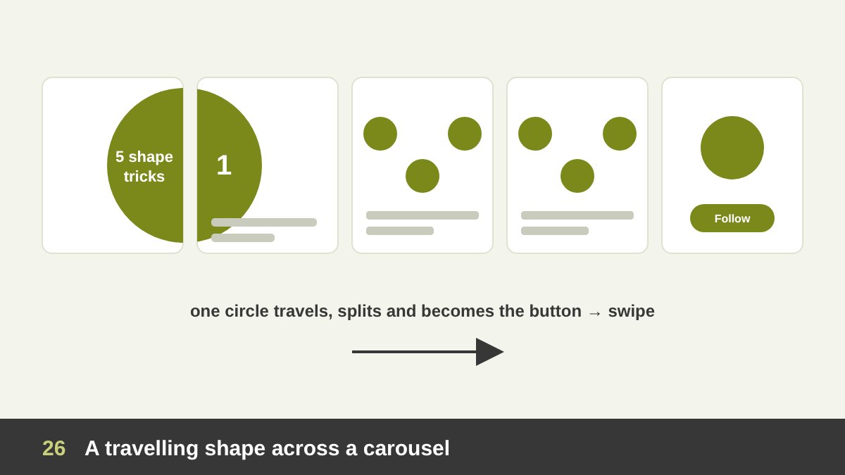
One of the most effective shape techniques on Instagram and LinkedIn is the travelling shape carousel: one shape, often a circle, appears on the cover and then moves, grows, splits or transforms on each slide. When half of the shape is cut by the right edge, the viewer’s brain wants to see the complete shape (closure again), so they swipe.
In the sample above, the shape has three jobs. On the cover it is a big circle holding the title, cut by the right edge to invite the swipe. On the middle slides it splits into smaller circles that hold each point, so the carousel feels like one story, not separate slides. On the last slide it becomes a round button for the call to action (follow, save, visit the website), so the shape that started the story also ends it.
Tips if you design one: choose one simple shape from your brand; plan the carousel as one long canvas and then cut it into slides; keep the shape’s colour consistent; and make sure each slide still works on its own. I use the same idea when I present design work to clients: one visual element that connects the story from beginning to end.
Common Mistakes When Using Shape
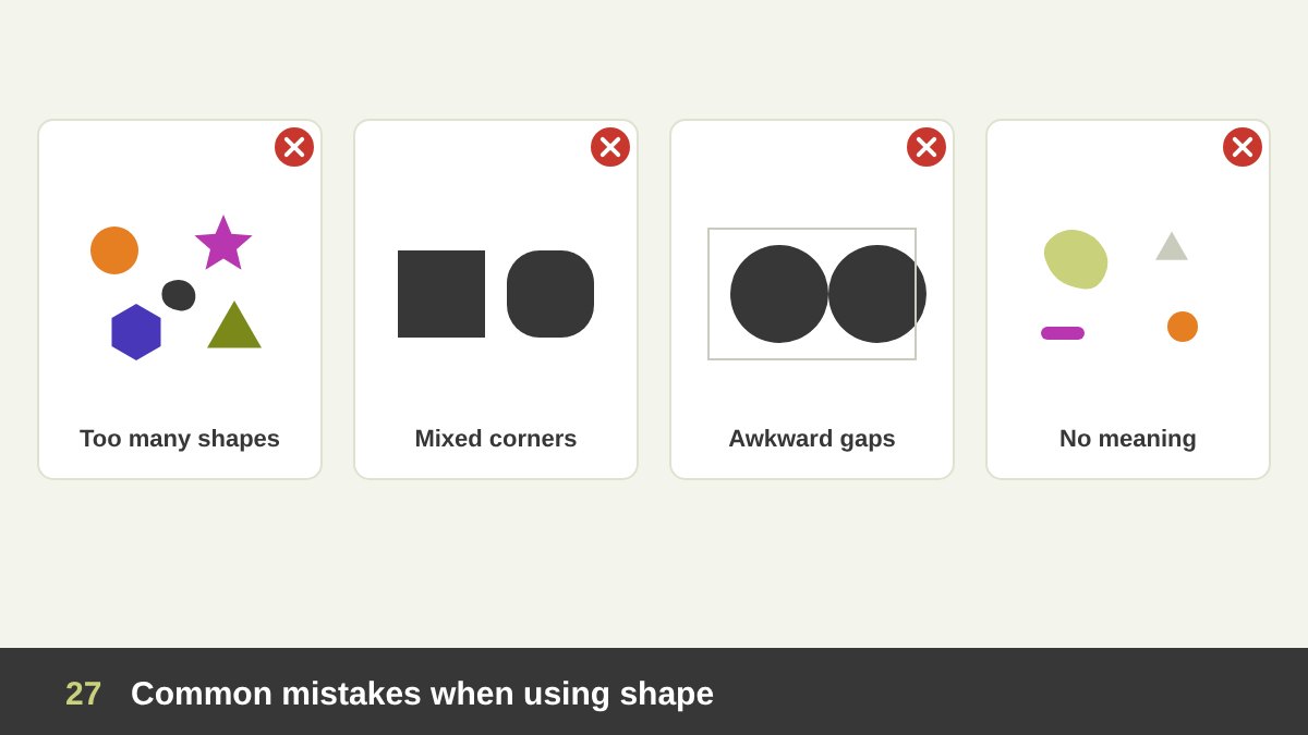
After years of reviewing students’ and junior designers’ work, these are the shape mistakes I see most often. Too many different shapes: circles, stars, hexagons, blobs and rectangles in one design, each with a different style. The result looks random. Choose one main shape family and one accent.
Inconsistent corners and edges: cards with 4 px corners next to buttons with 20 px corners, sharp icons next to rounded ones. Decide a radius system and stick to it. Ignoring negative space: designing the objects but not the space between them, so the gaps form awkward slivers, tangents (shapes that just touch) and trapped spaces. Look at the empty areas as shapes too.
Shapes with no meaning: decorative blobs, random triangles and floating circles added because the layout “feels empty”. Every shape should have a job: frame, group, highlight, signal or express. Weak silhouettes: logos and icons whose shape is unclear when they are small, filled black or seen from a distance. Always test the silhouette. And finally, breaking UI conventions: clickable things that do not look clickable, and decorative shapes that look like buttons.
How to Use Shape in Your Next Design: A Practical Checklist
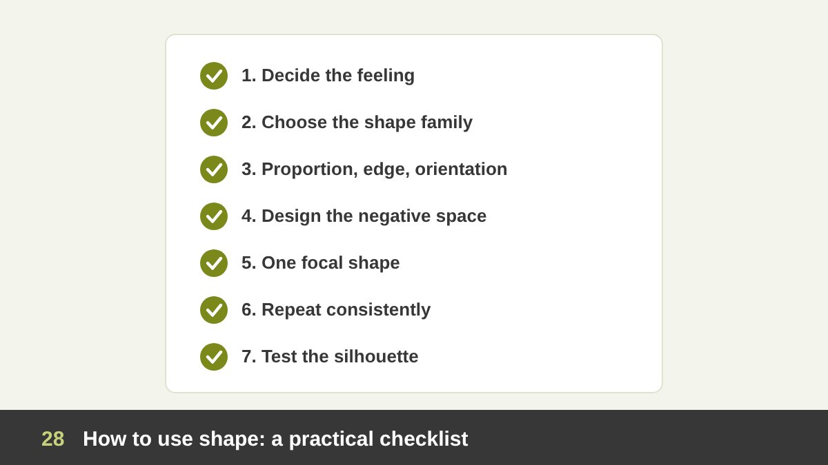
Here is the process I follow, and teach, whenever shape plays a role in a design. 1. Decide the feeling first. Friendly, stable, dynamic, natural, premium, playful? 2. Choose the shape family. Circles for unity and friendliness, squares for trust and order, triangles for energy and direction, organic shapes for warmth and nature. 3. Choose proportion, edge and orientation. Wide or tall, sharp or rounded, level or tilted, and keep these decisions consistent.
4. Design the negative space. Look at the empty areas as shapes and make them balanced and intentional. Ask whether a second idea could live in them. 5. Create one focal shape. Make the most important shape the most different, the biggest or the brightest, and keep the others supporting it. 6. Repeat consistently. Use the same shapes for containers, masks, icons and patterns so the design feels like a system.
7. Test it. Fill your main shapes with black and check the silhouette, view the design very small, and look at it on a phone. Shapes that become unclear need to be simplified. Shape is the element people recognise first, so mastering it changes everything else you do. If you would like help with a logo, a poster, a social media identity or a website built on clear, confident shapes, take a look at my portfolio or get in touch.
| Shape | What it communicates | Where to use it |
|---|---|---|
| Circle / ellipse | Unity, friendliness, completeness, community | Community, global and social brands, avatars, badges, focal points |
| Square / rectangle | Stability, trust, order, honesty | Corporate, finance, layouts, cards, structure |
| Rounded rectangle | Friendly order, approachability | Buttons, app icons, cards, tech and service brands |
| Triangle | Direction, energy, progress, risk | Sports, launches, warnings, play buttons, arrows |
| Hexagon | Efficiency, connection, science | Technology, chemistry, networks, patterns |
| Shield / pentagon | Protection, security, tradition | Security, insurance, sports clubs, universities |
| Star / burst | Excellence, celebration, offers | Ratings, awards, sale badges, festive content |
| Organic | Nature, warmth, humanity, creativity | Food, beauty, wellness, kids, eco and lifestyle brands |
| Abstract / icon | Clarity, quick recognition | Icons, pictograms, wayfinding, logos |
| Negative space | Cleverness, discovery, elegance | Logos, posters, minimalist layouts |
| Implied shape | Engagement, memorability | Logos, posters, carousels, minimal illustrations |
Shape in Design: Frequently Asked Questions
What is shape in design?
Shape is one of the basic elements of design. It is a closed, two-dimensional area with a boundary, created by a line that closes on itself or by contrast of colour, value or texture. Designers use shapes to build logos, icons, letters and layouts, to create focal points and hierarchy, to group content and to express feelings.
What are the main types of shapes in design?
The main types are geometric shapes (circles, squares, rectangles, triangles, polygons and stars), organic shapes (irregular, natural, free-flowing), abstract and symbolic shapes (icons, pictograms, silhouettes), positive and negative shapes (figure and ground), and implied shapes that the brain completes through Gestalt principles such as closure.
What do different shapes mean psychologically?
Circles usually feel friendly, complete and inclusive; squares and rectangles feel stable and trustworthy; triangles feel dynamic and directional, and sometimes dangerous; organic shapes feel natural and human; sharp shapes feel tense or exciting and rounded shapes feel soft and safe. Research such as the bouba/kiki effect supports these links, but culture and context always matter.
What is the difference between shape and form?
A shape is two-dimensional: it has width and height but no depth, like a circle or a square. A form is three-dimensional, or looks three-dimensional through light, shadow and perspective, like a sphere or a cube.
What is negative space in design?
Negative space is the empty area around and between the main shapes of a design. It is also a shape, and good designers plan it carefully. It gives a design breathing room and balance, and it can hide a second image, like the arrow between the E and the x in the FedEx logo.
How do I use shapes in social media design?
Give every shape a job: a big circle to spotlight a product, a masked photo in an arch or circle for personality, a burst badge for offers, a pattern built from brand shapes for consistency, soft blobs for warm educational content, and one travelling shape across carousel slides to encourage swiping. Keep shapes and corner radius consistent across the feed.
Leave a Reply