
What Makes Good Logo Design?
Almost every week someone sends me a logo and asks: “Is this good?” Usually the person likes it, the colors are nice and the shape is clean. But liking a logo is not the same as the logo working. After many years of designing identities for companies, shops, horse studs, jewelers and startups, I can tell you that good logo design is not about taste. It is about a few clear qualities, the right type for the brand, and, most of all, a concept behind the shape.
In this guide I explain the qualities every logo needs, the main types of logos and when to use each one, the technical specs a professional logo must come with, and why a logo without an idea is just decoration. I will also show you how I build a concept in my own projects, step by step. Here is the short version before we start:
Key takeaways
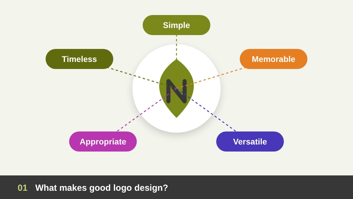
- A good logo is simple, memorable, versatile, appropriate and timeless. If it fails one of these, it will cost the brand later.
- There are seven main logo types: wordmark, lettermark, pictorial mark, abstract mark, mascot, combination mark and emblem.
- A logo is not a nice shape. It is a visual idea built from research about the brand, its audience and its competitors.
- A professional logo is delivered as a system: vector files, color codes, versions, clear space and minimum size.
A Logo Is a Signature, Not a Picture of Your Business
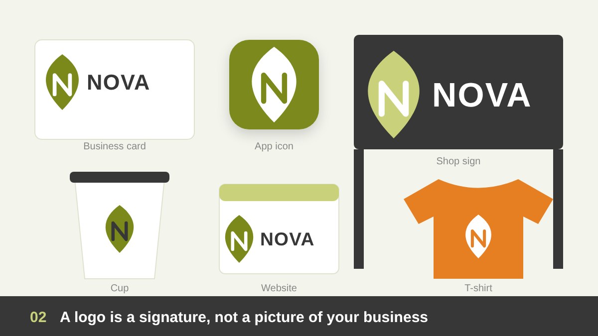
The first thing to understand is what a logo is supposed to do. A logo does not have to explain everything about your business. A dentist’s logo does not need a tooth, and a car company’s logo does not need a car. Think of it like a signature: its job is to identify you, quickly and consistently, wherever people see you. Meaning grows over time, as people connect the mark with their experience of the brand.
That is why the logo is only one part of a bigger picture. Your colors, typography, photography, tone of voice and customer experience together make the brand, and the logo is the most concentrated symbol of it. If this difference is new to you, read my guide on branding vs logo design first, because it changes how you judge a logo. A logo will not save a weak brand, but a strong logo makes a good brand much easier to remember.
Quality 1 and 2: Simple and Memorable
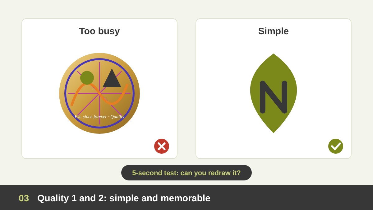
Simplicity is the first rule of good logo design, and it is also the hardest one. A simple logo is easy to recognize at a glance, easy to remember and easy to reproduce. A complicated logo with many details, gradients, small text and several ideas fighting each other becomes a blur on a phone screen. Most of the logos we all remember can be drawn from memory in a few seconds, and that is not an accident.
A good way to test this is the five-second test: show the logo to someone for five seconds, hide it, then ask them to describe or sketch it. If they remember the main shape, you are on the right track. If they only remember “something blue with lines”, the logo is too busy. Simple does not mean boring, though. The best simple logos have one clever detail, one surprise, that makes them stick in the mind. That detail usually comes from the concept, which we will get to soon.
Quality 3: Versatile and Scalable
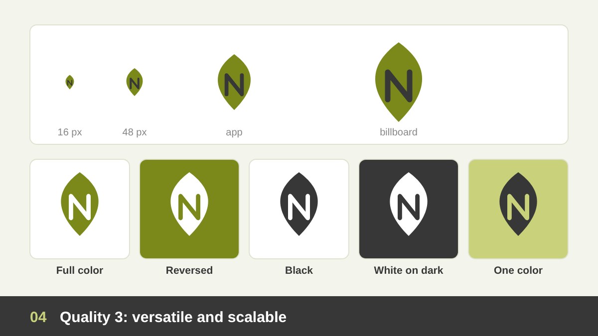
Your logo will live in places you cannot imagine on day one: a 16-pixel browser icon, a social media profile picture, an embroidered shirt, a stamp on paper, a car sticker, a huge sign on a building, and an animated intro on a video. A versatile logo works in all of them. That means it must stay clear when it is very small, look strong when it is very large, and work in one color as well as in full color.
Before I approve any logo, I check it in black only, in white on a dark background, on a photo, and at the smallest size it will ever be used. If the logo depends on a gradient, a shadow or thin lines to work, it will break somewhere. This is also why many brands have a few versions of the logo: a full horizontal version, a stacked version, and a small icon or symbol for tight spaces. Versatility is not a nice extra; it is part of the design brief.
Quality 4: Appropriate for the Brand and the Audience
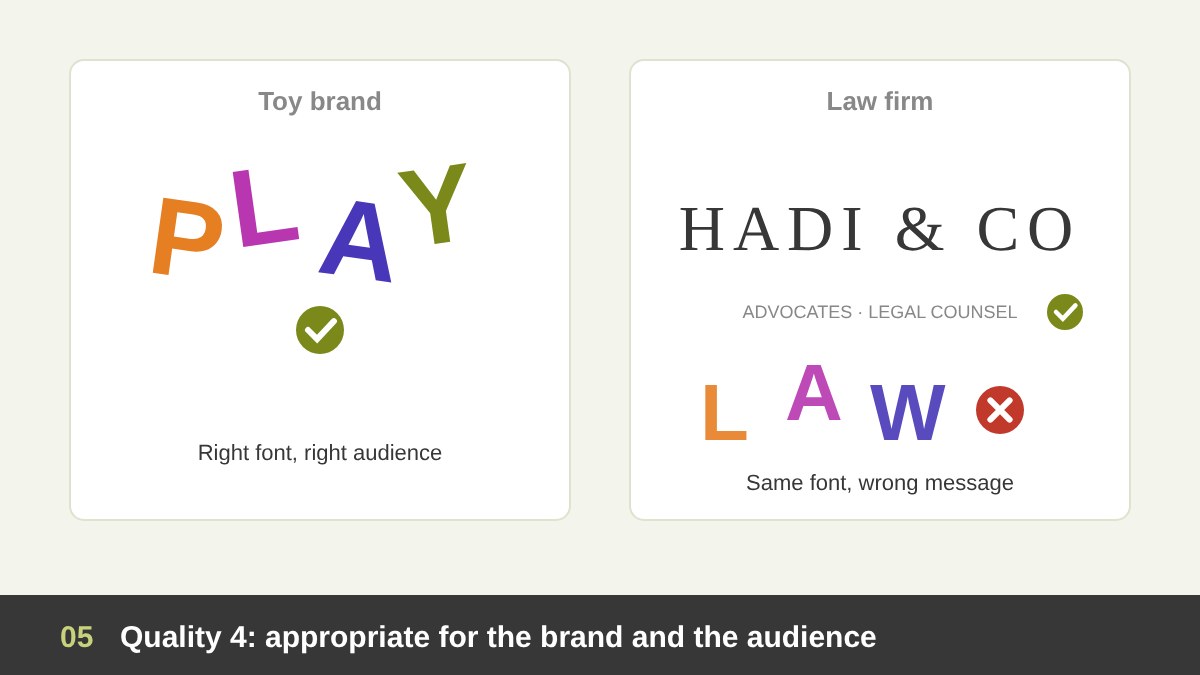
A logo must feel right for the business, the audience and the market. A playful, colorful, rounded font is great for a toy brand, and completely wrong for a law firm or a hospital. Gold and black calligraphy can feel luxurious for a jeweler, and too heavy for a fresh juice shop. The question is not “Is it beautiful?”, but “Does it say the right thing to the right people?”
Being appropriate also means respecting culture and language. In the Arab world, for example, many clients need a logo that works in Arabic and English, reads correctly from right to left, and does not use symbols or colors that carry the wrong meaning locally. It also means studying the competitors: if every company in your sector uses a blue globe, another blue globe will disappear among them. Appropriate and distinctive must go together.
Quality 5: Timeless and Distinctive
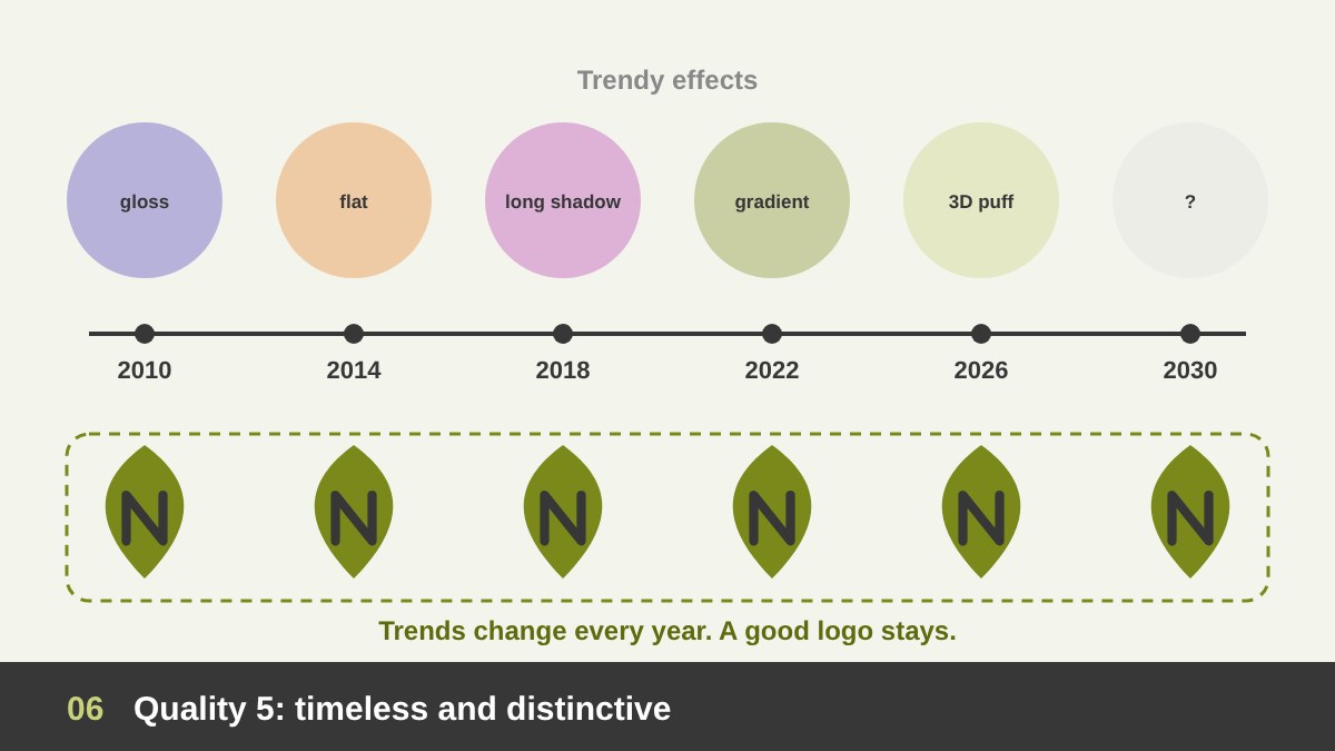
Trends come and go quickly. In just the last few years we have seen gradients, flat design, 3D effects, hand-drawn doodles and chrome type, and I wrote about many of them in my article on graphic design trends 2026. Trends are great for campaigns and social media, but a logo should be built to last ten or twenty years with only small updates. If a logo depends on this year’s effect, it will look old next year.
Distinctive is the partner of timeless. Your logo should not look like a template, a stock icon or a competitor’s mark. This is one of the biggest problems with cheap logos and AI logo generators: they are built from the most common shapes, so they look like everything else, and some may even be too close to existing trademarks. A distinctive logo is easier to remember, easier to protect legally, and more valuable to the business over time.
The 7 Types of Logos (and When to Use Each One)
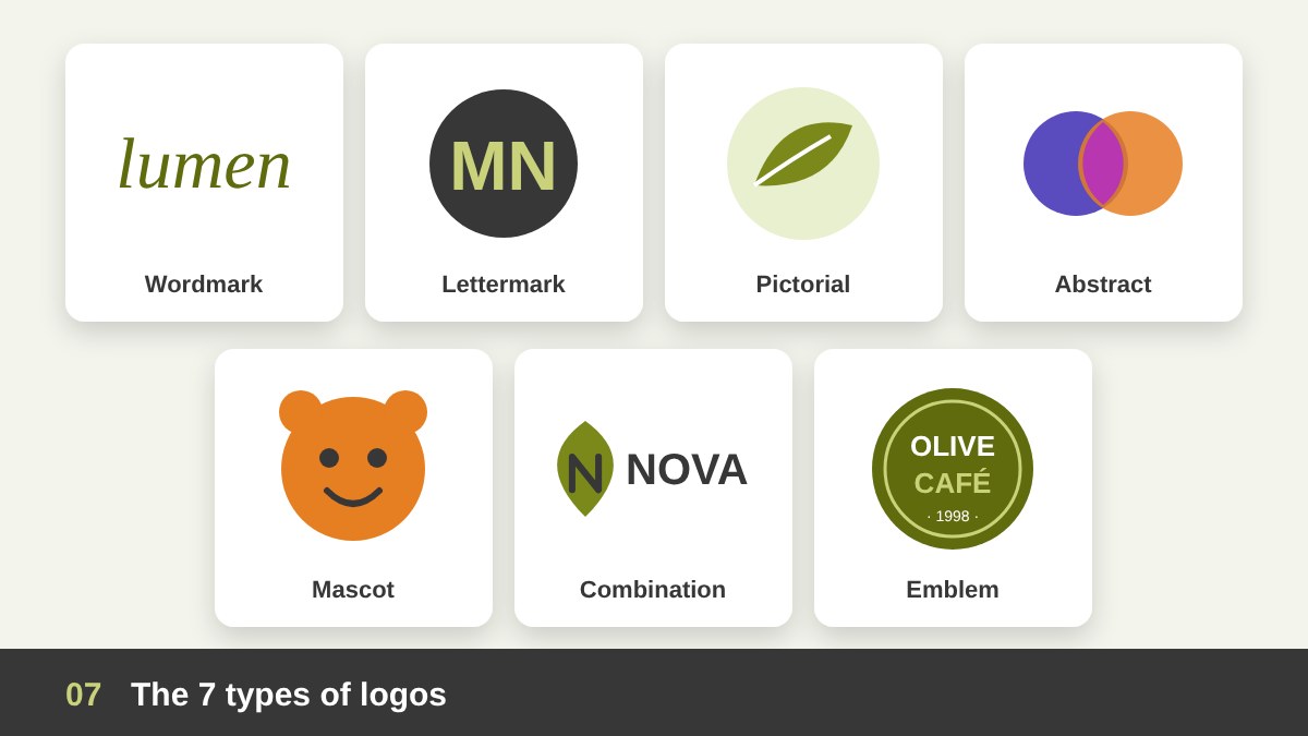
Now that we know the qualities, let us look at the main types of logos. Choosing the right type is a strategic decision, not a style choice. It depends on the length of the name, how known the brand is, where the logo will be used and the personality you want. These are the seven types designers usually work with:
1. Wordmark (logotype): the brand name written in a special font or custom lettering. Best for short, distinctive names. 2. Lettermark (monogram): initials, such as “MN”, for long names. 3. Pictorial mark: a recognizable picture, like a bird, a leaf or a horse. 4. Abstract mark: a geometric shape that expresses an idea, such as movement or connection, without showing a real object. 5. Mascot: a character that represents the brand, great for kids, food and sports. 6. Combination mark: a symbol plus the name, the most flexible and the most common choice for new brands. 7. Emblem: the name inside a badge, seal or crest, with a classic, official feel.
For a new business, I usually recommend a combination mark, because people do not know the brand yet and need to see the name, while the symbol can be used alone later on social media and app icons. Pure symbols without a name work best after the brand becomes well known. The table below compares all seven types.
| Logo type | What it is | Best for | Example idea |
|---|---|---|---|
| Wordmark | The name in a special font or custom lettering | Short, distinctive names | A name written in unique letters |
| Lettermark | Initials or a monogram | Long names, professional firms | “MN” for Mahmoud Nasr |
| Pictorial mark | A recognizable picture or icon | Known brands, app icons | A horse, a bird, a leaf |
| Abstract mark | A geometric shape that expresses an idea | Tech, finance, global brands | Shapes showing movement or connection |
| Mascot | A character that represents the brand | Kids, food, sports, gaming | A friendly animal or person |
| Combination mark | Symbol plus name, usable together or apart | New brands, most businesses | Icon on the left, name on the right |
| Emblem | The name inside a badge, seal or crest | Schools, clubs, cafés, heritage brands | A round badge with the name inside |
Arabic, Calligraphy and Bilingual Logos
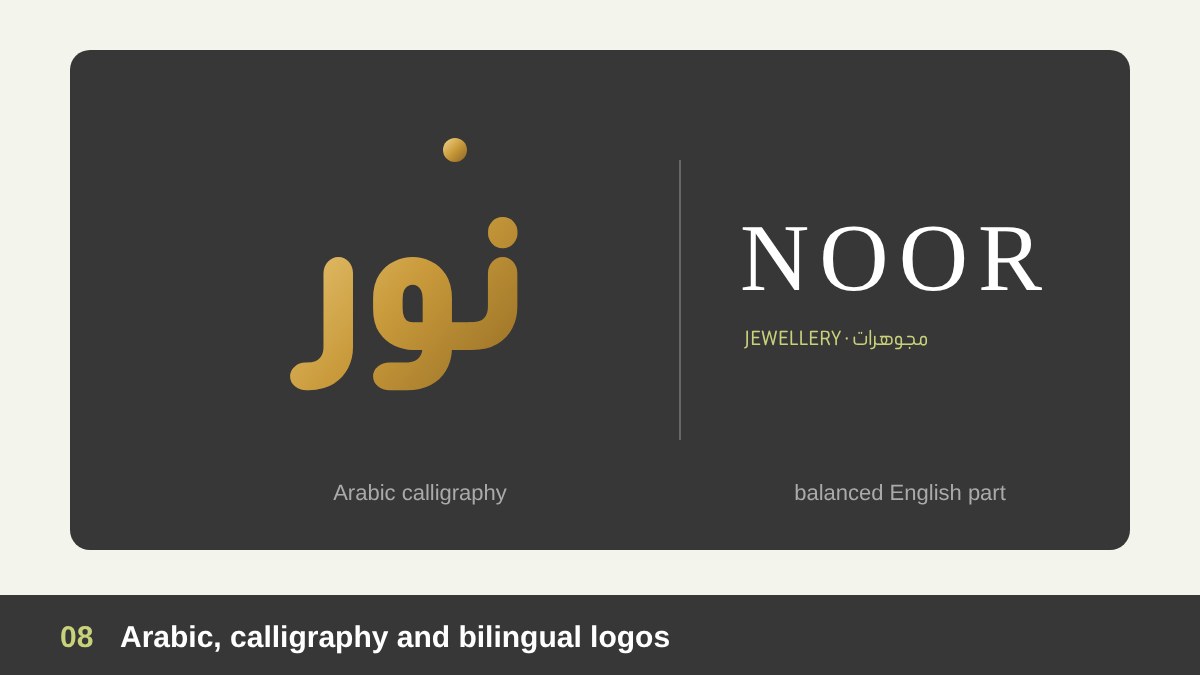
Arabic logos deserve their own section, because they open possibilities that Latin letters do not have. Arabic letters can stretch, connect, stack and flow, and in good calligraphy the word itself can become a picture. That is why a calligraphy logo is often a wordmark and a pictorial mark at the same time. It carries heritage, elegance and identity, and it is very hard to copy.
In my project for Al Malik Corporation in the UAE, the final logo is free-hand Arabic calligraphy, drawn by hand and then refined in vector. In the Naji El-Sayiegh jewelry rebranding, the client chose a calligraphy logo that feels like fine gold work. For bilingual brands, the real challenge is balance: the Arabic and English parts must have the same visual weight, the same spirit and a clear relationship, instead of looking like two different logos placed next to each other. Always design both together from the start.
Why a Logo Needs a Concept, Not Just a Nice Shape
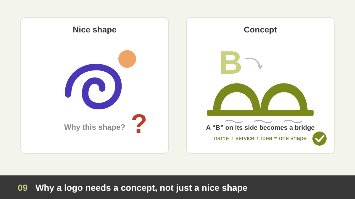
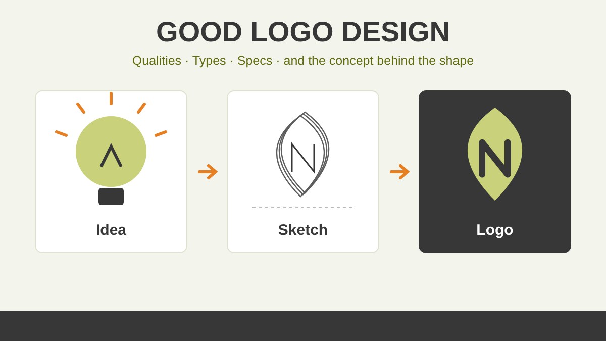
This is the most important part of this article. A nice shape can be made in five minutes. Anyone can combine a circle, a leaf and a gradient and get something that looks “professional”. But a nice shape has no reason to exist. You cannot explain it, you cannot defend it when the client asks “why?”, and it does not tell the brand’s story. It is decoration, and decoration is easy to forget and easy to replace.
A logo concept is the idea that connects the shape to the brand. It answers the question: “What is this logo saying, and why does it look this way?” The concept may come from the name, the history of the company, its values, its product, its place or its audience. When a logo has a concept, every curve and every color has a job. The client understands it, the team can present it, and customers feel it even if nobody explains it to them.
A concept also makes the design stronger technically. When you know the idea, it becomes clear what to keep and what to remove, so the logo becomes simpler and more distinctive at the same time. In other words, the concept is not an extra layer on top of good logo design. It is the reason good logo design works.
How I Build a Logo Concept: From Research to Final Mark
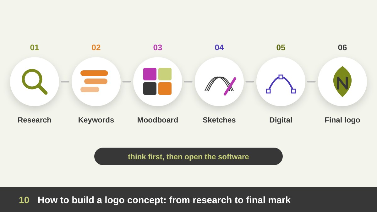
So where does a concept come from? Not from waiting for inspiration. In my work it comes from a clear process: research about the business, its audience and its competitors; a short list of keywords that describe the brand’s personality; a moodboard that sets the visual direction; then many quick hand sketches before I open any software. Only the strongest ideas move to the computer, where they are refined, tested and presented.
A good example is my logo for Maulana Stud, a stud farm for purebred Arabian horses. The keywords were heritage, pride and nobility. Instead of placing a horse drawing next to the name, the Arabic word “مولانا” itself is drawn as the head of an Arabian horse. The name and the symbol became one idea, which is exactly what a concept should do. You can see the full journey, from sketches to stationery, leather and signage, in the case study, and more projects in my branding portfolio.
Logo Design Specs: Files, Colors, Versions and Clear Space
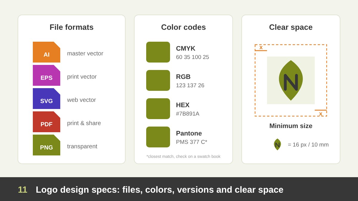
A professional logo is not one PNG file sent on WhatsApp. It is a small system that the brand will use for years, so it must be delivered with clear specs. The master logo should be designed in vector (AI, EPS, SVG or PDF), so it can be scaled to any size without losing quality. You also need PNG files with a transparent background for daily use, and an SVG for the website.
Colors must be defined precisely: CMYK for print, RGB and HEX for screens, and Pantone when exact color matching matters, such as packaging or signage. The logo should come in a few versions: full color, one color, black, white (reversed), horizontal, stacked and icon only. Finally, a simple guide should show the clear space (the empty area around the logo that nothing may enter), the minimum size, and a few examples of incorrect use, such as stretching, changing colors or adding effects. These specs protect the logo from being damaged by printers, developers and even the client’s own team.
Common Logo Design Mistakes and a Final Checklist
The most common mistakes I see are easy to avoid: too many details and fonts; following a trend instead of the brand; copying a famous logo or using stock icons; designing only in color and never testing in black and white; ignoring small sizes; forgetting the Arabic or English version; and, the biggest one, starting in the software before thinking. AI tools can help with research and quick exploration, as I explain in AI and Adobe for graphic designers, but they cannot do the thinking about your brand for you.
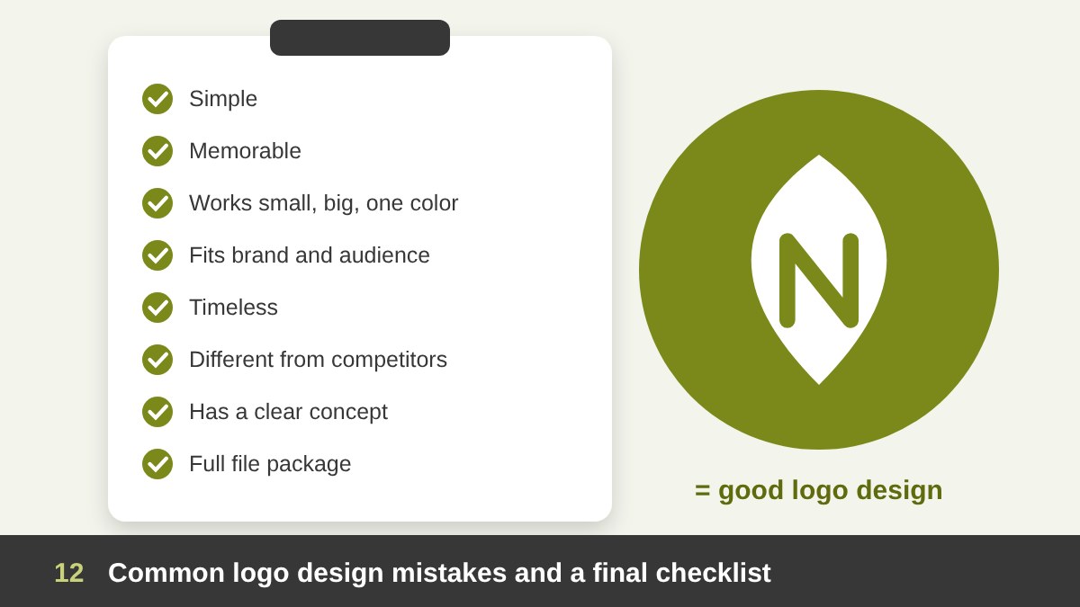
Before you approve your next logo, ask these questions: Is it simple? Will people remember it? Does it work small, big and in one color? Does it fit the brand and the audience? Will it still look right in ten years? Is it different from the competitors? Is there a clear concept you can explain in one sentence? And did you receive the full file package? If the answer to all of them is yes, you have good logo design. If you are building a new brand or updating an old logo and want a logo with a real idea behind it, get in touch with me and let us talk about your project.
Good Logo Design: Frequently Asked Questions
What makes good logo design?
Good logo design is simple, memorable, versatile, appropriate for the brand and its audience, timeless and distinctive. Most importantly, it is built on a clear concept, so the shape has a reason and tells something about the brand.
What are the main types of logos?
The seven main types of logos are the wordmark, lettermark (monogram), pictorial mark, abstract mark, mascot, combination mark and emblem. Many brands use a combination mark because the symbol and the name can work together or separately.
What is a logo concept?
A logo concept is the idea behind the logo: the reason it looks the way it does. It connects the shape, letters and colors to the brand’s name, values, story or audience, so the logo is meaningful and not just decorative.
Which file formats should a professional logo include?
A professional logo should include vector files (AI, EPS, SVG or PDF) for scaling and print, PNG files with a transparent background for daily use, and SVG for the web, in full color, one color, black and white versions, with CMYK, RGB, HEX and Pantone color codes.
Should a logo show what the business does?
Not necessarily. A logo’s main job is to identify the brand, not to describe it. A literal picture of the product can make a logo look generic. A clear concept, a distinctive shape and consistent use are more important than showing the product.
How long does it take to design a good logo?
For a professional logo with research, concepts, sketches, refinement and final files, it usually takes from two to six weeks, depending on the project size, the number of concepts and how quickly feedback comes back.