

2026 in Design: The Big Picture
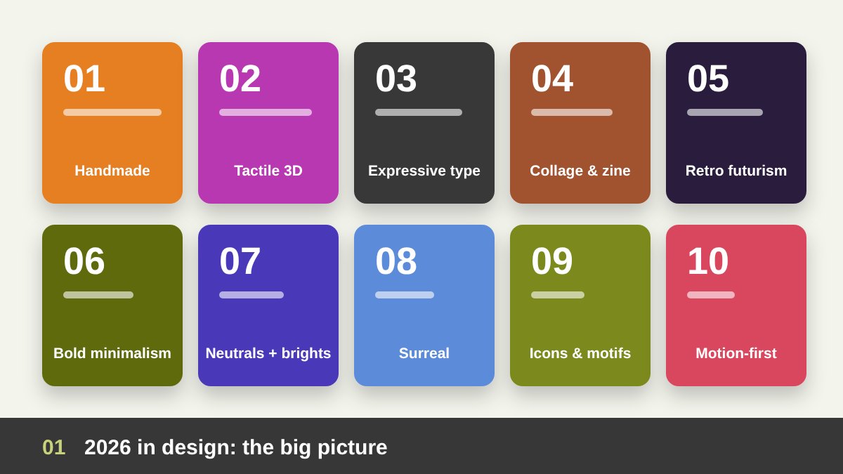
Every year has a visual mood, and 2026 had a very clear one. With AI images everywhere, people became tired of perfect, polished visuals that all look the same. Brands and designers answered by going back to the human hand: texture, imperfection, personality and real craft. Canva even named its 2026 trend report “Imperfect by Design”, and almost every major trend report this year said the same thing in different words. At the same time, the opposite trend grew too: calm, clean and confident minimalism for brands that want to feel trustworthy.
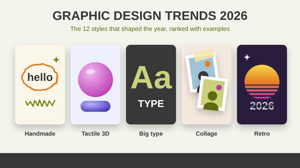
Now that we are close to the end of the year, it is a good moment to look back. In this guide I rank the graphic design trends 2026 was built on, starting with the most visible and influential ones. For each trend I explain what it looks like, why it became popular, where it works best, and how to use it without copying it. All the example images in this article are my own illustrations, drawn in a simple style to show the idea of each trend. Use the table below as a quick summary, then read the details.
| Trend | What it looks like | Best for |
|---|---|---|
| Handmade and imperfect | Doodles, scribbles, hand lettering, paper grain | Food, lifestyle, education, creative brands |
| Tactile 3D | Puffy, inflated, clay and glossy shapes | Tech, youth brands, social ads |
| Expressive typography | Oversized, stretched and custom type, serif revival | Posters, social media, editorial |
| Collage and zine | Cut-out photos, tape, stickers, editorial layouts | Events, music, fashion, storytelling |
| Retro futurism | Chrome, Y2K, 70s colors, halftone, grain | Music, fashion, food, youth |
| Bold minimalism | White space, one strong element, simple logos | Real estate, finance, premium brands |
| Soft neutrals and dopamine brights | Calm whites with vivid accents, grainy gradients | Almost any brand, as an accent |
| Surreal and uncanny | Floating objects, impossible scenes, dreamy spaces | Campaigns, album covers, launches |
| Icons, patterns and motifs | Custom icon sets, signature patterns, heritage details | Brand identity systems |
| Motion-first identities | Animated logos, kinetic type, flexible systems | Digital brands, apps, social video |
Handmade and “Imperfect by Design”
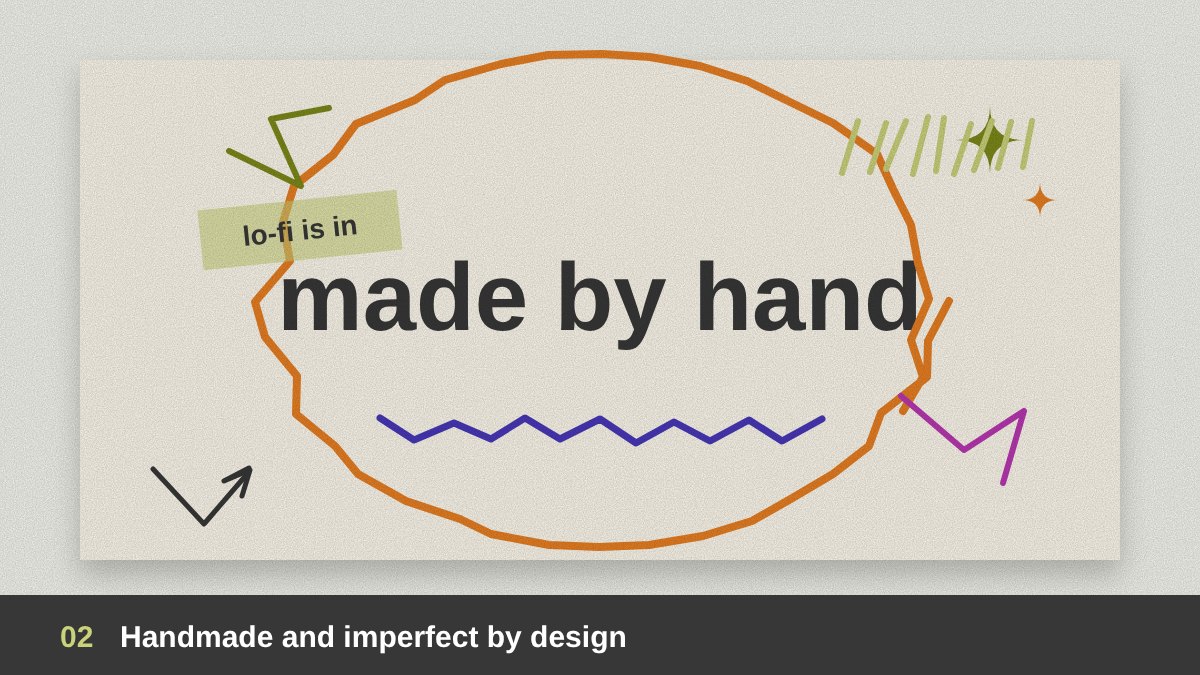
The number one trend of the year is the return of the human hand. Hand-drawn doodles, scribbles, rough brush lettering, visible pencil lines, uneven shapes and scanned paper textures appeared in branding, packaging, social media and even big tech campaigns. The message is simple: “a real person made this.” In a feed full of AI-generated images, a small imperfection became a sign of honesty and personality, and lo-fi visuals became a style of their own.
This trend has several types: doodle and scribble graphics drawn over photos, hand lettering instead of perfect fonts, naive illustration with simple childlike shapes, and analog textures such as grain, risograph print and paper. It works best for food, cafés, lifestyle, education and creative brands. As someone who comes from painting and drawing, I love this trend, but the key is control: the imperfection must be intentional, while the layout, hierarchy and readability stay professional.
Tactile 3D: Puffy, Squishy and Hyper-Real
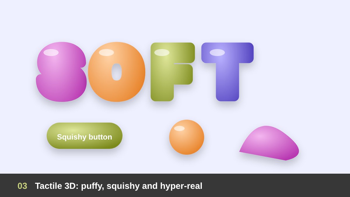
The second big trend makes you want to touch the screen. Designers used soft 3D shapes that look inflated, puffy, squishy, made of clay, jelly, plastic or fabric. Inflated letters, balloon-like icons, glossy “gummy” buttons and clay characters filled social media ads, app launches and packaging. Canva reported a strong rise in searches for tactile, realistic textures, and Adobe listed puffy and squishy textures among its key visual trends of the year.
The main types are inflated 3D typography, claymorphism (soft rounded shapes with gentle shadows), hyper-real objects with a playful twist, such as a sofa made of jelly, and material mash-ups such as chrome and fur together. Tools like Blender, Spline, Cinema 4D and Adobe’s 3D features made this style easier to produce. Use it for youthful brands, tech products, campaigns and social content, and keep it as a hero element rather than filling a whole layout with 3D.
Expressive and Experimental Typography
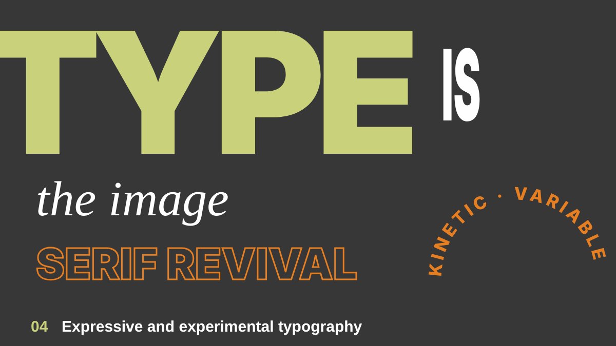
In 2026, type was not just there to be read; it was the image. Oversized words filled whole posters, letters were stretched, cut, stacked, overlapped or bent along paths, and many brands commissioned custom typefaces to own their voice. Typography carried the design even where there was no photo at all, which also makes it perfect for social media where people scroll quickly and a single strong word can stop them.
Inside this trend there are clear types: big bold sans-serif headlines, the serif revival with elegant high-contrast serifs replacing the neutral sans-serif look of the last decade, variable and kinetic type that changes weight or moves, and mixed type combining very different fonts in one line. For designers in the Arab world, this is also a great time for expressive Arabic lettering and bilingual layouts. Remember that expressive does not mean unreadable: test your headline on a phone screen before you approve it.
Collage, Scrapbook and Zine Layouts
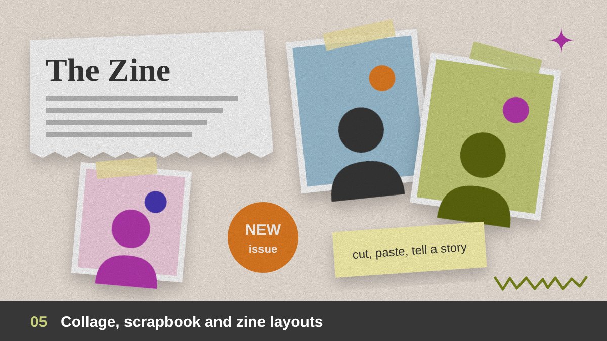
Collage was one of the fastest-growing styles of the year. Designers mixed cut-out photos, torn paper, tape, stickers, handwritten notes and bits of typography into layouts that feel like a personal scrapbook or a printed zine. Canva reported search increases of around 90% for DIY and collage elements and 85% for zine-style editorial layouts, which shows how much people wanted visuals that feel curated by a person, not generated by a machine.
Types of this trend include photo collage with cut-out people and objects, scrapbook graphics with tape, labels and notes, zine and editorial layouts inspired by small printed magazines and newsletters, and mixed media that combines photography, illustration and texture. It is excellent for storytelling: event campaigns, music, fashion, education and personal brands. The challenge is order inside the chaos, so build the collage on a hidden grid and keep one clear focal point.
Retro Futurism and Nostalgia
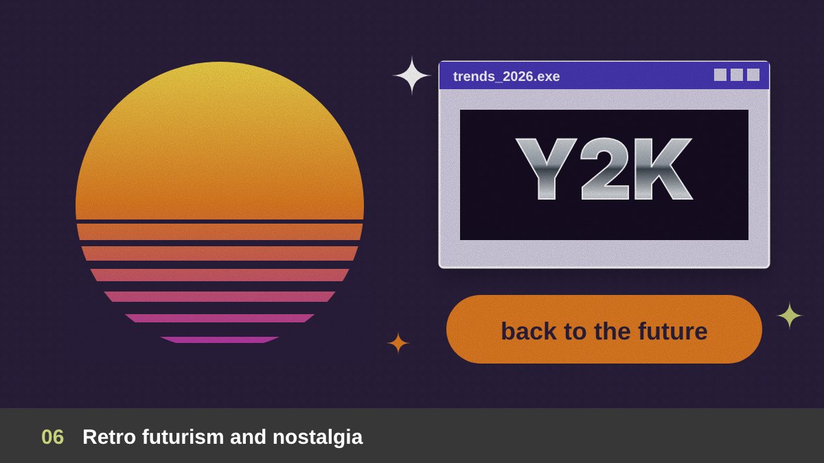
Nostalgia stayed strong in 2026, but with a twist. Instead of copying one decade, designers mixed the past with the future: 70s warm colors with chrome 3D type, 90s computer windows with modern layouts, Y2K stars and glossy effects with clean grids. Grainy gradients, halftone dots, old print textures and vintage badges added warmth and memory to digital design.
The main types are Y2K and early-internet aesthetics (chrome, pixel icons, browser windows), 70s and 80s retro (warm oranges and browns, rounded bold fonts, sun stripes), retro futurism imagining the future as people saw it in the past, and vintage print effects such as halftone and misregistration. It works very well for music, fashion, food and youth brands. To keep it fresh, borrow one or two retro details and combine them with modern spacing and typography, instead of making a full costume of the past.
Bold Minimalism and Clean Branding
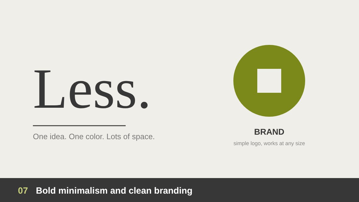
Not everything in 2026 was messy and handmade. Many brands moved the other way, towards calm, clean and confident design. Canva reported more searches for clean layouts, serif fonts and simple branding, and Pantone chose Cloud Dancer, a soft white, as its Color of the Year 2026, a clear sign that space and calm became valuable. This is not the cold minimalism of the past; it is bold minimalism: few elements, but each one strong.
Types of this trend include white-space-led layouts with one big image or word, simplified logos that work at tiny sizes on phones and app icons, monochrome and single-color identities, and quiet luxury design with refined serif type and soft neutral colors. It suits real estate, finance, tech, healthcare and premium products. Minimalism looks easy but is the hardest style to do well, because every detail is visible; it depends on strong fundamentals, which I explain in branding vs logo design.
Color in 2026: Soft Neutrals Meet Dopamine Brights
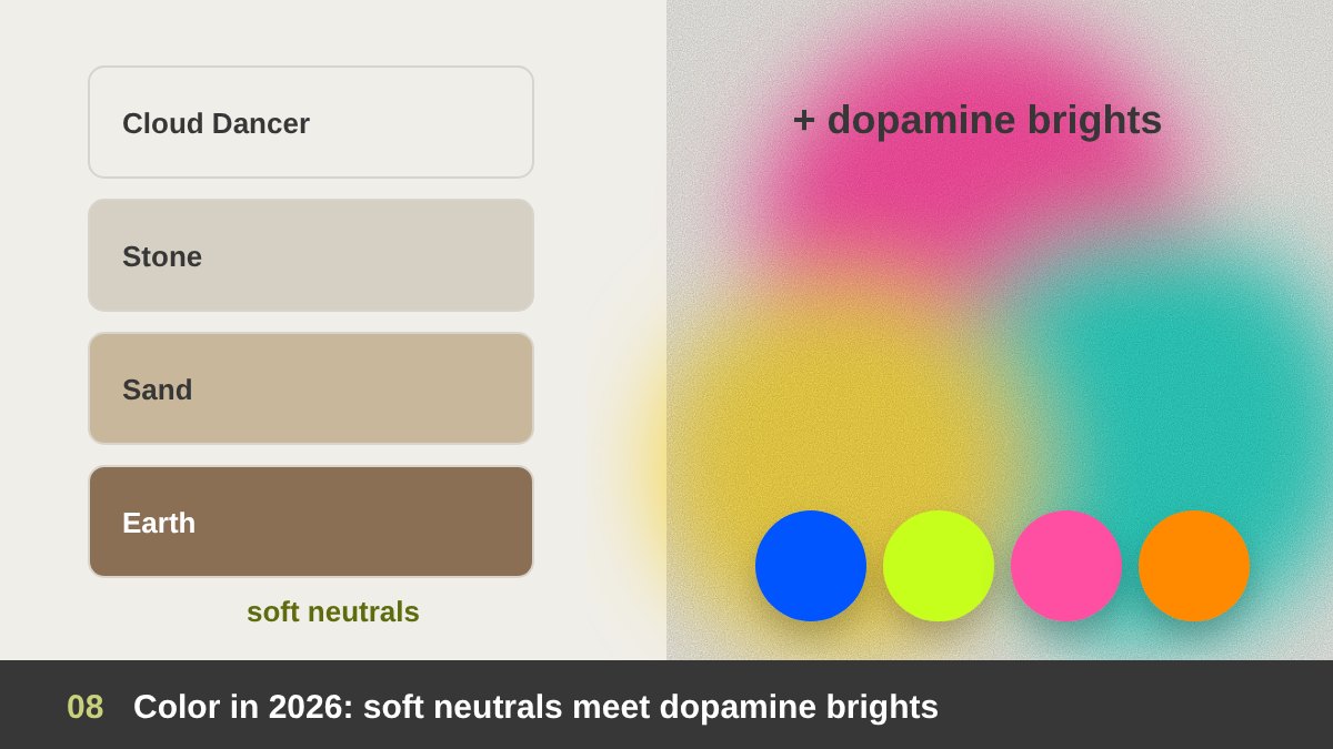
Color in 2026 had two sides. On one side, soft neutrals: off-whites, warm greys, sand, stone and gentle earth tones, led by Pantone’s Cloud Dancer. On the other side, energetic “dopamine” colors: electric blue, acid lime, hot pink, tangerine and saturated purples, used in bold blocks and unexpected combinations. Many of the best designs of the year combined both, using a calm neutral base with one shocking accent color.
The main color trends were soft neutral palettes, high-saturation dopamine palettes, grainy and blurred gradients that feel soft and organic instead of the sharp digital gradients of the past, and teal and blue-green tones, which trend forecasters such as WGSN and Coloro highlighted for 2026. When you choose a trendy color for a client, always check contrast for accessibility and think about how long the brand will live; a trendy accent is easier to update than a trendy main brand color.
Surreal, Dreamy and Uncanny Visuals
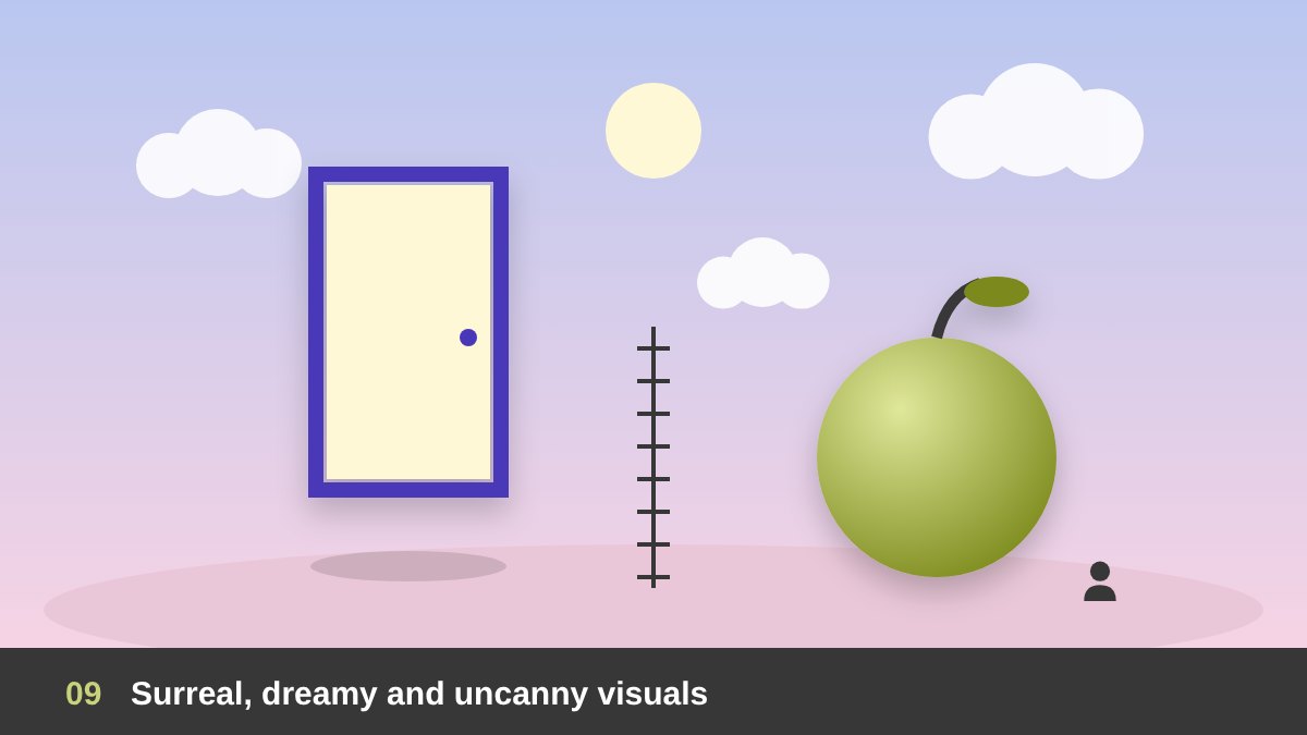
As the line between real and generated images became thin, many designers decided to play with it openly. Surreal compositions, floating objects, impossible scales, strange combinations and dreamy, empty “liminal” spaces became a strong visual language for campaigns and album covers. Canva reported a big jump in searches for liminal and uncanny content, showing that audiences enjoy images that make them look twice.
Types include surreal photo manipulation (a classic Photoshop skill that came back strongly), dreamcore and liminal spaces with soft light and empty rooms, scale play with giant products and tiny people, and visual puns that merge two objects into one idea. AI can help you explore these ideas quickly, but the strongest surreal work still comes from a clear concept and careful craft. I look at the tools side of this question in detail in AI and Adobe for graphic designers. Use surreal visuals when a brand wants attention and memorability, and connect the strange image to a clear message.
Custom Icons, Patterns and Cultural Motifs
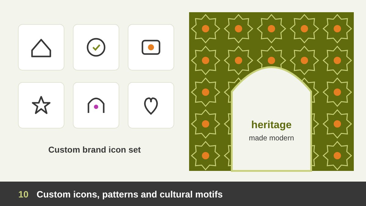
Stock icons and generic illustrations make brands look the same, so in 2026 more brands invested in their own visual language: custom icon sets, signature patterns, brand shapes and illustrated characters. Patterns brought richness back to minimal layouts, and icons became a key part of identity systems, not just small helpers in a user interface.
A beautiful part of this trend was the revival of cultural and heritage motifs. Canva noted a strong revival of local cultural motifs in India, and in our region we saw more brands using Arabic geometric patterns, calligraphy, Egyptian and Gulf heritage details and local colors in a modern way. The types here are custom brand icon sets, signature patterns, brand mascots and characters, and modern heritage design. This is the heart of brand identity work: elements that are recognisable even without the logo.
Motion-First and Dynamic Identities
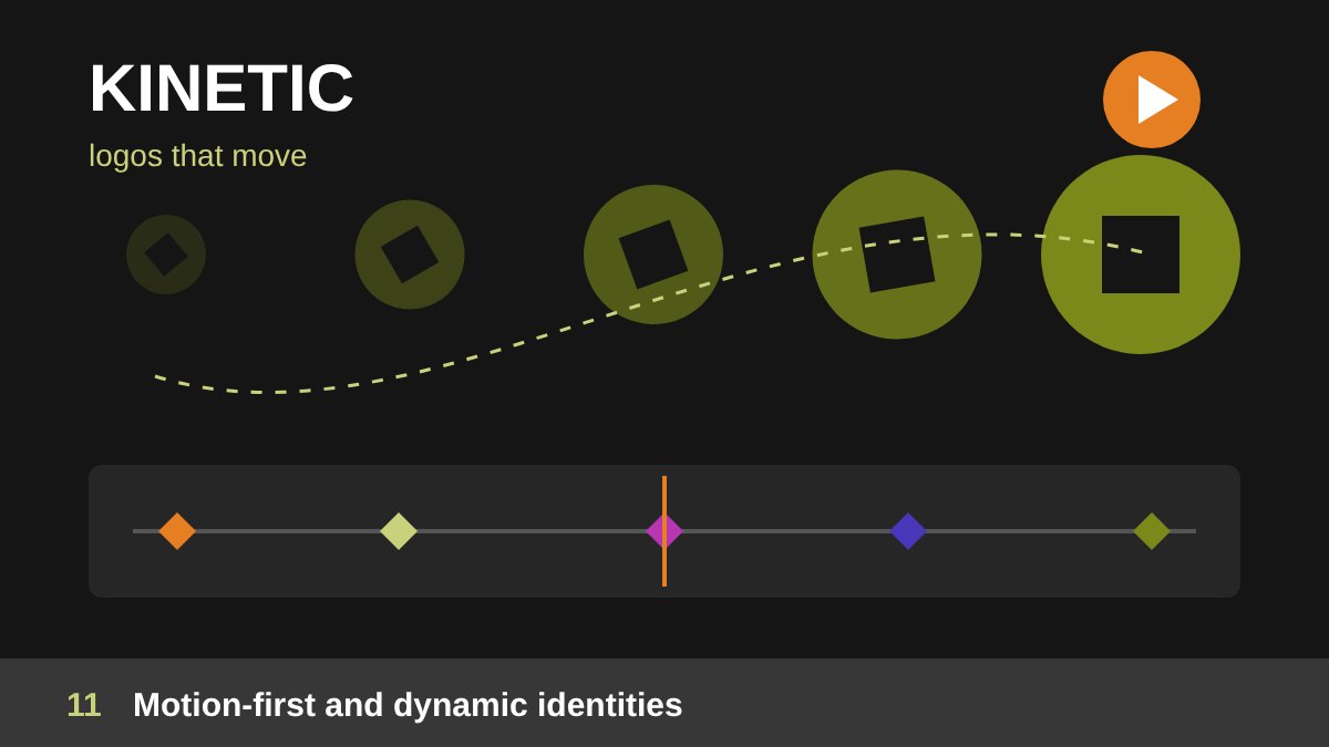
Most design is now seen on screens, so in 2026 many identities were designed to move from day one. Logos that animate, layouts that respond, kinetic typography in social videos and micro-animations in websites and apps became standard expectations. Brands also used dynamic identities: flexible systems where the logo, colors or patterns change for different products, seasons or campaigns while staying recognisable.
The main types are animated logos and brand intros, kinetic typography for reels and ads, micro-interactions in UI/UX and web design, and generative or flexible brand systems. For designers, basic motion skills in After Effects, Figma or Rive are now a real career advantage, as I mention in my guide to freelance graphic designer skills. Even for a static project, ask yourself how the design would move, because the client will probably ask for a video version later.
How to Use Design Trends and What Comes Next
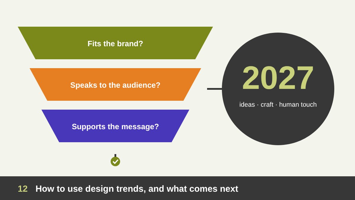
Trends are tools, not rules. Before you use any of the graphic design trends 2026 brought us, filter it through three questions: does it fit the brand’s personality, does it speak to this audience, and does it support the message? A law firm does not need puffy 3D letters, and a kids’ brand may not need quiet luxury. Use trends mostly in campaigns, social media and seasonal work, and keep the core identity more timeless, so the brand does not look dated in two years.
Looking ahead to 2027, the direction is clear: AI will keep speeding up production, so the value of design will move even more towards ideas, taste, storytelling and the human touch. Expect handmade and tactile styles to mature, motion to become the default, and accessibility and readability to matter more. The best way to stay relevant is to know the fundamentals deeply and to treat trends as a vocabulary you can speak when it fits. If you want a brand, a campaign or a website that feels current but lasts, take a look at my portfolio and get in touch.
Graphic Design Trends 2026: Frequently Asked Questions
What are the biggest graphic design trends in 2026?
The biggest graphic design trends in 2026 were handmade and imperfect design, tactile 3D shapes, expressive typography, collage and zine layouts, retro futurism, bold minimalism, soft neutral and bright dopamine colors, surreal visuals, custom icons and cultural motifs, and motion-first brand identities.
Why did imperfect, handmade design become popular in 2026?
Because AI-generated images became so common, audiences started to value visuals that clearly show a human touch. Hand-drawn elements, textures and small imperfections make a brand feel more honest, personal and memorable.
What is the Pantone Color of the Year 2026?
Pantone chose Cloud Dancer (PANTONE 11-4201), a soft, airy white, as its Color of the Year 2026. It reflects the wider trend towards calm, space and simplicity in design.
Is minimalism still a trend in 2026?
Yes, but in a bolder form. Bold minimalism uses few elements, lots of white space and one strong color, word or image, and it is popular for brands that want to look calm, premium and trustworthy.
Should I follow design trends for my brand?
Use trends carefully. Apply them in campaigns, social media and seasonal designs, and keep your core identity, logo and main colors more timeless. Always check that a trend fits your brand, your audience and your message.
Which graphic design trends will continue in 2027?
Handmade and tactile styles, expressive typography, motion-first identities and a balance between AI speed and human creativity are expected to continue into 2027, along with a stronger focus on accessibility.