

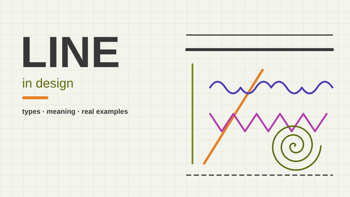
What Is a Line in Design?
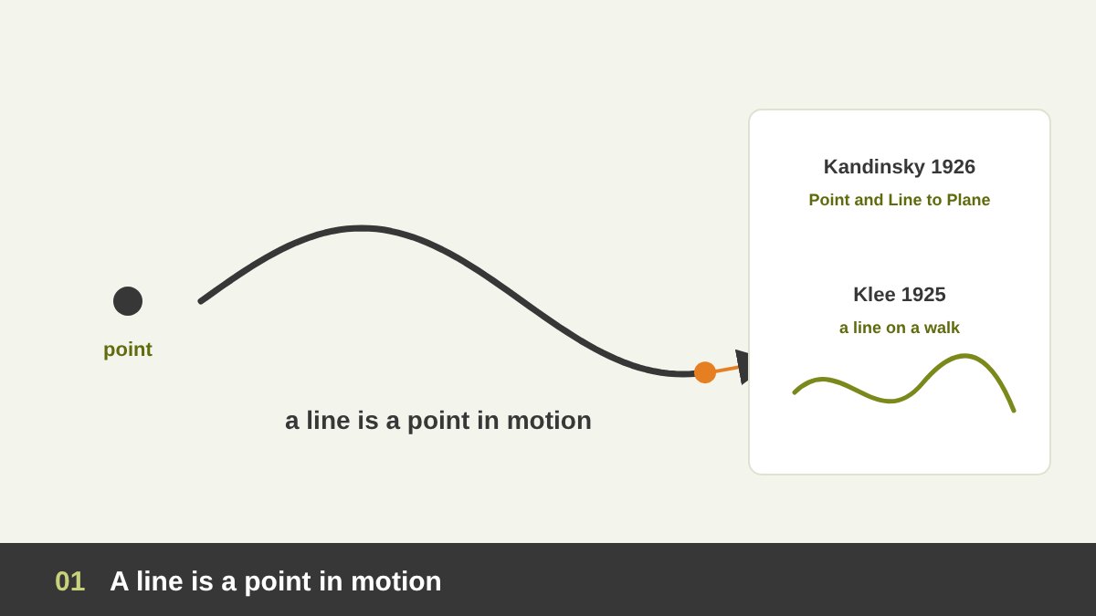
In design, a line is the mark or path left by a point that moves. Put your pen on paper and you have a point; move it and you have a line. That is why the painter Wassily Kandinsky, who taught at the Bauhaus, described the line in his book Point and Line to Plane (1926) as the track made by the moving point, and why his colleague Paul Klee famously spoke about taking “an active line on a walk” in his Pedagogical Sketchbook (1925).
In geometry a line has length but no width. In design it is more generous: a line can be thick or thin, smooth or rough, solid or broken, drawn by hand or made by the edge where two colours meet. What makes something “a line” is that it is much longer than it is wide, so our eye reads it as a direction or a path rather than an area.
Line is one of the core elements of design, together with point, shape, form, texture, value, colour, space and type. I explained how all of these fit together in The Principles of Design. In this article I focus only on line, because it is the element students usually underestimate. When I teach the basics of design, I always start here: if you understand line, you understand how to move the viewer’s eye, how to build a grid, how to draw a logo and how to give a design its mood.
Key takeaways
- A line is the path of a moving point. It is the most basic element of design after the point, and almost everything you design is built from lines: shapes, letters, icons, grids and drawings.
- Every line has properties you control: length, weight, direction, curvature, continuity, quality and colour. Change one of them and the message changes.
- The main types of line are straight (horizontal, vertical, diagonal), curved, wavy, spiral, zigzag, thick and thin, dashed and dotted, and the very important implied lines that the eye completes by itself.
- Lines have a psychology: horizontal feels calm, vertical feels strong, diagonal feels like movement, curves feel soft and natural, zigzags feel tense or energetic.
- In real work, line has a few big jobs: it leads the eye, divides and organises content, builds shapes and letters, creates texture and expresses emotion. Saul Bass, Müller-Brockmann, Harry Beck, Paul Rand and Mondrian built some of the most famous designs in history on line alone.
The Properties of a Line
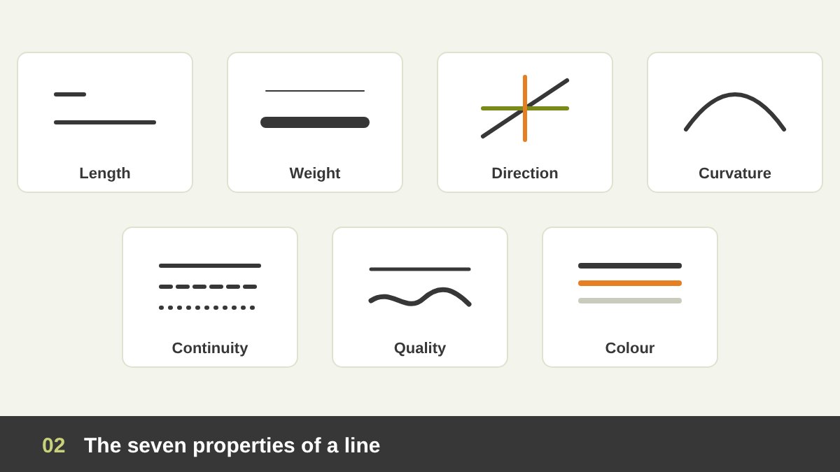
Every line you draw has a set of properties, and each one is a decision. A good designer chooses them on purpose instead of accepting the default 1-point stroke of the software.
Length: short lines feel like marks or accents; long lines feel like paths, borders or horizons. Weight (width): a thick line is loud, heavy and close; a thin line is quiet, light and elegant. Direction: horizontal, vertical or diagonal, each with its own feeling. Curvature: from perfectly straight to gently curved to tightly spiralled.
Continuity: a line can be solid, dashed, dotted or interrupted, which changes how “strong” or “temporary” it feels. Quality (character): a line made with a ruler feels mechanical and precise; a line made by hand with a brush feels human, spontaneous and expressive. Colour and value: a black line on white has maximum contrast; a light grey line almost disappears and works as a quiet guide. When you design, ask yourself which of these seven properties you are actually using to say something.
Straight Lines: Horizontal, Vertical and Diagonal
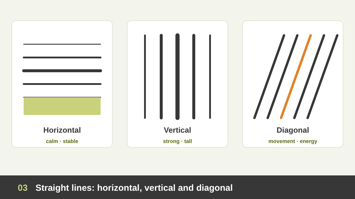
Straight lines are the backbone of design, and their direction is the first thing that changes their meaning. These associations come from our body and the world around us: we lie down horizontally to rest, we stand vertically, and things that lean diagonally are about to fall or move.
Horizontal lines feel calm, stable, wide and restful, like the horizon or the surface of still water. They are perfect for luxury, wellness, real estate and anything that should feel safe and settled. They also widen a layout. Vertical lines feel strong, tall, formal and confident, like columns, trees or skyscrapers. They give a design dignity and height, which is why banks, institutions and fashion brands love them.
Diagonal lines are the lines of movement and energy. They feel dynamic, active and sometimes unstable, because they are neither lying down nor standing up. Sports brands, action film posters, sale banners and anything about speed or change use diagonals. A simple rule: if your layout feels static and boring, try rotating one strong element or line to a diagonal; if it feels chaotic, bring things back to horizontals and verticals.
Curved, Wavy, Spiral and Zigzag Lines
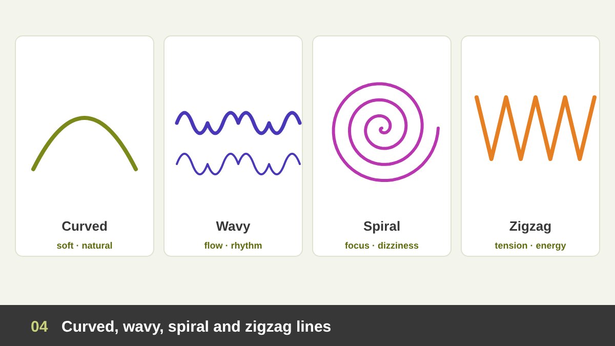
Curved lines feel soft, natural, friendly and graceful, because nature is full of curves: bodies, leaves, hills and waves. A single gentle curve can make a logo or a layout feel more human and welcoming than any straight line. Beauty, food, children’s and organic brands use curves constantly.
Wavy lines add rhythm and flow, and immediately suggest water, sound, air or music. Spiral lines pull the eye inward or outward and create a sense of hypnosis, growth or dizziness; they are one of the strongest ways to create a focal point, as you will see in the Vertigo poster below. The golden spiral is a special case built on the golden ratio.
Zigzag and jagged lines are the opposite of curves: sharp changes of direction create tension, excitement, danger or electricity. Think of lightning symbols, warning signs, comic-book explosions and heartbeat monitors. Use them when you want energy or alarm, and avoid them when you want calm and trust.
Line Weight and Line Style
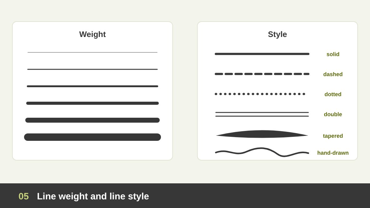
Line weight is the thickness of a line, and it is one of the easiest ways to create hierarchy. Thick lines come forward and shout; thin lines step back and whisper. In a technical drawing or an infographic, a thick line can show the main outline and thin lines the details. In a logo, consistent line weight makes the mark feel solid and professional; random weights make it feel unfinished.
Line style is the pattern of the line. A solid line feels permanent and definite. A dashed line feels temporary, optional or “cut here”, which is why it is used for coupons, folding guides, planned routes and future states in diagrams. A dotted line feels lighter and is often used for leaders in tables of contents, connections or paths. A double line feels formal and classic, like old certificates and menus.
A tapered line, thick in the middle and thin at the ends, feels like brush or calligraphy and gives elegance and movement. A rough, hand-drawn line feels personal, authentic and playful, and it is one of the strongest design trends in social media right now, because it breaks the perfect digital look.
Actual Lines and Implied Lines
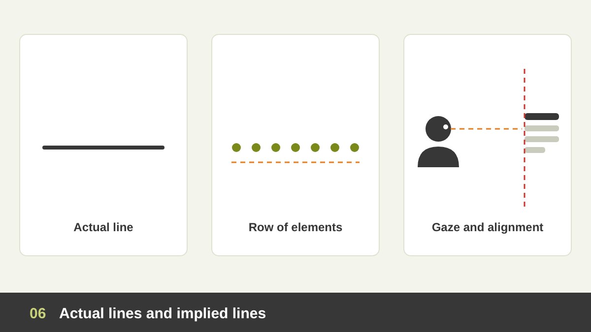
An actual line is one that is really drawn: a stroke, a rule, an outline. But some of the most powerful lines in design are implied lines: lines that are not drawn at all, but which the viewer’s brain completes by itself. This is the Gestalt principle of continuity at work.
There are three main kinds of implied line. First, a row of separate elements (dots, icons, words) that sit in a line: the eye connects them into one path. Second, alignment: when the left edges of a headline, a photo and a paragraph line up, you “see” an invisible vertical line holding them together. This invisible line is the secret of every clean layout and grid. Third, the direction of a gaze or a gesture, sometimes called a psychic line: if a person in a photo looks or points toward something, we follow their eyes or finger to it.
Professional designers use implied lines more than drawn ones. A layout with many visible boxes and rules often looks busy; a layout where everything is held together by alignment looks calm and confident. When a student shows me a cluttered design, very often the fix is not adding lines but removing them and letting alignment do the work.
Drawing Lines: Contour, Outline, Gesture and Hatching
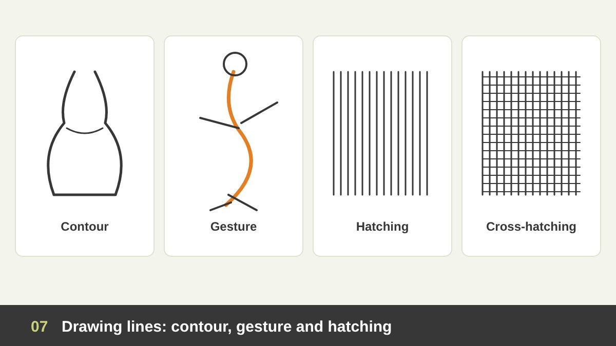
As a painter and drawing teacher, I see line as the first language of drawing, and these drawing types are useful for every designer, not only illustrators. An outline is the line around the outside edge of a shape. A contour line goes further: it follows the edges and the inner folds of a form, describing its volume. A blind contour exercise, where you draw without looking at the paper, is one of the best ways to train your eye.
A gesture line is a fast, loose line that captures movement and energy rather than detail, like the action line that runs through the body of a figure. Animators and character designers start every pose with it. Fashion illustrators use it to make clothes feel alive.
Hatching is a series of parallel lines used to create shade and texture; cross-hatching adds a second layer of lines in another direction to make the area darker. The closer and thicker the lines, the darker the value. This technique, used by engravers on banknotes and by artists like Albrecht Dürer, is still everywhere in packaging, vintage-style logos and editorial illustration.
The Psychology of Line: What Lines Make Us Feel
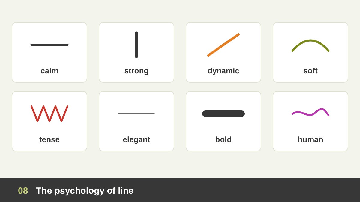
Lines speak to us before we read a single word. This is not magic; it is based on our experience of the physical world. Here is a practical cheat sheet I give my students:
Horizontal = calm, rest, stability, width, the horizon. Vertical = strength, height, growth, formality, ambition. Diagonal = movement, speed, action, change, risk. Curved = softness, comfort, nature, femininity, flow. Zigzag = excitement, tension, danger, electricity. Spiral = focus, hypnosis, growth, dizziness. Thin = delicacy, luxury, precision. Thick = power, confidence, loudness. Hand-drawn = human, honest, playful. Geometric = technical, modern, rational.
These meanings are tendencies, not laws. Culture and context matter: a red zigzag on a sale banner feels exciting, the same zigzag on a hospital poster feels alarming. The real skill is to choose line on purpose: decide the feeling first, then choose the direction, weight and quality of line that carries it, exactly like you would choose a colour or a typeface.
Using Line to Lead the Eye
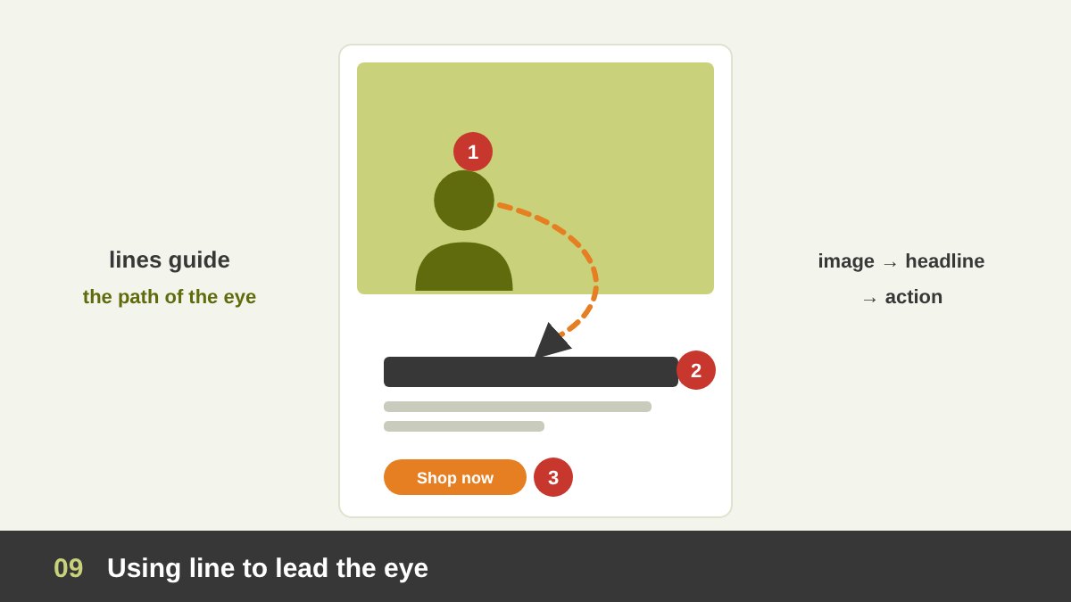
The most important job of line in composition is directing attention. The human eye naturally follows lines, the same way water follows a channel. A designer who knows this can decide the exact path the viewer’s eye will travel: from the image, to the headline, to the price, to the button.
You can lead the eye with actual lines (an arrow, a road, a stripe, a line of text), with implied lines (the gaze of a model, a row of products) and with leading lines inside a photograph (rails, roads, rivers, shadows). Lines that point into the frame keep the viewer inside the design; lines that point out of the frame lead their attention away, so be careful with them.
A practical test: print your design small or blur it, and trace with your finger where your eye goes first, second and third. If the strongest line leads to something unimportant, or straight off the edge, change it. In the principles of design this is called movement, and line is its main tool.
Using Line to Divide, Organise and Frame
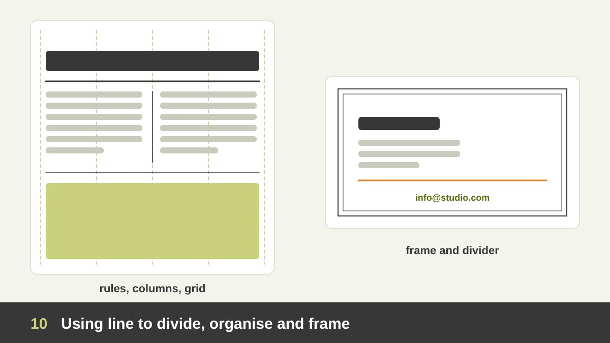
Line is also the designer’s tool for order. A thin horizontal rule separates a headline from the text, one section of a menu from another, or the header of a website from the content. A vertical rule separates columns in a newspaper. A frame or border around an element isolates it and says “look at this”, like a frame around a painting.
Behind almost every professional layout there are lines you do not see: the grid. Columns, margins, baselines and gutters are lines that the designer uses to place every element consistently. Swiss designers like Josef Müller-Brockmann turned the grid into a philosophy, and it is still the base of modern web design. Even the golden ratio is usually applied through a few guide lines placed at 38.2% and 61.8%.
The common mistake is using too many divider lines. If you need a line to separate every element, the problem is usually spacing, not lines. Try first to separate with white space and alignment, and keep lines for the places where you really need a clear boundary or a touch of elegance.
Line in Typography
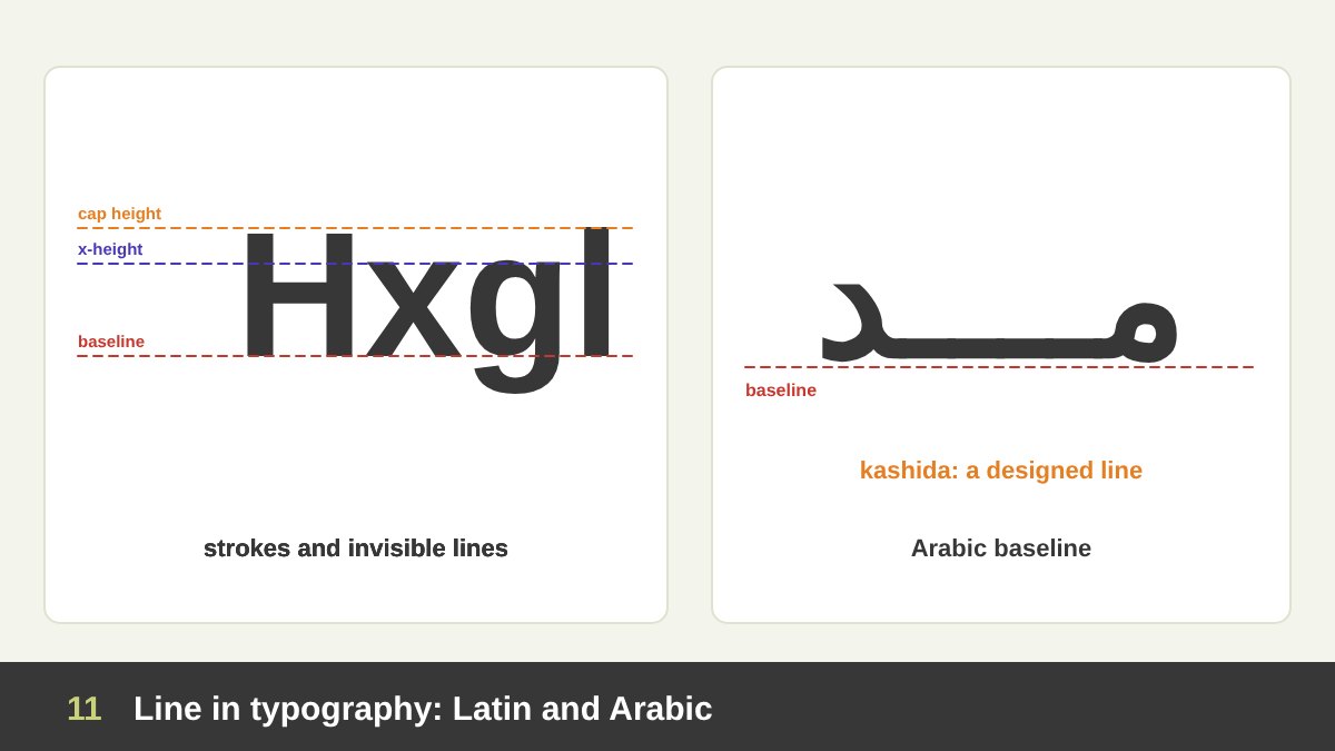
Typography is made of lines in two ways. First, every letter is built from strokes: the vertical stem of an “l”, the horizontal bar of a “t”, the curve of an “o”. The contrast between thick and thin strokes is what makes a typeface feel classic (high contrast, like Didot) or modern and neutral (low contrast, like Helvetica). A monoline typeface, where every stroke has the same weight, feels technical, friendly or retro depending on its shapes.
Second, text sits on invisible lines: the baseline, the x-height, the cap height, the ascender and descender lines. Every line of text is itself a horizontal line on the page, which is why a paragraph has a strong horizontal texture and why line length and line spacing (leading) matter so much for comfortable reading.
Arabic script is even more linear. Arabic is written along a strong horizontal baseline, and calligraphers can stretch letters with the kashida (tatweel), a horizontal extension that is literally a designed line. Kufic scripts, especially square Kufic, are built entirely from straight horizontal and vertical lines. When I design bilingual identities, I often use this baseline as the line that connects the Arabic and Latin parts of the logo.
Line in Logo Design
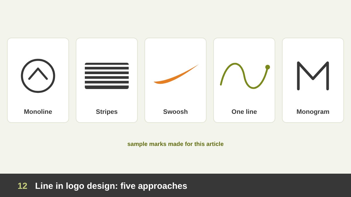
Many of the world’s best logos are essentially one or two lines. A single curved stroke can suggest motion, a smile or a wing; a set of parallel stripes can suggest speed and unity; a continuous line can tell a small story without lifting the pen. Line-based logos tend to be simple, memorable and easy to reproduce, which are exactly the qualities I describe in What Makes a Good Logo Design.
Popular line approaches include: monoline marks (one consistent stroke weight, great for modern tech and lifestyle brands), striped or lined marks (parallel lines that cut through letters or shapes), continuous-line symbols (one unbroken line drawing an object or initials), outline versions of a solid mark, and underline or swoosh accents that support a wordmark.
Be careful with very thin lines in logos. A hairline that looks beautiful on a big screen can disappear on a favicon, an embroidered shirt or a fax-quality print. Always test your line logo very small and in one colour, and keep the stroke weight thick enough to survive. A logo is only one part of a brand, as I explain in Branding vs Logo Design, but its line quality sets the tone for the whole identity.
Line in Web and UI/UX Design
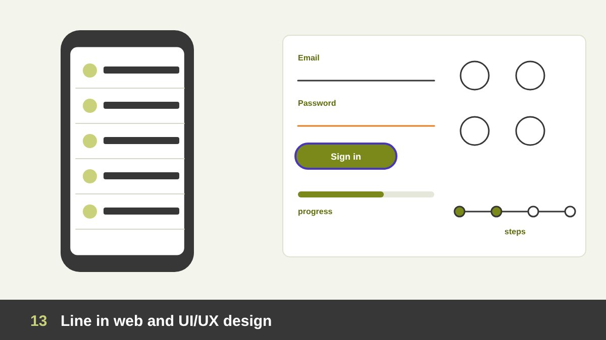
On screens, line does a lot of quiet, functional work. Dividers separate items in a list or settings screen. Borders define cards, buttons and input fields. An underline still says “this is a link” on the web, and an underline under a tab says “you are here”. A focus ring outline shows keyboard users which element is active, which is essential for accessibility.
Line also communicates progress and structure: progress bars, step indicators, timelines, sliders, and connector lines in onboarding flows. And most modern icon sets are outline icons drawn with a consistent stroke (often 1.5 or 2 px at 24 px size). Consistency is everything: mixing outline icons with different stroke weights is one of the first things that makes an interface look amateur.
The trend in UI over the last years has been fewer visible lines and more spacing, soft shadows and background tints to separate content. My advice: use a line in UI when it has a clear job (separate, connect, indicate, focus) and make it light, usually a low-contrast grey, so it supports the content without competing with it. But make sure functional lines such as input borders still have enough contrast to be seen.
Line in Information Design, Charts and Maps
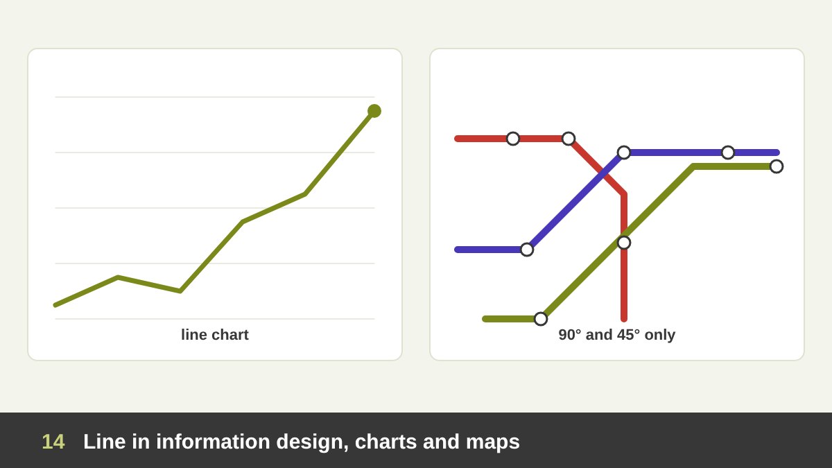
In information design, line turns data into a story. A line chart shows change over time better than any table, because the eye reads the slope instantly: up is growth, down is decline, flat is stability. Timelines, flowcharts, mind maps and organisation charts all use connecting lines to show relationships and order.
Maps and wayfinding are line design at its purest: roads, routes, borders and transit lines. The most famous example is the London Underground diagram by Harry Beck, which I analyse below. Its lesson for every designer is that simplifying lines to a few angles can make complex information instantly clear.
When you design a chart, think about line weight and contrast as carefully as in a poster: the main data line should be the strongest, grid lines should be very light or removed, and each series should be easy to tell apart, not only by colour but also by labels or line style, for people with colour blindness.
Line in Patterns, Texture and Op Art
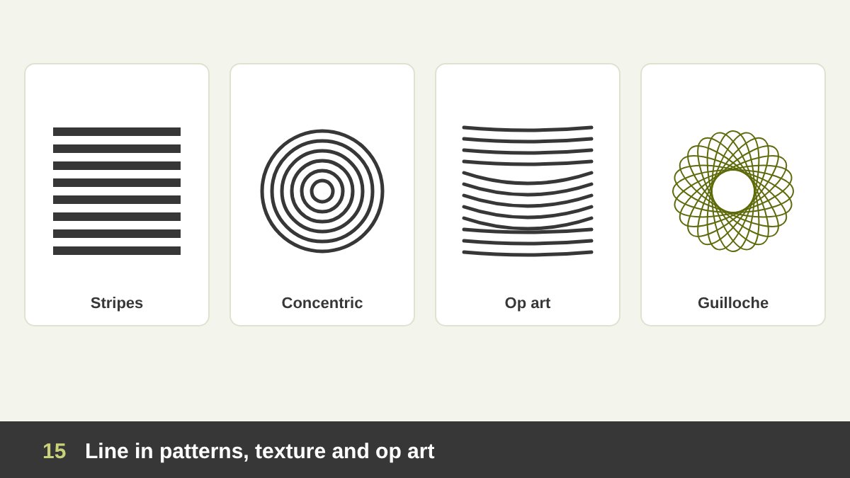
Repeat a line and you get pattern; repeat it closely and you get texture. Stripes are the simplest pattern in the world, yet they can feel nautical, sporty, formal or playful depending on their width, spacing and colour. Lines placed close together also create value: the denser the lines, the darker the area appears, just like hatching in drawing.
In the 1960s, Op Art artists such as Bridget Riley and Victor Vasarely showed that simple black and white lines, bent and spaced carefully, can make a flat surface appear to bulge, vibrate or move. Designers still use this effect in posters, album covers and motion graphics, and you will see it in the Mexico 68 Olympic identity below.
Line patterns also have a practical, protective job. Banknotes, certificates and passports use complex guilloche patterns of fine interlaced lines because they are very hard to copy. In packaging and branding, a signature line pattern can become a brand asset that is recognisable even without the logo.
Line Art, One-Line Drawings and Illustration
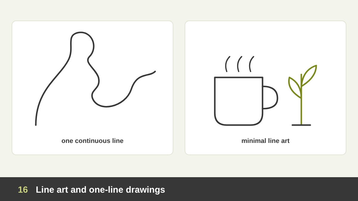
Line art is illustration made only, or mostly, of lines, without shading or filled colour. It feels clean, honest and elegant, and it works beautifully in print, on packaging, in tattoos, in icons and on social media. Because it uses so little, every line has to be confident; there is nowhere to hide a weak stroke.
The one-line (continuous line) drawing is a special kind of line art where the whole image is drawn without lifting the pen. Picasso famously drew with light in 1949, in long-exposure photographs taken by Gjon Mili for LIFE magazine, creating figures in a single glowing line. Today one-line drawings are everywhere: in minimal branding, wall art, wedding stationery and Instagram posts.
In my own work as a painter and illustrator, the line drawing is always the starting point: a quick gesture sketch, then a cleaner contour, then the final artwork. Whether the final piece is a digital illustration, a logo or an oil painting, the quality of that first line decides a lot. I write more about where art and design meet in Art vs Design.
Line in Photography, Motion and Video
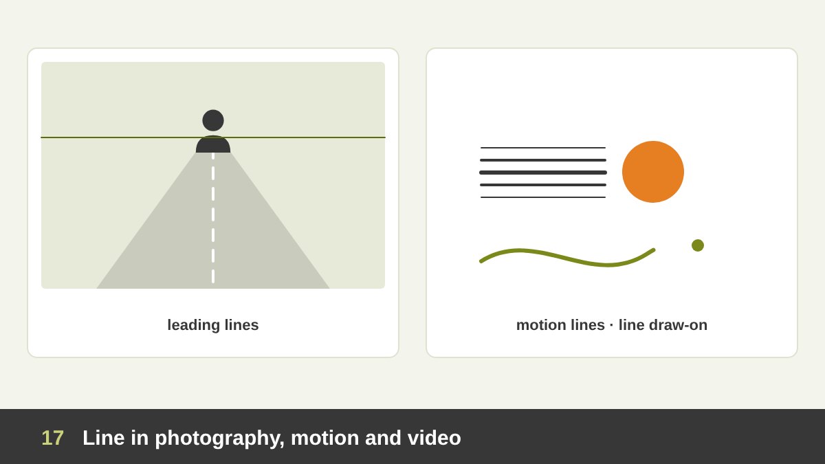
Photographers talk constantly about leading lines: roads, rails, fences, rivers, staircases and shadows that guide the eye toward the subject. When you choose or crop a photo for a design, look for these lines and make them point toward your headline or product, not away from it. Horizontal horizons should be straight unless you deliberately tilt them for drama.
In illustration and comics, motion lines (speed lines) show that something is moving fast; the artist Keith Haring used radiating lines around his figures to make them feel alive and energetic. In motion design, the line animation or “line draw-on” effect, where a stroke draws itself across the screen, is one of the most used techniques in logo reveals, explainer videos and reels.
Video editors also think in lines: the 180-degree rule uses an imaginary line between two characters to keep the camera on one side so the audience is not confused. Lower thirds, title underlines and transition wipes are all line-based. A single animated line is often enough to make a static social post feel alive.
Real Example: Saul Bass’s Vertigo Poster (1958)
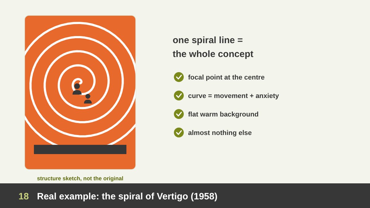
Now let’s look at real designs that are built on line and analyse why they work. The first is the poster for Alfred Hitchcock’s Vertigo (1958) by Saul Bass, one of the greatest film posters ever made. You can see the original in the People’s Graphic Design Archive; the image here is my own structure sketch of how its lines work.
The whole poster is built on a single idea: a spiral line. The spiral pulls the eye into its centre, turning and turning, exactly like the dizziness of vertigo and like the obsession of the film’s main character. Inside it, two small dark figures seem to fall. The background is a flat, warm orange-red, the lettering is hand-cut and slightly unstable, and there is almost nothing else. Bass did not need a photo of the stars; the line itself tells you how the film will make you feel.
Why it works: the spiral is the strongest possible focal point, the curved line creates movement and anxiety at the same time, and the extreme simplicity makes the line impossible to ignore. The spiral motif continued into the film’s famous title sequence, designed by Bass with animated spiral figures by John Whitney. Lesson for us: one meaningful line can carry a whole concept.
Real Example: The Man with the Golden Arm (1955)
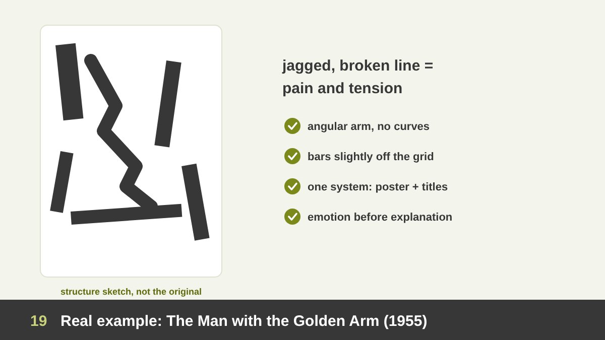
Three years earlier, Saul Bass created the identity for Otto Preminger’s The Man with the Golden Arm (1955), a film about addiction. Instead of the usual painted portrait of the stars, the poster shows a jagged, distorted arm made of thick, broken bars, surrounded by rectangular strips set at uneasy angles. It was a shock at the time, and it is still studied in every design history course (more about the film and its design).
Here line works through tension. The broken, angular arm is made of zigzagging segments, the opposite of a calm curve, and it immediately communicates pain, nervousness and struggle. The surrounding bars are not aligned to a neat grid; they feel slightly off, like the life of the main character. In the animated title sequence, those same white bars move across the screen and finally assemble into the arm.
Why it works: the quality of the line (jagged, heavy, uneven) matches the emotion of the story; the design uses one simple system of bars across poster, titles and advertising, which made it one of the first film campaigns where poster, titles and advertising shared one graphic system; and it trusts the audience to feel the message instead of explaining it. Lesson: choose the character of your line to match the emotion, not just the subject.
Real Example: Müller-Brockmann’s Beethoven Poster (1955)
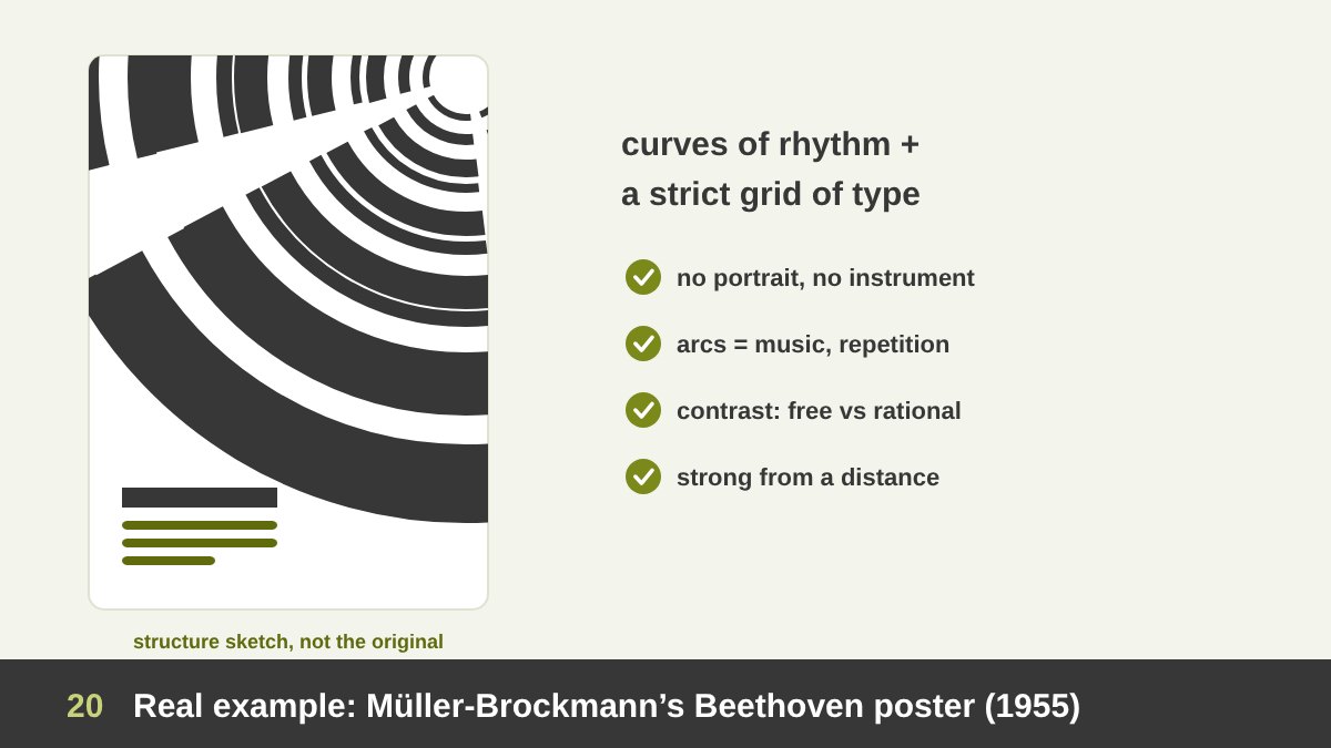
The Swiss designer Josef Müller-Brockmann designed concert posters for the Tonhalle in Zürich for many years. His 1955 poster for a Beethoven concert is one of the icons of the International Typographic Style (you can see records of it at the Cooper Hewitt museum). It contains no portrait of Beethoven and no musical instruments, only concentric arcs of black and white and a block of clean, aligned typography.
The arcs grow from one point, in bands of different widths, creating a rhythm that many designers read as a visual equivalent of music: repetition, variation, crescendo. The curved lines create strong movement, while the text sits on a strict grid of horizontal and vertical lines. Over the years his Tonhalle series became more and more abstract, focused on the feeling and the mathematical structure of the music rather than on illustrating it.
Why it works: it shows that abstract lines can carry emotion and meaning without any literal picture; it combines expressive curves with rational, grid-based typography, a perfect example of contrast; and it is unforgettable from a distance on the street. Lesson: when a subject is hard to show (music, sound, an idea), think about what kind of line it would be.
Real Example: Harry Beck’s London Underground Map (1933)
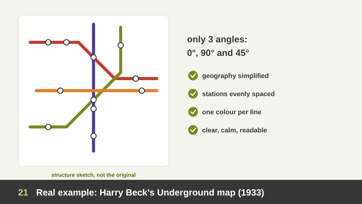
In 1931, Harry Beck, an engineering draughtsman working for the London Underground, sketched a new kind of map in his spare time. It was first printed for the public in 1933, and almost every transit map in the world now follows its ideas (read more about Beck and the map).
Beck’s big idea was about line. He ignored real geography and drew every route using only horizontal, vertical and 45-degree diagonal lines, like an electrical circuit diagram. He spaced the stations more evenly, enlarged the crowded centre, and gave each line its own colour. The map is “wrong” geographically, but perfectly right for a passenger, who only needs to know the order of stations and where to change.
Why it works: simplified, consistent lines remove noise; a limited set of angles creates order and calm; colour-coding turns each line into an identity. Massimo Vignelli applied similar principles to the New York subway diagram in 1972. Lesson for any infographic, flowchart or UI: decide a small set of line rules (angles, weights, colours) and follow them strictly.
Real Example: The Mexico 68 Olympic Identity
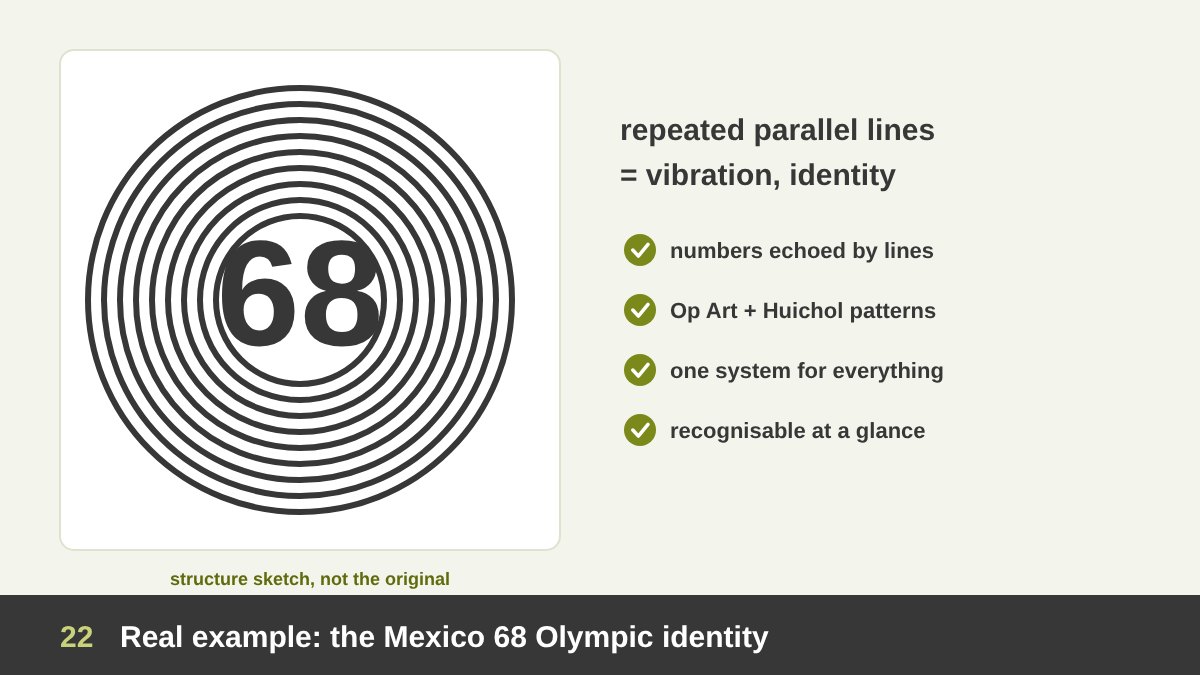
The identity for the 1968 Olympic Games in Mexico City is one of the most celebrated in design history. It was developed by a team led by architect Pedro Ramírez Vázquez with Eduardo Terrazas and the American designer Lance Wyman. According to the Victoria and Albert Museum, the five Olympic rings were developed into the number “68” and unified with the word “MEXICO” by means of radiating parallel lines.
Those repeated lines spread outwards from the letters like ripples or vibrations. They connect the 1960s language of Op Art with the line patterns of traditional Huichol art from Mexico, so the identity felt modern and local at the same time. The same line system was extended to posters, tickets, uniforms, signage and even the pavement around the stadium.
Why it works: the repetition of lines creates a vibrant, almost moving pattern that is instantly recognisable; the lines carry cultural meaning, not only decoration; and the system is flexible enough to be applied to anything. Lesson: a line pattern can be a full brand system, not just an ornament.
Real Example: Line in Famous Logos (IBM, Nike, Amazon)
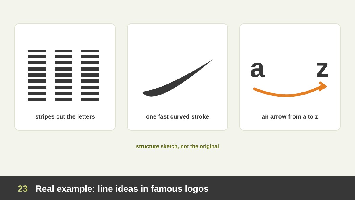
Some of the best-known logos in the world are built on a single line idea. In 1972 Paul Rand introduced the striped IBM logo, with the heavy letters cut by eight horizontal lines. According to IBM’s own history page, the company wanted a streamlined and dynamic redesign. The stripes make the heavy letters feel lighter and faster, suggest scan lines and technology, and unify the three letters into one mark.
The Nike Swoosh, designed in 1971 by Carolyn Davidson, then a graphic design student at Portland State University, is essentially one curved, tapered line. It suggests movement, speed and a wing, all in a single stroke, which is why it works without the word Nike (history of the Swoosh). The Amazon logo adds a curved arrow under the wordmark that goes from the “a” to the “z” (everything from A to Z) and also reads as a smile.
Why they work: each logo uses one line with one clear meaning (speed, motion, satisfaction); the line is simple enough to be drawn from memory; and it supports the brand story instead of decorating it. Lesson for your logos: before adding a line, ask what it means. If you cannot say it in one sentence, remove it.
Real Example: Mondrian’s Broadway Boogie Woogie (1942–43)
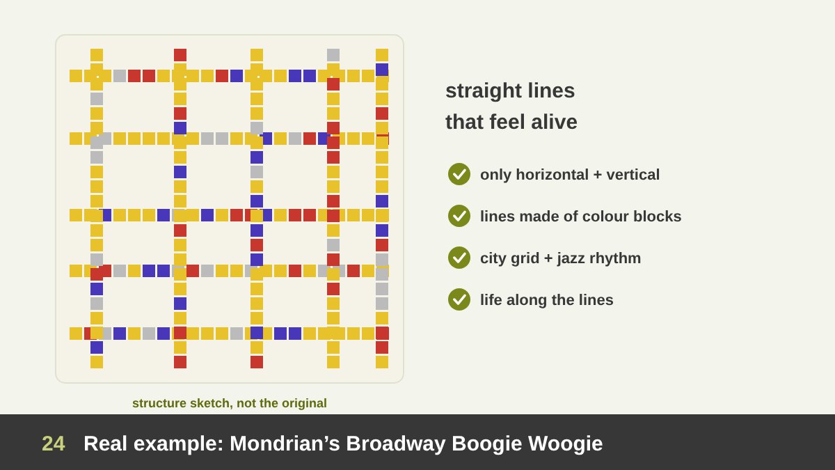
Line is not only a graphic design tool; it is a painter’s tool too. Piet Mondrian spent years reducing painting to horizontal and vertical black lines and blocks of primary colour. After moving to New York, he painted Broadway Boogie Woogie (1942–43), now in the collection of MoMA (about the painting).
In this painting the heavy black lines of his earlier work are gone. Instead, the lines are made of small blocks of yellow, red, blue and grey, like the grid of Manhattan streets seen from above, with traffic and lights pulsing along them, and like the rhythm of the boogie-woogie jazz music he loved. Only horizontal and vertical lines are used, yet the painting feels full of energy.
Why it works: it proves that straight lines in a strict grid can still feel lively when you add rhythm, colour and variation along the line; it connects line directly to the experience of a city and of music. Mondrian’s work has influenced graphic design, architecture, fashion and web layouts for decades. Lesson: a grid does not have to be boring; the life is in what happens along the lines.
Social Media Designs Built on Line: Six Techniques
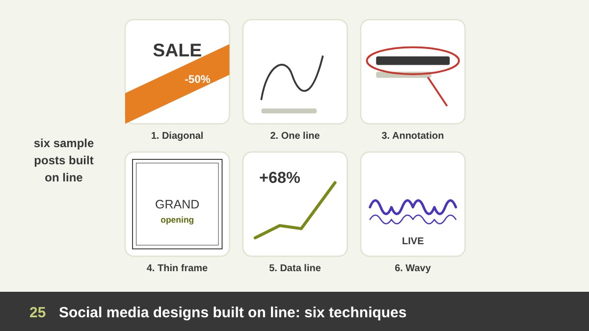
Lines are perfect for social media because they are fast to read on a small phone screen and they give a feed a consistent look. These six sample posts, which I designed for this article, show the techniques I use most and the reason each works.
1. The bold diagonal: a thick diagonal band crossing the post (great for sales, launches and sports) creates instant energy and stops the scroll. 2. The one-line drawing: a single continuous line drawing next to a short quote feels calm, personal and premium. 3. The hand-drawn annotation: rough circles, arrows and underlines drawn over a photo or text, like a teacher’s red pen, point to the important part and feel human and authentic. This style is everywhere in educational content and carousels.
4. The thin frame: a fine line frame or double rule inside the post gives instant elegance for luxury, real estate, weddings and restaurants. 5. The data line: a single growing line chart with one big number tells a result in a second, perfect for B2B and case studies. 6. The wavy or rhythmic line: wave or sound lines for music, events and podcasts suggest rhythm before anyone presses play. Notice that in every post the line has a job: to create energy, guide the eye, frame, explain or set a mood.
Analysing a Line-Based Instagram and LinkedIn Carousel
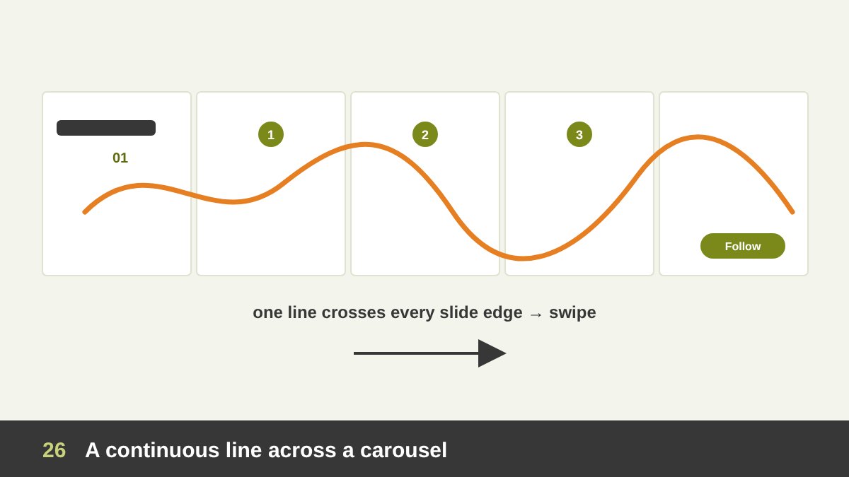
One of the most effective line techniques on Instagram and LinkedIn is the continuous line carousel: a single line (or shape) that starts on the first slide and continues across the edge into the next one, and the next. When the viewer sees a line cut off at the right edge, their brain wants to complete it, so they swipe. It is the Gestalt principle of continuity turned into a marketing tool.
In the sample above, the line has three jobs. On the cover it points to the title and then runs off the right edge, inviting the swipe. On the middle slides it connects the points like a path, so the carousel feels like one story instead of separate slides. On the last slide it ends at the call to action (follow, save, visit the website), so the eye arrives exactly where you want it.
Tips if you design one: plan the whole carousel as one long canvas, then cut it into slides; keep the line weight and colour consistent; make sure each slide still works on its own, because people see some slides in isolation; and keep important text away from the edges where the line crosses. I use the same idea when I present design work to clients: one visual thread that connects the story from beginning to end.
Common Mistakes When Using Line
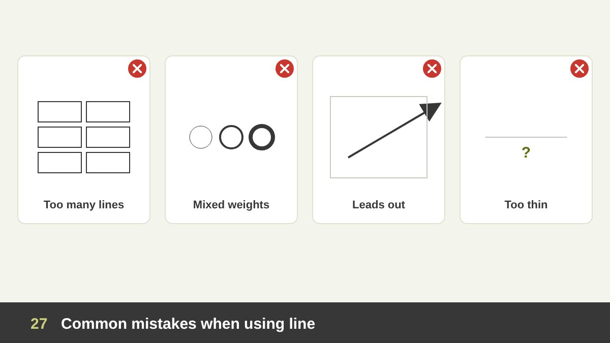
After years of reviewing students’ and junior designers’ work, these are the line mistakes I see most often. Too many lines: boxes around everything, dividers between everything. The design looks like a spreadsheet. Replace most of them with spacing and alignment.
Inconsistent stroke weights: icons with 1 px, 2 px and 3 px strokes on the same screen, or a logo with random line thicknesses. Decide a small set of weights (for example thin, regular, bold) and use only those. Lines that lead out of the frame: a strong diagonal or a model’s gaze pointing off the edge takes the viewer’s attention with it. Turn it inward, toward your message.
Lines that are too thin: beautiful hairlines that disappear on a phone screen, on cheap paper, in an embroidery or when a logo is printed small. Lines with no meaning: random swooshes and decorative strokes added because the layout “feels empty”. Empty space is not a problem to fix; a meaningless line is. And finally, ignoring implied lines: elements that are almost but not quite aligned create invisible broken lines that make a design feel messy even when the viewer cannot say why.
How to Use Line in Your Next Design: A Practical Checklist
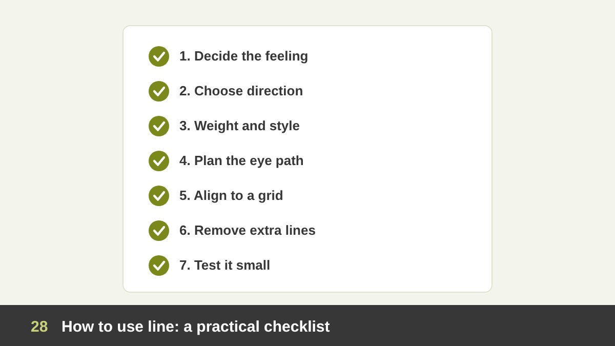
Here is the process I follow, and teach, whenever line plays a role in a design. 1. Decide the feeling first. Calm, strong, dynamic, soft, tense, elegant, playful? This tells you which direction and quality of line to use. 2. Choose the direction. Horizontal for calm, vertical for strength, diagonal for movement, curves for softness. 3. Choose weight and style. Thick or thin, solid or dashed, geometric or hand-drawn, and keep them consistent.
4. Plan the path of the eye. Where should the viewer look first, second, third? Use actual and implied lines to connect those points, and make sure no strong line leads out of the frame. 5. Build on invisible lines. Use a grid and align edges so that the structure is clear even without drawn lines. 6. Remove what is not needed. For every line, ask “what is its job?” If it has none, delete it.
7. Test it. View the design very small, in black and white, on a phone and printed. Lines that disappear or vibrate badly need to be adjusted. Line is the simplest element of design, but mastering it changes everything else you do. If you would like help with a poster, a logo, a social media identity or a website built on clear, confident lines, take a look at my portfolio or get in touch.
| Type of line | What it communicates | Where to use it |
|---|---|---|
| Horizontal | Calm, stability, rest, width | Luxury, wellness, real estate, landscape layouts, dividers |
| Vertical | Strength, height, growth, formality | Corporate, finance, fashion, tall posters, columns |
| Diagonal | Movement, speed, energy, change | Sports, sales, launches, action posters, social media |
| Curved / wavy | Softness, nature, flow, friendliness | Beauty, food, kids, health, music and events |
| Spiral | Focus, hypnosis, growth, dizziness | Focal points, film and event posters, logos |
| Zigzag / jagged | Tension, excitement, danger, electricity | Warnings, energy drinks, music, comic-style designs |
| Thick | Power, confidence, loudness | Headlines, bold brands, accents, icons at small sizes |
| Thin / hairline | Elegance, delicacy, precision | Luxury, editorial, frames, fine dividers (test small) |
| Dashed / dotted | Temporary, optional, path, cut here | Coupons, routes, diagrams, future states, guides |
| Hand-drawn | Human, authentic, playful | Social media, education, food, personal brands |
| Implied | Order, connection, direction of attention | Grids and alignment, gaze in photos, rows of elements |
Line in Design: Frequently Asked Questions
What is line in design?
Line is one of the basic elements of design. It is the path of a moving point, a mark that is much longer than it is wide. Designers use lines to create shapes and letters, lead the viewer’s eye, divide and organise content, create texture and pattern, and express feelings such as calm, strength or movement.
What are the main types of lines in design?
The main types are straight lines (horizontal, vertical and diagonal), curved lines, wavy lines, spiral lines, zigzag or jagged lines, thick and thin lines, dashed and dotted lines, contour and gesture lines in drawing, hatching, and implied lines that are not drawn but completed by the eye, such as alignment or the direction of a gaze.
What do different lines mean psychologically?
Horizontal lines usually feel calm and stable, vertical lines feel strong and formal, diagonal lines feel dynamic and active, curved lines feel soft and natural, zigzag lines feel tense or exciting, thin lines feel elegant and thick lines feel powerful. These are tendencies, so always consider culture and context.
What is an implied line?
An implied line is a line you do not draw but the viewer still sees. It appears when elements are aligned, when separate objects form a row, or when a person in an image looks or points in a direction. Implied lines are the secret behind clean layouts and grids.
What is the difference between line and shape?
A line is mainly about direction and length: it is much longer than it is wide. A shape is a closed, two-dimensional area. When a line closes on itself, it creates a shape, so lines are often the building blocks of shapes, letters and logos. I explain shape in detail in Shape in Design.
How do I use lines in social media design?
Use lines with a clear job: a bold diagonal for energy, hand-drawn circles and arrows to highlight key points, a thin frame for elegance, a line chart to show a result, and a continuous line that crosses carousel slides to encourage people to swipe. Keep stroke weights consistent and test the design on a phone screen.
Leave a Reply