

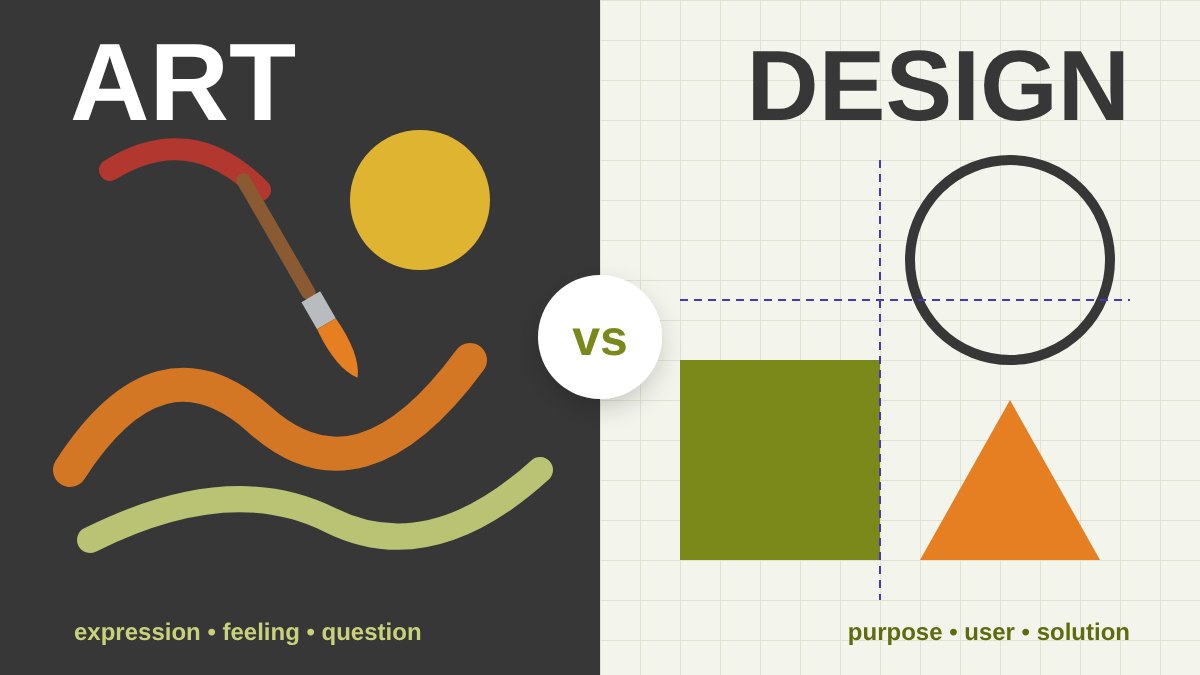
Art vs Design: Why the Question Still Matters
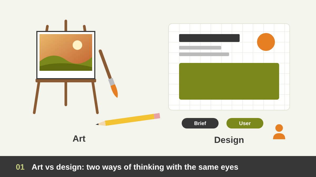
“Is design a kind of art?” I hear this question from students, from clients and from young designers almost every month. Some people use the two words as if they mean the same thing. Others put them in two separate worlds: art is for galleries, design is for business. The truth is more interesting. I work both as a painter and as an art director, and I can tell you that the difference between art and design is real, but it is not a wall. It is a line that history has drawn, erased and redrawn many times.
In this article we will look at art vs design in a simple way. First we will define the two words. Then we will travel through history: from the cave walls and ancient Egypt, to the Renaissance, the Industrial Revolution, the Arts and Crafts movement, Art Nouveau, the avant-garde, the Bauhaus, the Swiss Style, postmodernism and the digital era. On the way, we will meet the design theories that shaped how designers think, and at the end you will find a clear comparison table between art and design. Here is the short version:
Key takeaways
- Art starts from the artist: it asks a question, expresses a feeling or a point of view, and is free to be read in many ways.
- Design starts from a problem and a person: it has a brief, a user, a goal and a way to measure whether it works.
- For most of history the two were one practice. The split between “fine arts” and “applied arts” began in the Renaissance and grew with the Industrial Revolution.
- Arts and Crafts, Art Nouveau, the avant-garde, the Bauhaus, the Swiss Style, postmodernism and the digital era each redrew the line between art and design.
- The best designers keep an artist’s eye, and many artists use design thinking. The difference is in the purpose, not in talent or tools.
Defining the Terms: Art, Design and the Space Between
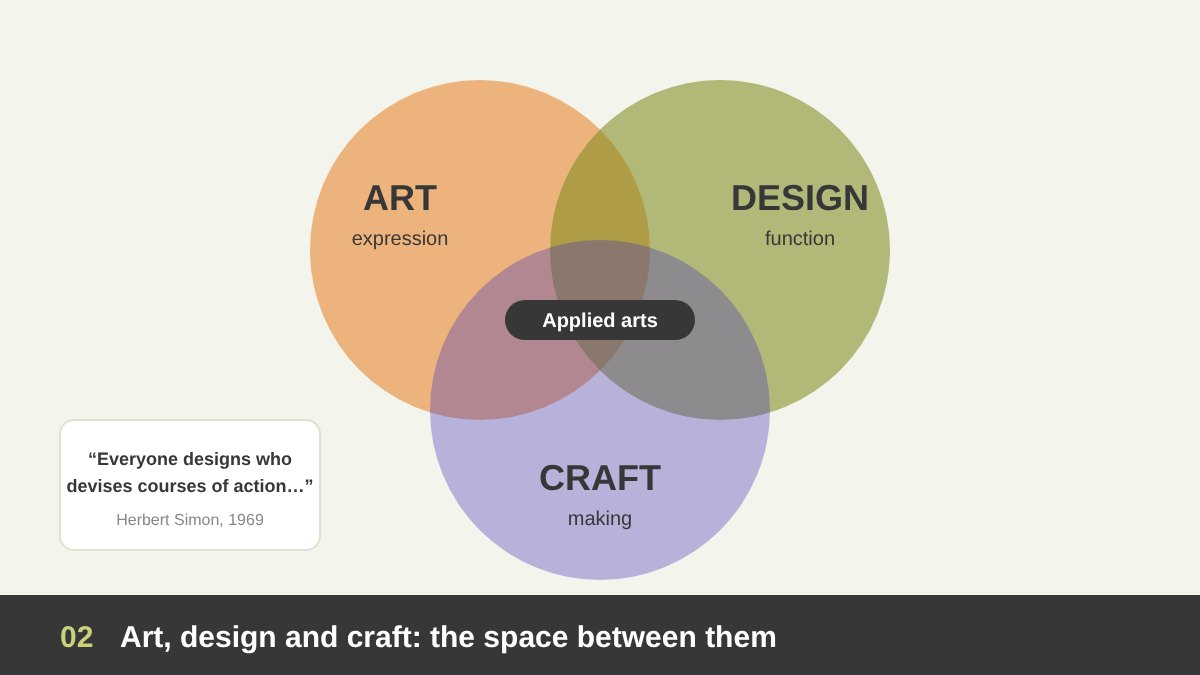
Art is a way of expressing an idea, a feeling or a view of the world through a medium: paint, stone, sound, light, the body, or a screen. A painting does not need to solve anything. It can ask a question and leave it open. Two people can stand in front of the same artwork and read it in two different ways, and both readings are valid. Its value lies in what it makes you feel and think.
Design is the planning of something for a purpose and for someone. A logo, a poster, a chair, an app screen or a booth is designed to do a job: to be understood, used, remembered or chosen. The economist and thinker Herbert Simon gave one of the best definitions in 1969: “Everyone designs who devises courses of action aimed at changing existing situations into preferred ones.” And between the two sits craft: the skill of making things well with the hands. In Arabic and in many universities, including the Faculty of Applied Arts here in Egypt, we still use the term applied arts for the place where art, craft and function meet.
Before the Word “Design”: When Art and Use Were One
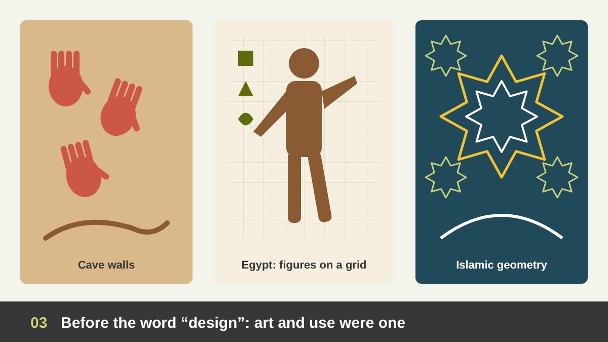
For thousands of years, nobody separated art from design. The handprints and animals on cave walls, such as Lascaux in France (around 17,000 years old), were art, but they were also signs and maybe rituals with a purpose. In ancient Egypt, the painter and the sculptor were craftsmen working for temples and tombs. They drew human figures on a grid of squares, so every figure followed the same canon of proportions. That is a design system, more than four thousand years before anybody spoke of grid systems. The hieroglyphs themselves were both beautiful images and a writing system: typography and illustration in one.
The same unity is clear in Islamic art. Arabic calligraphy, the geometric star patterns of the mosques of Cairo, the arabesque on a wooden mashrabiya or a brass lamp were made with mathematical rules and strong aesthetic sense, and they decorated real objects that people used every day. The craftsman did not ask “am I an artist or a designer?”. He was a master of a craft, and beauty and function were one job. Keep this in mind, because much of later design history is an attempt to bring that unity back.
The Renaissance: Disegno, the Genius Artist and the Printing Press
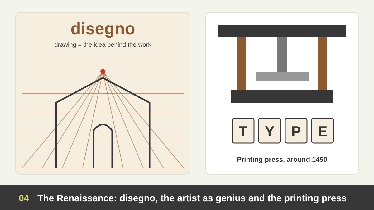
The Renaissance changed the status of the artist. In Italy, the word disegno meant both drawing and the idea or plan behind a work. Painters like Leonardo, Michelangelo and Raphael were no longer seen as simple craftsmen; they were celebrated as creative geniuses. In 1563, Giorgio Vasari helped found the Accademia delle Arti del Disegno in Florence, one of the first art academies. Slowly, a hierarchy appeared: painting, sculpture and architecture became the “fine arts”, and the making of furniture, textiles, books and objects was pushed down to the level of the “minor” or decorative arts.
At the same time, around 1450, Johannes Gutenberg’s movable-type printing press began a quieter revolution in Europe. Printing created a new profession: people who chose typefaces, arranged columns and margins and made pages easy to read for thousands of readers. This is the true ancestor of graphic design. So the Renaissance did two things at once: it lifted art to a higher, more personal place, and it created the first mass-produced visual communication, which needed a different kind of thinking.
The Industrial Revolution and the Arts and Crafts Movement
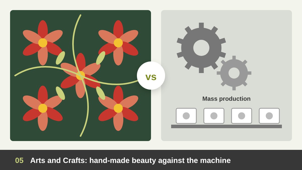
In the 18th and 19th centuries, factories began to produce furniture, fabrics, plates and printed matter in huge numbers. Machines could copy any ornament, so many products were covered in cheap decoration with little thought about quality or use. For the first time, the person who designed an object was clearly separated from the person who made it. In the same century, many artists adopted the idea of “art for art’s sake” (l’art pour l’art): art should serve no purpose except beauty itself. The gap between art and useful things became wider than ever.
The Arts and Crafts movement was the reaction. Inspired by the writer John Ruskin, the English designer William Morris started his decorative arts company in 1861 and later the Kelmscott Press in 1891. He designed wallpapers, textiles, furniture and books, and he believed that everyday objects should be honest, well made and beautiful, and that the maker should enjoy the work. His famous advice was: “Have nothing in your houses that you do not know to be useful, or believe to be beautiful.” The movement was romantic and often too expensive for ordinary people, but it gave design a moral idea: function and beauty belong together.
Art Nouveau and the Poster: When Art Went to the Street
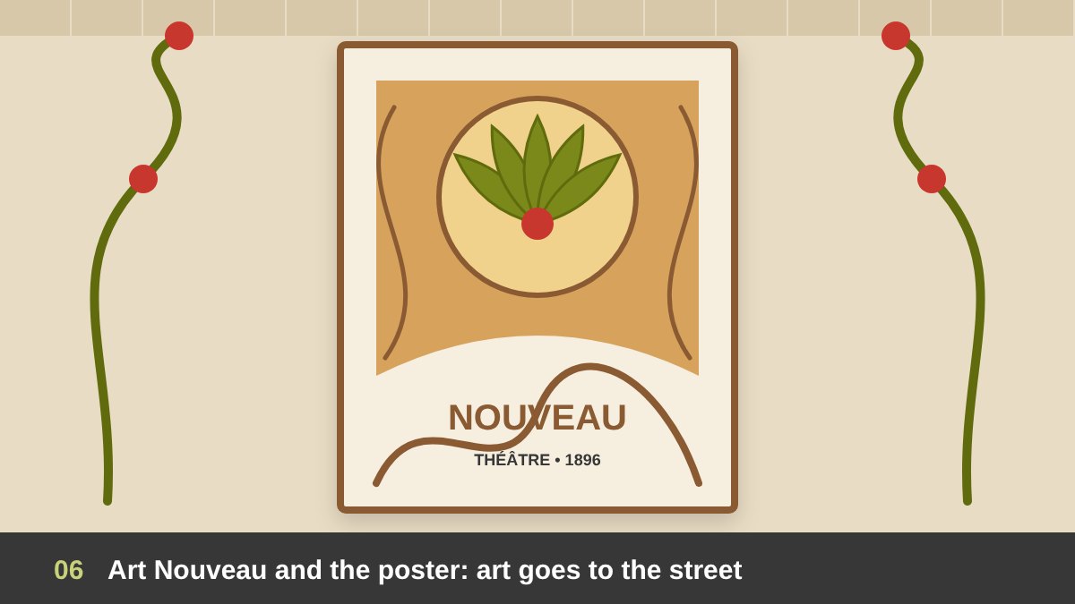
Between about 1890 and 1910, Art Nouveau spread across Europe: Jugendstil in Germany, Modernisme in Barcelona, the Vienna Secession in Austria. It was a total style, used on buildings, metro entrances, jewellery, furniture, books and posters, with flowing “whiplash” lines inspired by plants and nature. For the first time, a new style was born not only in paintings but in everyday things, and many of its masters worked as artists and designers at the same time.
The best example is the poster. New colour lithography allowed large, bright prints, and artists like Jules Chéret, Henri de Toulouse-Lautrec and Alphonse Mucha designed posters for theatres, cafés and products. Mucha’s posters for the actress Sarah Bernhardt are still copied today. These posters were advertising, with a client, a message and a deadline, yet people collected them as art. This is the moment when the street became a gallery, and it is a good reminder that commercial work can also be great art.
The Avant-Garde: Futurism, De Stijl and Constructivism
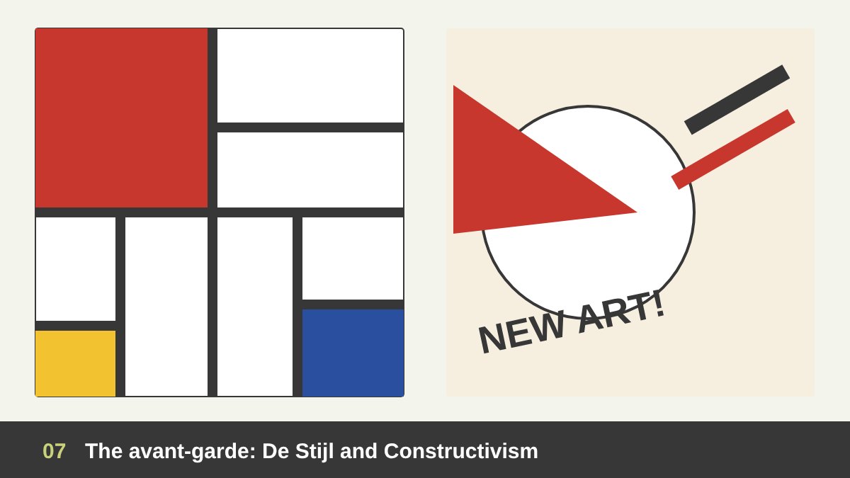
The early 20th century was the age of the avant-garde, and many of its art movements became design languages. The Italian Futurists, after Marinetti’s manifesto in 1909, broke typography apart to express speed and noise. The Dada artists used collage, random type and humour to attack logic. In the Netherlands, De Stijl (founded in 1917 by Theo van Doesburg, with Piet Mondrian) reduced everything to straight lines, right angles and primary colours, and applied it to paintings, furniture, interiors and graphics.
In Russia, the Constructivists went further: they believed the artist should become an engineer who builds a new society. El Lissitzky’s poster “Beat the Whites with the Red Wedge” (1919–1920) uses only geometric shapes and words to tell a political story. Alexander Rodchenko designed posters, books and advertisements with bold diagonals, photomontage and strong type. These movements showed that abstract art could communicate, and they gave graphic design its modern tools: the grid, asymmetry, photography and the power of the empty space.
The Bauhaus: Art and Technology, a New Unity
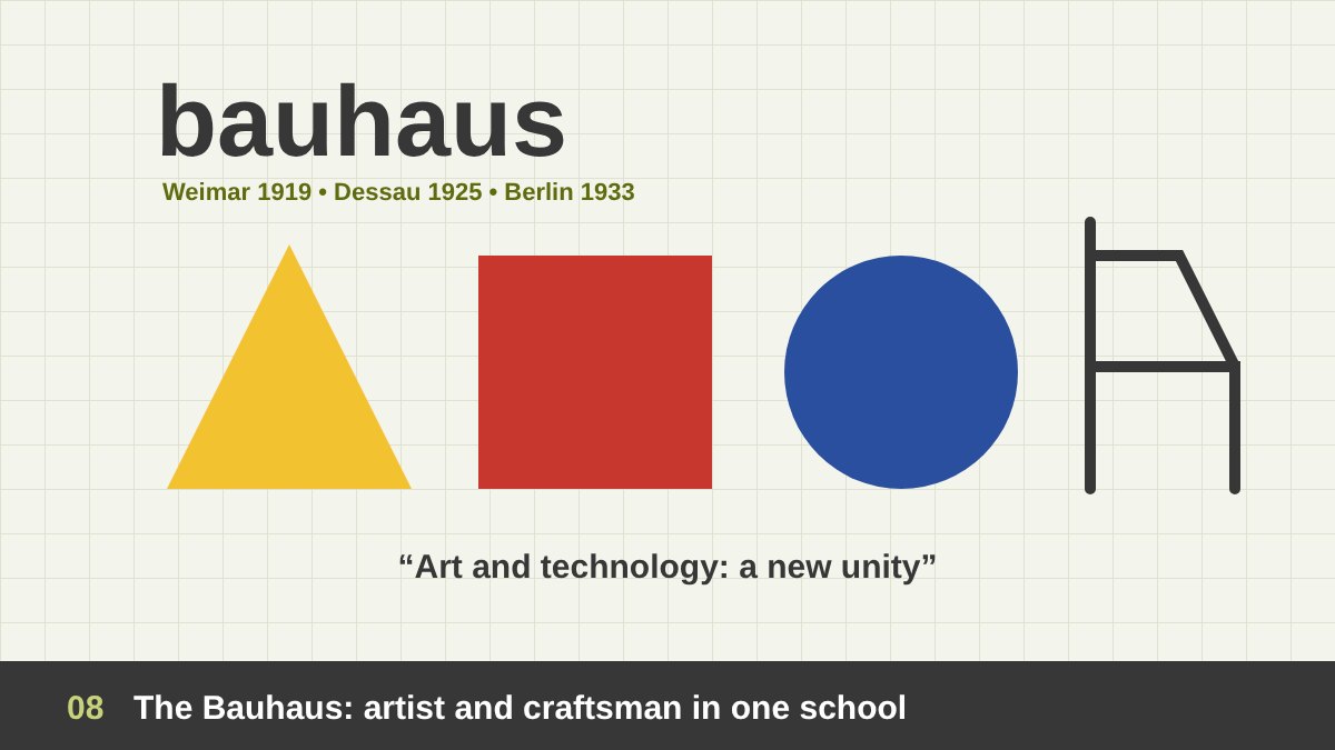
In 1919, the architect Walter Gropius founded the Bauhaus in Weimar, Germany. Its idea was simple and radical: there is no essential difference between the artist and the craftsman. Students began with a preliminary course on form, colour and materials, taught by artists like Johannes Itten, and later by László Moholy-Nagy and Josef Albers, and then worked in workshops for metal, wood, textiles, ceramics, typography and more. Wassily Kandinsky and Paul Klee taught there too, so painters and designers learned side by side.
At first the school was close to the Arts and Crafts spirit, but in 1923 it adopted the slogan “Art and technology: a new unity” and started to design prototypes for industry. It moved to Dessau in 1925 and was closed in Berlin in 1933 under pressure from the Nazi regime. Its teachers emigrated, and its ideas spread to the whole world. Simple geometric forms, sans-serif type, honest materials and the famous phrase of the American architect Louis Sullivan, “form follows function”, became the foundation of modern design education, including the way we still teach basic design today.
Modernism and the Swiss Style: The Grid, Clarity and “Less Is More”
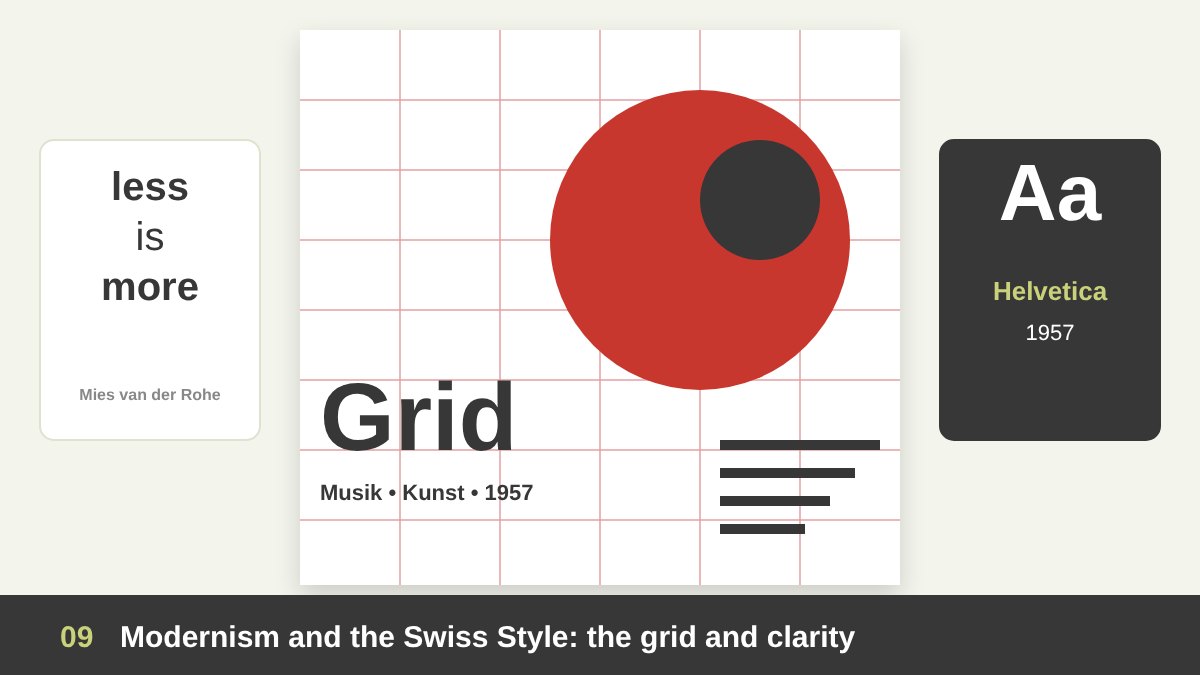
After the Second World War, modernism became the language of companies, airports, governments and international events. The architect Ludwig Mies van der Rohe’s motto “less is more” summed up the mood: remove everything that is not necessary. In graphic design, this produced the Swiss Style, also called the International Typographic Style, developed in the 1950s by designers like Josef Müller-Brockmann, Armin Hofmann and Emil Ruder in Zurich and Basel.
The Swiss Style is built on a mathematical grid, sans-serif typefaces, asymmetric layouts, objective photography and a lot of white space. It even created its own famous typeface: Helvetica, released in 1957 by Max Miedinger and Eduard Hoffmann. In product design, Dieter Rams at Braun followed the same spirit with his motto “less, but better” and his ten principles of good design. Here the designer looks more like a scientist than an artist: the goal is clarity, not personal expression. Many of the corporate identities and logos we know today, which I discuss in what makes a good logo design, come from this school of thought.
Pop Art and Postmodernism: Breaking the Rules Again
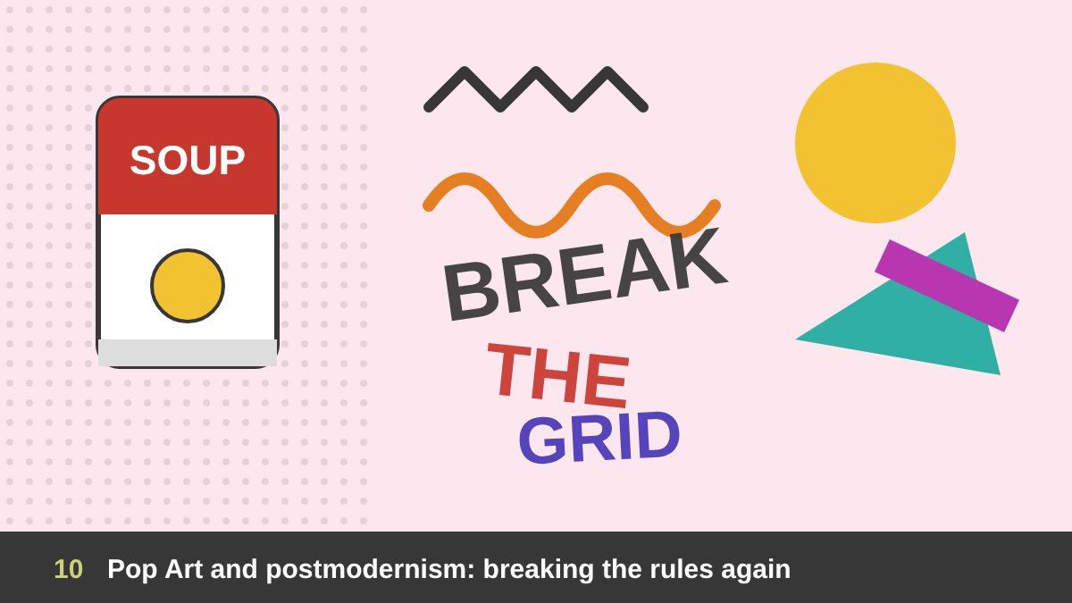
Every strong rule creates a rebellion. In the 1960s, Pop Art brought design and advertising into the gallery: Andy Warhol painted Campbell’s Soup Cans in 1962 and printed celebrities like products. Suddenly the supermarket, the comic strip and the logo were subjects of art. At the same time, the architect Robert Venturi answered Mies with “less is a bore” (1966), asking for complexity, history, humour and contradiction.
Postmodernism in design followed. The Memphis Group in Milan, led by Ettore Sottsass from 1981, made furniture in loud colours and strange shapes that looked more like sculptures than chairs. In typography, Wolfgang Weingart broke the Swiss grid from the inside, and in the 1990s David Carson’s magazine layouts were so expressive that some pages were hard to read on purpose. Postmodern designers proved that design can carry personal expression, emotion and irony, and the line between art and design became blurry again. You can still feel this energy in many of the graphic design trends of 2026.
The Digital Era: Screens, UX and Design Thinking
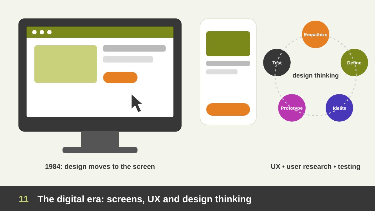
In 1984, the Apple Macintosh brought the graphical interface and, soon after, desktop publishing. Fonts, layouts and images moved from the drawing table to the screen, and design tools became available to everyone. Then came the web, mobile phones and apps, and a whole new family of disciplines: web design, interaction design, UI and UX design. My article on graphic design job titles explains many of these roles in detail.
Digital design pushed design closer to science and further from art. Don Norman’s book The Design of Everyday Things (first published in 1988) made usability a central value: if people cannot use it, it is not well designed, however beautiful it is. Methods like user research, prototyping, testing and design thinking, popularised by IDEO and Stanford’s d.school, turned design into a process for solving problems in business and society. Today, artificial intelligence is changing the tools again, but not the core question of who we design for and why; I discuss this in AI and Adobe for graphic designers. You can see some of my own web and UI/UX work here.
Design Theories Every Designer Should Know
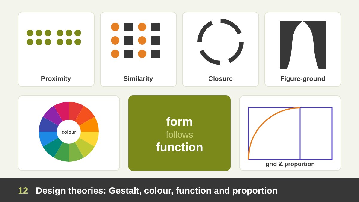
Art has many theories of beauty and meaning, but design developed its own practical theories, tested again and again on real users. The most important are the Gestalt principles, studied by the psychologist Max Wertheimer and his colleagues in the 1920s: proximity (things close together are seen as a group), similarity, closure, continuity and figure-ground. Every layout, icon and logo uses them, even when the designer does not know their names.
Then there is colour theory, from Johannes Itten’s colour contrasts at the Bauhaus to Josef Albers’ book Interaction of Color (1963), which showed that a colour changes depending on its neighbours. Add to them “form follows function”, “less is more”, the grid system, visual hierarchy, Dieter Rams’ ten principles and user-centred design. Proportion systems like the golden ratio are useful as tools too, but not as magic rules. What all these theories share is that they make design explainable: a designer can tell a client why a choice works. An artist rarely has to.
Art vs Design: The Main Differences
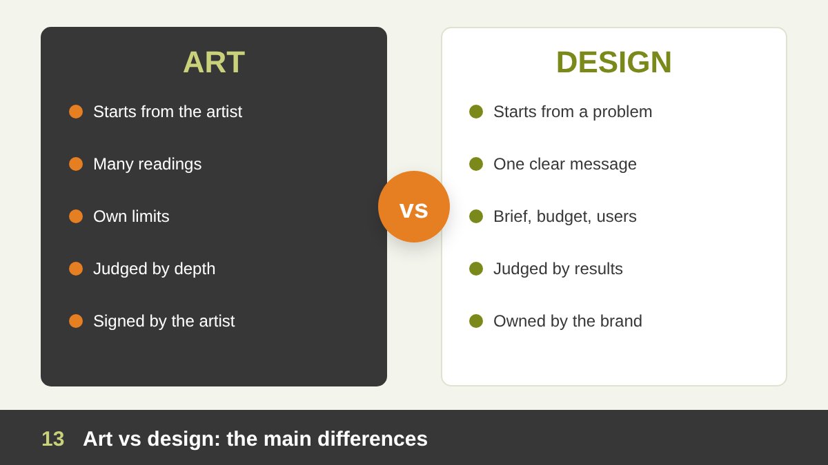
After this long journey, we can compare the two clearly. Art usually starts inside the artist: a feeling, an experience, a question. Design starts outside the designer: a client, a user, a problem and a brief. Art can be ambiguous and still succeed; design must communicate the intended message. A painting can be understood differently by each viewer, but if a road sign or a logo is understood in two ways, the design has failed.
The measure of success is also different. An artwork is judged by its depth, originality and the feeling it creates, often over many years. A design is judged by results: is it clear, usable, memorable, does it support the brand, does it sell or inform? Designers work with constraints of time, budget, technology and other people’s opinions, while artists choose their own limits. None of this makes one better than the other. They are two ways of thinking with the same eyes and often the same hands. If you work with brands, my article on branding vs logo design shows how this “design thinking” works in practice. The table below summarises the main differences.
| Aspect | Art | Design |
|---|---|---|
| Starting point | The artist’s idea, feeling or question | A problem, a client brief and a user |
| Main purpose | Expression, reflection, emotion | Communication, function, solving a problem |
| Audience | Open: whoever meets the work | Defined: a target user or market |
| Interpretation | Many readings are welcome | One clear message is the goal |
| Constraints | Chosen by the artist | Time, budget, brand, technology, users |
| Measure of success | Depth, originality, lasting impact | Clarity, usability, results |
| Ownership | Signed by the artist | Usually owned by the client or brand |
| Typical outcomes | Painting, sculpture, installation | Logo, poster, app, product, booth |
| Key movements | Renaissance, Impressionism, Abstract art | Arts and Crafts, Bauhaus, Swiss Style, UX |
Where Art and Design Meet: Why Designers Need an Artist’s Eye
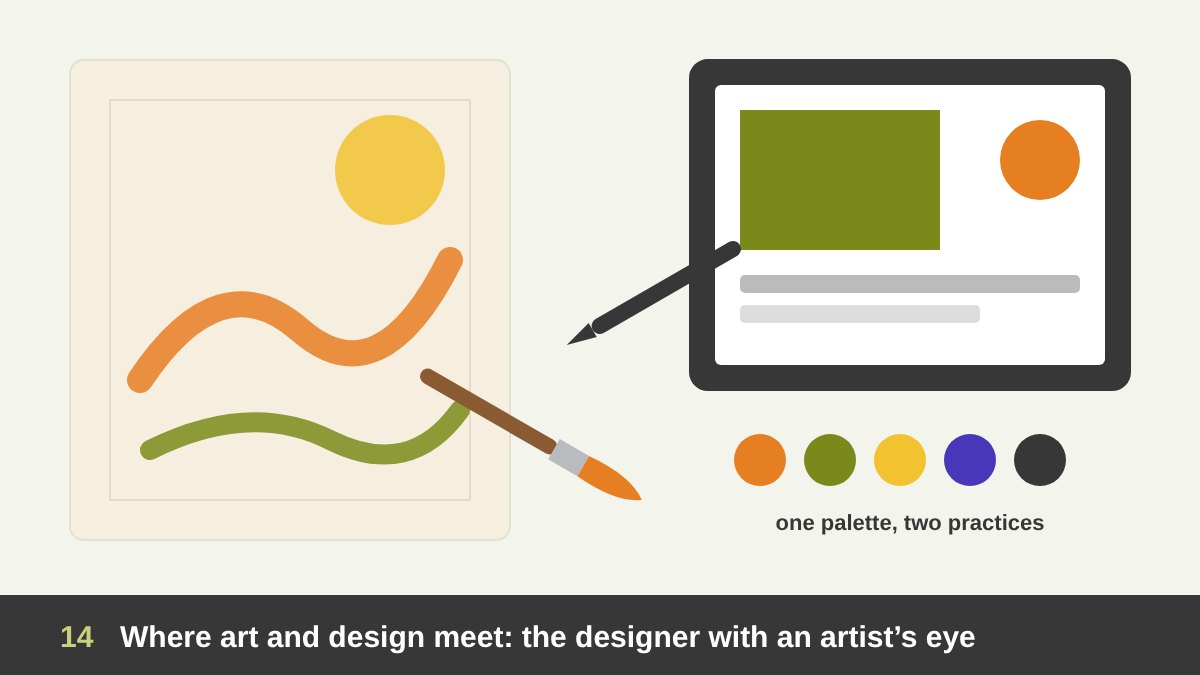
In my own practice, painting and design feed each other every day. Painting trains the eye: composition, light, colour harmony, rhythm and the courage to leave something unfinished. Design trains the mind: listening to the client, simplifying, building systems and accepting that the work is for someone else. When I direct a design team, the strongest designers are usually the ones who also draw, paint or photograph for themselves, because they bring a personal visual language into their professional work. You can see my paintings and drawings here and my design projects in the portfolio.
So, is design art? Design uses the tools and the sensitivity of art, but it serves a purpose outside itself. Is art design? Art can use design methods, but it does not need a brief to exist. The history of the Arts and Crafts movement, the Bauhaus and postmodernism shows that the best moments came when the two talked to each other. My advice to every young designer is simple: learn the theories, respect the brief, and keep a sketchbook for yourself. If you need a designer who thinks like an artist for your brand, website or project, get in touch with me.
Art vs Design: Frequently Asked Questions
What is the main difference between art and design?
The main difference between art and design is purpose. Art expresses the artist’s idea or feeling and can be read in many ways, while design solves a defined problem for a specific user or client and must communicate a clear message.
Is graphic design considered art?
Graphic design uses artistic skills such as drawing, composition, colour and typography, so it belongs to the applied arts. But because it serves a brief, a client and an audience, it is usually considered design rather than fine art.
What are applied arts?
Applied arts are the arts that give beauty to useful things: graphic design, interior design, textiles, ceramics, furniture, fashion, jewellery and more. The term is used to separate them from the fine arts, such as painting and sculpture, that exist mainly for expression.
Why was the Bauhaus important for design?
The Bauhaus (1919–1933) brought artists and craftsmen together in one school, joined art with industry, and taught design through form, colour and materials. Its ideas on simplicity, function and basic design still shape design education around the world.
What does “form follows function” mean?
“Form follows function” is a principle, from the architect Louis Sullivan, that the shape of a building or object should come from its purpose. In design it means you start from what the thing must do, and let its form grow from that.
Can an artist be a good designer?
Yes. Many great designers were also artists, from William Morris and Alphonse Mucha to the Bauhaus teachers. An artist becomes a good designer when they add design thinking: listening to the brief, understanding the user and accepting clear goals and limits.
Leave a Reply