

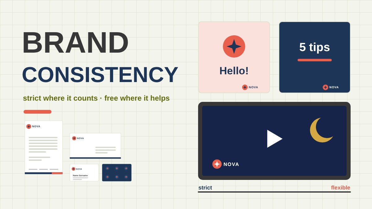
Brand Consistency: How Strict Should You Really Be?
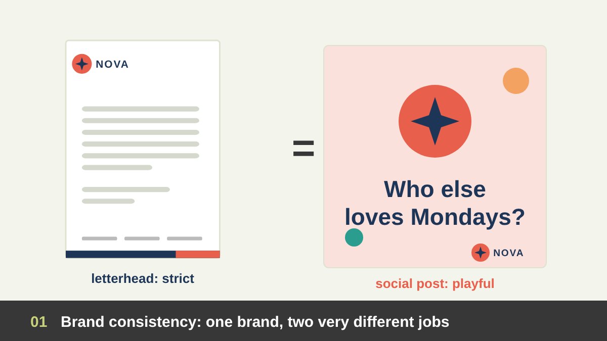
Every designer who works with an established brand eventually faces the same tension. On one side are the brand guidelines: the logo, two or three colours, a typeface and a list of rules. On the other side is the job in front of you: an Instagram post that has to stop someone scrolling, a Ramadan video that has to feel warm, a campaign that has to look new. Follow the guidelines too literally and the work becomes dull and repetitive. Ignore them and the brand slowly falls apart, one “just this once” at a time.
In my work as an art director I see both mistakes all the time. Some teams treat brand consistency as a cage: the same layout, the same two colours and the same photo style everywhere, even where they clearly do not fit. Other teams treat every post as a blank canvas, and after a year the brand’s feed looks like it belongs to ten different companies.
The honest answer is that brand consistency means different things in different fields. A letterhead and a TikTok video should not follow the brand in the same way, and they should not be judged by the same rules. This article goes through every design and marketing field, explains how strictly each one should follow the brand, and gives you practical rules for stepping outside the brand when you need to, without losing it. If you are new to the difference between a logo and a brand, start with my article on branding vs logo design.
Key takeaways
- Brand consistency is not sameness. A strong brand keeps a fixed core (name, logo, core colours, typeface, voice and values) and allows a flexible expression (layouts, extended colours, imagery, topics and formats) that changes with the channel.
- How strict you should be depends on the field. Stationery, official documents, signage and the logo itself are strict. Packaging, websites and presentations are systematic. Social media, campaigns, events and merchandise get the most room to flex, inside clear rules.
- If a brand has only two colours, you are not stuck: build tints and shades, a set of neutrals, an extended palette and functional colours, and set ratios so the brand colours are always recognisable.
- Before stepping outside the brand, run a simple test: is the core still recognisable, does it fit the brand’s values, does it serve this channel and audience, is it temporary and labelled, and would the brand team approve it?
- Below you will find every field of design and marketing with its level of strictness, a strict-to-flexible map, social media rules, template families, colour systems, video, campaigns, seasonal work like Ramadan, co-branding, how to write flexible guidelines, common mistakes and a checklist.
What Brand Consistency Actually Means
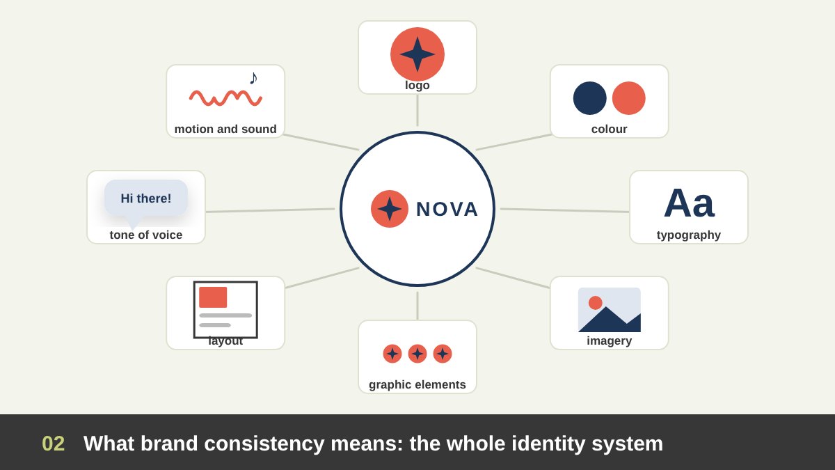
Brand consistency is the practice of presenting a brand in a recognisable and coherent way at every point where people meet it. That includes far more than the logo. A complete identity system usually includes the name and logo (with its versions, clear space and minimum sizes), colour, typography, imagery (photography, illustration and icons), graphic elements such as patterns, shapes and frames, layout principles and grids, tone of voice, and increasingly motion and sound.
Consistency also has a deeper level than visuals. A brand is consistent when what it says, how it behaves and how it looks all point in the same direction. A bank that promises simplicity and then sends a confusing four-page letter is inconsistent, even if the letter uses the right logo and the right blue.
So when we ask how strict to be, we are really asking which of these elements must stay fixed in a given piece and which can adapt. The rest of this article is a guide to answering that question field by field.
Why Brand Consistency Matters: Recognition, Memory and Trust
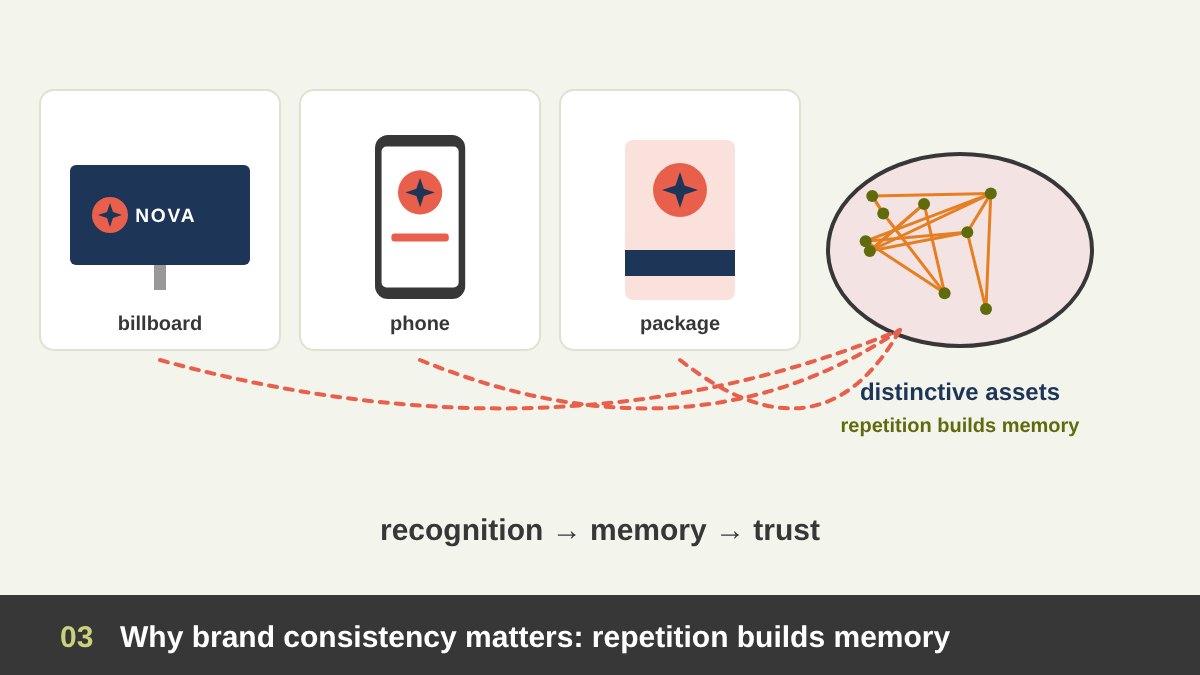
People do not study brands; they glance at them. Most contact with a brand lasts a second or two, on a phone screen, a shelf or a street. The marketing scientist Byron Sharp, in How Brands Grow (2010), and his colleague Jenni Romaniuk, in Building Distinctive Brand Assets (2018), argue that brands grow by being easy to notice and easy to remember, and that this depends on distinctive assets: colours, shapes, characters, sounds and phrases that people link with one brand only. Those links are built through repetition, which means through consistency.
Think of Tiffany’s robin’s-egg blue, which is protected as a trademark colour, or the red of Coca-Cola, or the shape of its bottle. Each of these assets works because it has been used the same way for decades. If a brand changes its main colour every season, it never builds that memory.
Consistency also builds trust. When the invoice, the website, the delivery van and the support email all look and sound like the same company, people feel it is organised and reliable. Vendor surveys, such as the brand consistency reports from Marq (formerly Lucidpress), link consistent presentation with higher revenue. Those figures come from self-reported surveys, so I treat them as a direction rather than a precise number, but the direction matches everything I have seen in practice.
Consistency Is Not Uniformity: Why Rigid Brands Fail
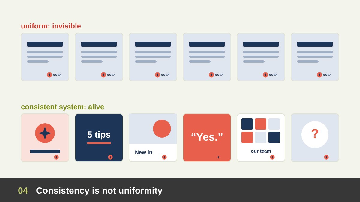
The opposite mistake is just as real. A brand that repeats exactly the same layout everywhere becomes invisible: people stop noticing it, a problem marketers call wear-out. Rigid brands also break when they meet formats their designers never imagined, such as a vertical video, a dark-mode app, an Arabic layout or a 16-pixel favicon.
Some of the most famous identities were built on controlled variation. MTV’s logo, designed by Manhattan Design in 1981, kept the same big M and small TV but changed its fill, colour and texture constantly. Google has changed its homepage logo into Doodles since 1998. Landor’s 2009 identity for the City of Melbourne used one M shape filled with endless patterns, and Stefan Sagmeister’s 2007 identity for the Casa da Música concert hall in Porto changed its colours for every use while keeping the building’s shape. These are called dynamic or flexible identities.
The lesson is that consistency lives in the system, not in identical copies. People recognise a brand by a few strong, repeated cues. As long as those cues are there, everything else can move. The real skill is knowing which cues those are for your brand.
The Three Layers of a Brand: Core, System and Expression
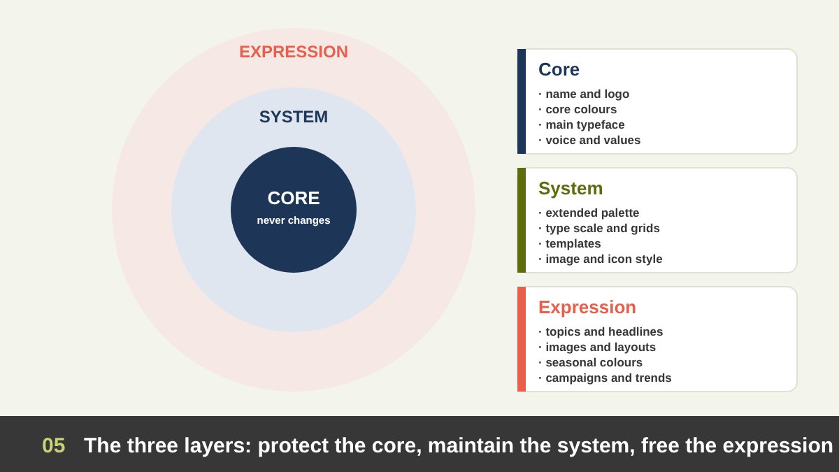
The most useful tool I know for deciding how strict to be is to divide the brand into three layers. The core is what almost never changes: the name, the logo and its rules, the primary colours, the main typeface, the brand’s values and its basic tone of voice. Changing the core is a rebrand, not a design decision.
The system is the set of tools that turns the core into real work: the extended colour palette, type scale, grids, templates, icon style, photography style and graphic elements. The system can grow and adapt over time, but changes should be deliberate, documented and shared with everyone who uses the brand.
The expression is everything that changes from piece to piece: the topic, the headline, the image, the illustration, the layout variation, a seasonal colour, a campaign idea, a trend. This is where creativity lives. A simple rule follows from the three layers: protect the core, maintain the system, free the expression. Each field of design simply has a different balance between these layers.
The Brand Flexibility Spectrum: How Strict Each Field Should Be
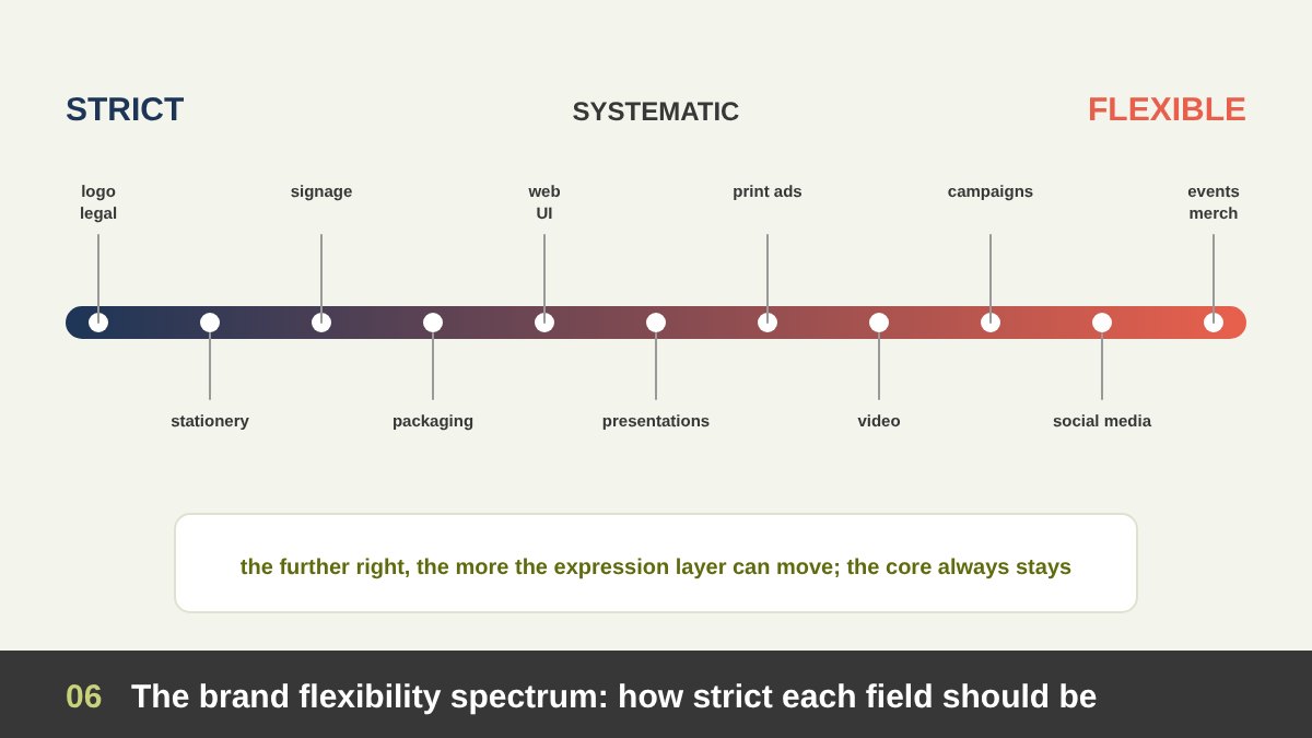
If we place every field of design on one line, from strict to flexible, a clear pattern appears. At the strict end are the logo itself, legal and official documents, stationery and signage. These are seen repeatedly, often for years, they represent the organisation officially, and many of them are produced by different suppliers, so exact rules protect them.
In the middle are fields that are systematic: packaging, websites and apps, presentations, brochures and reports, print and digital ads. They follow a strong system of templates and components but leave room for content, range variations and layouts.
At the flexible end are social media, campaigns, video storytelling, events, merchandise and seasonal work. They live for a short time, compete for attention, and often have to speak the language of a platform or a moment. They can flex the most, but only in the expression layer. The core still applies. The table near the end of this article summarises every field in detail.
Corporate Identity and Stationery: Where Brand Consistency Is Strict
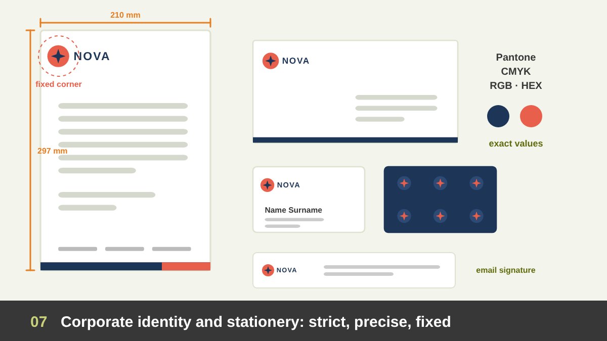
Stationery is the strictest field after the logo itself, and for good reason. Letterheads, envelopes, business cards, compliment slips, invoices, quotations, contracts, certificates, ID cards, stamps and email signatures are the official voice of the organisation. They are often legal or financial documents, they are printed by different suppliers in different years, and they are filled in by people who are not designers. If the rules are loose, every department ends up with its own version.
Strict here means precise: the logo version, size and position in millimetres; margins and the writing area; the typeface and size for the body text; the exact colour values for each process (Pantone for offset, CMYK for digital print, RGB and HEX for screen documents); paper stock and finish; and the order of the contact details. On an A4 letterhead the logo usually sits in a fixed corner with generous clear space, the legal details go in the footer, and the middle is left empty for the letter itself.
There is still a little room for design, but it is decided once, in the system: for example, a brand pattern on the back of the business card or inside the envelope, or a different colour accent for each department. After that, the templates are locked. When I deliver an identity, such as the Al Malik case study or the Erabco identity, the stationery is always presented as a fixed set, because that is how it will be used.
Print Collateral and Publications: Strict System, Flexible Content
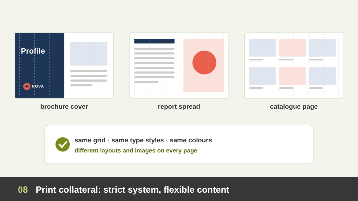
Brochures, company profiles, catalogues, annual reports, menus, flyers and magazines sit one step away from stationery. Their system should be strict: the grid, the margins, the type hierarchy (headings, body, captions), the colour usage, the image style and the position of the logo, usually on the cover and the back page. In InDesign this is what master pages, paragraph styles and colour swatches are for.
Their content is flexible. Each spread can use a different layout from the grid, different images and different ratios of text to picture. A long report can introduce a section colour from the extended palette to help readers find their way, and a catalogue can colour-code product ranges.
The test for print collateral is simple: if you cover the logo, can you still tell which brand the brochure belongs to? If yes, the system is working. If the brochure only looks like the brand because of the logo, the system is too weak; if every page looks the same, it is too rigid. Good use of white space and a clear grid does much of this work.
Signage, Environmental Graphics and Exhibitions
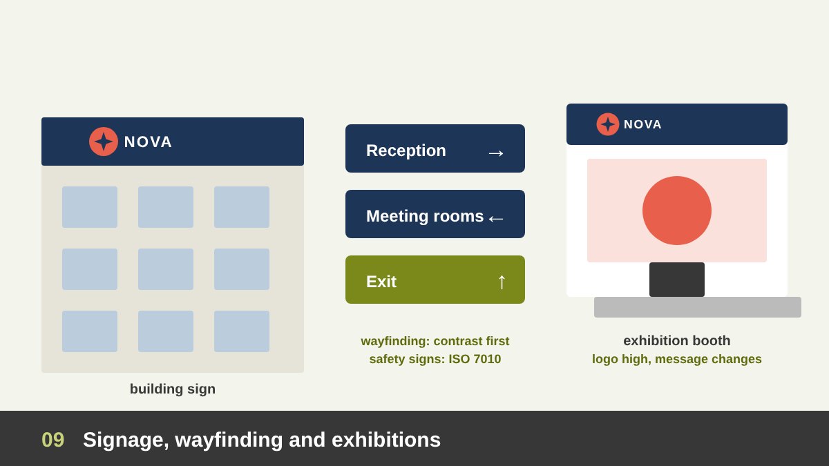
Signage and environmental graphics are strict for two reasons: they are expensive and permanent, and they often carry safety and accessibility duties. Shop fronts, building signs, wayfinding, vehicle graphics and office interiors follow exact rules for the logo, colours, materials, lighting and typography. Wayfinding needs high contrast and legible type at distance, and safety signs follow international standards such as ISO 7010, whose colours and pictograms override the brand. A fire exit sign should look like a fire exit sign, not like your brand.
Interiors and murals can be more expressive. Brand patterns, large photographs, illustrations of the brand’s story and quotes on walls give personality to a space, as long as the core colours and materials stay consistent across branches.
Exhibition booths sit between strict and flexible. The logo must be visible from far away and placed high, above head height, and the brand colours should dominate so visitors recognise the company across the hall. The graphics, the product focus and the message can change for each exhibition. I cover this in detail in my guide to exhibition booth design.
Packaging: Strict Brand Block, Flexible Range Colours
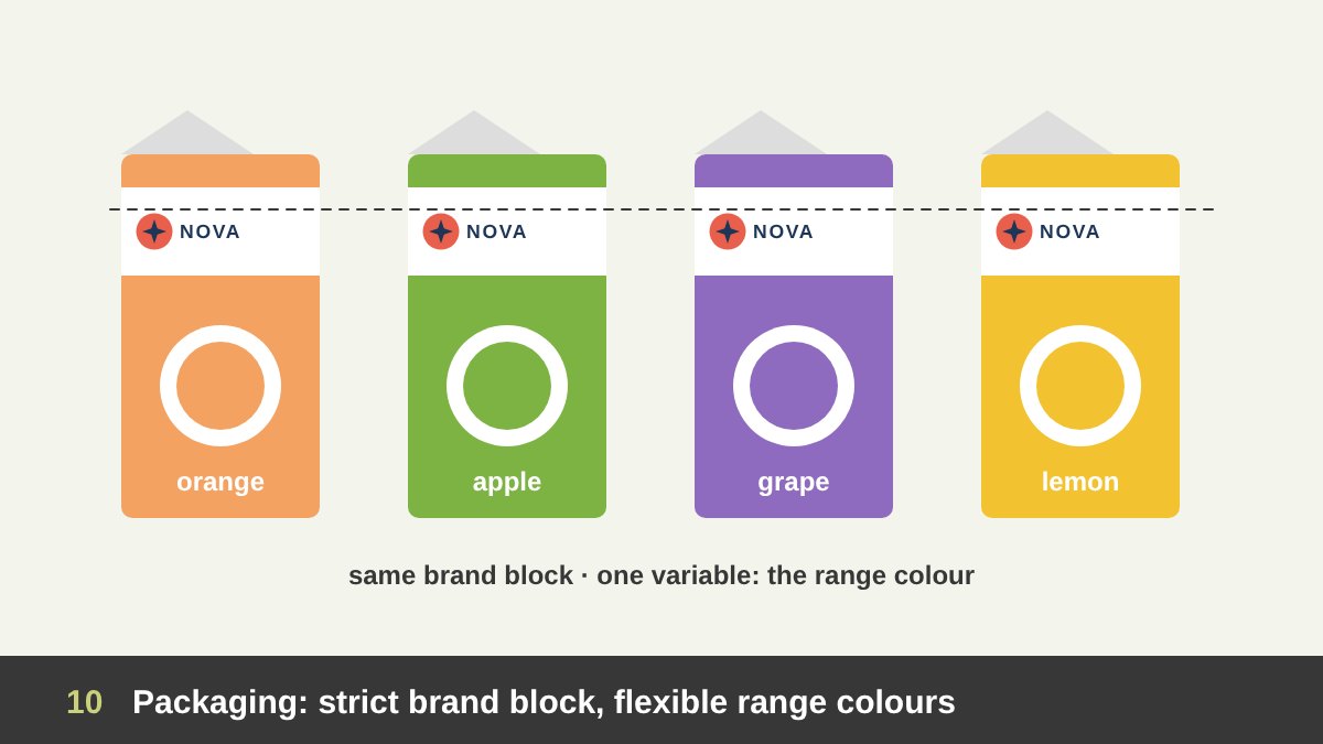
Packaging shows clearly how a brand can be strict and flexible at the same time. The brand block (logo, its position, the main typeface, the structure of the front panel) is strict, because shoppers find products on a shelf in seconds by recognising those cues. Change them and loyal customers literally cannot find you.
Within that structure, packaging often needs colours that are not in the brand palette at all: a flavour, a variant or a product range is commonly coded by colour. Coca-Cola keeps its red and its script, but Coca-Cola Zero Sugar uses black and Diet Coke silver. A juice brand might use orange for orange, green for apple and purple for grape. These colours are allowed because they follow a rule: same structure, one variable.
Limited editions and seasonal packs can flex even further, with illustrations or special finishes, but the brand block should stay in its usual place. Mandatory information, such as ingredients, barcodes and nutrition tables, follows legal rules first and brand rules second.
Websites, Apps and UI: Design Systems and Functional Colours
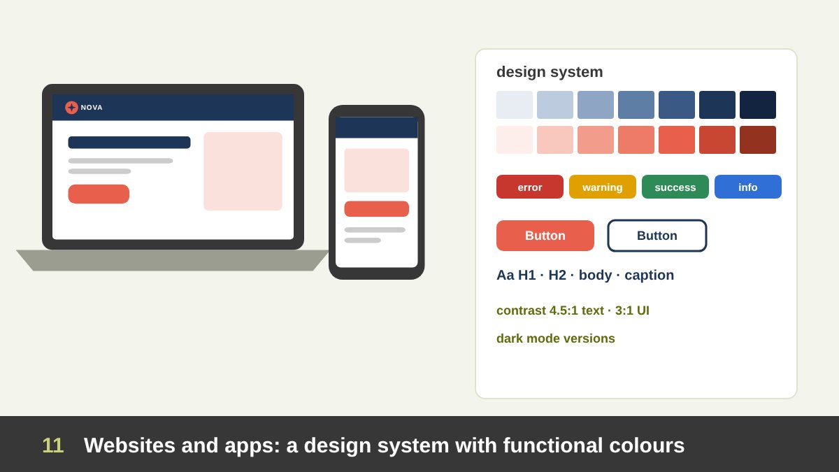
In digital products, brand consistency is managed through a design system: a library of colour and type tokens, components (buttons, forms, cards, navigation) and patterns, often built in Figma and in code. The system makes the brand consistent across hundreds of screens and many designers and developers. Components should be strict; once a button style is defined, it should not be redesigned on every page.
UI is also the field that proves why every brand needs colours outside its core palette. Interfaces need functional colours: red for errors, amber for warnings, green for success, blue for information, plus a full range of neutrals for text, borders and backgrounds. They also need colours that pass accessibility rules: WCAG asks for a contrast ratio of at least 4.5:1 for normal text and 3:1 for large text and interface components. A light brand yellow or coral often fails as text colour on white, so the system needs a darker version for text and a lighter one for backgrounds. Dark mode needs its own adjusted versions too.
Where can a website flex? Landing pages for campaigns, hero images, illustrations and microinteractions can carry more personality. The navigation, the components and the core colours should stay stable, because users learn them. Consistency here is not only brand recognition; it is usability.
Social Media: Why It Is Different
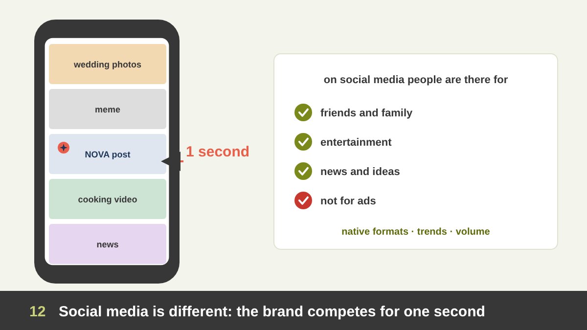
Social media is where most designers’ frustration with brand guidelines really sits. On Facebook, Instagram, TikTok, LinkedIn or X, a brand is not a guest in its own space. It appears in a feed between a friend’s wedding photos, a meme, the news and a cooking video. People are there to be entertained or informed, not to look at ads. If a post looks like a corporate brochure, the thumb keeps scrolling.
Social platforms also have their own visual languages: native formats (vertical video, carousels, stories), on-screen captions, trends, sounds, memes, creators’ faces. Content that feels native to the platform tends to perform better than content that looks imported from another medium. And the volume is huge: a brand may publish several posts a week, so the same three templates will wear out quickly.
This is why social media needs more flexibility than any other field. But more flexibility does not mean no rules. The brand still has to be recognised in that one second, or all the engagement goes to the content and none of it to the brand. The goal is posts that people enjoy and remember who made.
Social Media Brand Rules: What Must Stay Fixed and What Can Flex
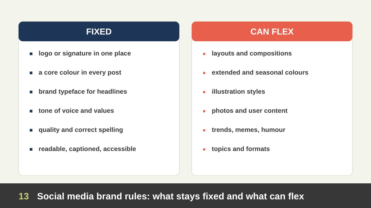
Here are the rules I use with teams for social media. What stays fixed: the logo or a brand signature appears in a consistent, small place (or the brand appears in the first seconds of a video); at least one core brand colour is present in every post; the brand typeface, or an approved display face, is used for headlines; the tone of voice and the brand’s values do not change; the quality bar (sharp images, correct spelling in Arabic and English, no stretched logos) never drops; and posts are accessible, with readable text sizes, enough contrast and captions on video.
What can flex: layouts and compositions, the extended and seasonal colours, illustration styles, photography and user-generated content, video formats and editing styles, humour, memes and trends, guest creators and influencers, and the topic of the post. A post can be educational one day, a behind-the-scenes photo the next, and a light joke after that.
A practical way to write this down is a colour ratio rule and a signature rule. For example: every post contains at least 20% brand colour or a brand frame, and every post carries the logo in the bottom corner or the brand handle in the caption image. With those two rules in place, a team can experiment freely and the feed still looks like one brand when you view it as a grid.
Content Pillars and Template Families for Social Media
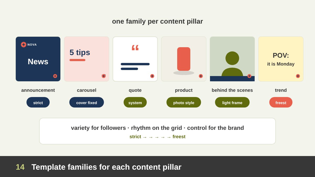
The best way to make social media both consistent and lively is to design template families, one for each content pillar, instead of one template for everything. A content pillar is a recurring type of content: education, product, people and behind the scenes, community and user content, news and announcements, and entertainment or trends.
Each family gets its own level of strictness. Announcements and official news are close to stationery: fixed layout, core colours, logo clearly visible. Educational carousels use a strong, recognisable cover style and a flexible inside. Product posts follow the photography style and leave room for the product’s own colours. Behind-the-scenes and people posts use real photos with a light brand frame. Trend and entertainment posts are the freest, often with almost no template, carried by the brand’s voice and a small signature.
This structure solves a real problem: designers get variety, followers get surprises, and the brand team gets a feed that still looks planned. When you view the profile as a grid, the repeated families create a rhythm, a principle I explain in my article on the principles of design.
Trends, Memes and Viral Formats: Rules for Joining In
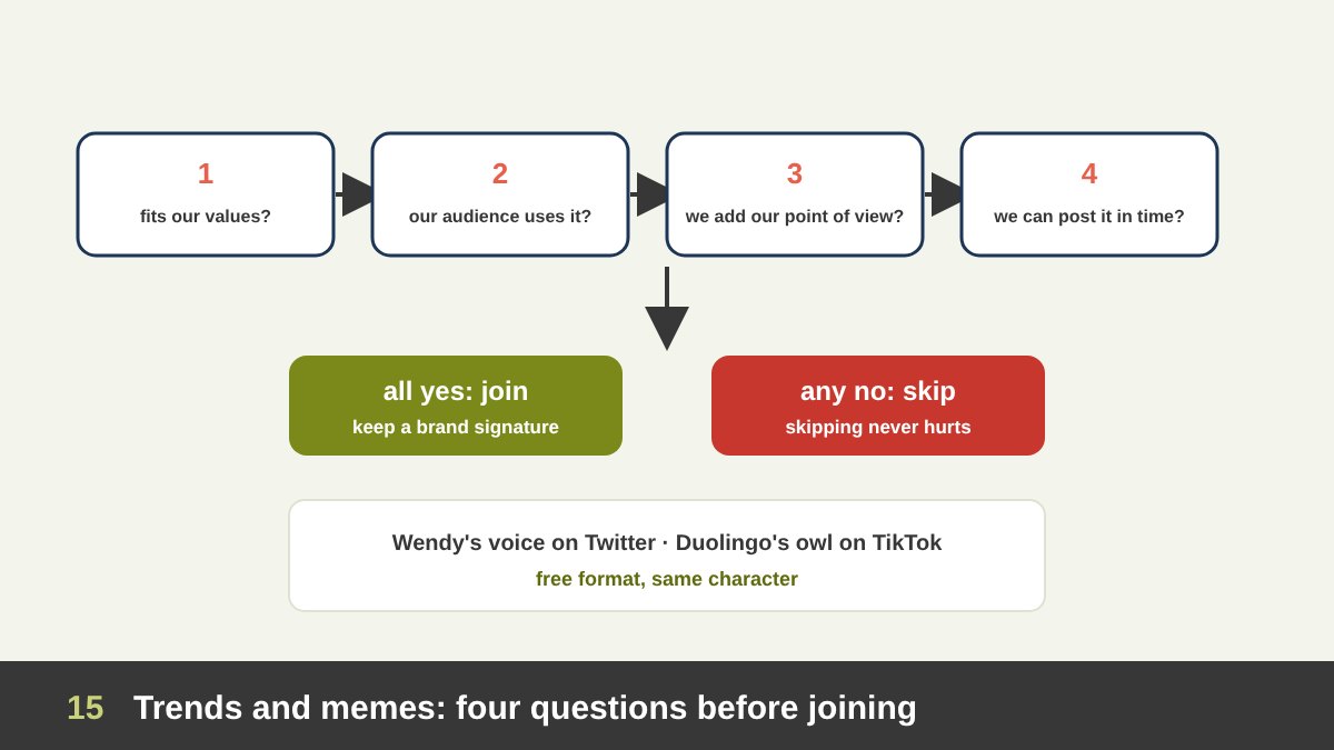
Trends and memes are the most extreme form of stepping outside the brand, because their visual style belongs to the internet, not to you. Some brands have built their personality on them. Wendy’s became famous for its sharp, funny replies on Twitter around 2017, and Duolingo turned its green owl mascot into a chaotic TikTok character from 2021. Notice that both stayed consistent at the deeper level: Wendy’s was always Wendy’s voice, and the owl is always Duolingo’s owl and green.
Before joining a trend, I suggest four questions. Does it fit our values? A trend built on mocking people or on a sensitive event is never worth it. Does our audience actually use it? A B2B audience on LinkedIn may not know a TikTok sound. Can we add our own point of view? Copying a meme adds nothing; linking it to your product or field makes it yours. Can we post it while it is still alive? Trends die in days, so a two-week approval process kills them.
If the answer to all four is yes, join the trend and keep at least one brand signature: your character, your colour, your voice in the caption or your handle. If not, skip it. Not joining a trend never hurt a brand; joining the wrong one often has.
When the Brand Has Only Two Colours
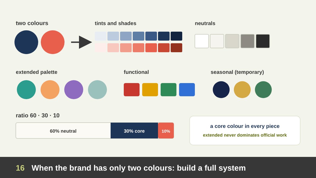
This is one of the most common real problems designers ask me about: the brand has two colours, and they do not suit everything. Maybe they are dark and heavy for a summer video, maybe they clash with food photography, or maybe after fifty posts in navy and coral the feed looks monotonous. Designers then feel trapped between breaking the brand and producing weak work.
The answer is that two colours are a core, not a complete palette. A working colour system grows from them in layers. First, tints and shades: lighter and darker steps of each brand colour, for backgrounds, cards and text. Second, neutrals: whites, off-whites, greys and near-blacks, ideally slightly warm or cool to match the brand. Third, an extended or secondary palette: two to four extra colours chosen to work with the core, used for illustrations, charts, campaigns and content categories. Fourth, functional colours for UI and data. Fifth, optional seasonal or campaign colours that are used for a limited time.
The key is to protect recognition with ratios. A common starting point is the 60-30-10 rule borrowed from interior design: about 60% neutral or a light tint, 30% a core brand colour and 10% accent. You can also set a minimum: every piece contains a core colour, and an extended colour is never the dominant colour in official materials. Within those limits, the extended palette gives you all the variety you need.
How to Build an Extended Colour Palette Step by Step
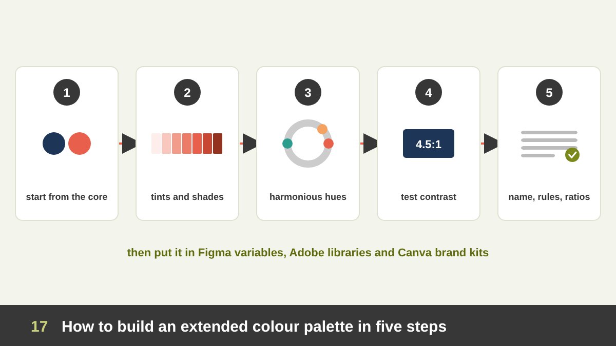
If the brand guidelines do not include an extended palette, you can build one properly and propose it to the brand owner, rather than picking random colours for each post. Here is the process I use.
1. Start from the core. Write down the exact values of the brand colours (Pantone, CMYK, RGB, HEX). 2. Build tints and shades for each, for example 10 steps from very light to very dark, keeping the hue stable. 3. Choose extra hues by relationship, not by taste: an analogous colour next to a core colour on the wheel feels calm and close to the brand; a complementary or split-complementary colour gives energy for accents. Match their saturation and value to the core so they feel like one family. 4. Test them: check text contrast for accessibility, check them in print and on screen, on photos, in dark mode and in charts, and check that none of them is the main colour of a direct competitor. 5. Define the rules: name each colour, say where it can be used, set ratios and add examples of right and wrong use.
Then document the palette in the guidelines and in the design tools (Figma variables, Adobe libraries, Canva brand kits), so the whole team uses the same values. A good extended palette makes the brand feel richer without ever making it feel like a different brand.
Typography: One Family, Clear Rules, Room for Display
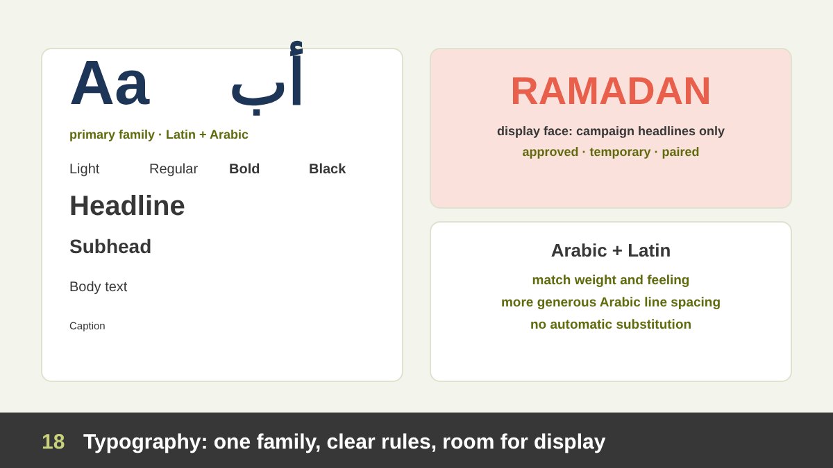
Typography is one of the strongest consistency tools, often stronger than colour, because it appears in every single piece. Most brands should use one main family, or one Latin and one Arabic family designed to work together, in several weights. Clear rules for the type scale (headline, subhead, body, caption), line spacing and alignment do more for consistency than any logo rule.
Where can typography flex? Campaigns and social media sometimes need a more expressive display face: hand lettering for a Ramadan campaign, a bold condensed face for a sports event, a playful script for a children’s range. That is acceptable when the display face is limited to headlines, approved, temporary, and paired with the brand’s own typeface for everything else.
For bilingual brands in our region, Arabic typography needs special care. The Arabic and Latin faces should match in weight and feeling, the Arabic should not be a cheap automatic substitution, and Arabic line spacing usually needs to be more generous than Latin. Inconsistent Arabic type is one of the most common reasons bilingual brands look unprofessional.
Imagery, Illustration, Icons and AI: Consistent Style, Varied Content
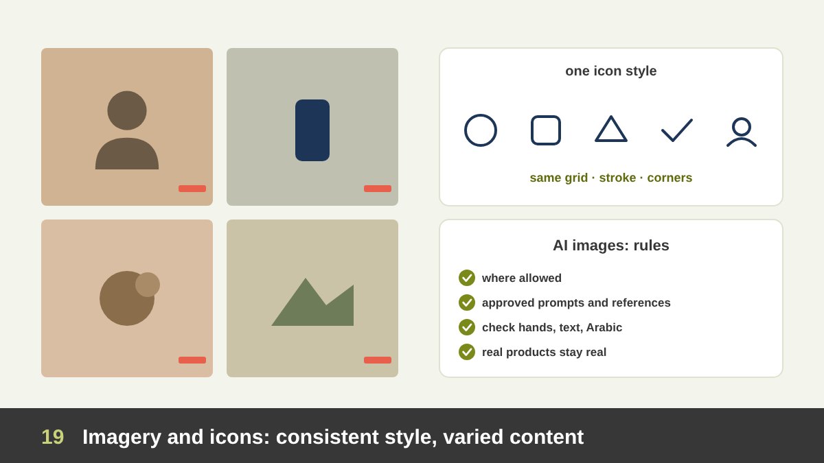
Images carry more of a brand than most guidelines admit. A brand can be recognised by its photography style alone: warm natural light or hard studio flash, real people or models, candid or posed, close crops or wide scenes, a particular colour grading. Defining that style, and giving examples, lets different photographers and designers produce different subjects that still look like one brand.
Illustration and icons work the same way. An illustration style is defined by its line weight, shapes, textures, colour palette and level of detail; an icon set by its grid, stroke weight, corner radius and fill style. Within a defined style, the subjects can be endless. Mixing three icon styles from three free websites is one of the fastest ways to make a brand look careless.
AI images need explicit rules today. They are useful for concepts and some content, but they tend to drift toward a generic look. Brands should decide where AI images are allowed, keep a set of approved prompts or reference images to keep the style consistent, check every image for errors (hands, text, Arabic letters, cultural details), and never let an AI image replace the brand’s real products or real people where honesty matters. I discuss this further in my article on AI and Adobe for graphic designers.
Video and Motion: Strict Signature, Free Storytelling
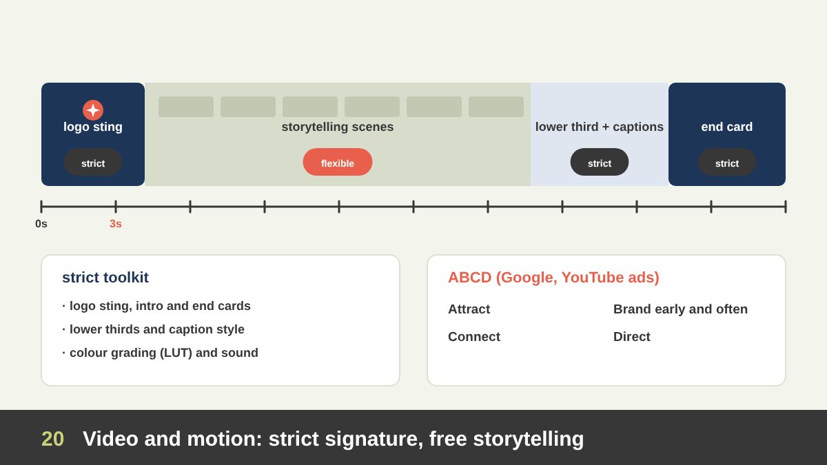
Video is where brand consistency moves in time. The strict parts are the signature elements: the animated logo or sting, intro and end cards, lower thirds for names and titles, caption and subtitle styles, transitions, the colour grading or LUT, the typeface for on-screen text, and the brand’s sound. These should be designed once as a motion toolkit and reused, so every video feels like part of the same channel.
The flexible part is the storytelling: the script, the location, the cast, the camera style, the music choice, the editing rhythm and the format. A product tutorial, a customer story, a Ramadan film and a quick vertical reel can be completely different in feeling. Brand colours do not have to fill every frame; a frame full of navy and coral would feel like an animated logo, not a story. Instead, let the brand appear through details: a costume, a prop, a wall colour, a graded tone, a graphic overlay.
For digital video, show the brand early. Google’s ABCD framework for effective YouTube ads (Attract, Brand, Connect, Direct) recommends introducing the brand early and often, because many viewers skip or scroll after a few seconds. On vertical social video, design for sound off: captions and on-screen text in the brand typeface carry both the message and the brand.
Sound and Sonic Branding
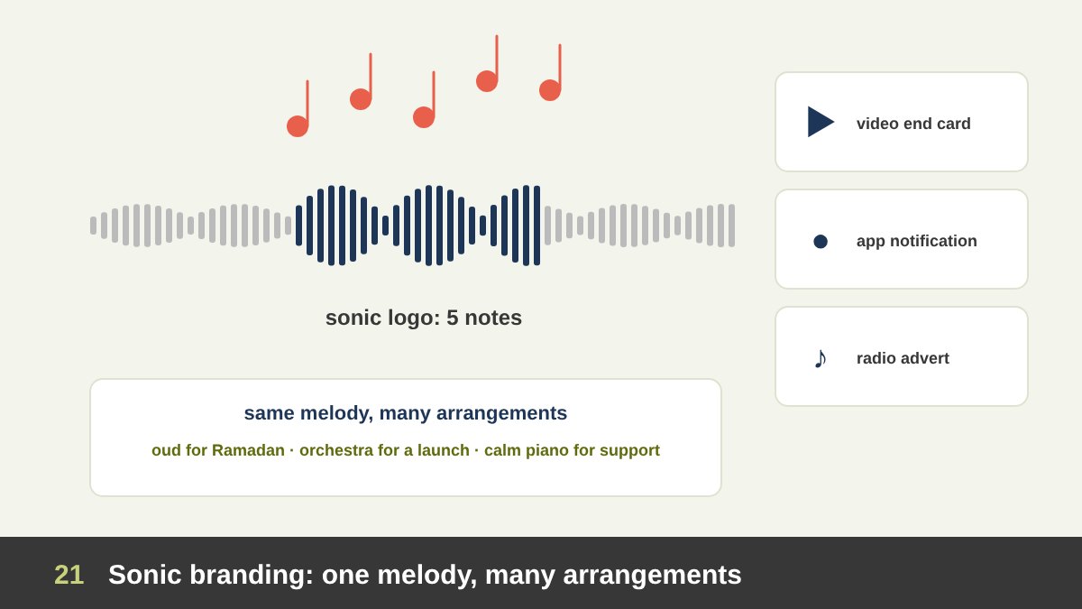
Sound is the field people forget most, and it follows the same logic as visuals. A sonic logo is a short, repeated sound linked with a brand. Intel’s five-note “bong”, created in 1994, is one of the best-known examples, and Mastercard launched a full sonic brand in 2019, including a melody that is adapted for different moments, from a short sound at the moment of payment to longer versions in ads.
The strict part of a sonic identity is the signature: the notes, the timing and where it appears (the end of videos, app notifications, radio ads, hold music). The flexible part is the arrangement: the same melody can be played on an oud for Ramadan, on an orchestra for a big launch or as a calm piano version for a support line. This is the same principle as an extended palette: one recognisable core, many expressions.
Even if a brand has no sonic logo, it should have sound guidelines: the type of music it uses, the voice-over tone, whether it uses trending sounds on social media, and its rules for music licensing.
Advertising Campaigns: A Campaign Identity Inside the Brand
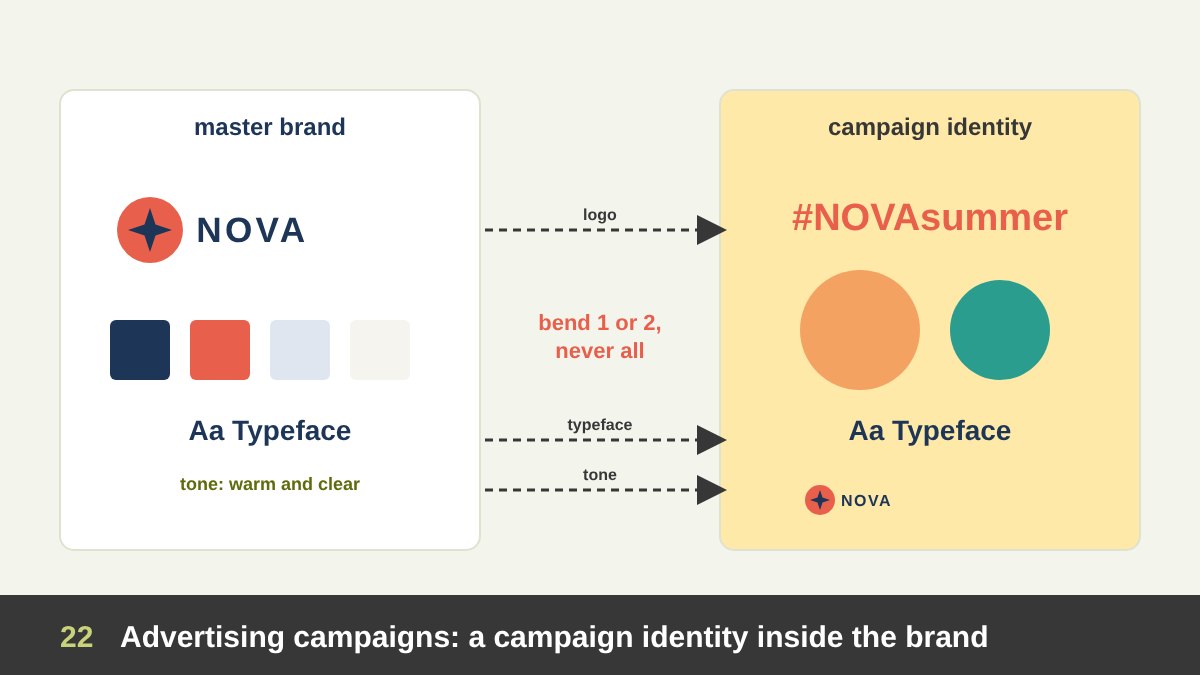
A campaign is a temporary story told by a permanent brand. It usually needs its own look, a campaign identity: a key visual, a headline style, a campaign colour or illustration style, sometimes a campaign name or hashtag. This look can be quite far from the everyday brand, because the campaign’s job is to be noticed and remembered for a limited time.
Some of the most famous campaigns break a brand rule on purpose. In 2011 Coca-Cola’s “Share a Coke” campaign, which began in Australia, replaced the logo on bottles with popular first names. It looked like a radical break, but the red, the Spencerian script style and the bottle shape stayed, so every bottle was still unmistakably Coca-Cola. Apple’s “Shot on iPhone” campaign (2015) filled billboards with customers’ photos instead of Apple’s polished product images, yet the minimal layout and the small line of text kept them clearly Apple. Spotify Wrapped, an annual campaign since 2016, changes its visual style every year while keeping the green, the voice and the format.
The rule I take from these examples: a campaign can bend one or two elements of the brand, never all of them. If the logo changes, keep the colour and the type. If the colour changes, keep the logo, the type and the voice. And a campaign identity should be documented in a short campaign guide, so all its pieces, from billboards to social posts, follow the same campaign rules.
Digital Ads, Billboards and Performance Marketing
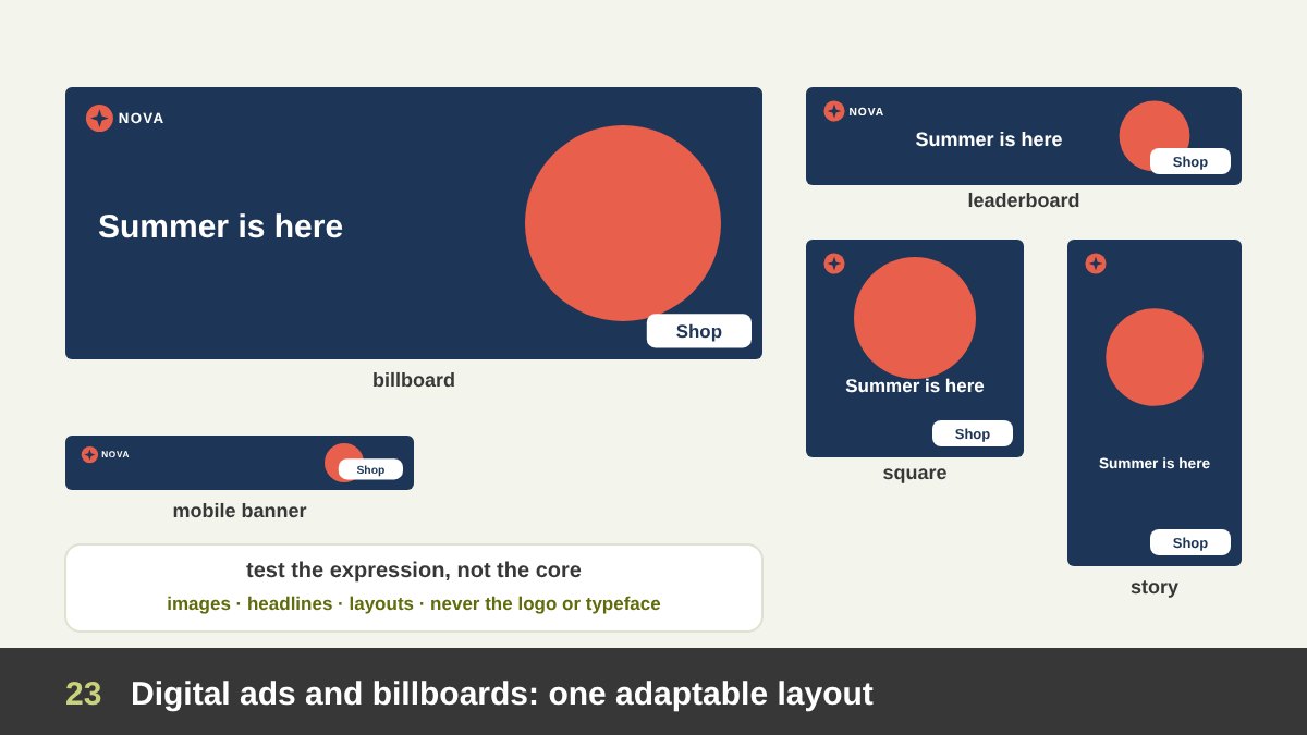
Paid ads have their own constraints. Billboards are read in a few seconds from a moving car, so they need very few words, a large logo and strong contrast. Digital banners appear in many sizes, from a wide leaderboard to a small mobile banner, so the design must be built as an adaptable layout: logo, headline, image and call to action that rearrange for each size. In the smallest sizes, the logo and the call to action matter more than the image.
Performance marketing adds testing. Teams test different headlines, images, colours and formats to see which ones convert, and the winning version is often not the one that follows the guidelines most closely. That is fine, as long as the tests vary the expression (image, headline, layout, extended colour) and not the core (logo, brand name, typeface, voice). Testing a different logo colour to get more clicks is a bad trade.
A good habit is to build an ad toolkit: master layouts in all common sizes, a small set of approved colour combinations, call-to-action button styles and rules for text on images. It saves time and keeps hundreds of ad variations looking like one brand.
Events, Merchandise, Presentations and Internal Communication
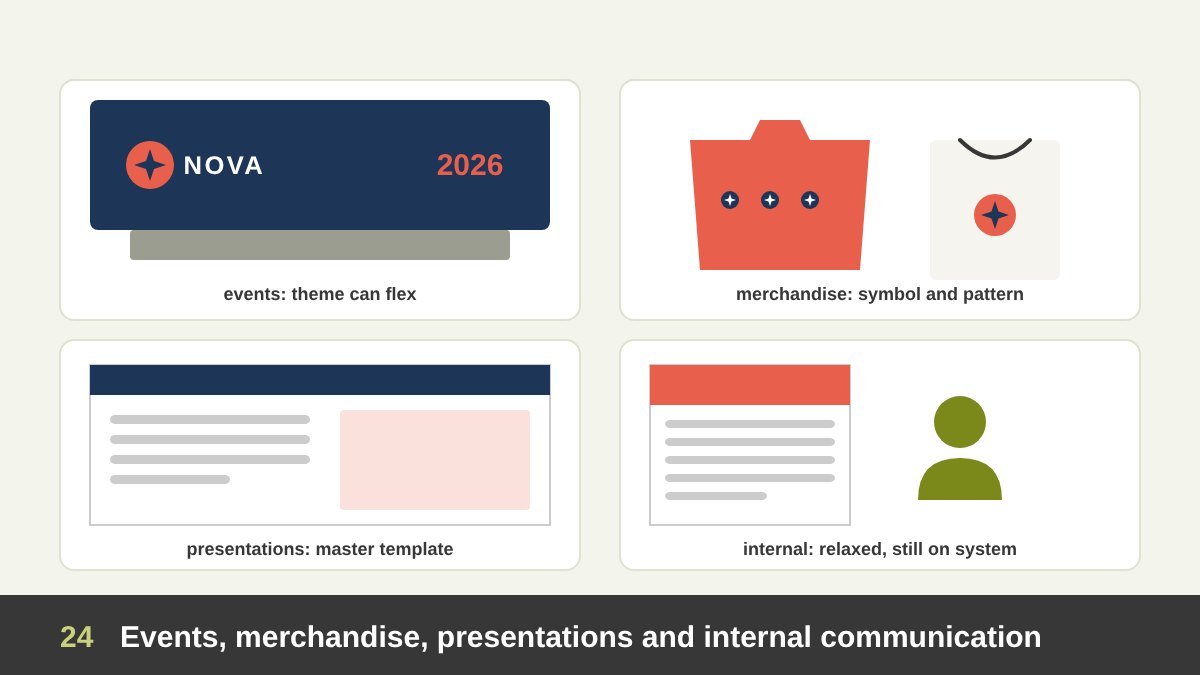
Events are temporary environments and can flex a lot. A conference, a product launch or an anniversary celebration usually gets an event identity, similar to a campaign: a theme, a key visual, stage graphics, badges and social templates. The logo should be clear on the stage, the backdrop and the badges, and the brand colours should be present, but the theme can bring its own colours and style.
Merchandise is often the most playful field. A t-shirt, tote bag, mug or notebook does not need the full logo lockup; it can use a brand pattern, a symbol alone, a slogan or an illustration. People wear and use merchandise only if they like it, so it should feel like a product, not a business card. But materials and print quality must reflect the brand: a cheap, badly printed mug says something about the company too.
Presentations are systematic: a master template with title, section, content, data and closing slides, brand fonts and chart colours, so that every employee produces consistent decks. Designers should leave room for image-led and data-led layouts. Internal communication, such as newsletters, HR campaigns and office posters, can be more relaxed and human than external work, but should still use the brand system; employees are the people who live the brand every day. I give advice on presenting design work in how to present your design work.
Seasonal and Cultural Moments: Ramadan, Eid and National Days
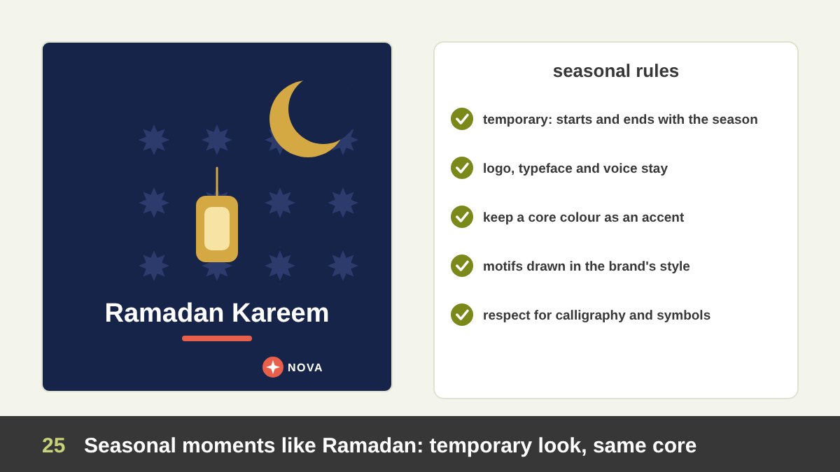
In Egypt and across the Arab world, Ramadan is the most important advertising season of the year, followed by Eid, national days, back to school and the New Year. These moments almost always need visuals that go beyond the brand: lanterns, crescents, Islamic geometric patterns, night blues and golds, festive greens, national flag colours.
This is acceptable and even expected, if you follow a few rules. The seasonal look is temporary: it starts and ends with the season and is clearly a theme, not a new identity. The core stays: logo in its usual position, brand typeface, at least one core colour as an accent, the brand’s tone of voice. The seasonal elements are designed in the brand’s own style: if the brand uses line icons, the lantern should be a line icon too; if it uses bold flat shapes, so should the crescent. And cultural respect comes first: Arabic calligraphy, Quranic text and religious symbols must be used correctly and respectfully, never as decoration in the wrong context.
Many brands now prepare a seasonal toolkit every year: a palette, a pattern, an illustration set and templates for posts, stories, video end cards and packaging sleeves. It keeps a busy season consistent and saves a lot of last-minute work.
Co-Branding, Sponsorships and Sub-Brands
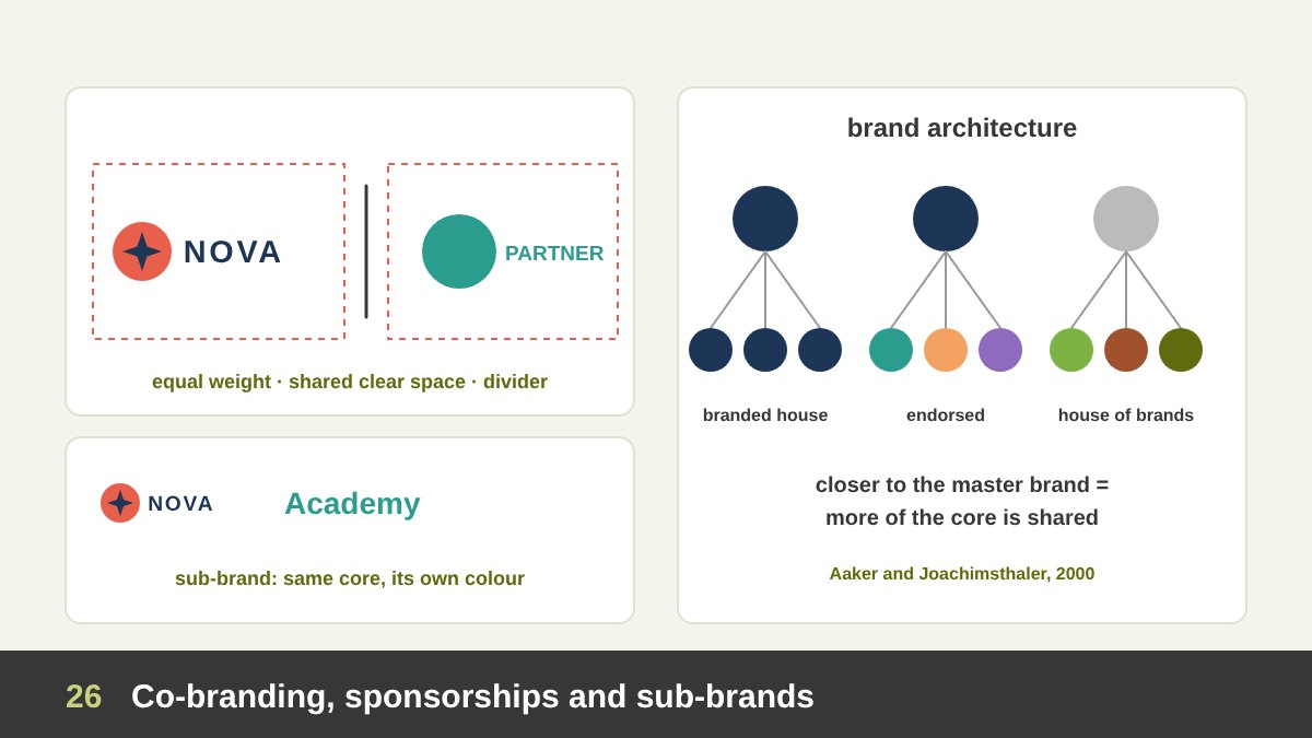
When two brands appear together, in a partnership, a sponsorship or a co-branded product, consistency becomes a negotiation. The usual rules are: each brand uses its own approved logo version without changes; the logos sit in a lockup with equal visual weight (not equal size, since shapes differ), shared clear space and often a thin divider; and the design of the piece belongs to the brand that leads the project, while the partner’s rules are respected for its own logo. If you sponsor an event, the event’s identity leads and your logo follows its sponsor rules.
Sub-brands are a question of brand architecture. David Aaker and Erich Joachimsthaler described a spectrum (2000) from a branded house, where every product uses the master brand, through endorsed brands (“by” the parent company), to a house of brands, where products have independent identities. The closer a sub-brand is to the master brand, the more of the core it must share.
In practice, a sub-brand often keeps the master typeface, logo structure and layout system, and gets its own colour from the extended palette. That single variable is what tells customers it is a different service from the same company, the same idea as range colours in packaging.
The Rules for Stepping Outside the Brand
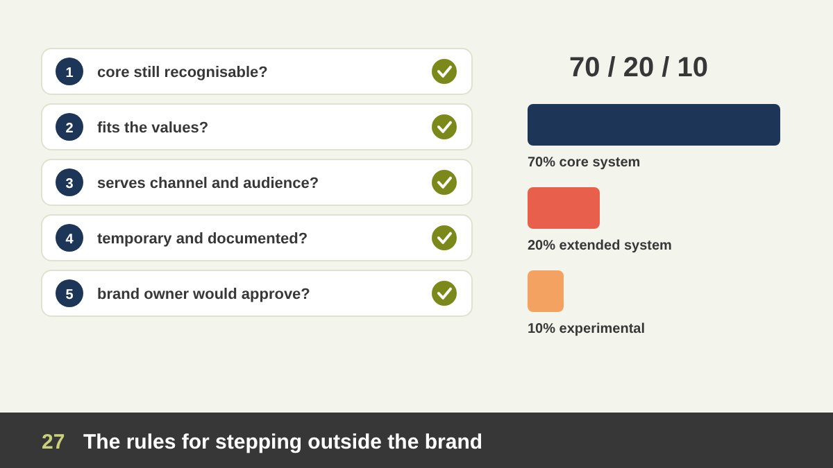
Everything in this article leads to one practical question: when can you go beyond the brand, and how far? Here is the test I use before approving any piece that steps outside the guidelines. 1. Is the core still recognisable? Cover the logo: is the brand still there through colour, type, voice or a signature element? 2. Does it fit the brand’s values and personality? A serious law firm can be warm, but should not be silly. 3. Does it serve this channel and this audience? The reason to flex must be a real need of the format or the audience, not boredom. 4. Is it limited? Temporary, for one campaign, season or content family, and documented as such. 5. Would the brand owner approve it if they saw it? If you would rather they did not see it, you already know the answer.
For planning a whole channel, I also use a simple rule of thumb that I call 70/20/10: about 70% of the content uses the core system as it is, about 20% uses the extended system (extended colours, display type, new layouts), and about 10% is experimental (trends, collaborations, bold ideas). The exact numbers matter less than the principle: experiments are welcome, but they sit on a strong base.
Finally, steps outside the brand should feed back into the system. If an experimental colour or format works again and again, add it to the guidelines. That is how healthy brands evolve gradually and avoid sudden, costly rebrands. The table below summarises how strict every field should be.
| Field | How strict | What stays fixed | What can flex |
|---|---|---|---|
| Logo and legal documents | Very strict | Logo versions, clear space, colours, legal details | Almost nothing |
| Stationery | Very strict | Layout, logo position, type, colour values, paper | Back-of-card pattern, department accents (decided once) |
| Signage and wayfinding | Strict | Logo, colours, materials, type; safety standards first | Interior graphics, murals |
| Packaging | Strict structure | Brand block, logo position, typeface, front-panel layout | Range and flavour colours, limited editions |
| Print collateral | Systematic | Grid, type hierarchy, colour use, logo placement | Layouts per spread, section colours, images |
| Website and apps | Systematic | Components, tokens, navigation, core colours | Landing pages, illustrations, microinteractions |
| Presentations | Systematic | Master template, fonts, chart colours | Image-led and data-led layouts |
| Digital ads and billboards | Systematic | Logo visibility, brand name, typeface, voice | Images, headlines, layouts, extended colours in tests |
| Video and motion | Strict signature, free story | Logo sting, lower thirds, captions, grading, sound | Script, cast, camera, music, format |
| Campaigns | Flexible within the brand | Logo, typeface or colour (bend one or two, never all) | Key visual, campaign colour, display type, name |
| Social media | Flexible with rules | Signature, core colour ratio, voice, values, quality | Layouts, trends, memes, illustration, UGC |
| Events and merchandise | Flexible | Logo on stage and badges, quality of materials | Theme, colours, symbol-only and pattern use |
| Seasonal (Ramadan, Eid) | Flexible, temporary | Logo, typeface, a core accent, voice | Seasonal palette, motifs, illustrations |
Writing Flexible Brand Guidelines and Keeping Them Alive
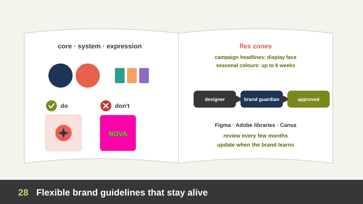
Most brand guidelines fail because they only describe the core. They show the logo, the colours and the font, then leave designers alone with the real problems. Good guidelines are written for the field: they explain what is fixed, what is flexible and how far it can go, with examples. A section for social media, one for video, one for campaigns, one for packaging and one for seasonal work saves endless arguments.
Useful guidelines include: the three layers (core, system, expression); an extended palette with ratios; type rules for Arabic and English; photography, illustration and icon styles; template families for social media; a motion toolkit; do and don’t examples; and clear flex zones that say, for example, “campaign headlines may use an approved display face” or “seasonal colours may replace the extended palette for up to six weeks”.
Then keep them alive. Put the templates where people work (Figma, Adobe libraries, Canva brand kits), give one person or a small team the role of brand guardian, review the brand’s output every few months, and update the guidelines when the brand learns something new. As an art director, I find this governance work is as important as the design itself, and saying no to off-brand requests is part of the job, as I explain in when to say no as a designer.
Common Brand Consistency Mistakes
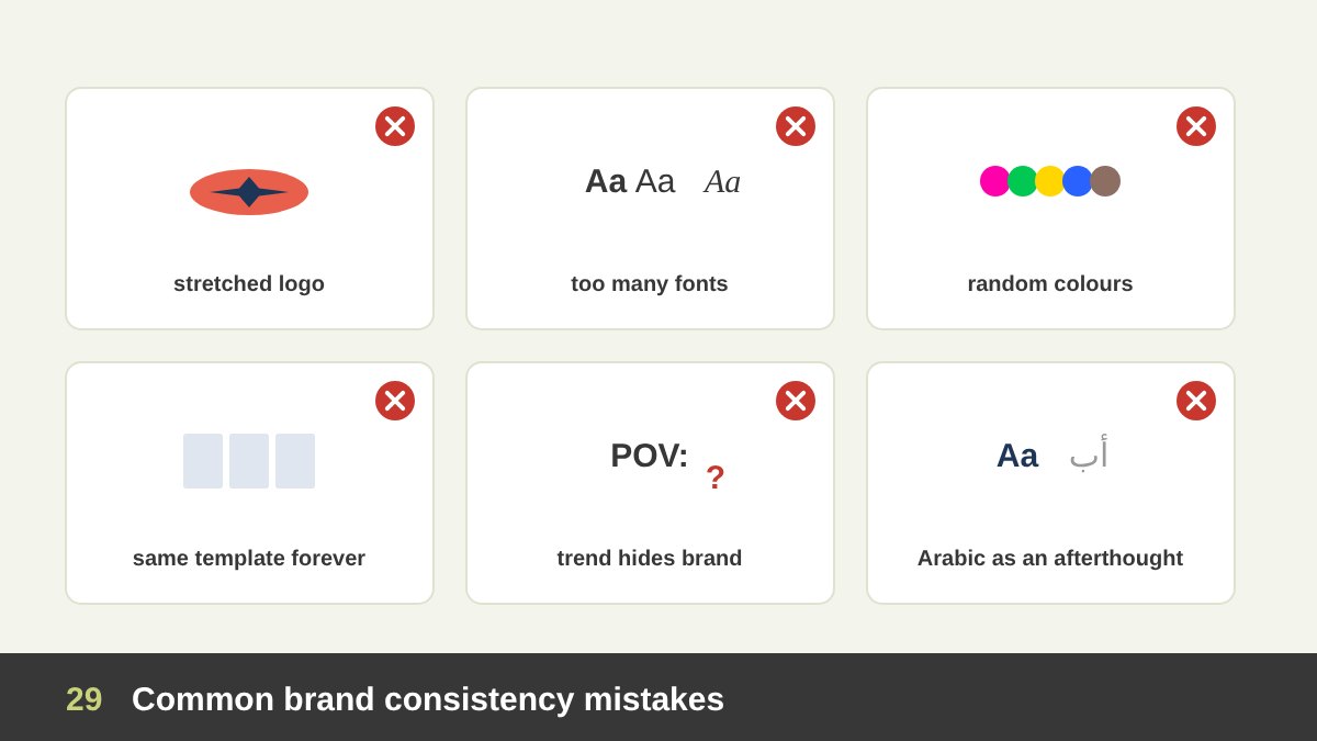
Treating the guidelines as a cage. Using the same layout, two colours and one photo style everywhere until the audience stops noticing. Treating every piece as a blank canvas. New colours, new fonts and new styles every week, so nothing builds memory. Changing the core in small steps. A slightly different logo colour here, a stretched logo there, a new font for one campaign that never leaves; after a year the brand has drifted without anyone deciding it.
Random extra colours. Picking colours by taste for each post instead of building an extended palette with rules. Trends that hide the brand. Viral content with no brand signature, so the content gets the views and the brand gets nothing. Ignoring Arabic. A careful Latin layout with a careless Arabic version. Forgetting function. Brand colours that fail contrast rules, or safety signs that follow the brand instead of the standard.
And the most common of all: guidelines that nobody can find. A beautiful PDF in someone’s inbox does not create consistency; templates in the tools people use every day do.
Brand Consistency Checklist
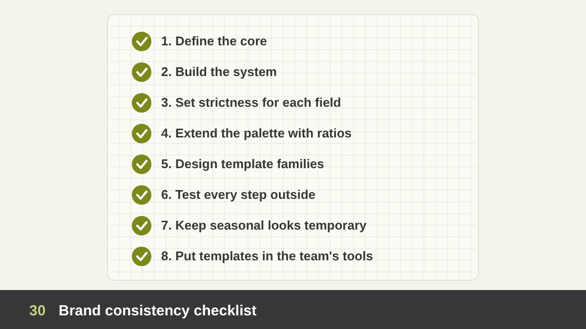
Use this checklist when you start working with a brand, or before you approve any piece that goes outside its usual style.
1. Define the core: logo versions, core colours, typefaces, voice and values. 2. Build the system: extended palette, type scale, grids, image and icon styles, templates. 3. Decide the level of strictness for each field you work in, from stationery to social media. 4. If the brand has few colours, extend them with tints, neutrals, accents and functional colours, and set ratios. 5. Design template families for each content pillar. 6. Before stepping outside the brand, run the five-question test. 7. Keep seasonal and campaign looks temporary and documented. 8. Put templates in the team’s tools and review the brand’s output regularly.
If you need help building a brand identity that is consistent and flexible at the same time, from the logo and stationery to social media templates and campaign toolkits, you can see examples in my portfolio, such as the Maulana Stud and BlueFly case studies, or contact me to talk about your project.
Brand Consistency: Frequently Asked Questions
What is brand consistency?
Brand consistency is presenting a brand in a recognisable and coherent way everywhere people meet it: the same core logo, colours, typography, imagery style and tone of voice, and the same values in how the brand behaves. It does not mean every piece looks identical; it means every piece is clearly from the same brand.
Why is brand consistency important?
Because people recognise and remember brands through repeated cues. Consistent colours, shapes, type and voice build memory and trust over time, make marketing more efficient, and make the organisation look professional and reliable.
Can I use colours that are not in the brand guidelines?
Yes, if they are part of a planned system: tints and shades, neutrals, an extended or secondary palette, functional colours and temporary seasonal or campaign colours. Keep at least one core colour in every piece and set ratios so the brand stays recognisable. Avoid picking new colours by taste for each design.
How do I stay on brand on social media and still get engagement?
Keep a fixed signature (logo placement or brand handle), a minimum share of core brand colour, the brand typeface, voice and values, and let everything else flex: layouts, illustration styles, photography, trends and humour. Design template families for each content pillar, and give trend posts the most freedom with a small brand signature.
What should never change in a brand?
The core: the name, the logo and its rules, the primary colours, the main typeface, the tone of voice and the values. Changing these is a rebrand and should be a strategic decision, not something that happens one design at a time.
What is a flexible or dynamic brand identity?
A flexible or dynamic identity is designed to change in controlled ways, for example a logo shape that can be filled with different patterns or colours, as in MTV’s 1981 logo or the City of Melbourne’s identity. It stays recognisable because a few strong elements are always fixed.
Leave a Reply