

What Is White Space in Design?
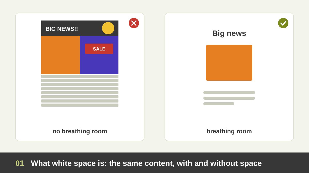
White space is the empty space in a design: the margins around a page, the gaps between paragraphs, the space around a logo, the distance between a headline and a photo, the air inside a button. It is also called negative space, and in everyday studio language we simply call it breathing room. A design without it feels like a room full of furniture with no space to walk.
The name is misleading: white space does not have to be white. It can be black, olive, a photo of the sky or a flat colour. What matters is that it is free of content. A poster with a single word on a dark blue background is full of white space, even though nothing on it is white.
White space is not a separate element like line, shape or texture; it is the space element, the one that holds all the others. I explained the full set in The Principles of Design and wrote full articles on line, shape and texture. The typographer Jan Tschichold wrote in 1928, in Die neue Typographie, that white space should be treated as an active element, not a passive background. This article is about that idea: how the space you leave empty is as designed as the things you put in.
Key takeaways
- White space, also called negative space, is the empty area in a design: around and between text, images and shapes. It does not have to be white; it is any space that is left free of content.
- Every design is made of positive space (the figure: the things we look at) and negative space (the ground: the space around them). Good designers design both, because the empty space has a shape too.
- White space can be macro (margins, space between sections and big blocks) or micro (line spacing, letter spacing, padding inside buttons). It can be passive (just there) or active (used on purpose to guide the eye).
- Breathing room makes designs easier to read, creates hierarchy and focus, groups related things, and changes how people feel: generous space reads as calm, confident and premium; no space reads as cheap, urgent and stressful.
- Hasegawa Tōhaku, Kazimir Malevich, Vilhelm Hammershøi, the Volkswagen “Think Small” ad, Josef Müller-Brockmann, the FedEx, NBC, Toblerone and Formula 1 logos and the Google homepage are all built on empty space. Below I analyse each one, then show how to use white space in typography, UI, print and social media.
Positive Space and Negative Space: Figure and Ground
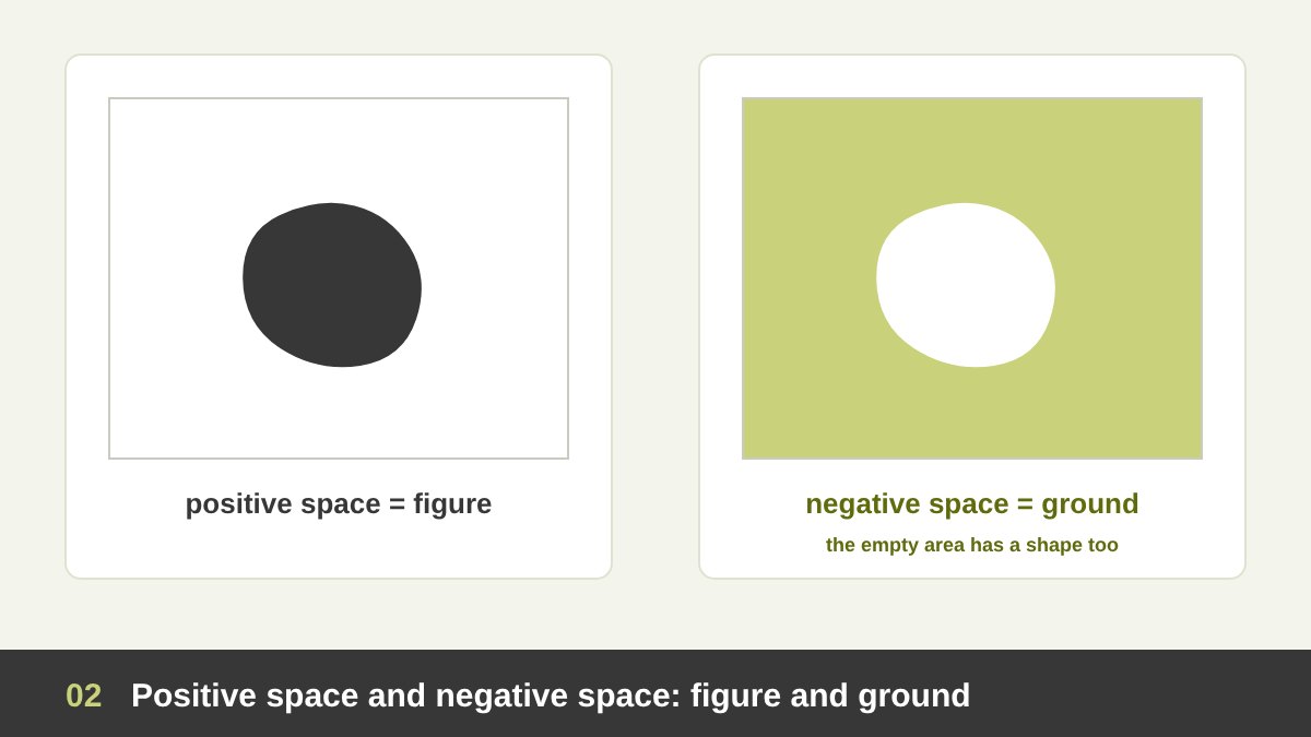
Every composition is made of two kinds of space. Positive space is the area occupied by the subject: the text, the photo, the logo, the person, the shape. Negative space is everything around and between them. In perception psychology these are called figure and ground: the figure is what we notice, the ground is what it stands on.
The key insight is that negative space has a shape. When you place a circle on a page, you have also created a page with a circle-shaped hole in it, and four different gaps to the four edges. Beginners design only the positive shapes and the negative space happens by accident. Experienced designers look at the empty shapes as carefully as the full ones: are the gaps balanced, is one corner crowded, is there an awkward sliver between two elements?
A simple exercise I give my students: take a layout and fill all the empty areas with colour, then look only at those coloured shapes. If they look random, ugly or uneven, the layout will feel wrong even if every element is good. If they look calm and intentional, the layout breathes. Positive and negative space are not opposites; they are partners, and changing one always changes the other.
Active and Passive White Space
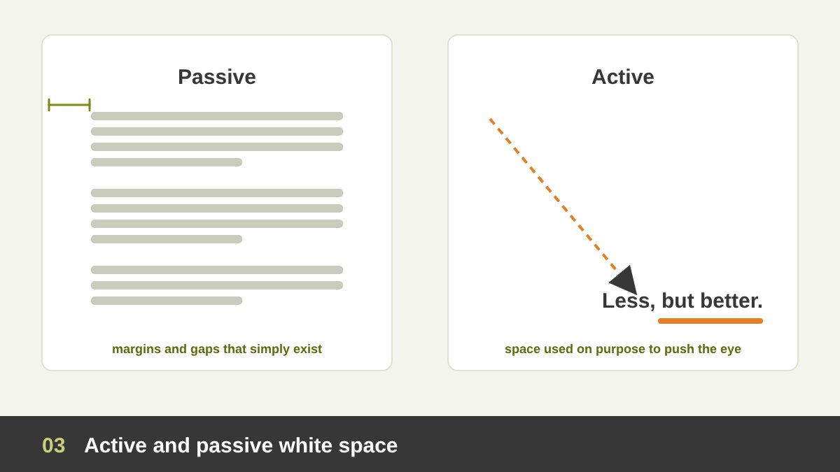
Designers often separate white space into two kinds. Passive white space is the space that naturally appears around things: the normal margins of a page, the gap between words, the space at the end of a short line. It is necessary, but it is not doing anything special.
Active white space is space that is used on purpose to do a job: to push the eye towards a headline, to isolate a product, to separate two ideas, to slow the reader down, to create tension or luxury. When a designer leaves two thirds of a poster empty so that one small line of text becomes impossible to ignore, that emptiness is active.
The difference matters because it changes the question you ask. Instead of “how do I fill this space?”, ask “what is this space doing?”. Every empty area should either help reading (passive) or guide attention and feeling (active). Empty space that does neither is usually just a leftover, and leftovers make a design look unfinished.
Macro and Micro White Space
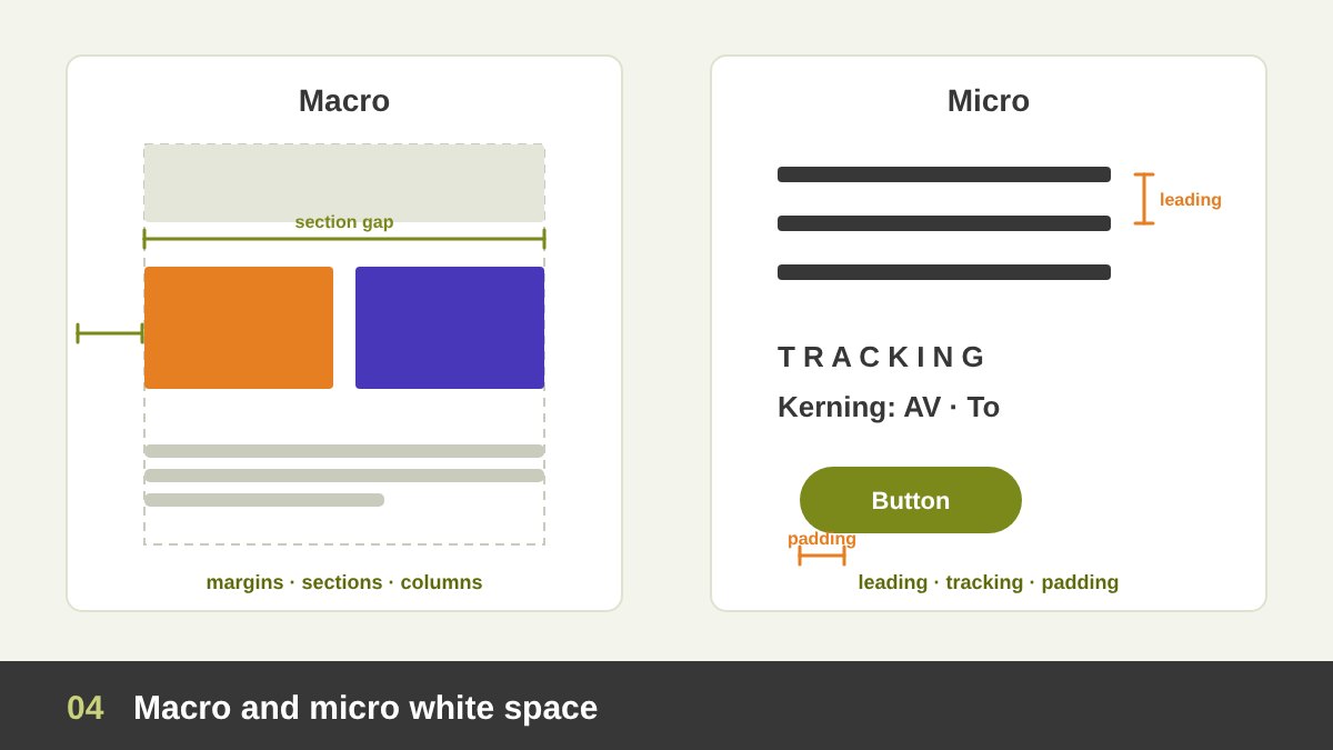
White space works at two scales. Macro white space is the big space: page margins, the gap between columns, the space between sections of a website, the empty area around a hero image, the distance between a logo and everything else on a poster. It shapes the overall layout and decides whether a design feels open or crowded at first glance.
Micro white space is the small space: line spacing (leading), letter spacing (tracking and kerning), word spacing, the space between a heading and its paragraph, the padding inside a button or a card, the gap between an icon and its label. You rarely notice good micro white space, but you always feel bad micro white space: text that is tiring to read, buttons that feel cramped.
Both scales must agree. A page with luxurious margins but tight, crowded text feels confused, like a beautiful hotel lobby with tiny, airless rooms. A good rule is to set your micro spacing first (comfortable reading), then build the macro spacing from multiples of it, so that the whole design breathes with one rhythm.
Why White Space Matters
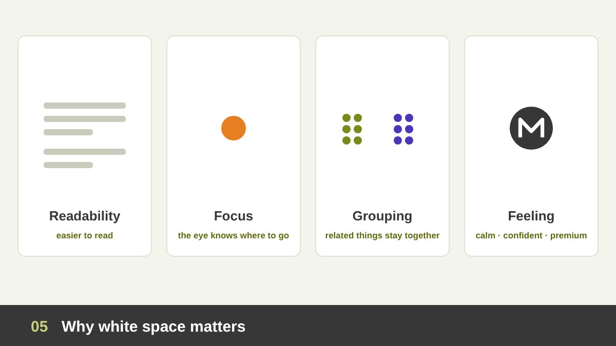
White space is not wasted space; it is working space. First, it improves readability and comprehension. Text with comfortable margins, line spacing and paragraph spacing is easier to scan, easier to follow from one line to the next and less tiring. On screens, where people skim, space is what lets them find what they came for.
Second, it creates focus and hierarchy. The more space around an element, the more important it looks. Third, it creates grouping: things close together are read as one group, and space between groups separates them, often better than lines or boxes. Fourth, it creates feeling: calm, elegance, confidence, luxury, silence.
Finally, white space is about respect for the audience. A crowded design says “I am afraid you will miss something, so here is everything”. A spacious design says “I chose what matters, and I trust you to see it”. That confidence is exactly what clients pay for when they ask for a premium brand. As Mies van der Rohe’s famous phrase puts it, less can be more, but only when the less is chosen with care.
Breathing Room: Margins, Padding and Gutters
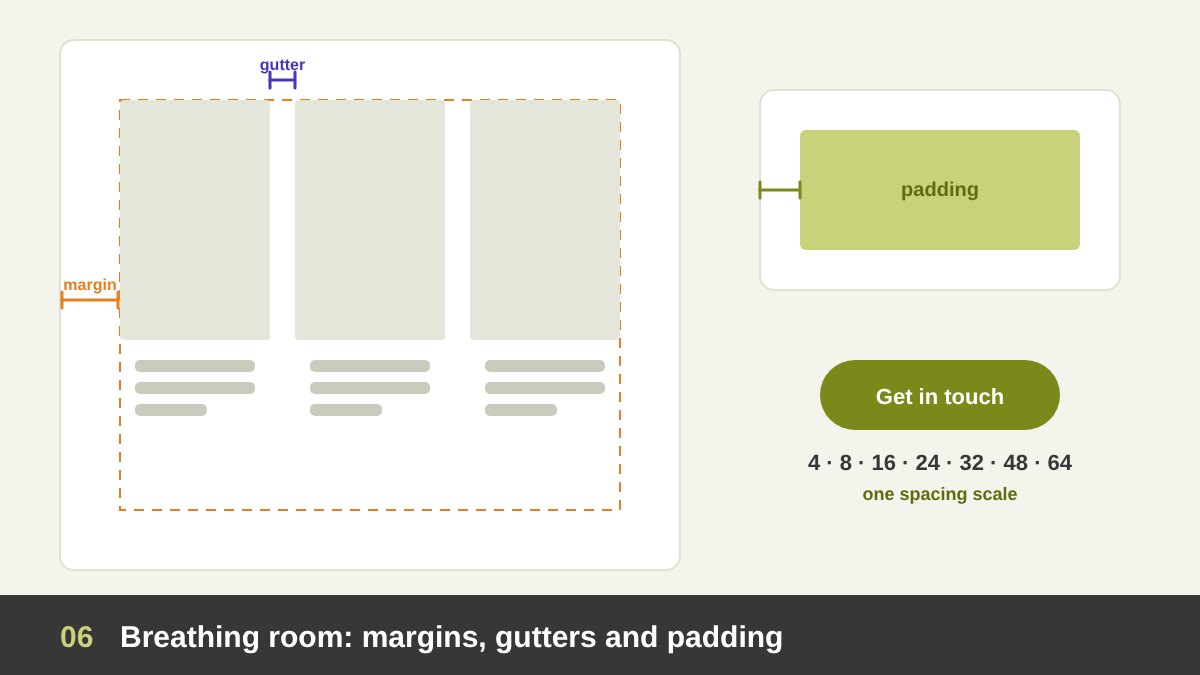
Breathing room is the practical side of white space: the specific distances you set. Margins are the space between the content and the edge of the page, poster or screen. They frame the design like a passe-partout frames a painting, and they keep important things away from the edge where they feel trapped or get trimmed in print.
Gutters are the spaces between columns in a grid, and between images in a gallery. They must be wide enough to separate the columns clearly, but not so wide that the page falls apart into unrelated strips. Padding is the space inside a container: between the text and the edge of a button, a card or a text box. Too little padding is the most common reason a design looks amateur.
A helpful habit is to use a spacing scale: a small set of distances, such as 4, 8, 16, 24, 32, 48 and 64 pixels (or the equivalent in millimetres for print), and to use only those values. Consistent spacing creates rhythm and makes the design feel planned. I explain how grids and proportions such as the golden ratio can set these distances in their own articles.
Micro White Space in Typography: Leading, Tracking and Paragraph Spacing
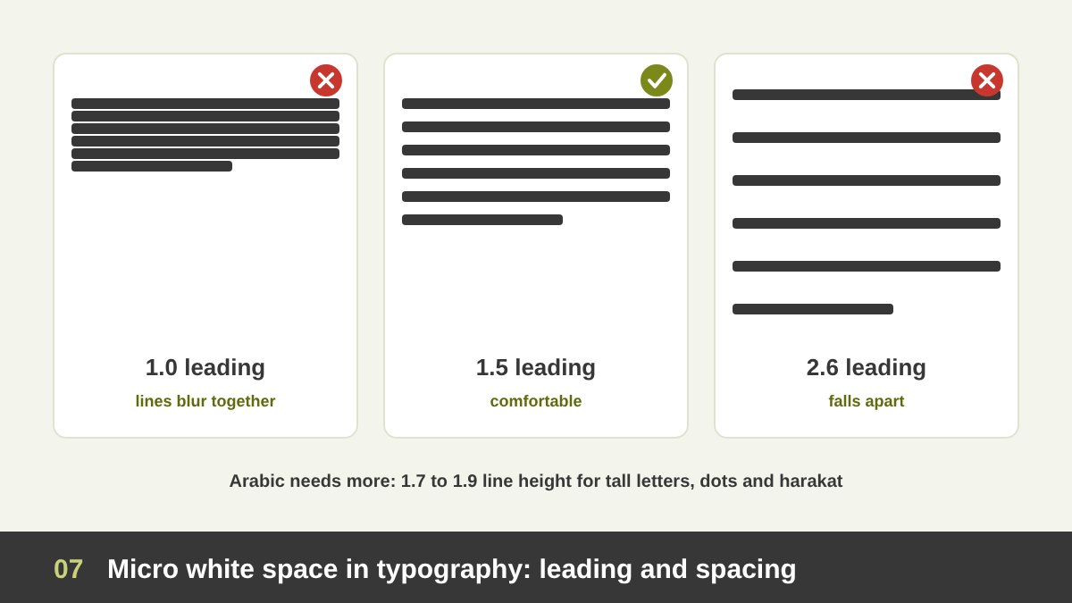
Typography is where white space is felt most directly. Leading (line spacing) is the space between lines. For body text, a line height of around 1.4 to 1.6 times the font size is comfortable for most Latin typefaces. The accessibility guidelines WCAG recommend at least 1.5 inside paragraphs and paragraph spacing at least 1.5 times larger than the line spacing. Too tight and lines blur together; too loose and the paragraph falls apart into separate lines.
Tracking is the overall letter spacing of a word or line, and kerning is the space between two specific letters. Headlines in capitals usually need a little extra tracking to breathe; large display text often needs less. Uneven kerning creates holes inside words that the eye reads as accidental white space, like the famous gap that turns “click” into something embarrassing.
Line length is also a white space decision: lines of roughly 45 to 75 characters are easiest to read, and the margin that limits them is part of the reading experience. For Arabic text I always give more line height than for English, around 1.7 to 1.9, because Arabic letters have tall ascenders like the alef and lam, deep descenders and diacritics above and below. Arabic text that is set with English leading looks crowded and its dots and harakat collide.
White Space Creates Focus and Hierarchy
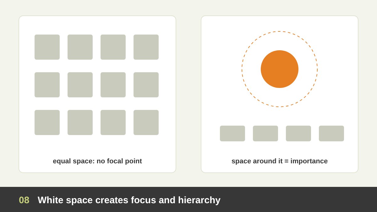
The fastest way to make something look important is not to make it bigger or brighter; it is to give it space. An element surrounded by emptiness is isolated, and our eyes are drawn to isolated things. This is related to the isolation effect, described by the psychologist Hedwig von Restorff in 1933: an item that stands apart from similar items is noticed and remembered better.
This is why luxury brands place a single product in the middle of a large empty page, why a good presentation slide has one sentence instead of ten bullets, and why the most important button in an app usually has the most space around it. Space is a form of emphasis, and often a more elegant one than size, colour or effects.
White space also creates hierarchy between levels: more space above a heading than below it ties the heading to its own paragraph and separates it from the previous section. Big gaps mean “new topic”, small gaps mean “same topic”. When I review layouts for students, half of the hierarchy problems are actually spacing problems, not size problems.
White Space Groups Things: Proximity and Gestalt
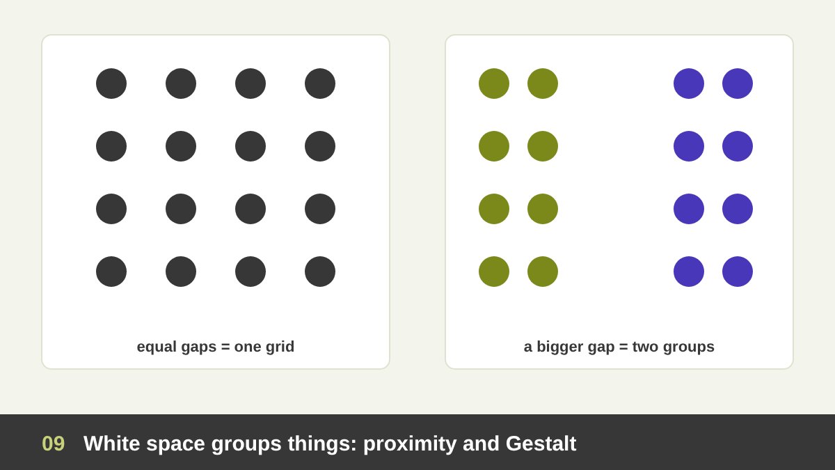
According to the Gestalt principle of proximity, things that are close together are seen as belonging together. That means white space is not only between things; it is the tool that organises them. Change the gaps and you change the groups, without adding a single line or box.
Look at a business card: the name and title sit close together, the phone and email sit close together, and a bigger gap separates the two groups. The reader understands the structure instantly. The same principle organises forms (a label close to its field), navigation menus, product cards and price lists. When related items are too far apart, or unrelated items too close, the design lies about its own structure.
A common beginner habit is to separate everything with lines, boxes and dividers. Most of the time, a bit more space does the job better and looks cleaner. Use dividers only when space alone is not enough, for example in dense tables. Space is the quietest way to say “these belong together, and those are something else”.
The Psychology of White Space: Calm, Luxury and Trust
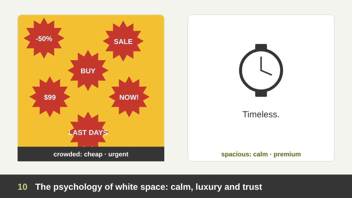
White space changes how a design feels, and therefore how a brand is judged. Generous space reads as calm, confident, expensive, clean, honest and modern. Little space reads as busy, urgent, cheap, energetic or overwhelming. Compare a supermarket discount flyer, packed edge to edge with prices, and a jewellery advertisement with one ring on a large empty page. Both are designed well for their goals, and the difference is mostly space.
There is a simple economic logic behind this. Space on a page, a shelf or a screen costs money, so leaving it empty is a sign that the brand can afford not to shout. Luxury fashion houses, high-end hotels and premium tech brands use white space as a signal of quality, while discount retailers fill every centimetre to signal “more for less”.
Space also gives a sense of silence and time. It slows the viewer down and invites contemplation, which is why museums hang paintings far apart and why meditation and wellness brands use so much empty space. Before you decide how much space to use, decide what you want people to feel: urgency or calm, abundance or exclusivity.
Ma: The Japanese Art of Meaningful Emptiness
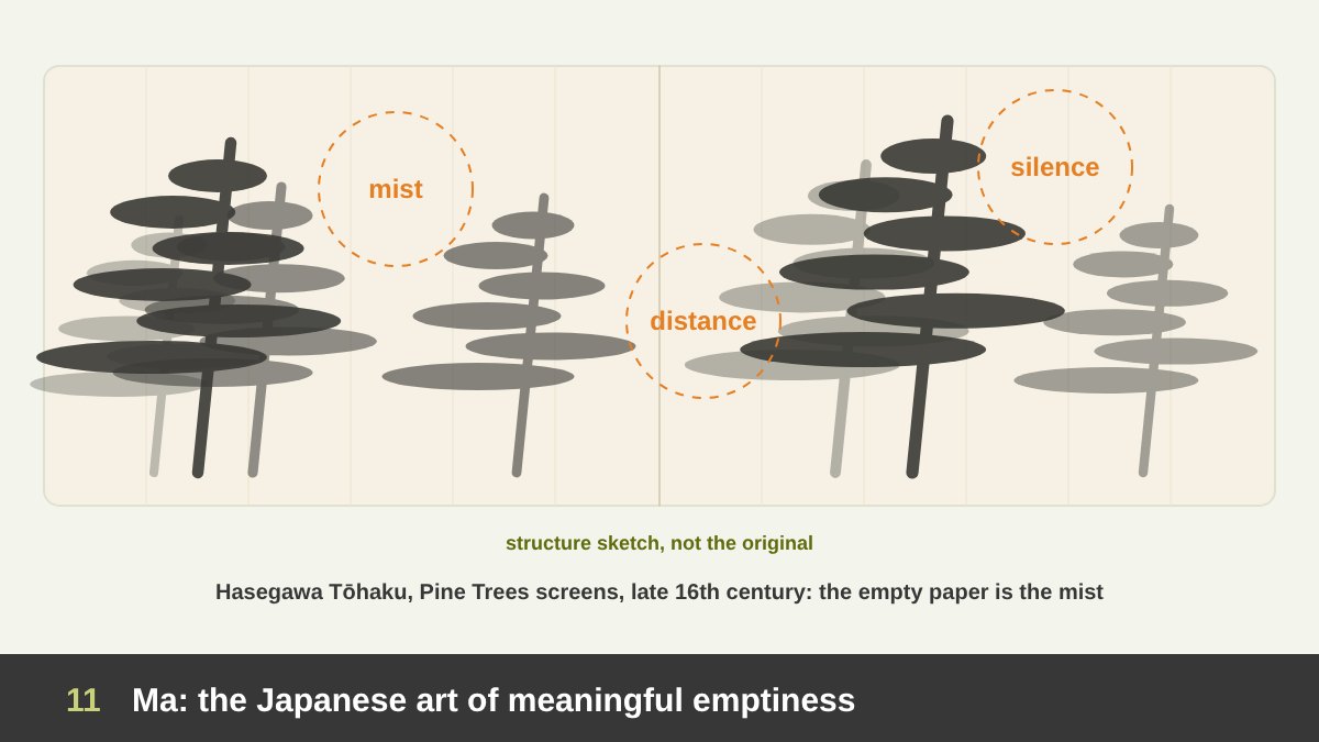
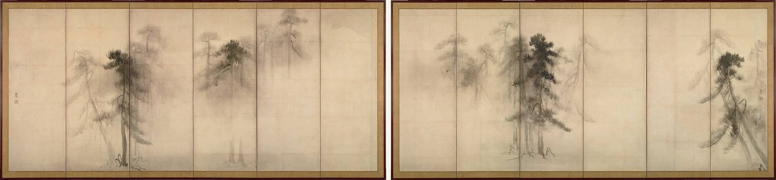
Long before graphic design existed, East Asian artists treated empty space as part of the work. In Japanese aesthetics this idea is called ma (間): the interval, the pause, the meaningful gap between things. Ma is the silence between notes in music, the pause in a conversation, the empty area of a garden or a scroll. It is not nothing; it is space full of possibility.
The most famous example is the pair of folding screens Pine Trees (Shōrin-zu byōbu) by Hasegawa Tōhaku, painted in ink on paper in the late 16th century and now a National Treasure at the Tokyo National Museum. Tōhaku painted only a few groups of pine trees, some dark and close, others so pale they almost disappear. The rest of the paper is left empty, and that emptiness becomes mist, distance and morning air. You can almost feel the humidity.
What can a designer learn? First, the empty areas are not equal: the gaps between the tree groups have different sizes, creating rhythm. Second, the viewer completes the picture: our imagination fills the mist, so we participate. Third, emptiness creates mood: the whole work feels quiet and meditative. Chinese painting has the same tradition; the Song dynasty painter Ma Yuan was nicknamed “one-corner Ma” because he pushed his landscapes into one corner and left the rest of the silk empty.
Figure-Ground Relationships: Stable, Reversible and Ambiguous
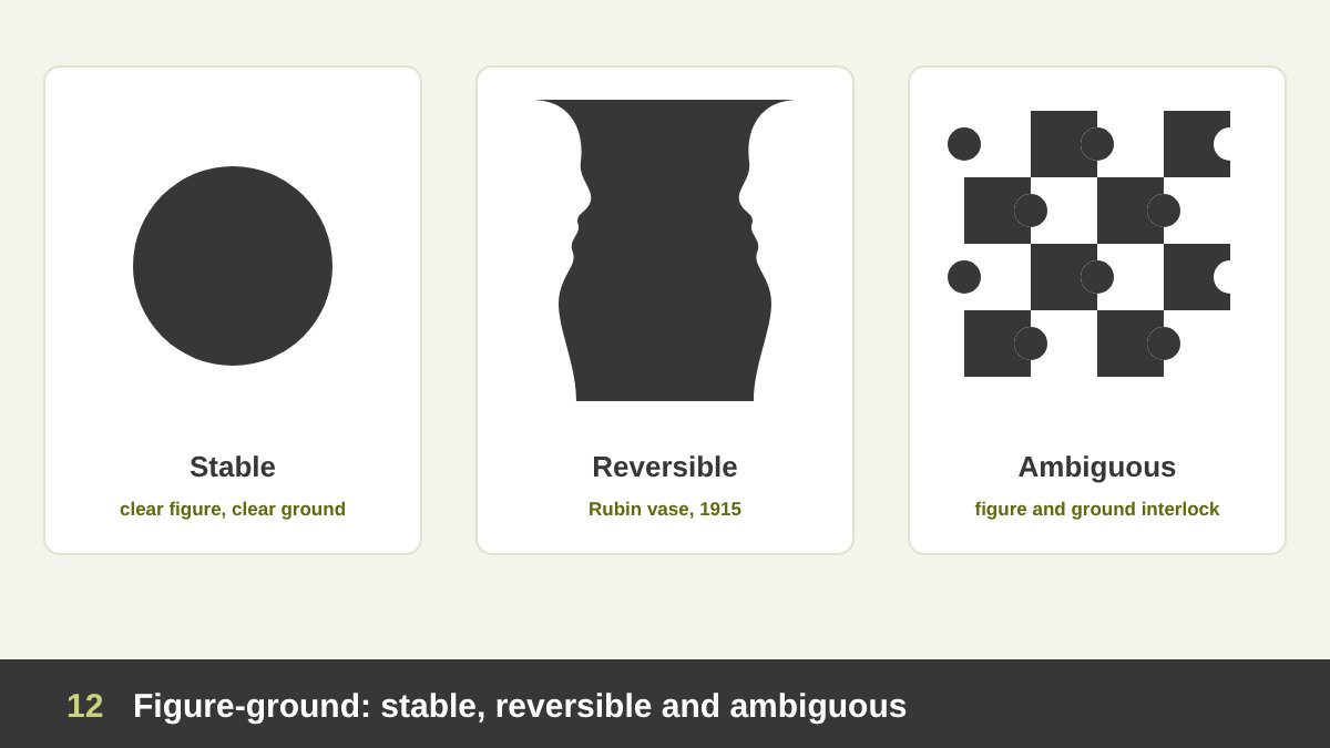
The relationship between figure and ground is not always clear, and designers play with that. In a stable figure-ground relationship, it is obvious what is the subject and what is the background: a black logo on a white page. Most layouts should be stable, so that reading is effortless.
In a reversible relationship, figure and ground can swap. The classic example is the Rubin vase, published by the Danish psychologist Edgar Rubin in 1915 in his study Synsoplevede Figurer (Visually Experienced Figures). You see either a vase in the middle or two faces in profile looking at each other, but never both at exactly the same moment. The same edge belongs to both shapes, and our brain keeps switching. I also used it in Shape in Design because it shows that the empty shape is a shape too.
In an ambiguous relationship, figure and ground interlock so much that the eye moves back and forth, as in tessellations and some patterns. Reversible and ambiguous figure-ground are powerful in logos, posters and illustrations, because the viewer gets a moment of discovery: “oh, there is something hidden here”. That small surprise makes the design memorable, as the next examples show.
Negative Space Logos: FedEx, NBC, Toblerone and Formula 1
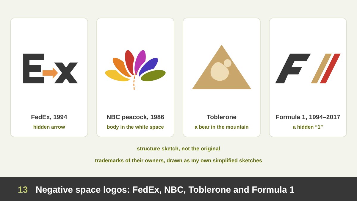
Logos are where negative space becomes famous. The FedEx wordmark, designed by Lindon Leader at Landor Associates in 1994, hides a white arrow between the “E” and the “x”. Most people do not see it until someone points it out, and then they cannot stop seeing it. The arrow says speed and direction without adding a single extra shape. It won many awards and is still the most quoted example of negative space in branding.
The NBC peacock, redesigned in 1986 by Chermayeff & Geismar (Steff Geissbühler), is made of six coloured feathers; the peacock’s head and body are the white space between them. The Toblerone mountain hides a standing bear, the symbol of Bern, the city where the chocolate was created. And the old Formula 1 logo (1994 to 2017) used the white space between a black “F” and red speed lines to form the number “1”.
The lesson from all four is that negative space can add a second meaning without adding complexity. The logo stays simple, but rewards a second look. That is a quality I discuss in what makes a good logo: simple, memorable and meaningful. A warning: a hidden image must still be built on a strong main shape. The FedEx logo works first as a clear, bold wordmark; the arrow is a bonus, not a puzzle. (These logos are trademarks of their owners and are shown here as my own sketches.)
Negative Space in Illustration and Posters
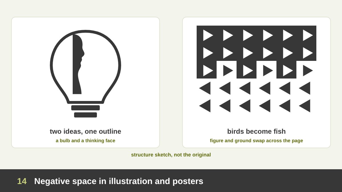
Illustrators and poster designers use negative space to tell two stories in one image. The London-based illustrator Noma Bar is the master of this today; his book Negative Space (2009) is full of portraits and objects where the empty area forms a second meaning: a face that is also a map, a profile that is also a weapon. His images are minimal, often only two or three colours, and the idea lives in the space between the shapes.
The Dutch artist M. C. Escher took figure-ground to its limit in woodcuts such as Sky and Water I (1938), where white birds at the top gradually become the background for black fish at the bottom. In the middle, every edge belongs to both a bird and a fish. The Japanese designer Shigeo Fukuda, whose poster Victory 1945 I analysed in the shape article, built a whole career on these visual tricks.
For designers, the technique is simple to describe and hard to do: find two ideas that share an outline, then draw only that outline and let the empty space complete the second idea. It works brilliantly for campaigns and editorial illustrations, because the viewer has to think for a second, and that second of thinking is when the message is remembered. (Escher’s and Noma Bar’s works are under copyright, so I show my own sketches and link to the originals.)
Real Example: Malevich’s White on White (1918)
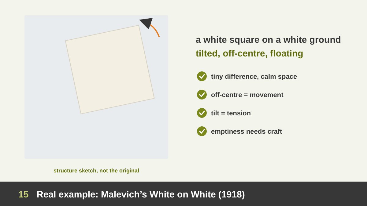
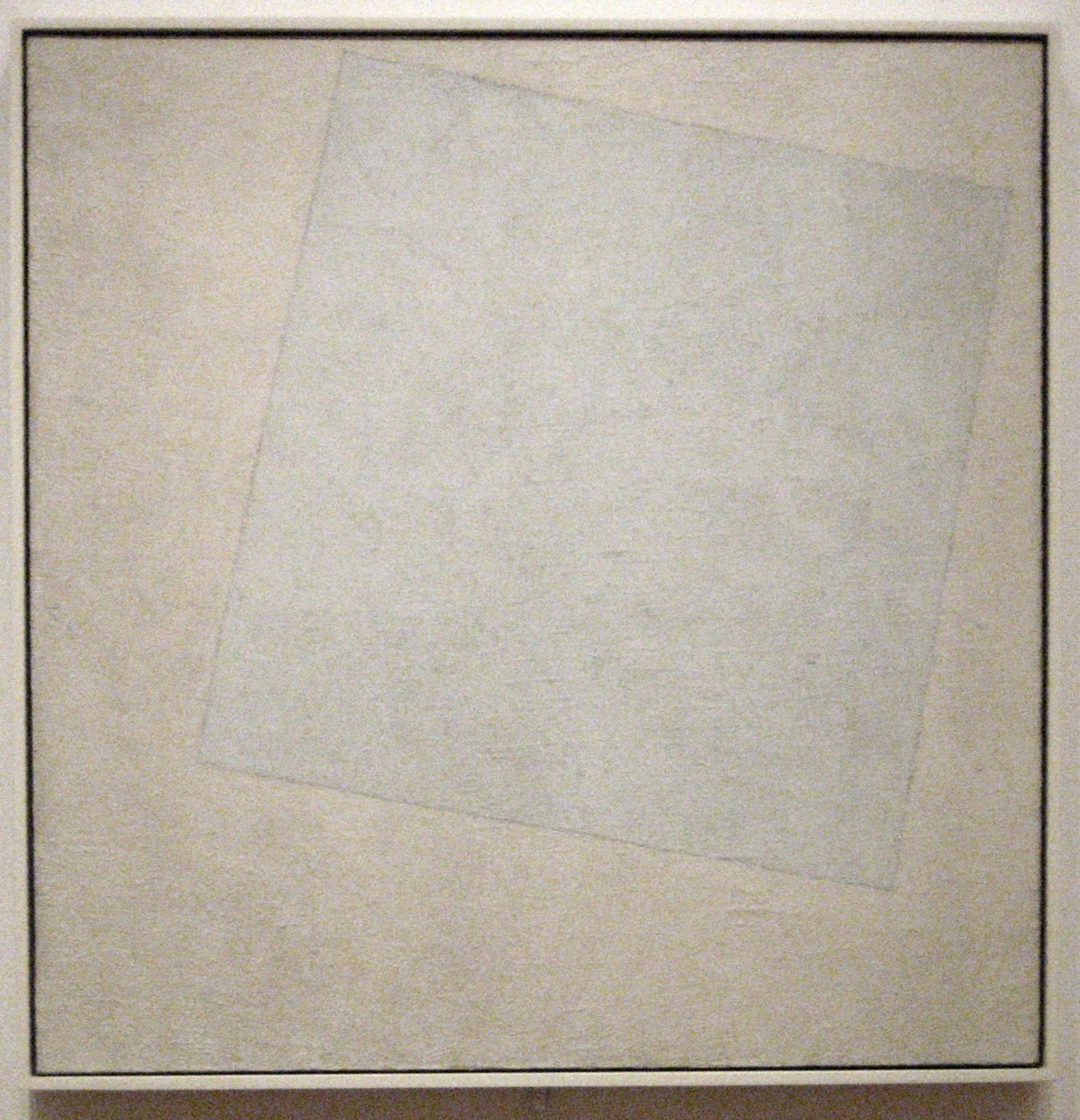
In 1918 the Russian painter Kazimir Malevich painted Suprematist Composition: White on White, now at the Museum of Modern Art in New York. It is a square canvas, about 79 by 79 cm, with a slightly tilted white square painted on a white ground. The two whites are only slightly different: the ground is cooler, the square is warmer, and you see the edge mainly through the brushwork.
Why is it in an article about white space? Because it is a painting almost made of white space. The tilted square is placed off-centre, closer to the top right, and that placement plus the tilt creates movement and tension in a field that is otherwise silent. The square seems to float, even drift away. Malevich wanted to reach “the supremacy of pure feeling”, and he did it by removing almost everything.
For designers, White on White teaches three things. First, a tiny difference can be enough when the space around it is calm. Second, position in the empty field is itself a message: centred feels stable, off-centre and tilted feels alive. Third, emptiness needs craft: the subtle whites and visible brushstrokes are what make it a painting and not an empty canvas. Minimalism is not doing less work; it is doing precise work.
Real Example: Hammershøi’s Empty Interiors
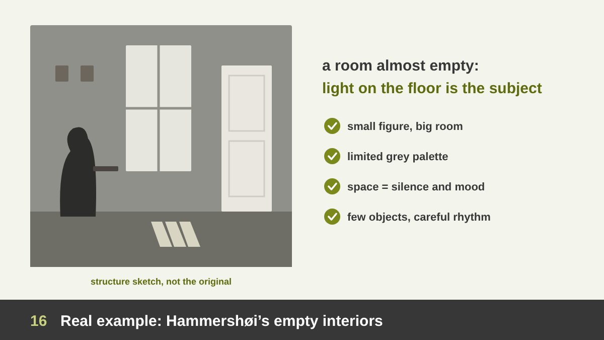
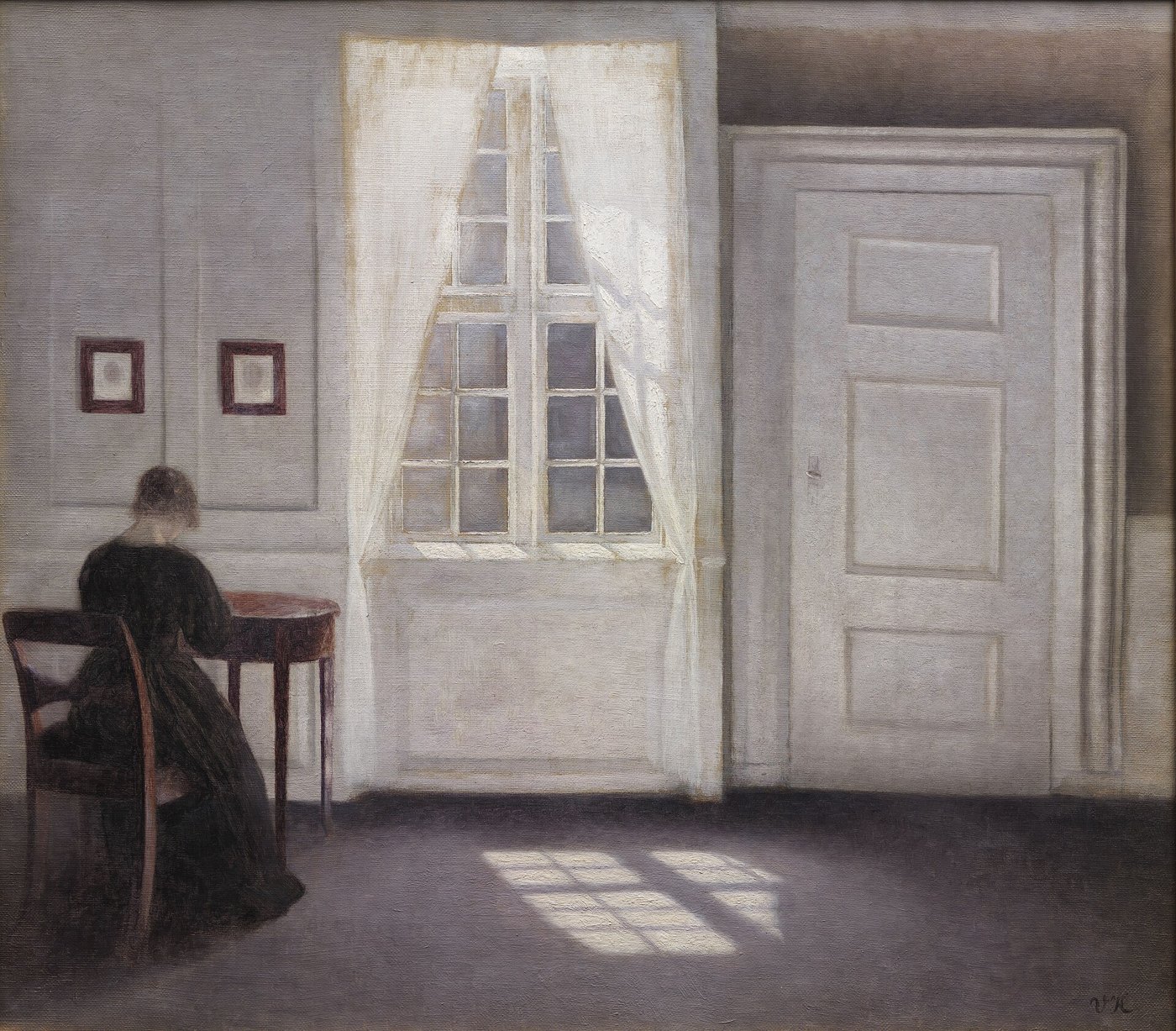
The Danish painter Vilhelm Hammershøi (1864 to 1916) painted the rooms of his own apartment at Strandgade 30 in Copenhagen again and again: grey walls, white doors, a window, sometimes his wife Ida seen from behind, often nobody at all. In Interior in Strandgade, Sunlight on the Floor (1901, National Gallery of Denmark), the main subject is almost nothing: light from the window falling on an empty floor.
Hammershøi is a lesson in breathing room as atmosphere. The figure is small and pushed to the side; the large empty wall, the floor and the closed door take most of the canvas. That emptiness creates silence, loneliness and calm, a mood so strong that his paintings are often called “poetry of silence”. The few objects, a chair, a table, a frame, are placed with great care, so the empty areas between them form a quiet rhythm.
Designers can borrow this directly. A website hero image with one person small in a big empty space feels more cinematic than a close-up. A brand photo with lots of empty wall says calm and confidence. And Hammershøi shows that a limited palette plus a lot of space can be more emotional than many colours and many objects. Interior designers and Scandinavian brands still use exactly this recipe.
Real Example: Volkswagen “Think Small” (1959)
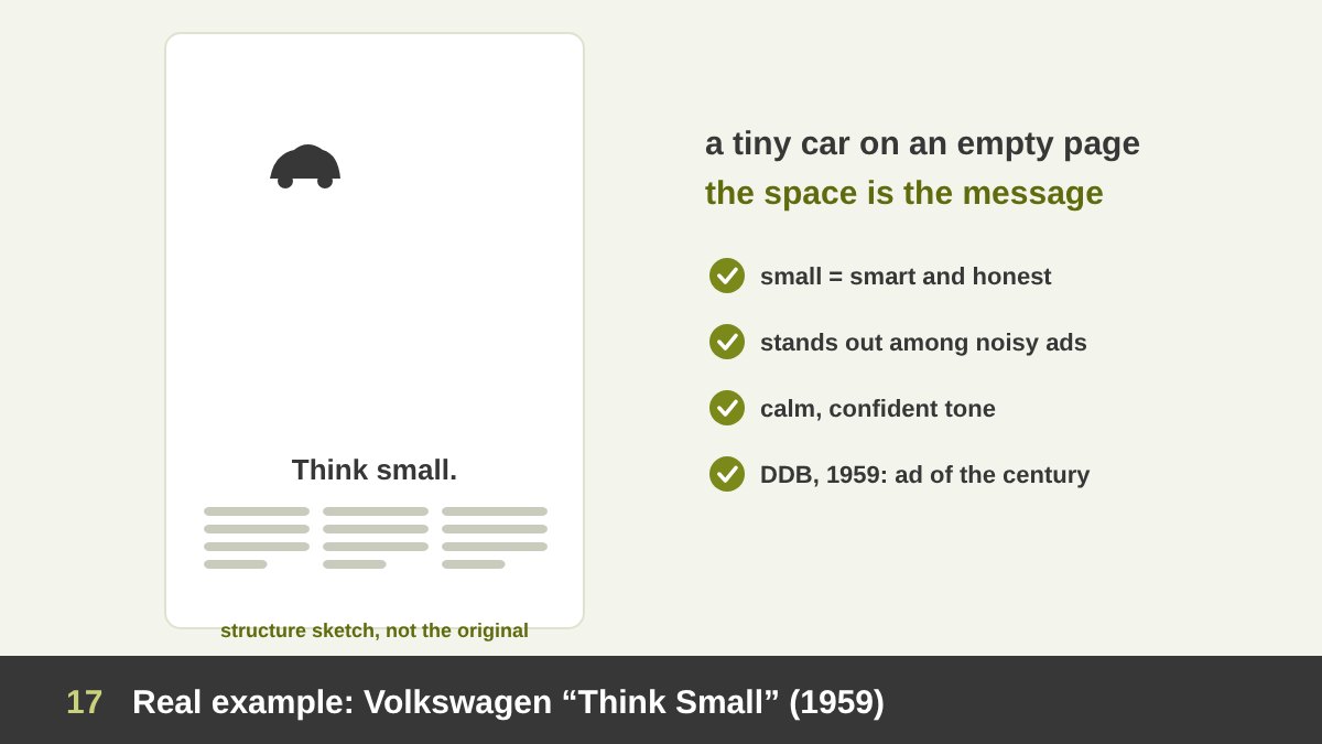
In 1959 the agency Doyle Dane Bernbach (DDB) created the advertisement “Think Small” for the Volkswagen Beetle, with art director Helmut Krone and copywriter Julian Koenig. At a time when American car ads showed huge cars in colourful, crowded scenes, this ad showed a tiny black-and-white car in the top-left area of a page that was almost completely empty. Below, a short headline and three columns of honest, witty text. In 1999 Advertising Age named the campaign the best of the 20th century.
The white space is the message. The emptiness makes the car look small, and instead of hiding that, the ad celebrates it: small is smart, economical, easy to park. The space also makes the ad stand out on a magazine page surrounded by noisy ads, and it gives the reader a calm, confident feeling that matches the brand’s honest tone.
This is the best example I know of white space as strategy, not decoration. The designers did not leave space because they had nothing to say; they left space because the space said it better. Whenever a client asks to “fill the empty area”, I think of this ad. (The ad is under copyright, so I show my structure sketch; you can see the original in many advertising histories and on Wikipedia.)
Real Example: Josef Müller-Brockmann and Swiss Posters
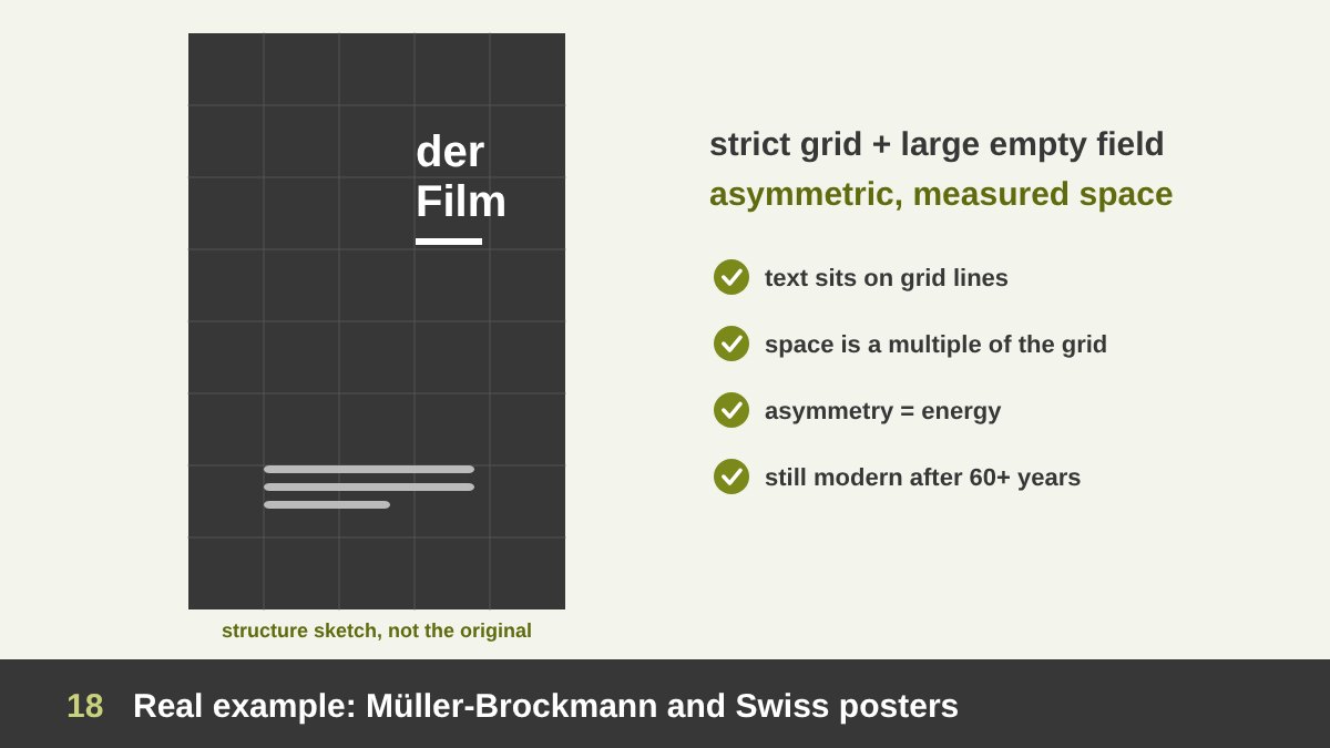
The Swiss designer Josef Müller-Brockmann (1914 to 1996) was one of the leaders of the International Typographic Style, also called Swiss Style. His posters for the Zurich Tonhalle concerts and his exhibition poster Der Film (1960, Kunstgewerbemuseum Zürich) are built on a strict grid, clear sans-serif type and large, carefully measured areas of empty space.
In Swiss posters, white space is asymmetric and structured. The text is not centred; it sits along grid lines, often in one area of the poster, leaving a large empty field that gives it energy and direction. The emptiness is not random: every gap is a multiple of the grid unit. That combination of order and space is why these posters still feel modern after more than sixty years. Müller-Brockmann explained the system in his book Grid Systems in Graphic Design (1981).
For today’s designer, the Swiss lesson is that white space and grids are best friends. A grid tells you where things can go, and therefore where the space will be. When the space follows the grid, even a very empty layout feels intentional and stable. I use this approach in websites and corporate reports all the time. (Müller-Brockmann’s posters are under copyright, so I show my structure sketch and link to more about him.)
Real Example: Apple and Premium Product Design
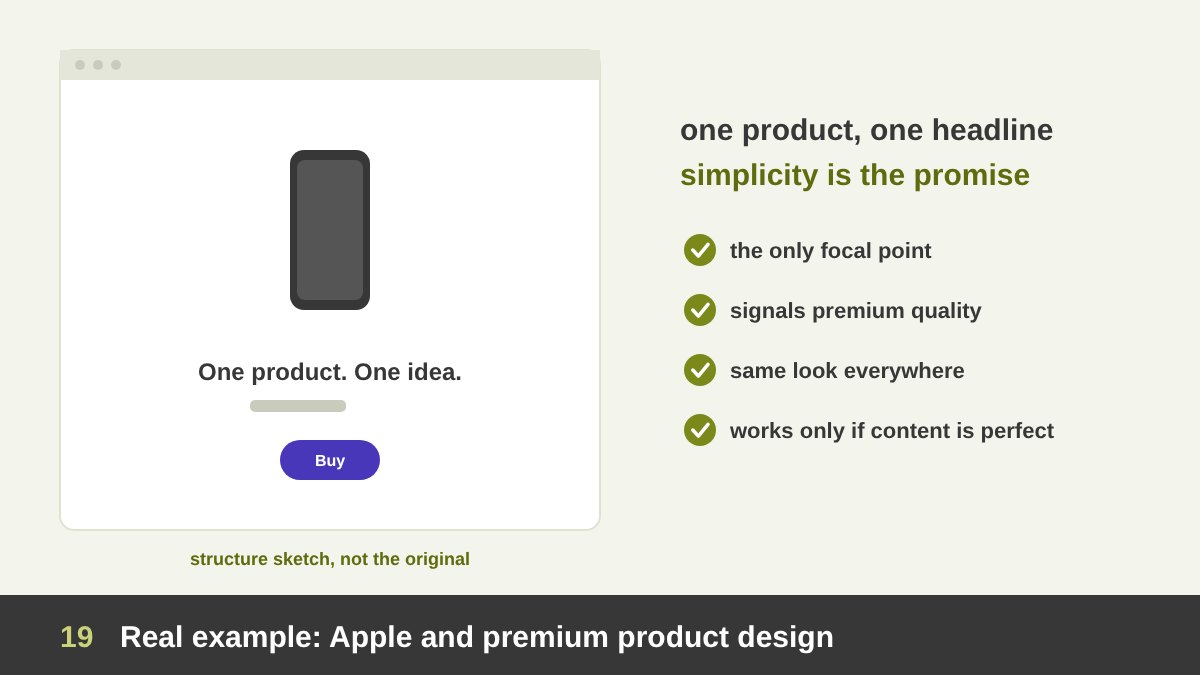
No brand made white space as famous in technology as Apple. Its product pages, ads and packaging usually show one product, photographed on a plain background, with one short headline and very little text. The unboxing experience is designed the same way: a white box, the product alone in the first layer, the cables and papers hidden underneath.
The space does several jobs at once. It makes the product the only focal point. It communicates simplicity, which is the core of the brand’s promise: if the ad is simple, the product must be easy to use. It signals premium quality and confidence. And it creates a consistent look across hundreds of products and countries, because the empty background is the same everywhere.
Many brands tried to copy this and failed, because they copied the white background but not the discipline. White space only works when the content left in it is excellent: a perfect photo, a sharp headline, precise typography. If the product photo is weak, empty space just makes the weakness more visible. The real lesson is to remove everything that is not essential, and then make the essentials perfect.
Real Example: The Google Homepage
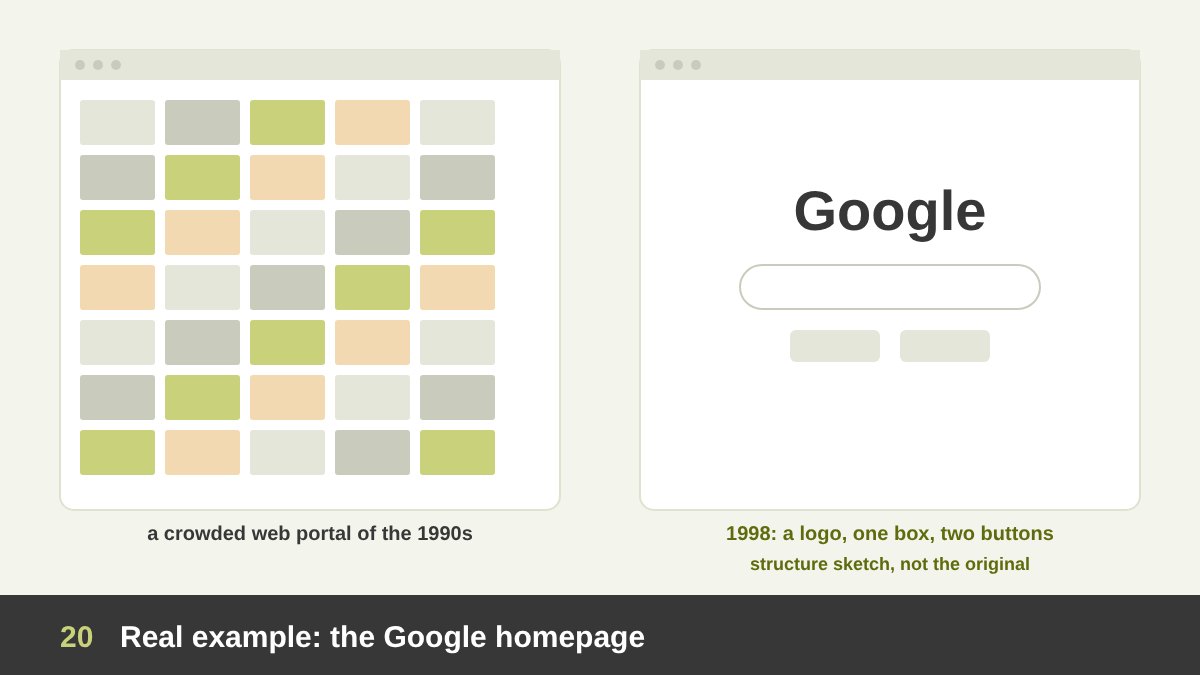
When Google launched in 1998, the big web portals of the time, such as Yahoo!, Excite and AOL, were crowded with news, weather, ads, links and categories. Google’s homepage showed a logo, one search box and two buttons on an almost empty white page. Sergey Brin later joked that part of the reason was that they had no webmaster, but the effect became the company’s identity.
The space made the purpose impossible to miss: you came here to search. It also made the page load quickly on slow connections, and it made the brand feel focused, trustworthy and different from its competitors. More than twenty-five years later, the homepage is still mostly empty, while many of those crowded portals are gone or forgotten.
For UI designers, this is the clearest proof that white space is a product decision. Every link you add to a page competes with the main action. When you design a landing page, an app screen or a form, ask Google’s question: what is the one thing people come here to do? Give that thing the space, and move everything else away. (The Google logo is a trademark; the image is my own sketch.)
White Space in Web and UI Design
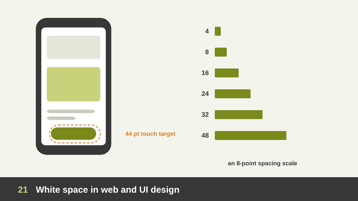
In interfaces, white space is part of usability. Space separates sections so users can scan, groups related controls, and gives fingers enough room to tap the right button. Apple’s Human Interface Guidelines recommend touch targets of at least 44 by 44 points, and Google’s Material Design recommends 48 by 48 dp; the space around a small icon is what makes it usable.
Most product teams use a spacing system, often based on multiples of 4 or 8 pixels (the “8-point grid”). Padding inside buttons, gaps between cards and margins around sections all use the same scale, which makes interfaces consistent and much easier to build. The space between sections on a landing page is usually much larger than the space inside them, so each section reads as one block.
On mobile, white space is precious but even more important: a small screen with no breathing room is exhausting. Use fewer elements, larger spacing between groups and comfortable line height. And remember that in RTL Arabic interfaces the spacing must be mirrored properly: margins, icons and alignments flip, but the rhythm of space should stay the same. I explain how visual trends shape interfaces in graphic design trends 2026.
White Space in Print: Books, Magazines and Packaging
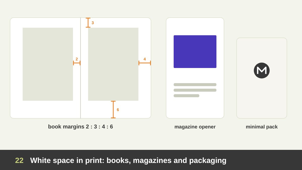
Print designers have studied white space for centuries. Classic book design uses margins that are not equal: the inner margin (near the spine) is the smallest, then the top, then the outer, and the bottom margin is the largest. A well-known proportion used by Jan Tschichold and others gives inner, top, outer and bottom margins in the ratio 2 : 3 : 4 : 6 on a 2:3 page. The generous bottom margin gives the text block a stable, elegant position and a place for the thumbs.
Magazines use white space to create pace: dense news pages, then a feature opening with a full page of space and a single photo, like a pause in music. Annual reports and catalogues use space to make figures and products readable and to look trustworthy. In packaging, an empty, calm front panel stands out on a crowded supermarket shelf exactly because everything around it is noisy.
Print adds a practical reason for margins: the safe area. Text and logos placed too close to the edge can be cut off when the paper is trimmed. Keep important content inside a safe margin (often 3 to 5 mm for cards and flyers, more for books), and remember that white space on paper also shows the paper itself, so its colour and texture become part of the design.
White Space in Logos and Brand Identity
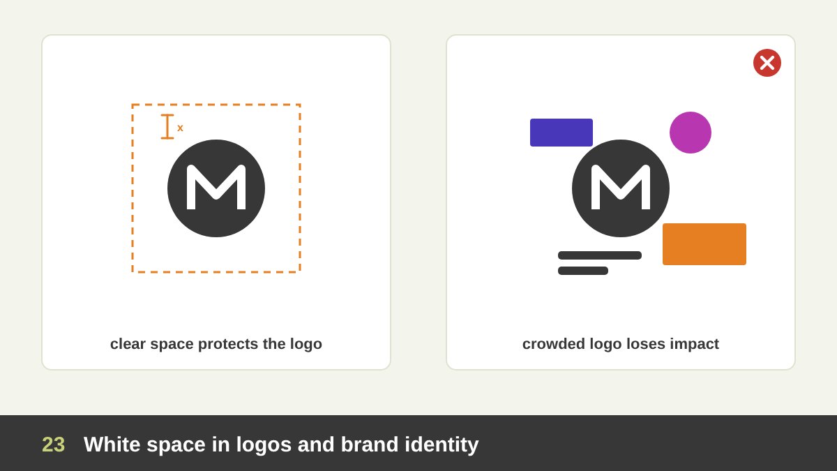
Every professional brand guideline includes a clear space rule (also called exclusion zone or safe zone): the minimum empty area that must surround the logo. It is often defined using a part of the logo itself, for example the height of one letter, so that the space scales with the logo. Without it, logos get crowded by text, photos and other logos, and lose their impact.
White space is also part of a brand’s visual voice. A brand that always uses generous margins, few elements and calm layouts becomes recognisable even when the logo is not visible. Think of how you can recognise certain luxury, tech or Scandinavian brands from a single ad. Space becomes a brand asset, as important as colour and typography, and I always include it in the identities I design. The difference between a brand and a logo is exactly this kind of system, as I explain in branding vs logo design.
Inside the logo, counters (the enclosed spaces in letters such as o, e and a) and the gaps between letters must be balanced, especially when the logo is used small. Open, generous counters keep a logo readable on a phone screen or an embroidered shirt; tight counters fill in and turn the logo into a blob. Always test a logo at its smallest size before you approve it.
When Less White Space Is the Right Choice
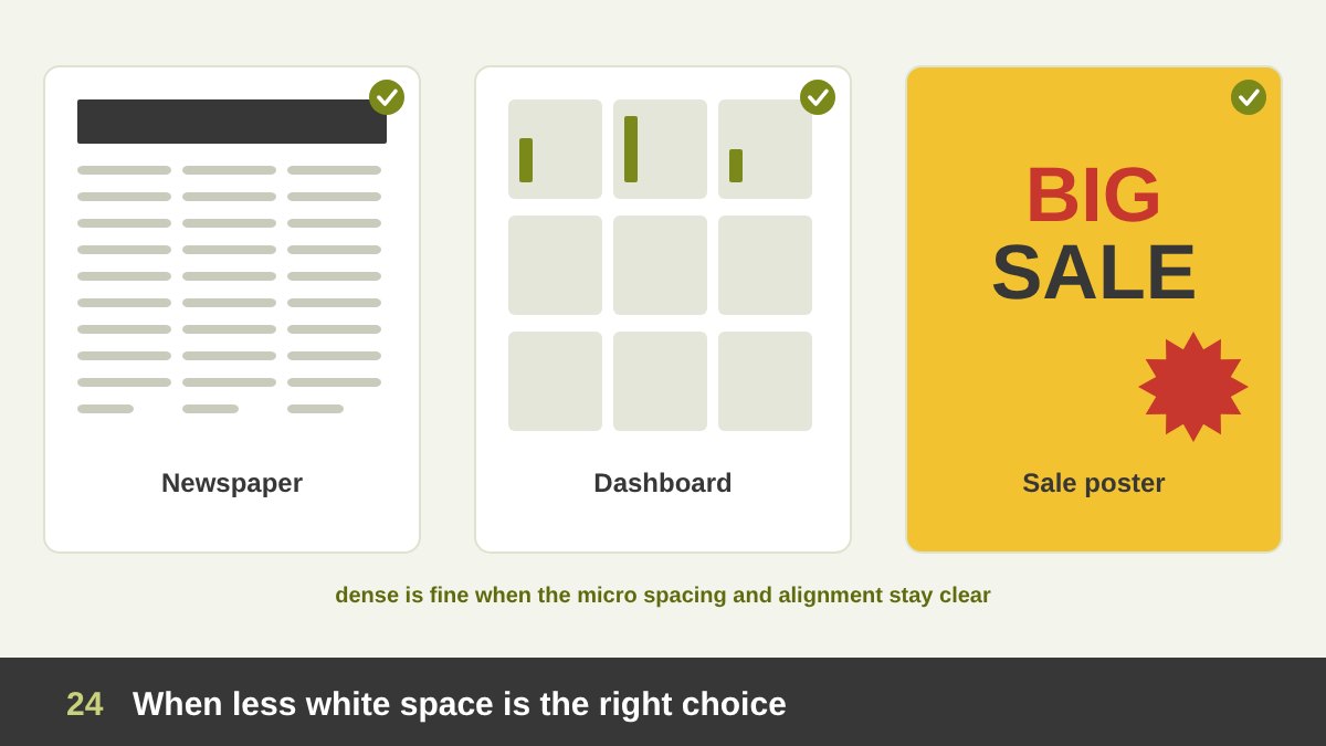
White space is not always the answer, and “more space” is not a rule for every project. Newspapers, timetables, dashboards, dictionaries and data tables need to show a lot of information at once, and their users want density. A financial dashboard with huge empty areas would force people to scroll and click for what they need.
Some brands and genres also need energy and abundance: a street-food menu, a festival poster, a sale campaign, a children’s game. Filling the space can communicate fun, urgency and generosity. Movements like punk graphics and maximalism deliberately reject empty space to feel rebellious or joyful.
The trick is that good dense designs still use white space, only at a micro level: clear gutters, consistent alignments, comfortable line spacing inside the dense grid. Density without structure is chaos; density with structure is efficient. So the real question is not “how much space?”, but “how much space does this audience need to do this task and feel this feeling?”.
White Space in Social Media Designs: Six Examples
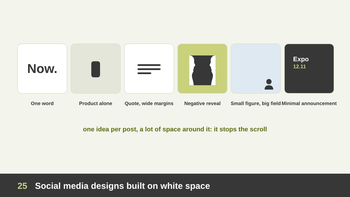
On social media, white space is your best tool for stopping the scroll, because the feed is crowded and a calm post stands out. Here are six formats I use and recommend. 1. One word: a single bold word or number on a plain colour, with nothing else. 2. Product alone: one product photographed small in a big empty field, like the VW ad.
3. Quote with wide margins: a short quote set in a narrow column with generous space around it; it feels thoughtful and is easy to read on a phone. 4. Negative space reveal: a shape that hides a second image, like a hidden arrow or a face; people stop to find it and share it. 5. Small figure, big field: a tiny person or object in a huge empty colour area, in the spirit of Hammershøi; it feels cinematic and emotional.
6. Minimal announcement: event name, date and logo, set with Swiss-style asymmetry and a lot of space. Keep in mind that platforms add their own interface on top of your post (profile name, buttons, captions), so keep important content away from the edges and leave a safe margin. A spacious post also leaves room for the viewer’s imagination, and that is often what makes people comment.
A White Space Carousel for Instagram and LinkedIn
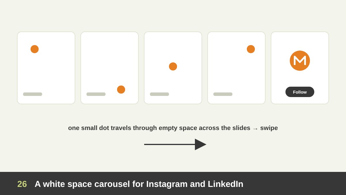
Carousels are a perfect format to teach or tell a story with white space. One idea I like: a single small element, a dot or a circle, travels across the slides through a big empty field. On each slide it moves to a new position next to one short sentence, and on the last slide it becomes the logo or the call to action. The empty space makes every slide feel calm, and the moving dot pulls the viewer to swipe.
Another format is “crowded vs. breathing”: the same layout shown first with no space, then with good margins, line spacing and grouping. It is very effective for designers explaining their work, because the improvement is visible in one swipe. You can also build a negative-space puzzle carousel: show a logo or illustration, ask “what do you see?”, and reveal the hidden shape on the next slide.
Practical tips: keep the same margins on every slide so the series feels consistent, use one or two short lines of text per slide, keep the text inside the safe area away from the platform buttons, and give the final slide a single clear action. These are the same principles I use when I present design work to clients: one idea per slide and space around it.
Common White Space Mistakes
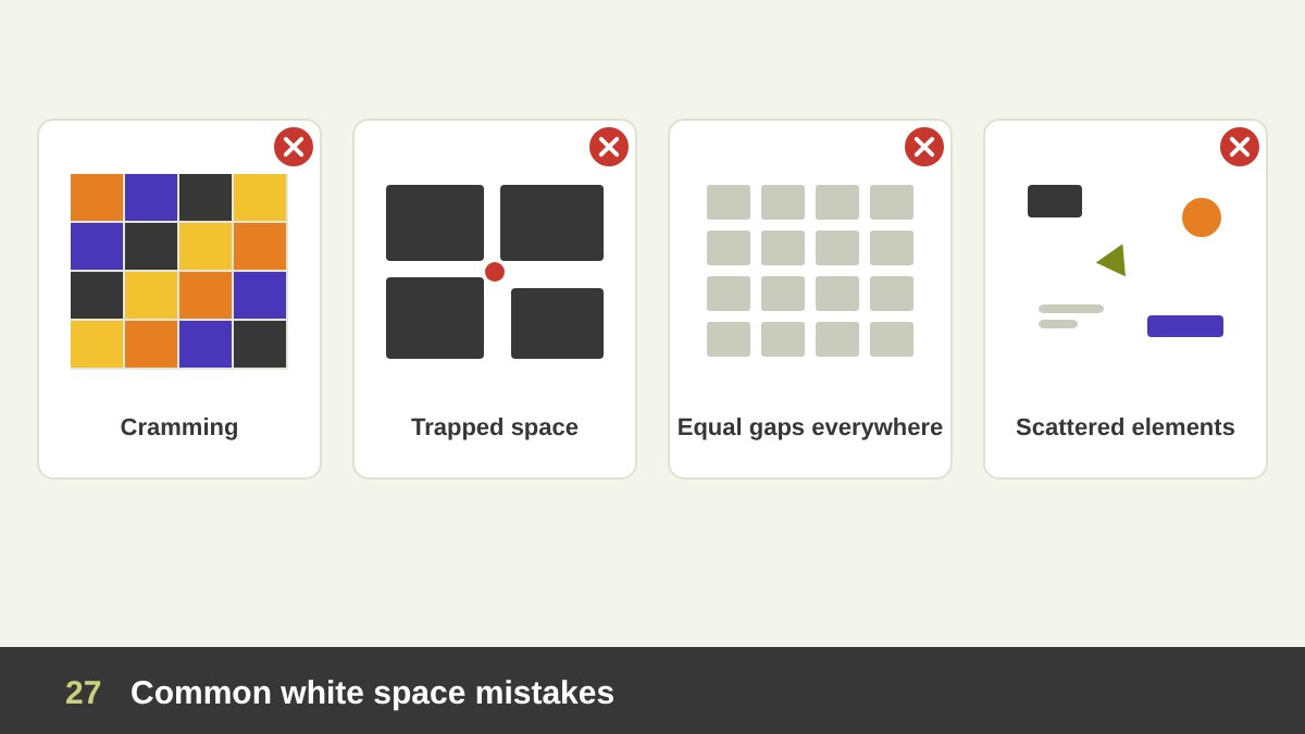
These are the white space mistakes I see most often in students’ and clients’ designs. Cramming: filling every gap “because it looks empty”, pushing text to the edges and shrinking the margins to fit more. The design looks cheap and nothing stands out. Trapped white space: small, awkward empty pockets caught between elements, which look like holes rather than breathing room. Move the elements so the space joins the open areas.
Equal spacing everywhere: when every gap is the same, nothing is grouped and there is no hierarchy. Vary the space: small inside groups, larger between groups. Scattered elements: the opposite problem, elements floating around a large empty area with no alignment or relation to each other. White space only looks elegant when the elements in it are aligned to a clear structure.
Two more: forgetting micro space (luxurious margins but tight leading and cramped buttons), and emptiness without a strong focal point. A spacious design with weak content just looks unfinished. The space must frame something worth looking at. If you are unsure, print the design or view it small on your phone: crowding and trapped space become obvious immediately.
How to Use White Space in Your Next Design: A Practical Checklist
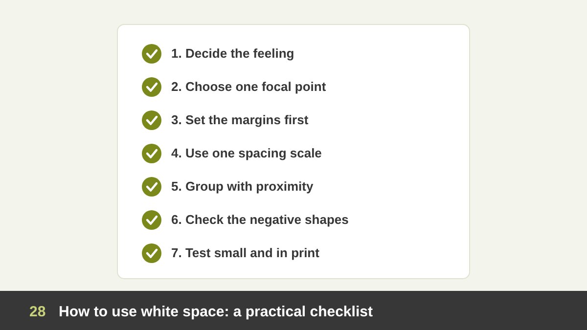
Here is the process I follow, and teach, for white space in any layout. 1. Decide the feeling. Calm and premium, or energetic and abundant? That decides how much space you need. 2. Choose one focal point and plan the most space around it. 3. Set the margins first, before placing any content, so the frame is decided and not squeezed later.
4. Use a spacing scale (for example 8, 16, 24, 32, 48, 64) and only those values. 5. Group with proximity: small gaps inside groups, larger gaps between groups, and more space above headings than below them. 6. Check the negative shapes: fill the empty areas mentally (or literally) and see if they are balanced, with no trapped pockets. Set comfortable line spacing, especially for Arabic.
7. Test it: view the design small on a phone, from far away, and in print. Ask whether every empty area is doing a job. White space is the element that holds all the others together, and learning to see it is what separates a layout that merely contains things from one that feels designed. If you would like help with a brand identity, a website or a layout that breathes, take a look at my portfolio or contact me.
| Type of space | What it does | Where you see it |
|---|---|---|
| Macro white space | Frames the layout, separates big sections, sets the overall mood | Margins, space between sections, around hero images and logos |
| Micro white space | Makes text and controls comfortable to read and use | Line spacing, letter spacing, padding inside buttons and cards |
| Passive white space | Keeps content readable and organised | Normal margins, gaps between words and paragraphs |
| Active white space | Guides the eye, creates emphasis, tension or luxury | A single product or line of text in a large empty field |
| Positive space | The subject: what the viewer looks at | Text, photos, shapes, logos, people |
| Negative space | The ground around the subject; it has a shape too | The gaps between and around every element |
| Reversible figure-ground | Adds a second, hidden meaning and a moment of discovery | Rubin vase, FedEx, NBC, Toblerone, Noma Bar, Escher |
| Clear space | Protects a logo from crowding | Brand guidelines, packaging, signage |
| Ma (meaningful emptiness) | Creates silence, mood and room for the imagination | Japanese painting, gardens, minimal posters and interiors |
| Dense layout with micro space | Shows a lot of information while staying readable | Newspapers, dashboards, timetables, data tables |
White Space in Design: Frequently Asked Questions
What is white space in design?
White space, also called negative space, is the empty area in a design: around and between text, images, shapes and other elements. It does not have to be white; it can be any colour or texture, as long as it is free of content. It improves readability, creates focus and hierarchy, groups related elements and affects how a design feels.
What is the difference between positive and negative space?
Positive space is the area occupied by the subject of a design, such as text, images and shapes. Negative space is the area around and between them. In psychology they are called figure and ground. Both have shapes, and good designers balance them together.
What is the difference between white space and negative space?
In design the two terms are usually used to mean the same thing: the empty space in a composition. Some designers use “white space” more for layout and typography (margins, line spacing, padding) and “negative space” more for the shapes formed by the empty areas, especially in logos and illustrations.
What are macro and micro white space?
Macro white space is the large space in a layout: margins, the space between sections, columns and big elements. Micro white space is the small space: line spacing, letter spacing, word spacing and the padding inside buttons and cards. Both need to work together.
What are famous examples of negative space?
Famous examples include the hidden arrow in the FedEx logo, the NBC peacock, the bear in the Toblerone mountain, the hidden “1” in the old Formula 1 logo, the Rubin vase (1915), M. C. Escher’s Sky and Water I, Noma Bar’s illustrations, Hasegawa Tōhaku’s Pine Trees screens and Malevich’s White on White.
How much white space should a design have?
There is no fixed number. It depends on the feeling and the task: premium, calm and focused designs need generous space, while dense designs such as newspapers and dashboards need less macro space but still need clear micro spacing. Start with comfortable margins and line spacing, give the main focal point the most space, and test the design small on a phone.
Leave a Reply