

Is Drawing Still Important for Designers in the Age of AI?
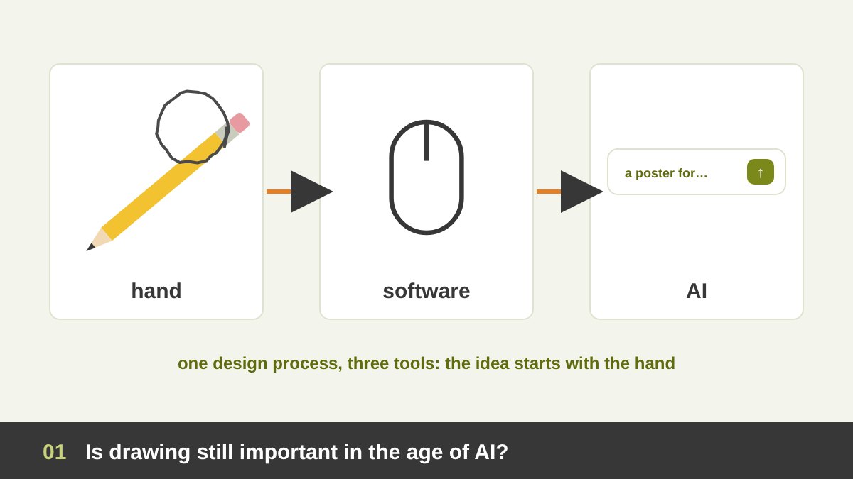
Every few years someone announces that drawing is finished, and the importance of drawing for designers is questioned again. It happened when the Macintosh arrived, when Photoshop took over, when stock libraries became cheap, and it is happening loudly now, because an AI model can produce a polished image from one sentence in a few seconds. Students ask me the same question in almost every course: if the computer and AI can draw for me, why should I keep practising with a pencil?
My honest answer, after many years as an art director, designer and painter, is that drawing is still important for designers, but not for the reasons people usually think. Hardly anyone today draws a final logo by hand with ink and a ruling pen, or paints a poster with gouache for print. That part of drawing really was replaced. What was never replaced is drawing as a tool for thinking: finding an idea, testing a composition, explaining a concept to a client, and training your eye to see proportion, light and form.
This article answers the question in depth and honestly. I will separate what software and AI actually took over from what they did not, look at what research on sketching shows, analyse real sketchbooks, and finish with a practical routine so you can keep drawing alongside your graphics software and your AI tools, not instead of them. It connects with my articles on art vs design and AI and Adobe for graphic designers.
Key takeaways
- Yes, drawing is still important for designers, but its job has changed. Software replaced drawing as a production skill; AI is replacing parts of image making. Neither replaced drawing as a way of thinking, seeing and communicating.
- Research on design sketching (Goldschmidt, Schön, Suwa and Tversky) shows that designers find new ideas by drawing, looking at what they drew and seeing it differently. That loop is faster on paper than on any screen.
- You do not need to draw beautifully to be a good designer. You need to draw quickly, clearly and often: boxes, arrows, thumbnails, rough forms and simple figures.
- AI makes sketching more valuable, not less: today’s tools can turn a rough sketch into a render, so the designer who can draw an idea controls the result better than the one who can only type a prompt.
- Below you will find what software and AI really replaced, what the research says, real sketchbooks from Leonardo da Vinci, Michelangelo, Hokusai and my own logo work, a daily practice routine, exercises, tools and a hybrid workflow that uses paper, software and AI together.
What Drawing Means for a Designer: Sketches, Thumbnails, Studies and Plans
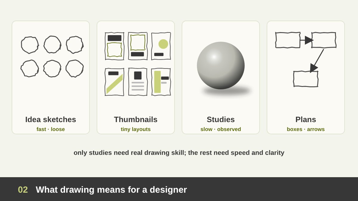
When designers say drawing, they rarely mean a finished artwork. Drawing in design covers at least four different activities, and it helps to name them, because each one has a different purpose and a different level of finish.
Idea sketches are fast, loose and disposable: ten versions of a logo mark on one page, a symbol you are not sure about, a word with an arrow. Thumbnails are tiny layouts, often the size of a matchbox, used to compare compositions for a poster, a page, a slide or a social post before committing to one. Studies are slower drawings from observation, a hand, a bottle, a chair, a face, made to understand how something really looks. Plans and diagrams are boxes, arrows and notes: a site map, a user flow, a mind map of a brand’s keywords, a storyboard for a video.
Only the third kind needs real drawing skill. The other three need speed and clarity more than beauty. This is important, because many designers stop sketching altogether because they think their drawings are not good enough, when most of the value of sketching comes from the kinds of drawing anyone can learn in a few weeks.
From Cave Walls to Prompts: A Short History of Drawing and Design Tools
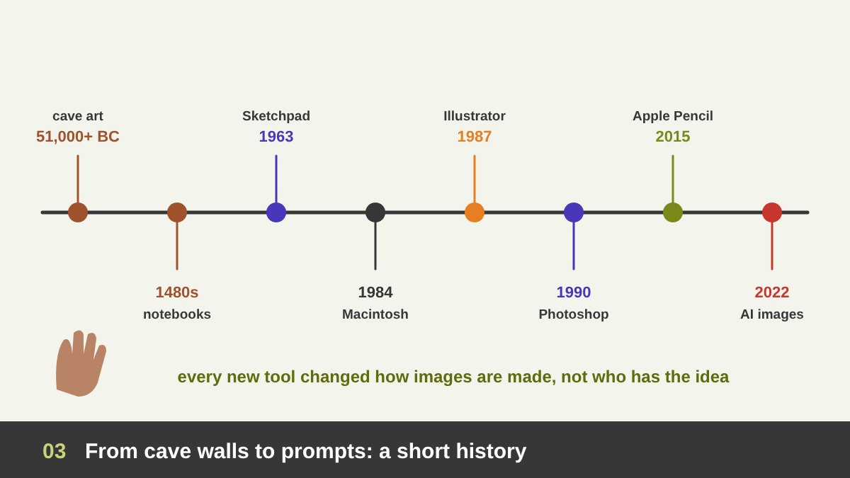
Drawing is older than writing. In 2024 researchers published a cave painting in Sulawesi, Indonesia, dated to at least 51,200 years ago, and the painted caves of Chauvet in France are more than 30,000 years old. For almost all of that time, if you wanted an image you drew it by hand, and for centuries designers, architects and engineers worked from hand drawings on paper.
The digital story starts surprisingly early, and with a telling name. In 1963 Ivan Sutherland presented Sketchpad, the first interactive graphics program, drawn with a light pen directly on the screen. The Macintosh (1984) brought graphic interfaces to designers, Adobe Illustrator (1987) and Photoshop (1990) turned paste-up boards, airbrushes and photo retouching into software, and pressure-sensitive tablets let designers draw digitally. The iPad with Apple Pencil (2015) and apps like Procreate made drawing on screen feel close to paper.
Then, in 2022, DALL·E 2, Midjourney and Stable Diffusion made images from text prompts available to everyone, and Adobe Firefly (2023) brought generative tools into Photoshop and Illustrator. Notice the pattern: each new tool changed how images are produced, but every one of them, from Sketchpad to today’s sketch-to-image tools, still assumes a person with an idea and a hand that can show it.
What Graphics Software Replaced, and What It Did Not
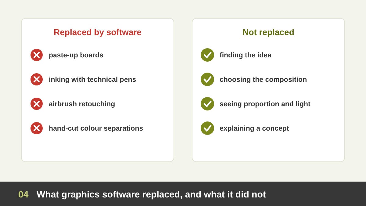
Let us be honest about what the computer took away. Before the 1990s a designer prepared artwork for print by hand: lettering was drawn or set and pasted onto boards, logos were inked with technical pens, photos were retouched with an airbrush, colour separations were cut by hand. Software replaced almost all of this, and it did it better: cleaner curves, perfect repeats, unlimited undo, exact colour. Nobody should miss inking a logo with a ruling pen at two in the morning.
So yes, software replaced drawing as a production method. A modern designer can build a complete identity without drawing a single final line by hand, using the pen tool, shapes, grids and type.
What software did not replace is everything that happens before the production stage. Illustrator does not tell you which idea is worth building. Figma does not tell you whether the layout should be centred or asymmetric. Photoshop does not train your eye to notice that a shadow is the wrong colour or that a figure’s arm is too long. Those decisions happen in the head, and for most designers they happen fastest with a pencil. Software is an excellent place to finish an idea and a slow place to find one, because every tool, menu and default pushes you toward a specific solution before you have explored the alternatives.
What AI Replaced, and What It Did Not
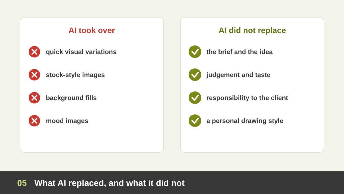
AI is a bigger change than software, and pretending otherwise would be dishonest. Generative tools already do work that used to be paid for: generic stock-style illustrations, quick concept variations, mood images for a pitch, extending a background, removing objects, producing a hundred versions of a scene in an afternoon. Some illustrators and concept artists have lost commissions because of it, and that is a real cost.
But look closely at what AI actually does. It produces images. It does not produce decisions. It does not read the brief, understand the client’s market, decide what the brand should feel like, or take responsibility for the result. It averages what it has seen, so without strong direction its output drifts toward the familiar: the same lighting, the same faces, the same glossy look. And it is weak exactly where design needs precision: a logo that works at 16 pixels, consistent characters across a campaign, Arabic lettering that is actually correct.
So AI replaced part of image making, not design thinking. The designer’s value moves up: from producing pixels to defining the idea, directing the tools and judging the result. And the fastest way to define and direct a visual idea is still to draw it. That is why I see AI as a reason to sketch more, which I explain in detail in sections 19 and 20.
Drawing Is Thinking: What Research on Design Sketching Shows
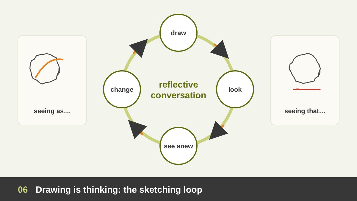
Design researchers have studied sketching for more than thirty years, and their findings explain why designers keep doing it. In 1991 Gabriela Goldschmidt described “the dialectics of sketching”: designers move between seeing as (this line could be a wing) and seeing that (this wing makes the mark too wide). The sketch is not a picture of an idea that already exists in the head; it is the place where the idea is formed.
Donald Schön called design a “reflective conversation with the situation”, and with Glenn Wiggins (1992) he showed how designers draw, look, discover unintended consequences and draw again. Masaki Suwa and Barbara Tversky (1997) found that architects noticed new relations and features in their own sketches when they looked at them again, ideas they had not planned when they drew. Ambiguity, the very thing that makes a rough sketch look “bad”, is what lets you see more than one possibility in it.
Bill Buxton, in Sketching User Experiences (2007), lists the qualities of a sketch: quick, cheap, disposable, plentiful, clearly unfinished, open to suggestion. A polished screen design has the opposite qualities: it looks decided, so you and your client stop questioning it. The designer and illustrator Milton Glaser put the whole idea into the title of a small book: Drawing Is Thinking. Keep the loop of the image in mind: draw, look, see, change. Any tool that slows that loop slows your thinking.
The Hand and the Brain: Handwriting, Doodling and Memory
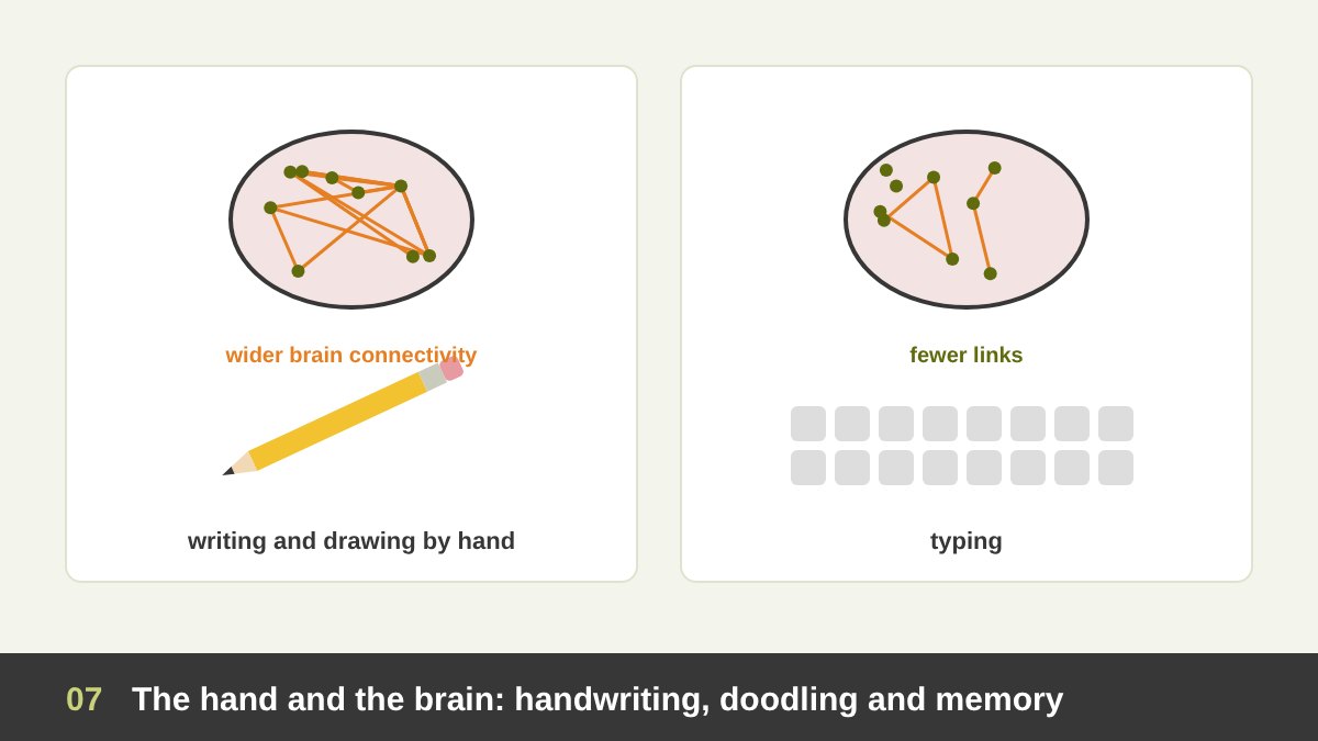
Beyond design studies, research on handwriting and drawing points in the same direction, though it is worth reading carefully. Karin James and Laura Engelhardt (2012) scanned children’s brains and found that writing letters by hand, not typing or tracing them, later activated the brain’s reading network. Audrey van der Meer and Ruud van der Weel (2024) recorded the brain activity of university students and found much wider connectivity when they wrote by hand than when they typed, in patterns linked to memory and learning.
Doodling helps too. Jackie Andrade (2010) asked people to listen to a boring phone message; those who shaded shapes while listening remembered about 29% more than those who did not. The famous “pen is mightier than the keyboard” study by Pam Mueller and Daniel Oppenheimer (2014), which found that students who took notes by hand understood lectures better, is a good example of why we should stay honest: a larger replication in 2019 found the difference much smaller and not reliable.
So I will not claim that drawing makes you a genius. The fair conclusion is this: using the hand to write and draw engages attention and memory in ways that typing and clicking do not fully replace, and for a designer, whose job is to notice, remember and connect visual ideas, that is a good reason to keep a pen in the process.
Speed: Why Paper Wins the First Hour of a Project
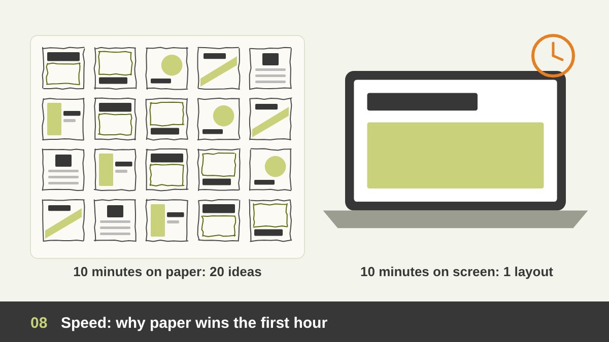
Try a simple test. Give yourself ten minutes for a poster. On paper, with a pen, you can draw fifteen to twenty thumbnails: big title on top, title at the bottom, image full-bleed, image small in the centre, diagonal, symmetric, type only. On the computer, in the same ten minutes, most designers manage one or two layouts, because they open a file, choose a size, pick a font, place an image, adjust the kerning, and suddenly they are polishing instead of exploring.
That is not a problem with the software; it is what software is for. It wants decisions: which typeface, which colour, which exact size. A pencil asks for none of them. It lets you stay at the level of the idea while ideas are still cheap.
This is why I tell my team that the first hour of any project belongs to paper. Quantity first, quality second: the more different options you see, the better your chance that one of them is genuinely good. Google Ventures’ design sprint uses the same logic in its “Crazy 8s” exercise, eight sketches in eight minutes, described in Jake Knapp’s book Sprint (2016). Then, once you have chosen two or three directions, move to the computer, where speed of production is on your side.
Drawing Teaches You to See
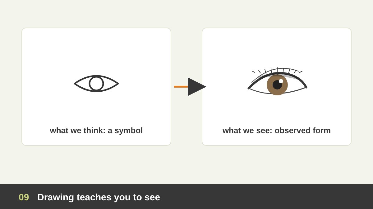
Drawing from observation trains something no software can give you: the ability to see. When beginners draw an eye from memory, they draw a symbol, an almond with a circle. When they look carefully, they notice the thickness of the lower lid, the highlight, the shadow the upper lid casts on the eyeball, the fact that the iris is partly hidden. Betty Edwards built her famous course Drawing on the Right Side of the Brain (1979) on exactly this shift from symbol to observation. Her explanation about brain hemispheres is now considered oversimplified, but her exercises still work very well.
Designers use this trained eye every day, even when they never draw. You notice that an icon’s stroke is 1.5 points heavier than its neighbours, that a photo is lit from the left while the product render is lit from the right, that a typeface’s counter is too small at caption size. These are judgements of proportion, value, light and shadow and shape, and observational drawing is the gym where they are trained.
You can see the difference in my own early studies, such as this pencil study of an eye and this nose study: the goal was not a pretty picture but to understand form. That understanding stays with you when you design an icon, light a 3D mock-up or judge an AI image.
Sketching as a Language: Talking to Clients, Teams and Developers
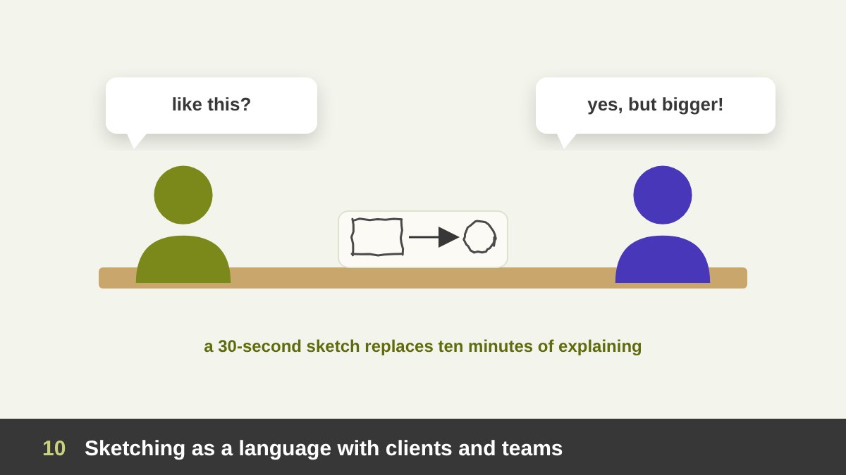
A sketch is also a way to talk. In a meeting, a quick drawing on a whiteboard or a notebook settles in thirty seconds what words would take ten minutes to explain: “the logo sits here, the image bleeds off the edge, the button follows the scroll”. Dan Roam built a whole book, The Back of the Napkin (2008), on the idea that simple pictures solve business problems because everyone can read them.
Rough sketches also invite the right kind of feedback. Show a client a polished mock-up and they comment on the colour of a button. Show them three rough sketches and they talk about the idea, which is what you need at that stage. As an art director I often sketch directions for the team instead of writing long briefs, and developers understand a hand-drawn user flow faster than a paragraph about it.
This is also why sketches belong in your design presentations. Showing the process, the paper explorations behind the final logo or layout, helps clients understand why the final solution is right and makes your work look considered, not accidental.
Leonardo da Vinci’s Notebooks: Drawing as Research
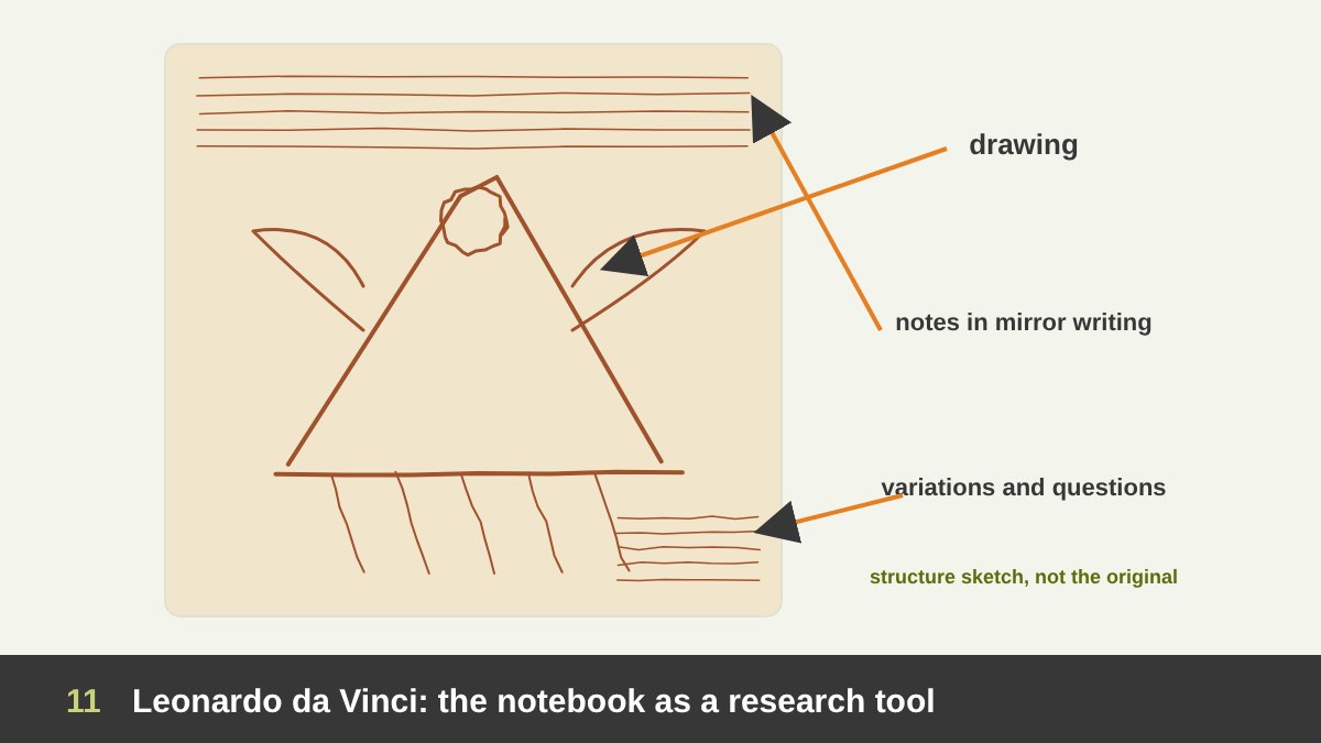
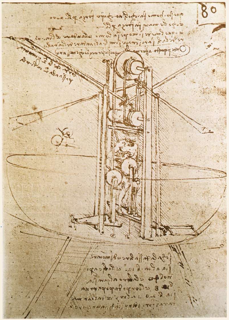
Leonardo da Vinci is the classic proof that drawing is a way of thinking, not only of picturing. More than 7,000 pages of his notebooks survive, filled with machines, anatomy, water, plants, faces and plans, written in his famous mirror script. Many of the machines were never built; the drawings were how he worked out whether they could be.
Look at the page shown below, one of his studies for a flying machine from the late 1480s. It is not a presentation drawing. The structure is drawn from one angle, notes explain the mechanism, and parts are repeated as he tests variations. The drawing asks questions: how would a person power this? where do the forces go? It is exactly the dialectic Goldschmidt described five centuries later: draw, look, rethink.
For a designer the lesson is practical. Use your sketchbook as Leonardo did, as a place for research, not for showing off. Draw the problem, write next to it, draw it again from another side. Most of those pages will never be seen by a client, and they are where the good ideas come from.
Michelangelo’s Studies: Planning Before the Masterpiece
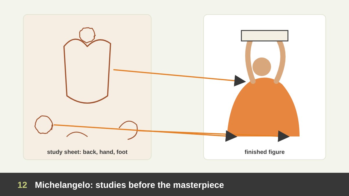
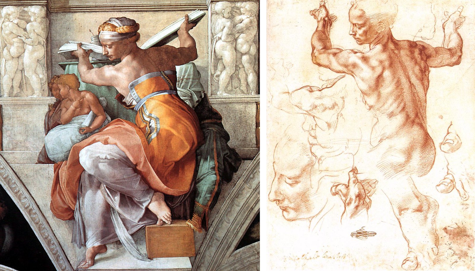
Michelangelo’s red-chalk Studies for the Libyan Sibyl (about 1510–11), now at The Metropolitan Museum of Art, show the other side of drawing: planning. Before painting the sibyl on the Sistine Chapel ceiling, he drew a model’s twisting back and shoulders, then repeated the difficult parts, the hand, the foot, the toes, the face, until he understood them. In the final fresco the figure is a woman in a colourful robe, but the structure underneath is the one he worked out on this sheet.
Notice what he chose to repeat. Not the easy parts: the big toe appears several times because the foot carries the whole pose. Good planning concentrates effort where the risk is. Designers do the same when they sketch the hardest part of a logo, the connection between two letters, or the most complex screen of an app, many times before building the rest.
Compare the two images below: the study and the finished figure. One is a working document, the other a public result. Your clients see your finished work; your studies are what make it convincing.
Hokusai Manga: Sketchbooks as a School
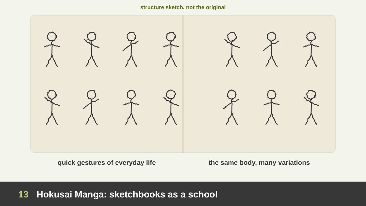
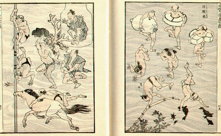
Katsushika Hokusai, the artist of the Great Wave, published fifteen volumes of sketches known as the Hokusai Manga, the first in 1814 and the last after his death. They are full of people bathing, working, stretching, falling, of animals, plants, ghosts and objects, drawn quickly with a confident line. They were intended partly as model books for students, a way to learn by copying how a master observed everyday life.
The page below, with people swimming and bathing, shows what makes them so useful for designers: variation. The same body is shown in dozens of poses, each one simplified to the essential gesture. That is the skill behind every good pictogram, icon set, mascot and illustration system. When you design twenty icons that must feel like one family, you are doing what Hokusai did on these pages.
Hokusai also reportedly said that nothing he drew before the age of seventy was worth anything. Whether or not the quotation is exact, the attitude is right: drawing is a lifelong practice, not a course you finish.
Logo Design Starts on Paper: My Al Malik Sketches
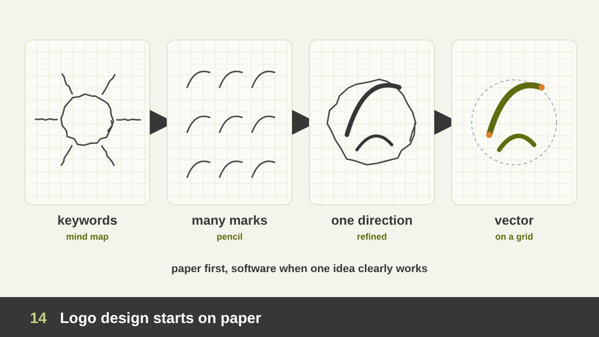
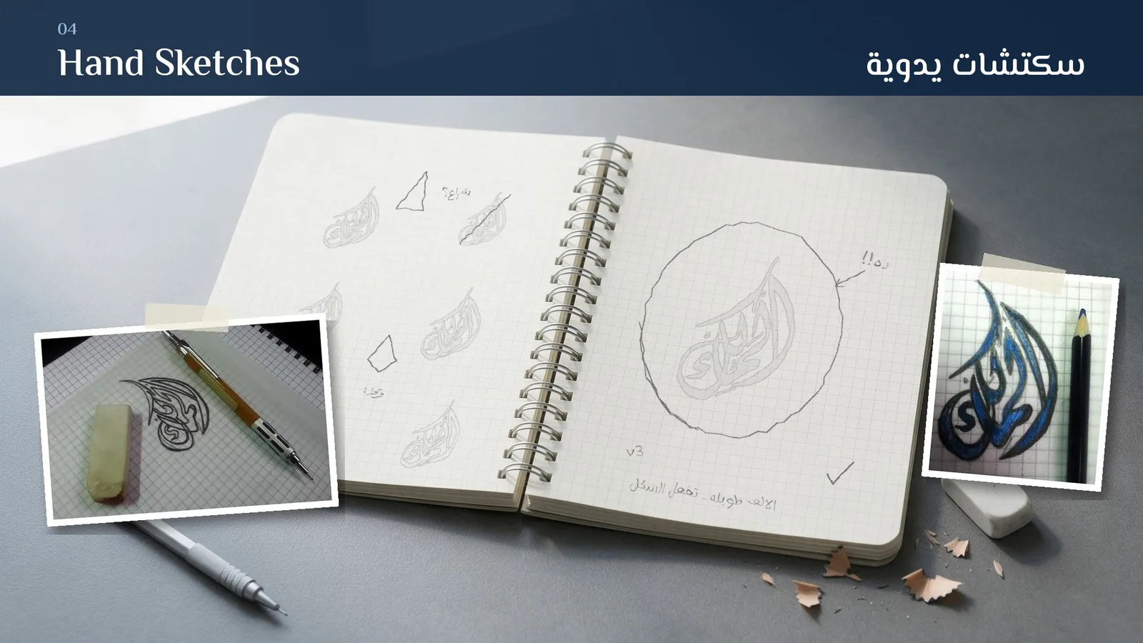
Let me show you my own process. For the Al Malik Corporation logo, a calligraphic Arabic mark, everything started in a squared sketchbook. The first pages were not drawings at all but a mind map of the name and keywords: trust, strength, heritage, royal, fluid, calligraphy, timeless. Then came many small pencil versions of the word, some inside a leaf-like shape, some inside a circle, each one a quick question: does the long alef lead the eye? does the shape stay readable when small?
You can see those pages below. Some sketches are crossed out, some have notes, one has a question mark. That is what a working sketchbook should look like. Only after one direction clearly worked on paper did I move to the computer, where the curves were rebuilt precisely with the pen tool and tested in colour, in small sizes and on mock-ups.
Could an AI model produce a calligraphic logo? It can produce something that looks like one, but Arabic letterforms generated by AI are very often wrong or unreadable, and it cannot know which of my keywords mattered most to this client. The sketches are where the strategy became a shape. If you want the full method, my guide to what makes a good logo explains the principles behind those decisions.
Planning on Paper: Mind Maps, Thumbnails and Layout Plans
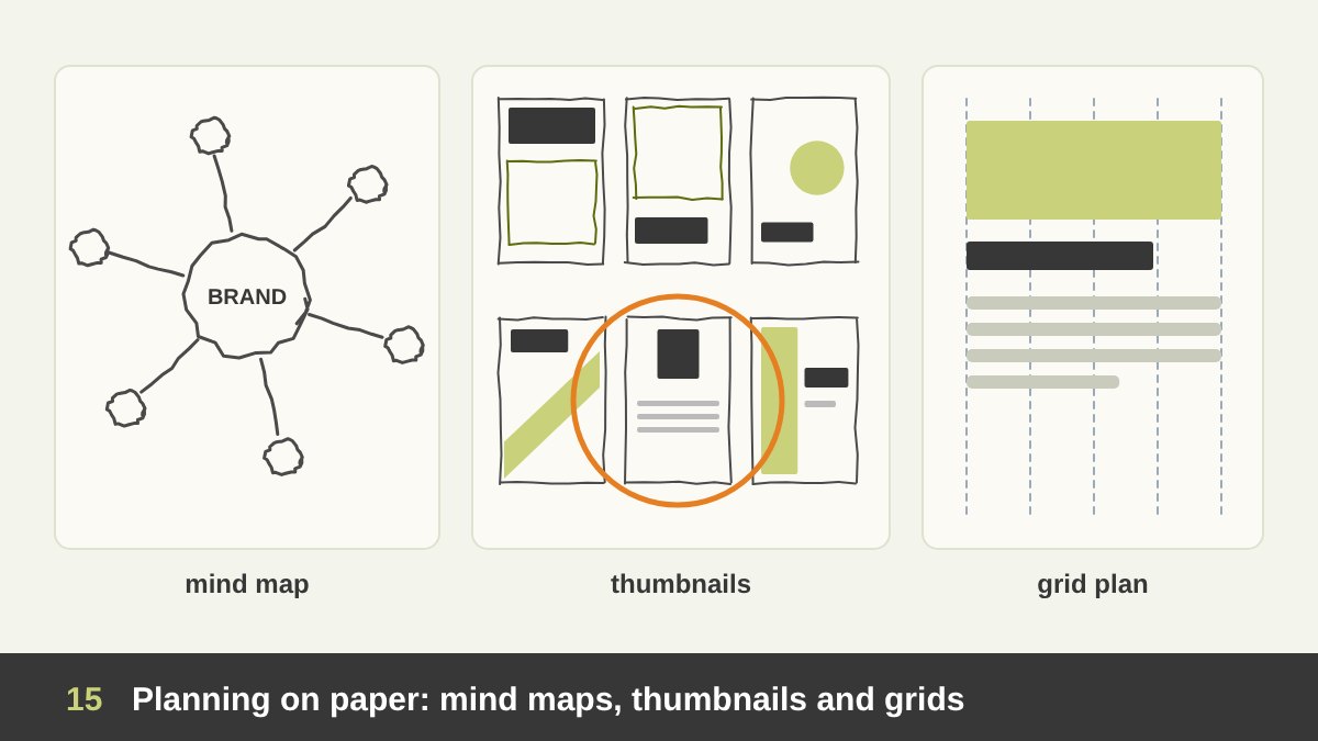
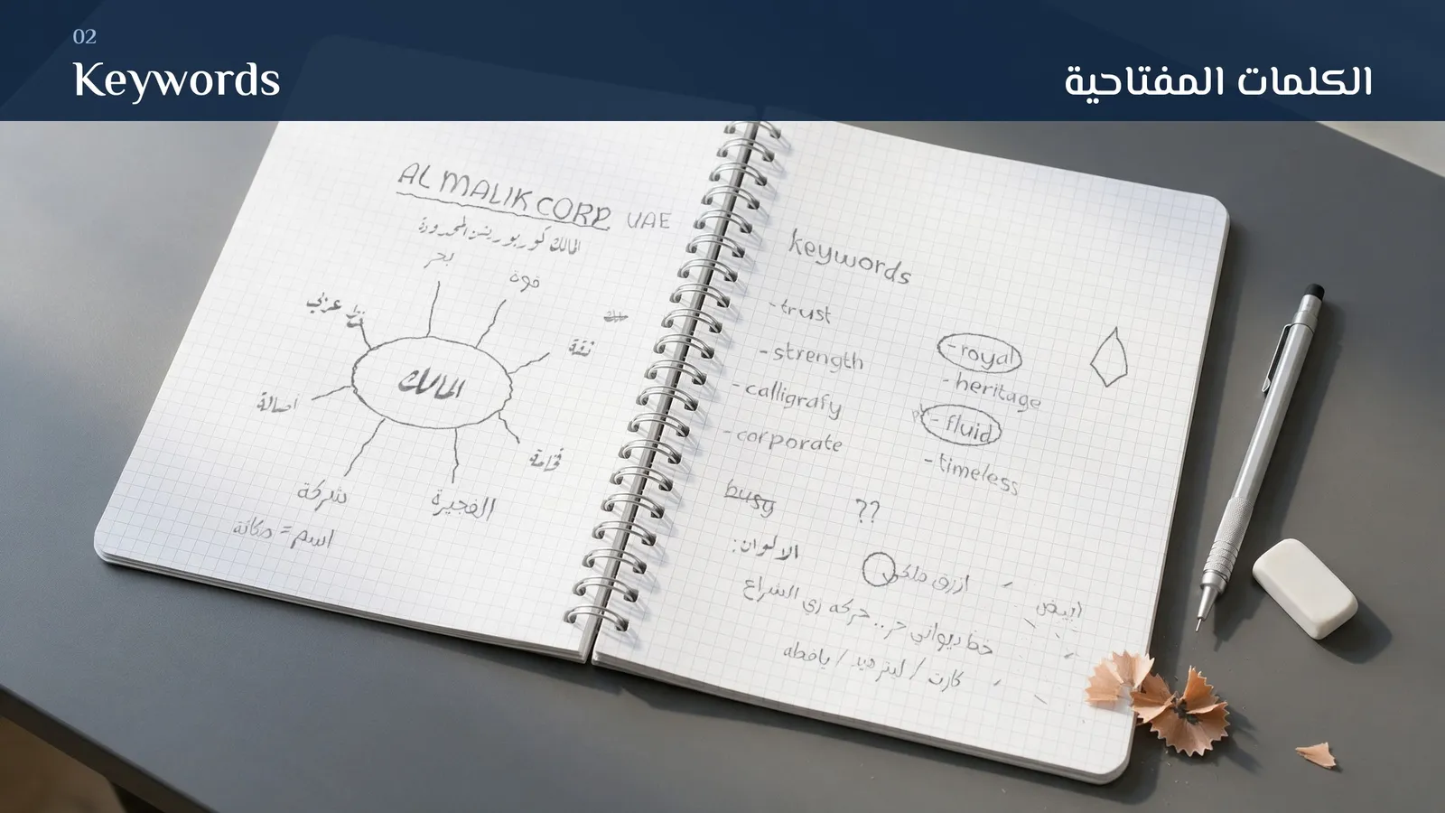
Drawing is not only for images. Pen and paper are the best planning tools a designer has. A mind map turns a brief into keywords and associations, as in the Al Malik pages above. A row of thumbnails tests compositions before you design a poster, a cover, a landing page or a carousel. A rough grid plan decides margins, columns and the place of the main image before you open the software.
The advantage is that planning on paper keeps the whole project in view. On screen you see one artboard at a time and zoom into details; on a desk you can lay out twelve thumbnails for a full social media campaign and see immediately that six of them have the title in the same place and the feed will look repetitive.
A good habit: before every project, fill one page with a mind map and one page with thumbnails. It takes fifteen minutes. In my experience it saves hours of trial and error in the software, and it gives you something concrete to discuss with the client or the team at the start, when changing direction still costs nothing. These plans also make the principles of design, hierarchy, balance, contrast, visible before any colour or font gets in the way.
Sketching in UI/UX: Paper Prototypes and Wireframes
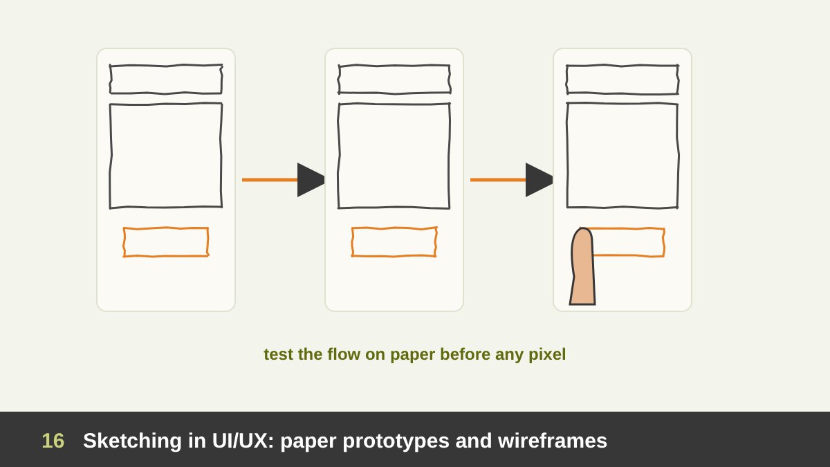
UI and UX design may look fully digital, but sketching is still central there. Before a single screen is designed in Figma, good UX designers sketch user flows, rough screens and navigation on paper or a whiteboard. Carolyn Snyder’s book Paper Prototyping (2003) showed that you can test an interface with real users using paper screens, moving the pieces by hand as the user “taps”, and find serious problems before any code is written.
Paper wireframes have one big advantage over digital ones: nobody falls in love with them. Because they look unfinished, teams discuss structure, content and steps rather than colours and icons. You can draw six versions of a checkout flow in the time it takes to align one digital screen.
Today many teams move quickly from paper to clickable prototypes, and AI tools can even turn a photographed sketch into a first digital wireframe. That makes the sketch more powerful, not less: the clearer your hand-drawn structure, the better the generated draft. You can see this approach in my UI/UX portfolio.
Storyboards for Motion, Video and Presentations
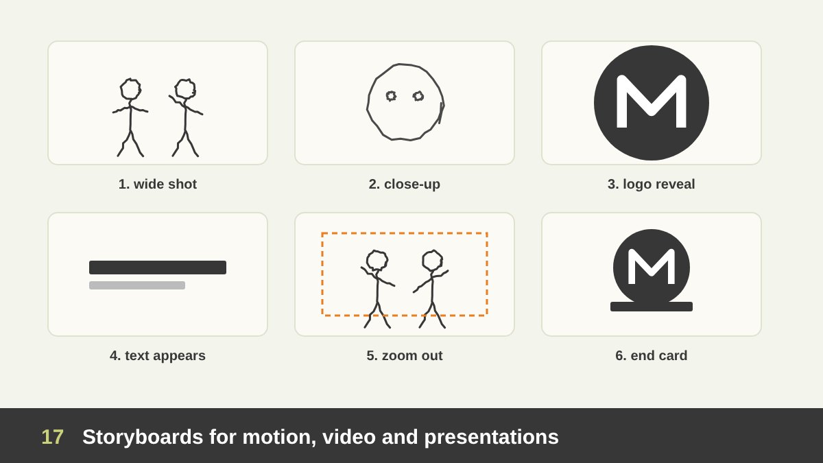
Every animation studio, from the big feature studios to small motion teams, still starts with storyboards: rough frames that plan shots, timing, camera moves and transitions. Many are drawn digitally now, on tablets, but they are still drawings, and they are still made by hand because they are the fastest way to see a sequence before spending days on animation or rendering.
For a designer making a promo video, an explainer, a logo animation or even a slide deck, a storyboard does the same job. Six to twelve small frames with stick figures, arrows and short notes show whether the story makes sense, where the logo appears, and how long each idea stays on screen. Clients understand storyboards immediately, so they are also a great tool for approval before production begins.
AI video tools make this even more important. If you can only describe a scene in words, you get whatever the model decides. If you can sketch the frame, the composition and the movement, you can guide the tools, check the results and correct them. A storyboard is a plan, and a plan is what turns generated footage into a designed piece.
Drawing Skills Inside the Software: Pen Tool, Brushes and Tablets
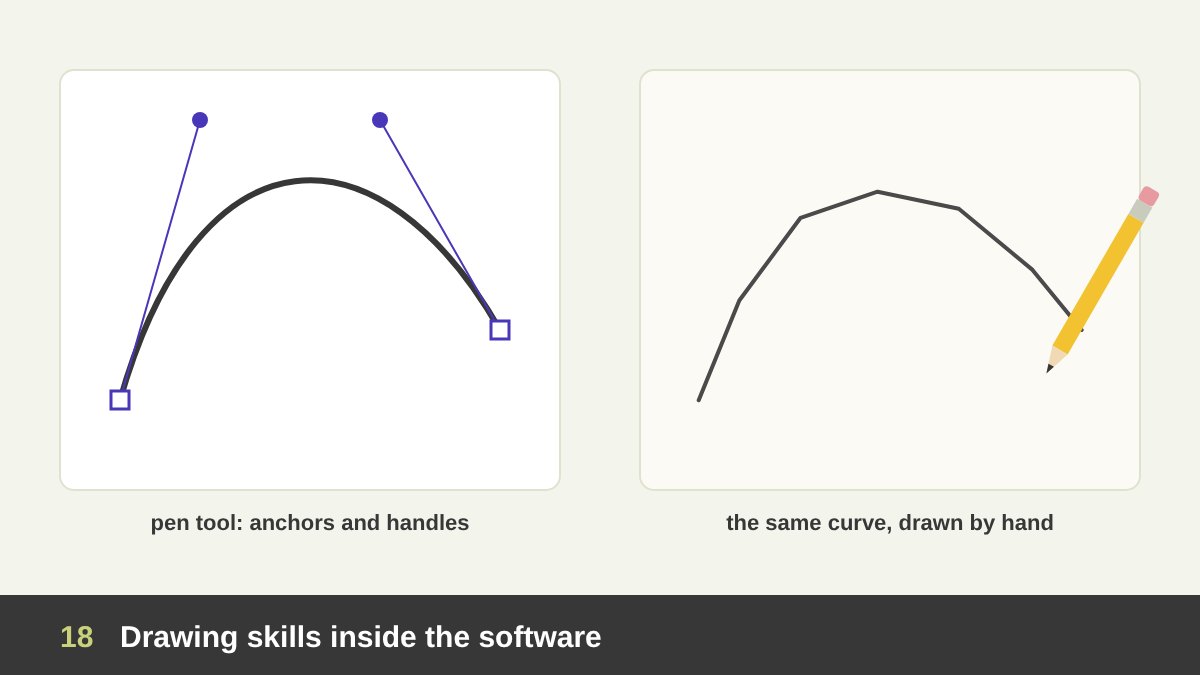
Even inside graphics software, drawing skill shows. The pen tool in Illustrator and Figma is a drawing tool: placing anchor points with few, well-positioned handles is a matter of seeing the curve before you build it. Designers who draw draw better vector curves, because they understand where a line should accelerate and where it should relax.
Digital painting, illustration, retouching, mock-up shading and 3D sculpting all depend on the same knowledge as traditional drawing: proportion, perspective, light and shadow, value and edges. A pressure-sensitive tablet or an iPad does not replace that knowledge; it only changes the surface. My own still life and portrait paintings, digital and traditional, all rely on what I learned drawing with a pencil.
So the question is not really paper versus screen. Drawing on an iPad is drawing. The real distinction is between drawing, where your hand and eye make every decision, and assembling, where you combine ready-made elements. Both are useful; a strong designer can do both and knows which one the project needs.
Sketch to AI: Why AI Makes Drawing More Valuable, Not Less
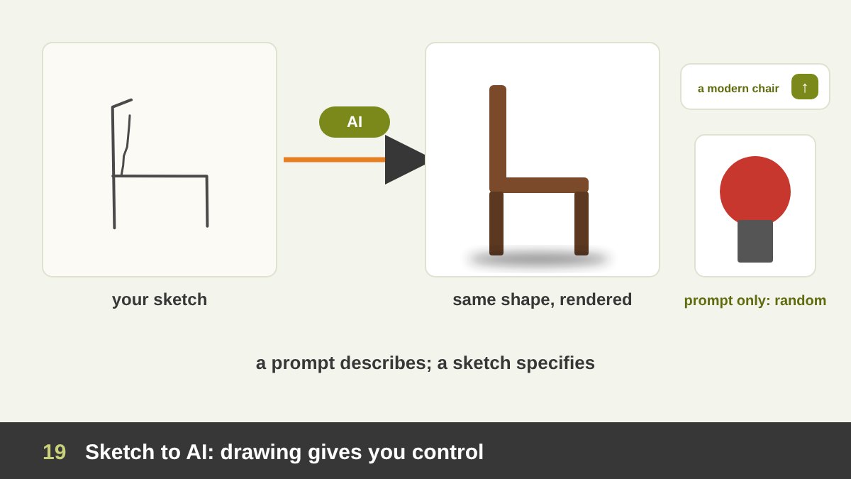
Here is the part many people miss. The newest AI image tools are designed to take drawings as input. ControlNet (2023), a widely used technique for Stable Diffusion, lets a scribble or line drawing control the composition of the generated image. Adobe Firefly added structure and style references so a sketch can guide the layout. Real-time canvas tools and industrial-design apps such as Vizcom turn rough product sketches into renders in seconds.
Compare two designers using the same tool. The first types “a modern chair, side view, studio light” and gets whatever the model imagines, then tries again and again. The second draws the exact silhouette, the angle of the legs and the proportions in thirty seconds and uses it as the structure. The second designer gets a result that belongs to their idea, and can change it precisely by changing the sketch.
In other words, AI rewards people who can show what they want. A prompt describes; a sketch specifies. Combined with strong design principles, the ability to draw quickly is becoming one of the best ways to control AI, which is the opposite of what the “drawing is dead” headlines predicted. I covered the tools themselves in AI and Adobe for graphic designers and the visual direction of the moment in graphic design trends 2026.
Taste, Originality and Ownership: What AI Cannot Do for You
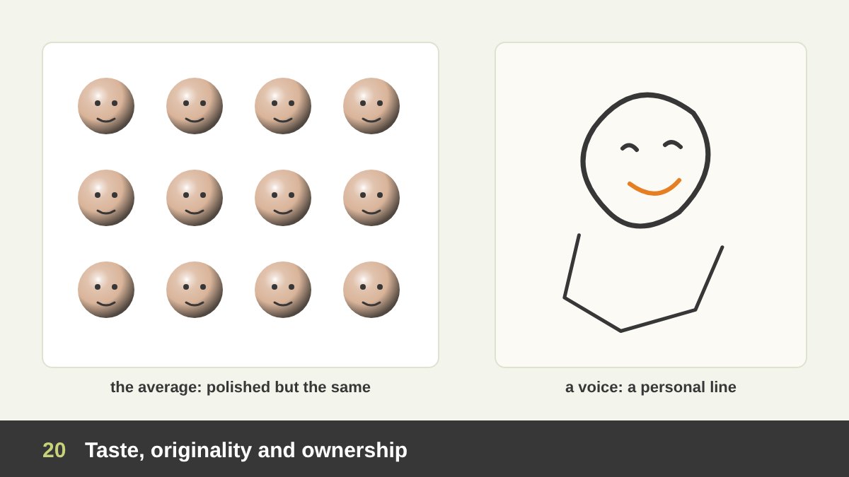
Three things still depend on the human hand and eye. The first is taste: choosing which of a hundred generated images is right for this brand, and knowing why. Taste is trained by looking and by making, and drawing is one of the most direct ways to train it.
The second is originality. Generative models learn from huge collections of existing images and tend to return their average: you have seen the same smooth lighting, the same faces and the same compositions everywhere. A personal drawing style, a distinctive line, an unusual way of simplifying form, is something clients cannot get by typing a prompt, and it is becoming more valuable as generic images become free.
The third is ownership. The U.S. Copyright Office has stated that material generated by AI without sufficient human authorship cannot be registered for copyright, as in the 2023 Zarya of the Dawn decision, and a U.S. appeals court confirmed the human-authorship requirement in Thaler v. Perlmutter in 2025. Rules differ by country and are still developing, but the direction is clear: for logos and brand assets that a client wants to own, human-made design work, from sketch to final vector, is the safer foundation.
Do You Need to Be Good at Drawing to Be a Designer?
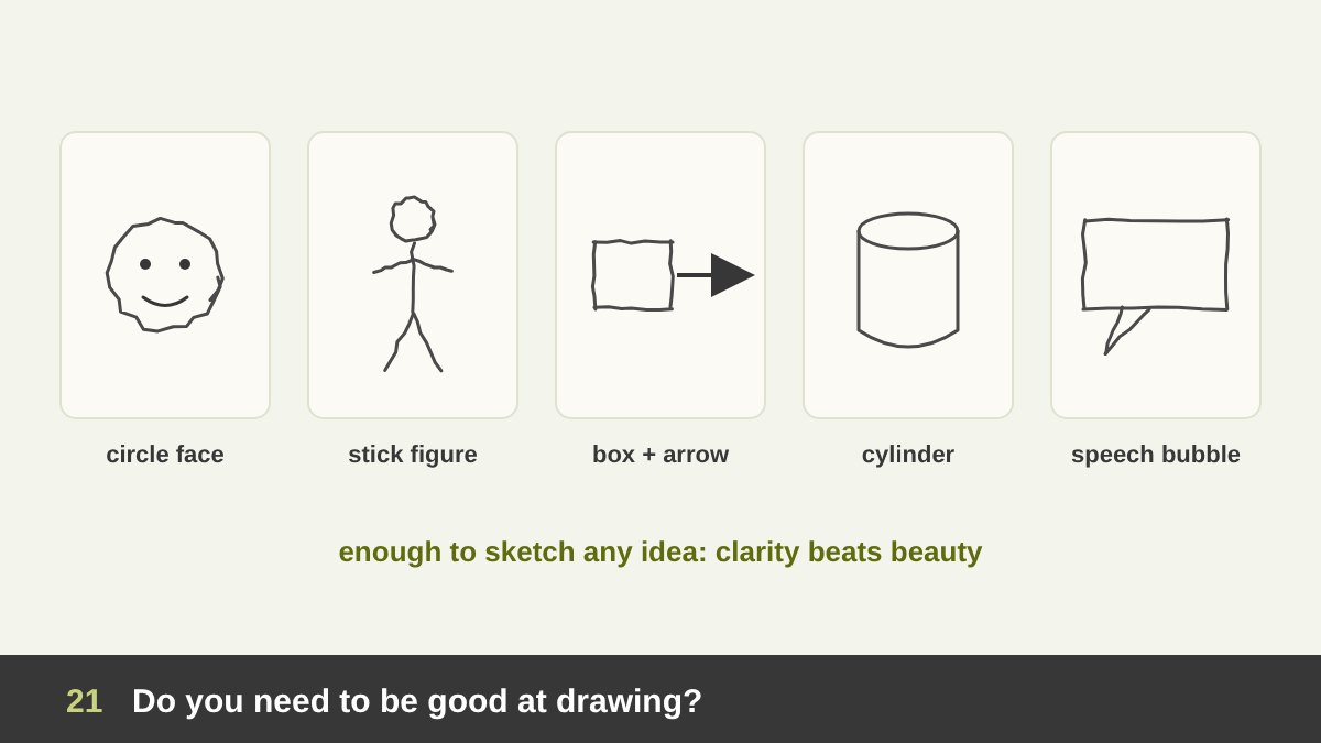
No, and I want to be very clear about this, because the fear of drawing “badly” stops many designers from sketching at all. Many excellent graphic designers, UX designers and art directors are not skilled illustrators. They can draw a box, a circle, an arrow, a stick figure, a simple cylinder and a readable word, and that is enough for idea sketches, thumbnails, wireframes and storyboards.
What matters is that your sketches are clear enough to think with and to show to another person. Beauty is optional. Speed, confidence and clarity are what count. Dan Roam’s point in The Back of the Napkin is that a few basic shapes can explain almost anything.
That said, if you work in illustration, character design, packaging with illustrated elements, concept art, painting or teaching, real drawing skill is still a strong professional advantage, and with AI flooding the market with generic images, a distinctive hand is worth more, not less. The good news is that drawing is a skill, not a talent: it improves with regular practice at any age, which is what the next sections are about. It is also one of the core skills I list for freelance graphic designers.
A Daily Sketching Routine for Designers: 15 Minutes a Day
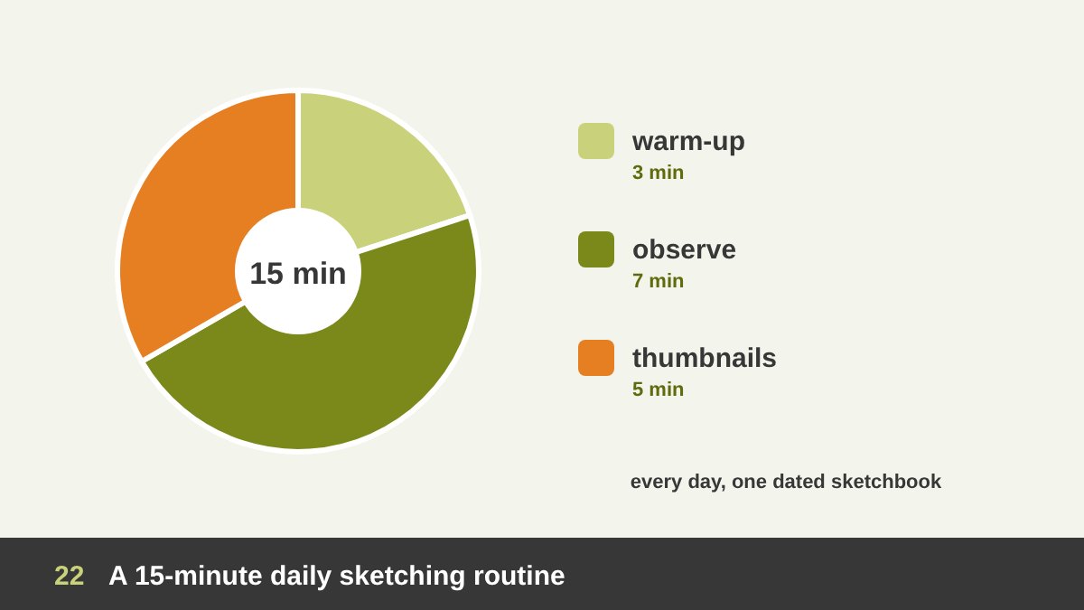
The best routine is the one you actually keep, so make it small. Fifteen minutes a day is enough to see a real difference in two or three months. Here is the routine I recommend to designers and to my students:
3 minutes of warm-up: straight lines between two points, circles and ellipses, quick hatching, to loosen the wrist and train control. 7 minutes of observation: draw one real object on your desk, a cup, your phone, your hand, your shoe, and look at it more than at the paper. Pay attention to proportion and to the shapes of light and shadow. 5 minutes of design thumbnails: take a real brief or invent one (“a poster for a jazz night”, “a logo for a bakery”) and draw at least six small, different solutions.
Keep everything in one sketchbook and date the pages. Do not tear out the bad ones; looking back after a month is the best motivation you will get. If fifteen minutes feels like too much on busy days, do the thumbnails only. The habit matters more than the length of any single session.
Seven Drawing Exercises That Make You a Better Designer
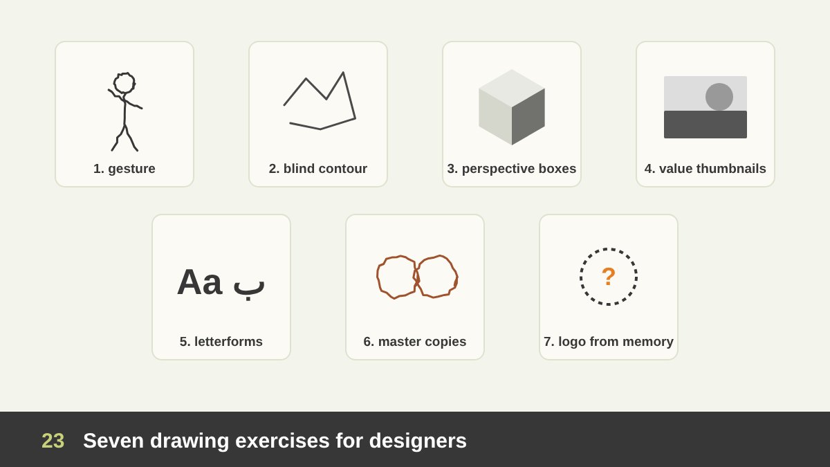
Beyond the daily routine, these seven exercises target the skills designers use most. 1. Gesture drawing: 30-second to 2-minute sketches of people or animals, capturing movement, not details, as taught in Kimon Nicolaïdes’ classic The Natural Way to Draw (1941). It trains rhythm and simplification. 2. Blind contour: draw an object while looking only at the object, never at the paper. The result looks strange, but it trains real looking.
3. Perspective boxes: fill a page with boxes in one- and two-point perspective, then turn them into packaging, buildings or devices. 4. Value thumbnails: plan a poster or a photo in three or four grey values only, to train value and contrast. 5. Letterforms by hand: draw letters in Latin and Arabic, slowly, to understand weight, contrast and spacing before you choose or modify a typeface.
6. Master copies: copy a small part of a great drawing, a Leonardo study, a Hokusai figure, a poster by a designer you admire, purely for learning, not for publishing. 7. Logo from memory: draw a famous logo from memory, then compare it with the real one. You will be surprised how much you never noticed, and you will start seeing shapes, negative space and proportions in every mark you look at.
Tools: Pencil, Fineliner, Markers, Sketchbook and the iPad
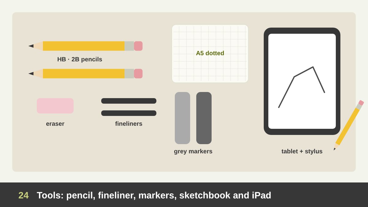
You need very little. A pencil (HB for light construction lines, 2B or 4B for darker lines and shading), a kneaded eraser, and one or two black fineliners (0.3 and 0.5) are enough for most design sketching. Pens are useful precisely because you cannot erase: they force you to draw the next version instead of fixing the last one.
For thumbnails and storyboards, add two grey markers, a light and a medium grey, to block in values quickly. For the sketchbook, choose a size you will actually carry: A5 is ideal, and dotted or squared paper helps with layouts, grids and logo construction. My Al Malik sketches were made in a squared sketchbook for exactly this reason.
An iPad or a pen tablet is a great addition, especially for clean storyboards, client sketches and digital painting, with layers, undo and easy sharing. My advice is to keep both. Paper is faster to start, has no notifications and makes you commit; the tablet is better when a sketch needs to be shared, coloured or developed. The tool matters much less than the habit of picking it up.
A Hybrid Workflow: Paper, Software and AI Together
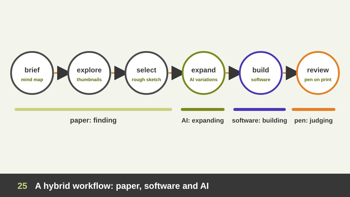
The question is not “drawing or software or AI” but which tool for which stage. Here is the workflow I use and recommend. 1. Understand: read the brief and make a mind map of keywords on paper. 2. Explore: fill pages with thumbnails and idea sketches, quantity first. 3. Select: choose two or three directions and draw them a little more carefully.
4. Expand with AI where it helps: use AI to find references, generate mood images, test colour moods or turn your sketch into quick variations, always starting from your own sketch and brief. 5. Build in software: construct the final logo, layout or interface precisely in Illustrator, Figma, Photoshop or InDesign. 6. Review by hand: print the result or look at it on a tablet and mark corrections with a pen. Drawing over a printout is still one of the fastest ways to see what is wrong with a layout.
Paper is for finding, AI is for expanding and testing, software is for building, and the pen comes back at the end for judging. The table below summarises which tool fits each stage and why.
| Stage | Best tool | Why |
|---|---|---|
| Understanding the brief | Pen and paper (mind map) | Fast, free association, keeps the whole problem in view |
| Exploring ideas | Pen and paper (thumbnails) | Many options in minutes, no software decisions too early |
| Choosing a direction | Rough sketches, then quick digital roughs | Clear enough to compare and discuss with the client |
| References and variations | AI tools, guided by your sketch | Quick mood images, colour tests and variations of your own idea |
| Production | Graphics software (Illustrator, Figma, Photoshop) | Precision, consistency, files ready for print and screen |
| Review | Pen on a printout or tablet | Easy to see and mark problems in proportion, spacing and hierarchy |
| Long-term skill | Daily sketching and drawing from life | Trains the eye, taste and a personal style that AI cannot copy |
Common Mistakes Designers Make with Sketching and AI
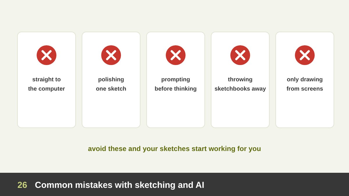
Jumping straight to the computer. The most common mistake. You get the first idea, not the best one, and you spend the day polishing it. Polishing sketches. The opposite mistake: spending an hour shading one beautiful sketch instead of drawing twenty rough ones. At the idea stage, a sketch that looks finished has failed at its job.
Prompting before thinking. Opening an AI tool with no idea of your own and choosing whatever looks impressive. The result may be attractive and still wrong for the brand, and it will probably look like everyone else’s work. Throwing sketchbooks away. Old sketchbooks are a library of ideas; many of my solutions came from a page I drew months before for another project.
Only drawing from screens. Copying photos and other designs on a screen is useful, but drawing from real objects and people trains depth, light and proportion in a way that copying flat images cannot. Believing you are “not a drawing person”. Drawing is a skill. Fifteen minutes a day will change your sketches, your eye and your design decisions faster than you expect.
The Honest Answer: Did Software or AI Replace Drawing? A Checklist
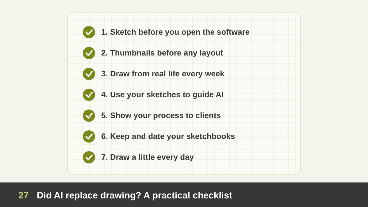
So, did graphics software replace drawing? It replaced drawing for production: final artwork, inking, paste-up and retouching. Did AI replace drawing? It is replacing part of image making, especially generic illustration and quick variations. Neither replaced drawing for thinking, seeing and communicating, and AI is actually making that kind of drawing more useful, because the designer who can show an idea directs the tools instead of being directed by them.
My checklist for every designer: sketch before you open the software; make thumbnails before any layout; draw from real life at least once a week; use your own sketches as the structure for AI, not prompts alone; show your process to clients; keep and date your sketchbooks; and draw a little every day, even when no project needs it.
If you would like to see how this process looks in real projects, browse my portfolio, from logo sketches to finished identities and paintings. And if you have a project that needs ideas built from the first pencil line to the final file, get in touch.
The Importance of Drawing for Designers: Frequently Asked Questions
Is drawing still important for graphic designers?
Yes. Software replaced drawing as a production method, but drawing is still the fastest way to find ideas, plan layouts, communicate with clients and teams, and train the eye for proportion, light and form. Most strong designers sketch at the start of a project even if the final work is fully digital.
Has AI replaced drawing and sketching?
No. AI has taken over part of image making, such as generic illustrations and quick variations, but it does not replace the thinking that sketching supports. Many AI tools now accept sketches as input, so the ability to draw an idea quickly gives a designer more control over AI results.
Do I need to be good at drawing to become a graphic designer?
No. You need to sketch clearly and quickly: boxes, arrows, thumbnails, simple figures and readable letters. Advanced drawing skill is a real advantage in illustration, character design, concept art and painting, and it can be learned with regular practice.
How can a designer practise drawing every day?
Use a 15-minute routine: three minutes of warm-up lines and circles, seven minutes drawing one real object from observation, and five minutes of thumbnails for a real or imaginary brief. Keep everything in one dated sketchbook.
Is drawing on an iPad the same as sketching on paper?
For skills, yes: drawing on a tablet trains the same eye and hand. Paper is usually faster to start and helps you commit to lines, while a tablet is better for sharing, colouring and refining. Many designers use paper for exploration and a tablet for presentable sketches.
What should a designer sketch before starting a logo or layout?
Start with a mind map of the brief keywords, then many small thumbnail sketches of different ideas or compositions. Choose two or three directions, draw them more carefully, and only then build the final version in software, using AI only for references or variations guided by your sketches.
Leave a Reply